Every week, 2000 AD brings you the galaxy’s greatest artwork and 2000 AD Covers Uncovered takes you behind-the-scenes with the headline artists responsible for our top cover art – join bloggers Richard Bruton and Pete Wells as they uncover the greatest covers from 2000 AD!
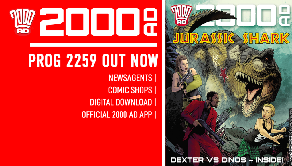
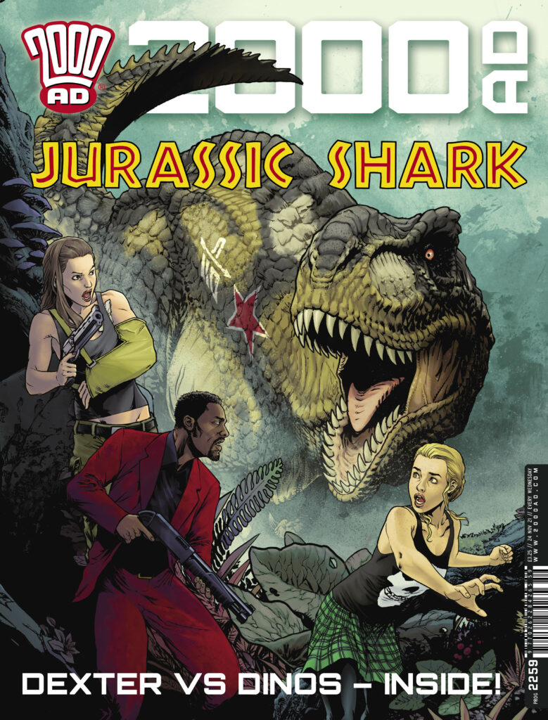
It’s time to check in again with Sinister Dexter… or at least Dexter, in 2000 AD Prog 2259, out on 24 November – as Dan Abnett and Tazio Bettin bring us Dexter in Lordy Jordy: King of Everything. And it’s also a warm welcome for his debut cover to Tazio Bettin!
.
Now, over to Tazio for the making of the cover…
TAZIO BETTIN: Your first cover for 2000 AD is no small deal. When my editor, Matt, gave me green light to create one, I knew it had to be one of my best. I was determined to impress both him and Dan Abnett, who got me into working with him on his Sinister Dexter.
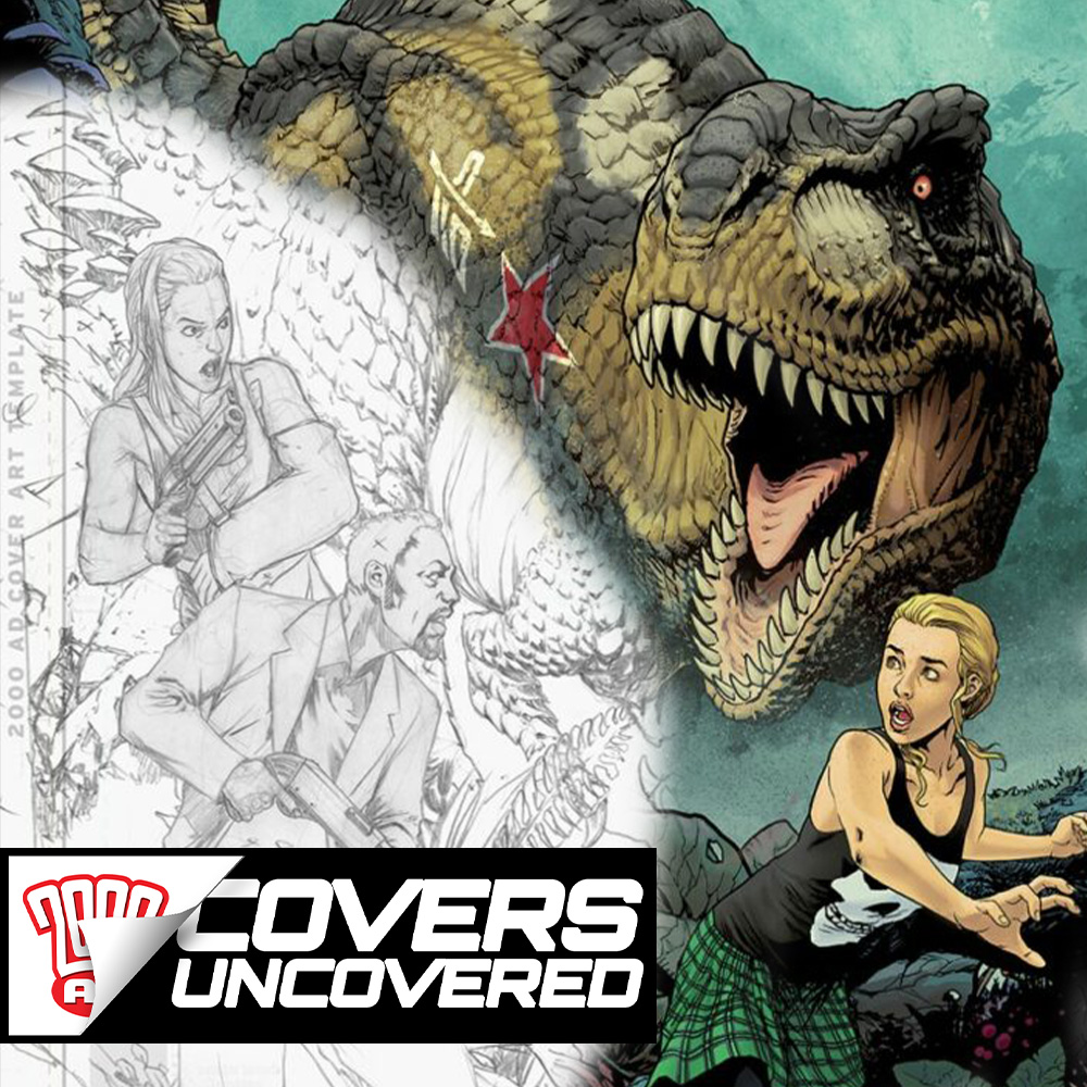
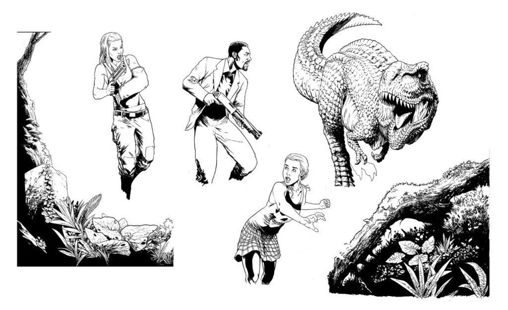
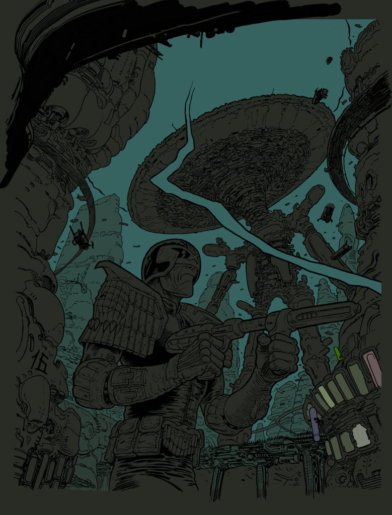
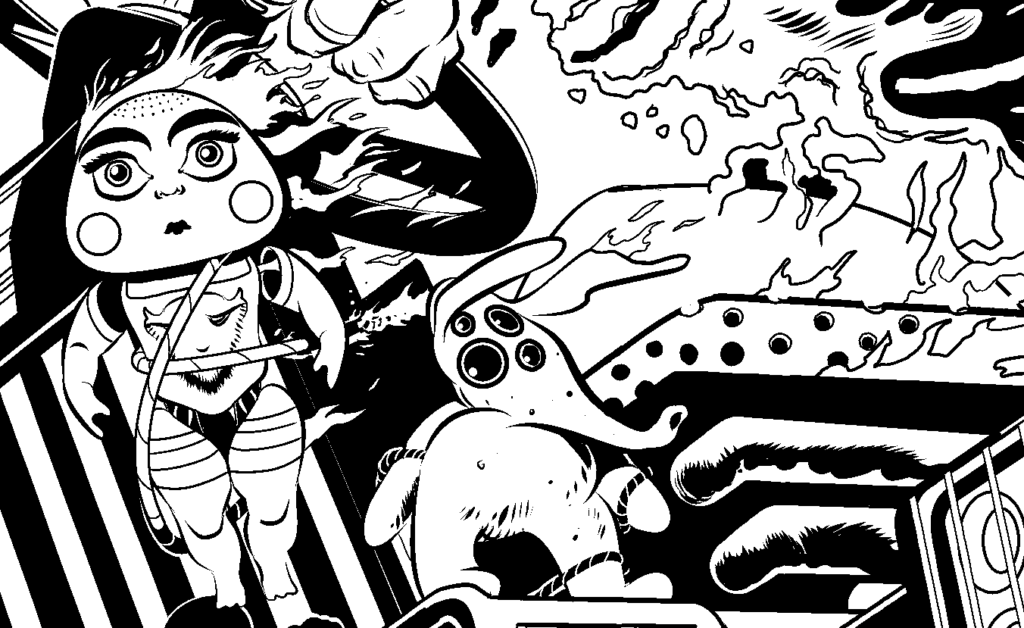
I had carte blanche on the cover, so I started thinking what elements would need to be present to successfully convey what the chapter’s story is about. The current chapter of the comic is set in an underground sewer jungle island that hides an abandoned soviet complex, and there are dinosaurs, as a result of me nagging Dan to have them because… I mean, dinosaurs, right? Dan went one step further and made these creatures unique and badass by giving them Russian military tank insignia. The gentleman always knows how to blow my mind.
Dexter, Carrie and Billi are the focus characters, so they obviously needed to be there. Previously, they had encountered some pretty cool characters, which I had immense fun in designing, such as Kalinka the robot and especially Vegvisir. She was initially meant to be just some lieutenant of the queenpin Bates, capturing our heroes at the beginning of the previous chapter, but when I drew this character as a tough, muscular woman with a cold attitude, Dan decided to give her a name and make her central to the story, which filled me with joy.
.
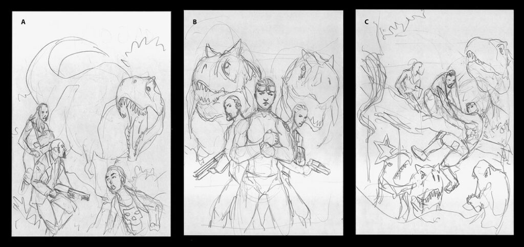
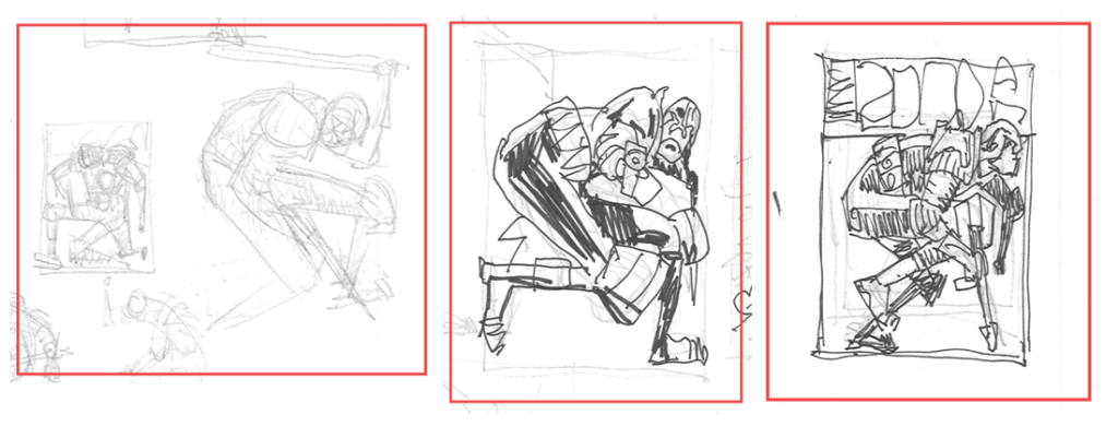
So on I went and prepared some layouts for the cover, two of which included Vegvisir, and the last focusing on the main characters only. I didn’t want the composition to be excessively busy: I think I prefer essential, simple, and iconic compositions over crowded covers with dozens of characters striking an action pose, the likes of which you constantly saw – especially during the nineties when I grew up – and didn’t especially like. I decided that this composition had to have no more than three characters and, of course, dinosaurs.
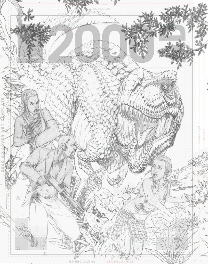
As you can see from the initial sketches, this stage is little more than a composition study where I plan elements and their placement. In the end, the first option was chosen, one focusing on the main characters – Dexter, Carrie, and Billi. So, knowing where I was going, I got busy with pencils...
.
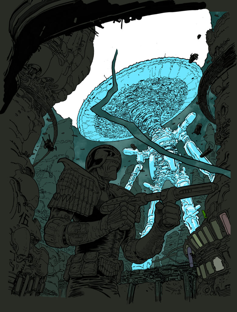
In drawing dinosaurs for this chapter of Sinister Dexter I actually tried to go with the best scientific knowledge we have of these awesome animals, which ones were likely (or proven) to have feathers and which ones apparently didn’t. To the best of my current knowledge, it seems likely that among Theropods, Tyrannosauridae didn’t have feathers, so my inspiration came from crocodiles. I know it’s a completely different clade, but I took some artistic license inspired by Peter Jackson’s King Kong dinosaurs. Unlike your naked-skin Jurassic park T-Rex, I decided that my Tyrannosauri have scales on their backs and heads and a slightly crocodile-like tail. Oh and let us remember that Tyrannosauridae first appeared in the Late Cretaceous. What’s with this Jurassic nonsense anyways?
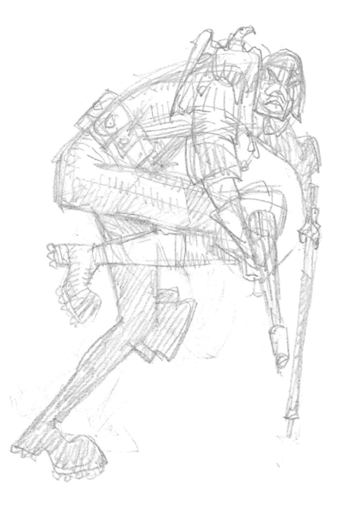
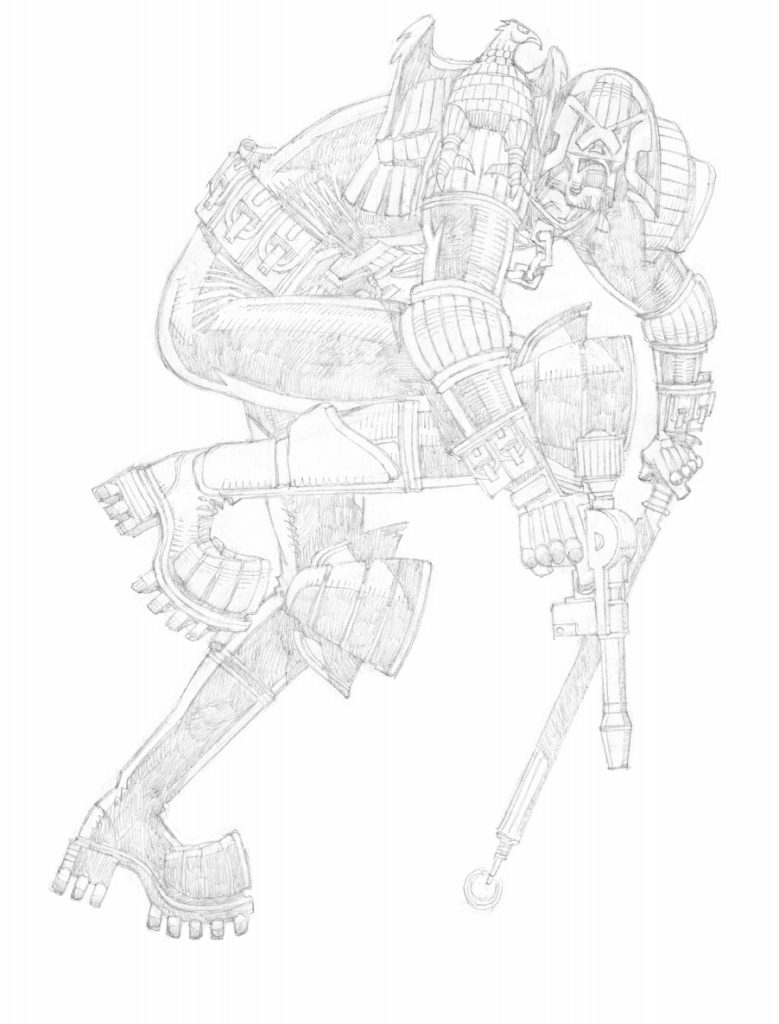
Since I wanted to take advantage of the cover space in the best possible way I could, I decided to draw all the elements separately and to assemble them later…
.
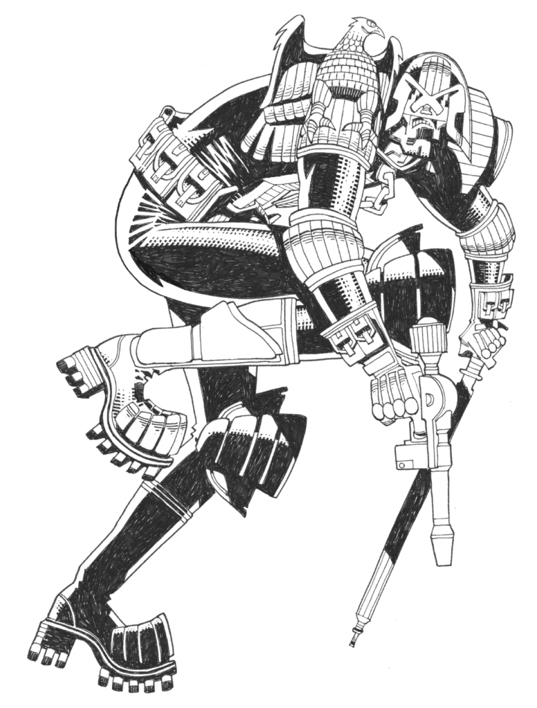
After approval of the pencils, I went ahead using some good thick paper I could safely scratch ink textures on, and my faithful collection of nibs, fineline markers, and brushes. I believe that where pencils are the foundation and skeleton of a drawing, what gives it life is the inks, and that inkers are often the unsung heroes of comics. A good inking is what marks the difference between a good piece of comic art and a mediocre one, no matter how good the pencils are. The versatility of inking instruments and techniques allows for a number of great solutions that can make a drawing really pop out.
My favourite part of inking is the texturisation of uneven surfaces and volumes, such as the vegetation here. I often like to flick my nib on the rim of an old plastic card to create a controlled splatter effect here and there, as well as using my fingerprints to create a very fine, texturised midtone where needed. The final effect I usually go for is a juxtaposition of clean, regular lines and texturising smudges that break down the shapes and give a realistic, worn feeling to objects.
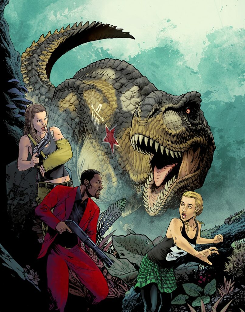
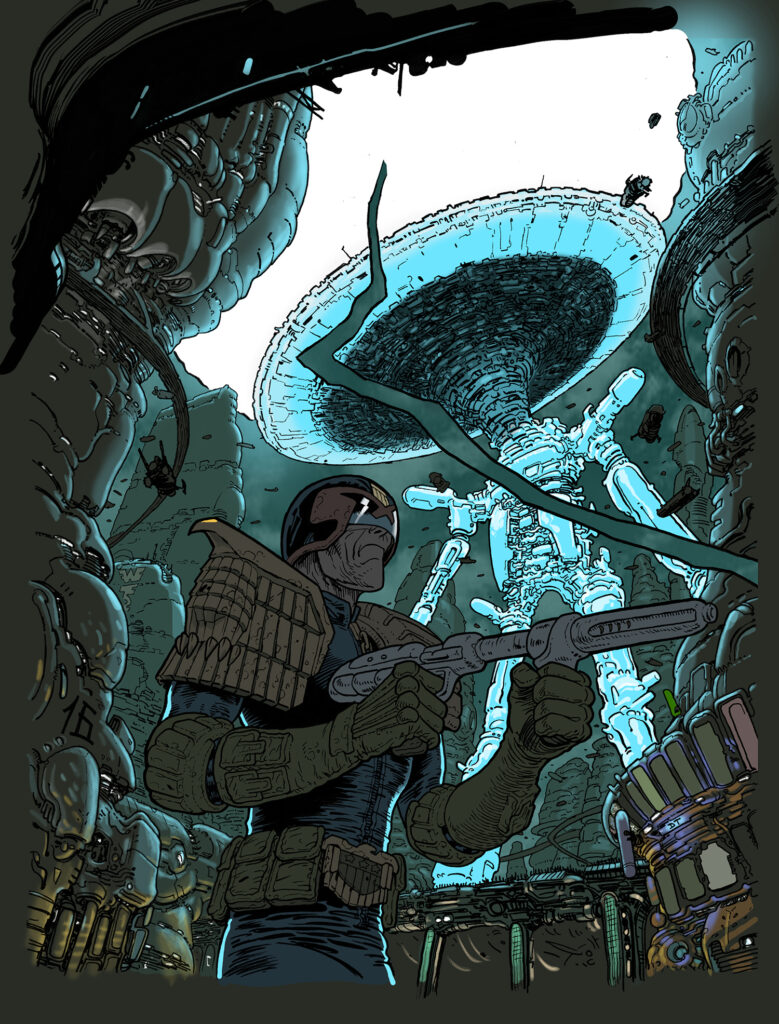
Finally, when it comes to colouring, I’m reminded of the legendary Gennady Tartakovsky’s rule that made his Samurai Jack so visually memorable: ‘no green grass and no blue skies.’ Colours are always at least slightly askew in the expected colour palette, and that’s indubitably a big part of that cartoon’s magic.
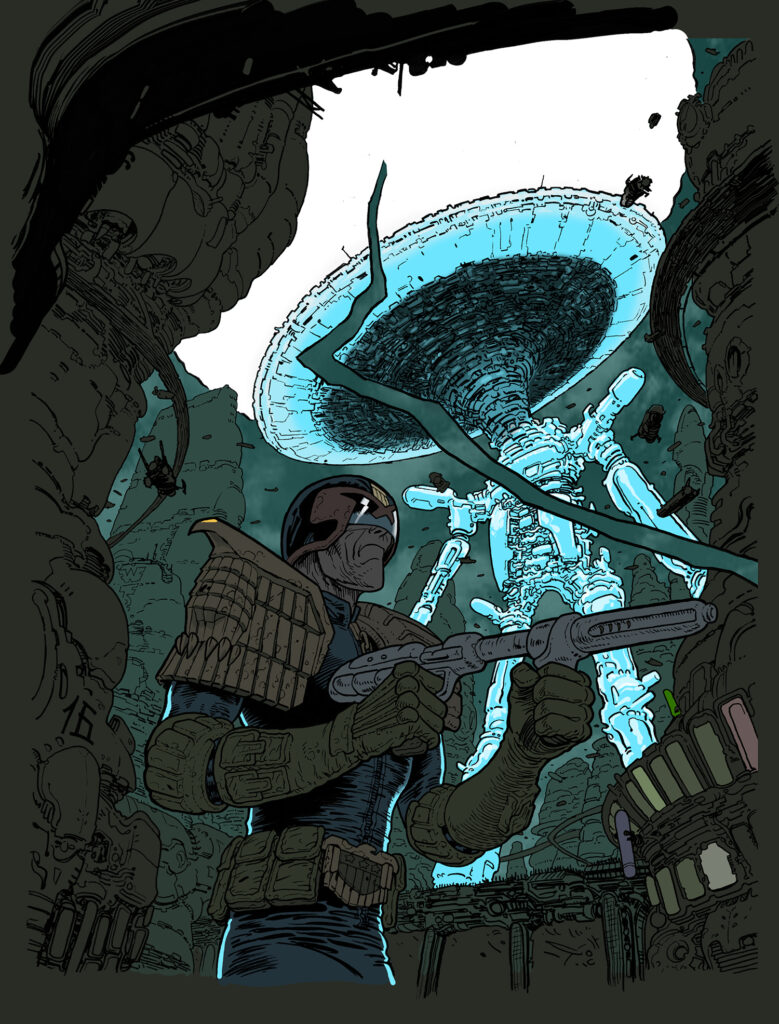
After having decided what the colour dominance will be in an illustration, I start from the background and work my way up to the foreground. Every element remains separate at this stage, and therefore movable just in case I feel like that would benefit the overall composition. Just like in inking, I like a juxtaposition of clean colouring and natural looking, irregular textures.
.
For the background, I’ve used some abstract textures I previously created by smudging watercoloured ink on paper, so as to create an illusion of foliage. The Tyrannosaurus’ skin is also painted with textured brushes, whereas the foreground elements, and especially the characters, have clean, regular gradients to them, which makes them stand out in the composition. The wood, rock and foliage were already textured at the inking stage, so I kept clean, untexturised colouring to not overdo the effect, with the result of only making the image difficult to read.
As it is when working on interior pages, the readability of a composition is the main concern, and that remains true during every stage of the process. The value of the chosen colours is probably the key at this point. A good idea is to turn your illustration to black and white, and see if it’s still readable. If the values are too uniform, it will just look like a grey mess. If you can look at a cover at thumbnail size and in black and white, and still read the elements, then you’ve done your first job right.
And hopefully this is just the beginning of a series of covers for 2000 AD, I hope you all like my work!
Oh – we do Tazio, we do!
Thanks so much to Tazio for sending along his cover work – always great to see an art droid get their first ever 2000 AD cover! And you can find Tazio’s cover adorning the front of 2000 AD Prog 2259 – out on sale wherever you get your Thrill-power from, including the 2000 AD web shop, on 24 November
Every week, 2000 AD brings you the galaxy’s greatest artwork and 2000 AD Covers Uncovered takes you behind-the-scenes with the headline artists responsible for our top cover art – join bloggers Richard Bruton and Pete Wells as they uncover the greatest covers from 2000 AD!
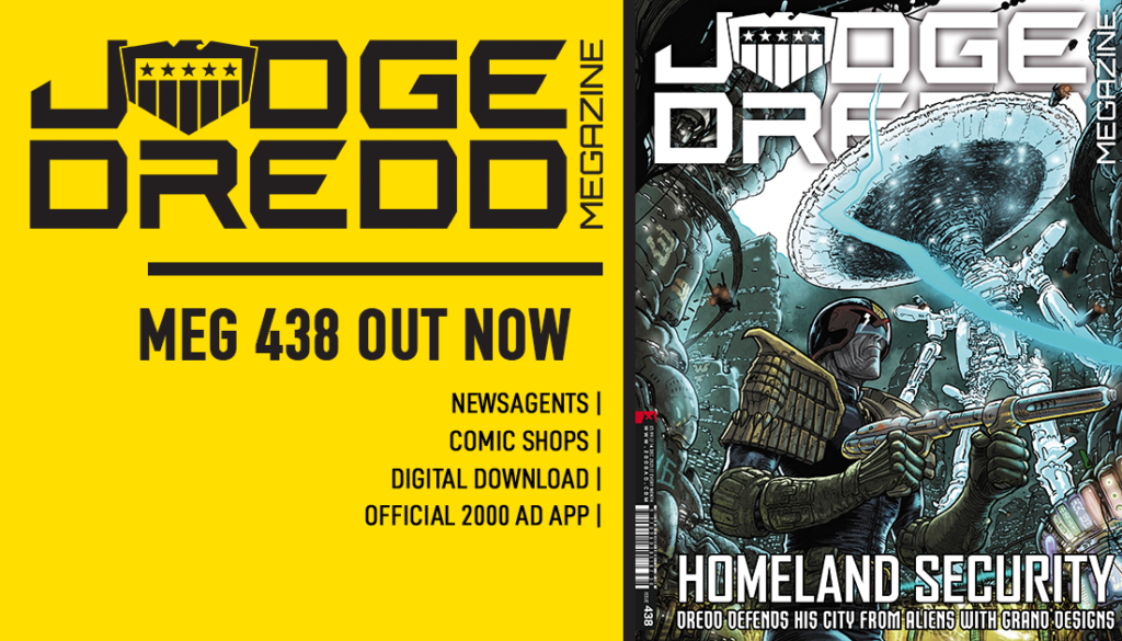
Borag Thungg, Eartlets – the new Judge Dredd Megazine issue 438 is out now , with a thrill-powered collection of strips and a stunner of a Judge Dredd cover with the old man in action (complete with stub gun!) courtesy of art droid Dave Taylor. After giving us the retro-futurist art deco delights of Megatropolis earlier in the year, Taylor’s back in artistic action for Judge Dredd: Dez-Rez in this months’ Megazine, written by Ian Edginton.
Over to Dave Taylor now to give you his rundown on the creation of the cover…
DAVE TAYLOR: The Ian Edginton droid and I were working on a little Dredd story called Dez-Rez, a charming peek into the day-to-day life of the Galaxy’s favorite Judge, and it occurred to me that this wee tale had elements that might make for a dynamic cover.
I used the traditional method of meditation and before long I was in communication with mighty Tharg. He agreed with my daft idea and requested a few sketches. The concept had already formed in my head, so I did one sketch, which I then messed around with to give my Master the choice he so needed.
He chose the right one, naturally, and so I moved onto doing the actual piece.
Drawing Judge Dredd is an honour and a privilege. No, don’t be like that, I’m serious. I’ve been a fan since 1977, not always a devoted fan (I strayed in the ’90s somewhat), but this guy means a heck of a lot to me, and obviously to hundreds of billions across the galaxy. So it’s always a little nerve-wracking starting something like this. That said, I had a disturbingly large amount of fun, which hopefully comes across to the reader. Comics are fun, right?
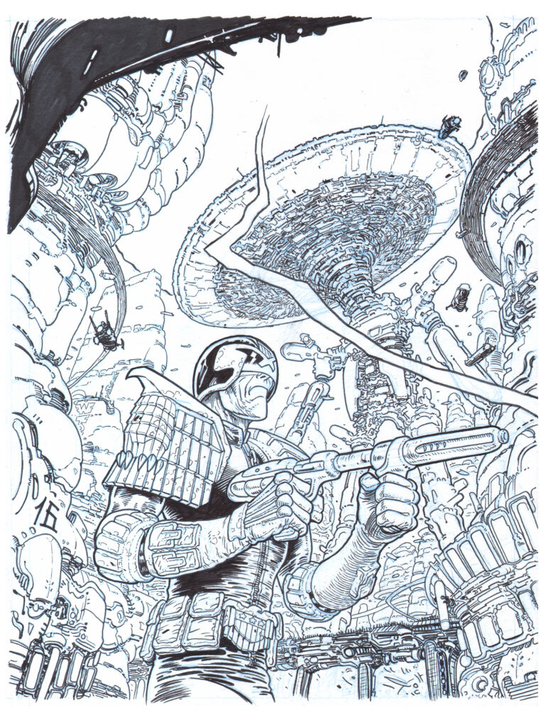
This is a scan of the finished inks before I photoshop “clean” it up. I forgot to take a scan of it before I inked it, but rest assured that looked very much like this image, just not as inky.
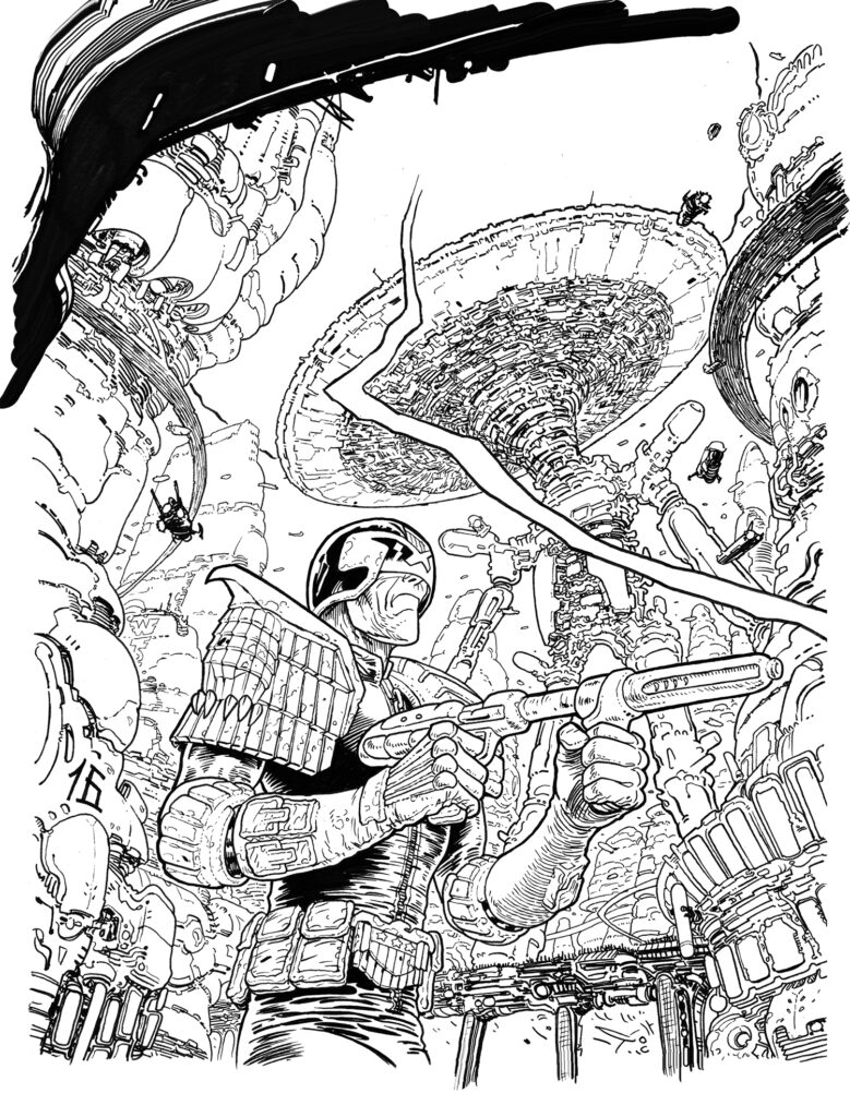
I’ve mentioned the magic electric fairies (photoshop) before so I’ll not bang on this time about how in love with them I am, suffice to say they helped me “clean” this image so we can now only see the inked line.
Next up – “Flatting”. The art of finding all the big areas of an image and coloring them in such a way as to distinguish them from other big areas. You’ll see that I’m already creating depth by using dark in the foreground and lighter tone for the background. I like a lot of depth.
What’s the major light source in this image? Establish that and you’re off and running.
I like to start with the darkest tones and work the light on top of that layer. I think it’s faster to do that, less messy, easier to control.
Now the hand painting begins as I start to light the scene, from the major light source already established. I use a small drawing tablet and the pen that comes with it that plugs into my computer. Simple and basic but it does the job. Takes a while for your brain to figure out that you look at the screen not your hand while drawing!
Secondary light sources established. This is where we start to see the true colour of things. An overall colour is beginning to come through. Again, this is hand painting via said tablet and pen.
The fiddly bits. Put on some music, sit back and just get on with it. In no time, ages have passed and you’ve done the fiddly bits.
To finish off I add the atmosphere and some ridiculous details aaaaand we’re done. I say “aaaaand” to represent the time I spend looking at it wondering if I like it enough to send of the Great Tharg.
This part can take hours, just staring at it, waiting for it to say “yup, I’m finished, thanks!”.
Thank you so much, as always, to Dave Taylor for showing us the ins and outs and all the fiddly bits involved! Great to see the stub gun on a cover!
Judge Dredd Megazine issue 438 hits the stands and the 2000 AD web shop on 17 November – don’t miss out!
Every week, 2000 AD brings you the galaxy’s greatest artwork and 2000 AD Covers Uncovered takes you behind-the-scenes with the headline artists responsible for our top cover art – join bloggers Richard Bruton and Pete Wells as they uncover the greatest covers from 2000 AD!
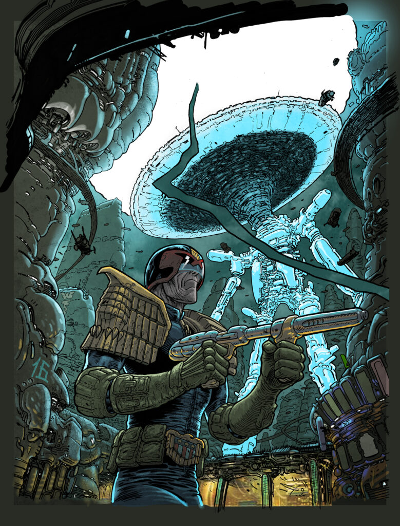
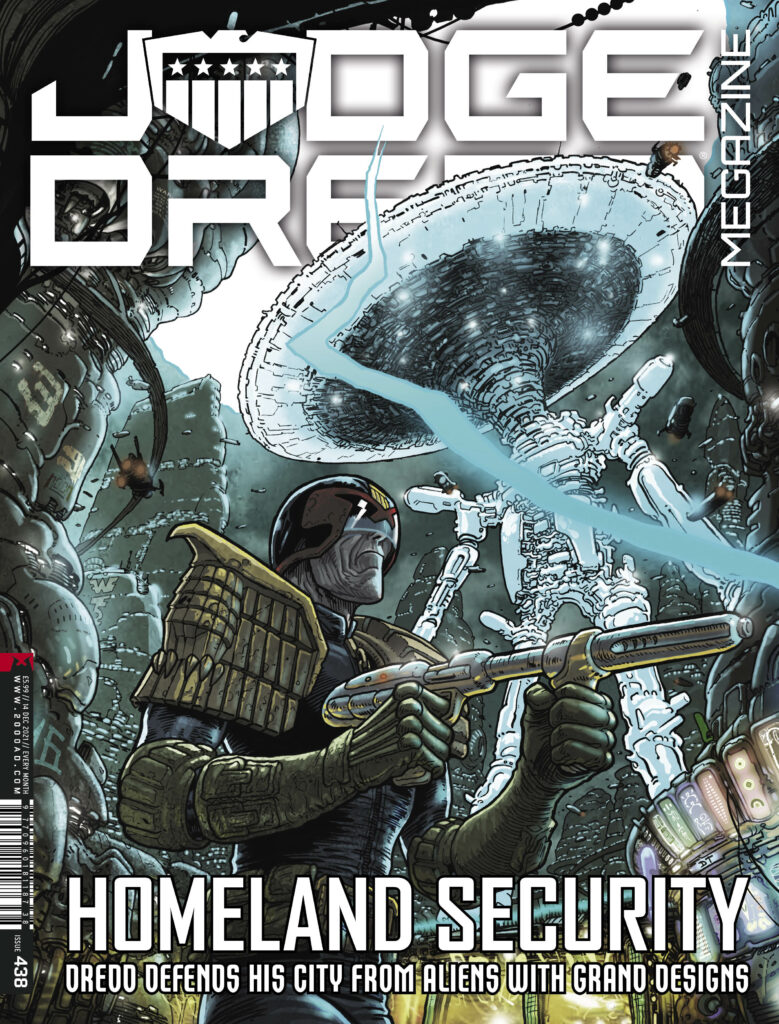
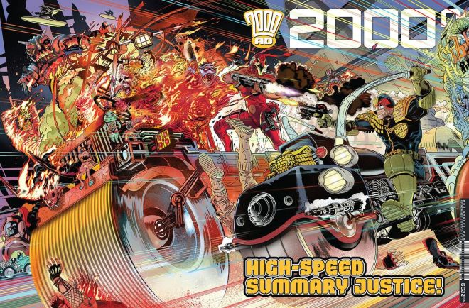
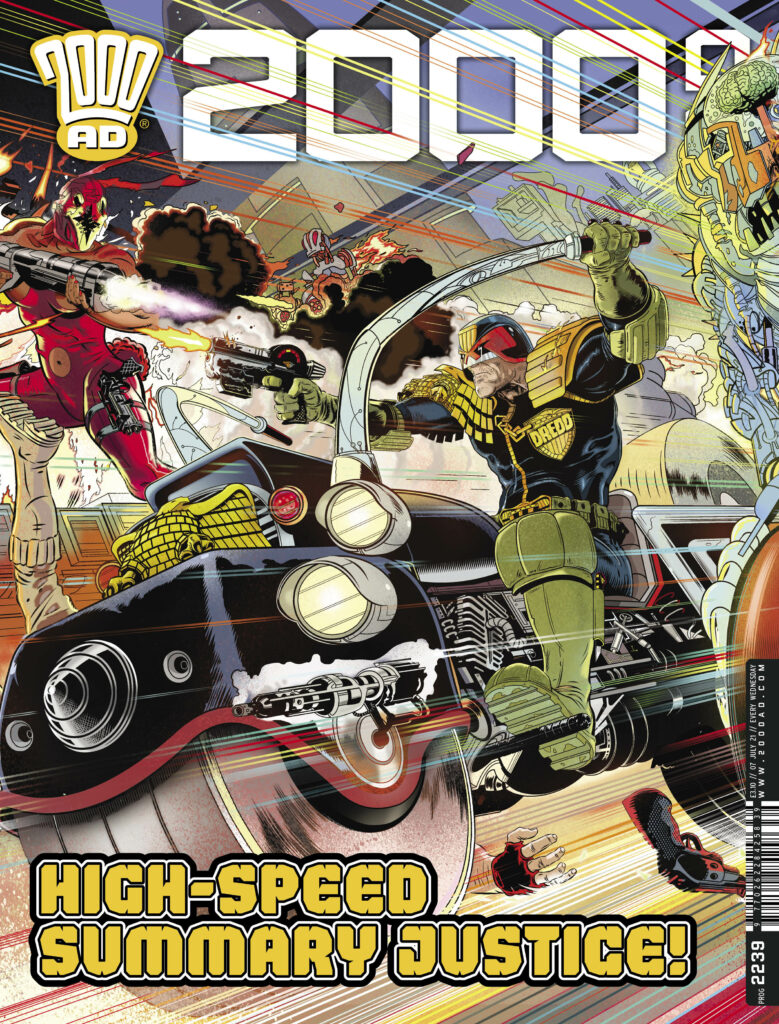
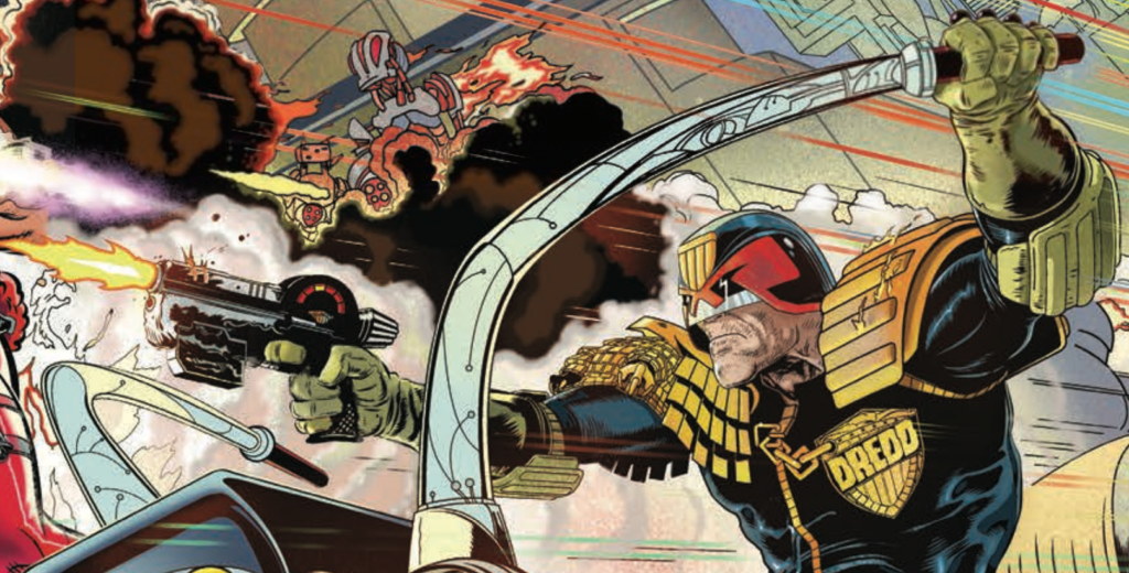
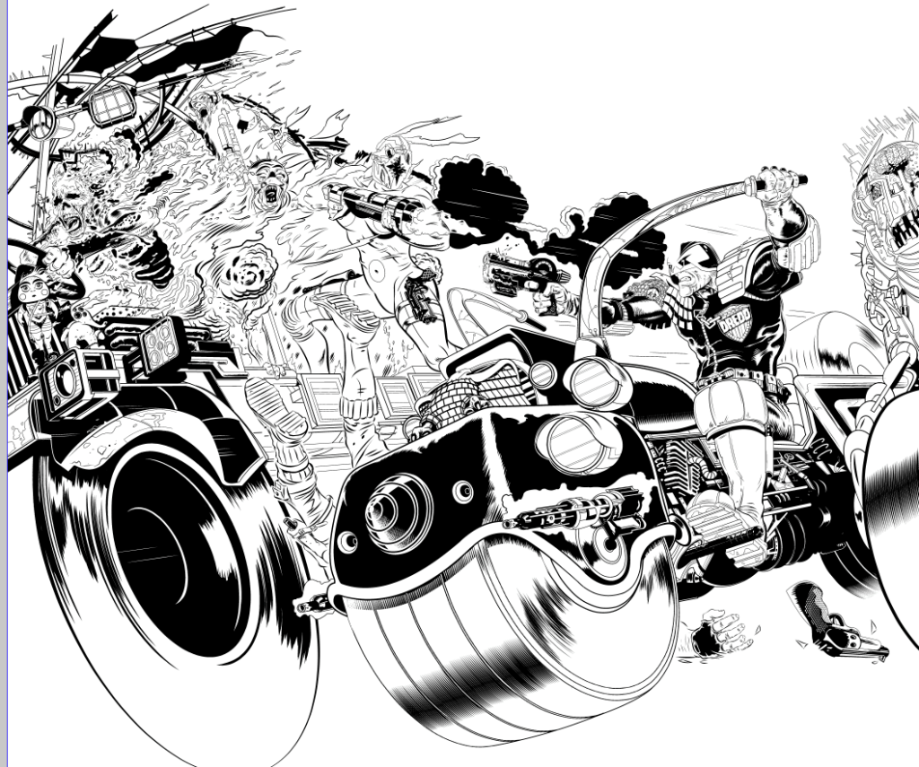
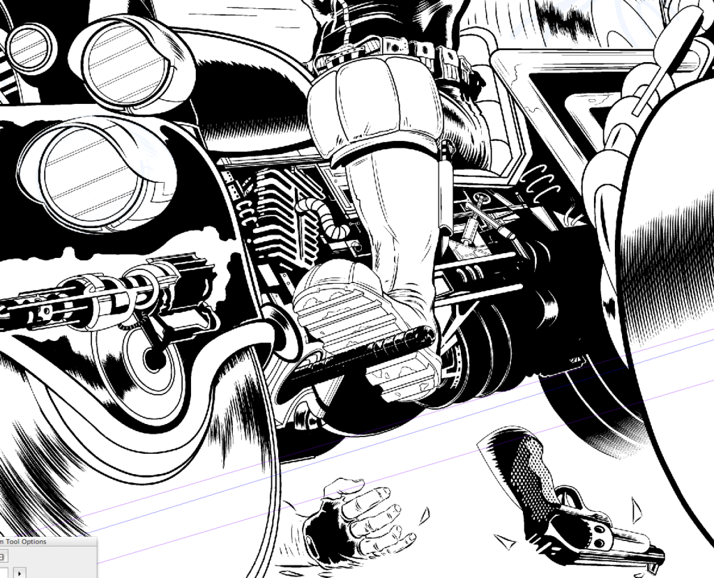
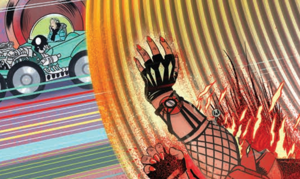
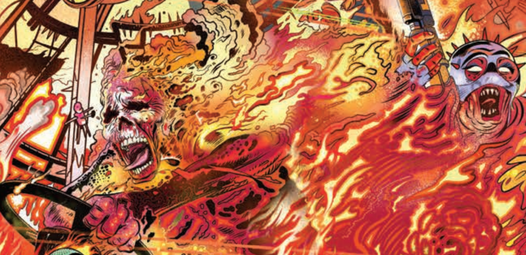
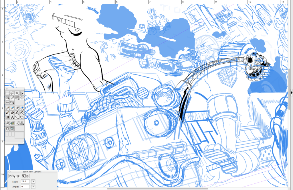
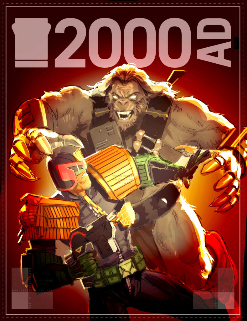
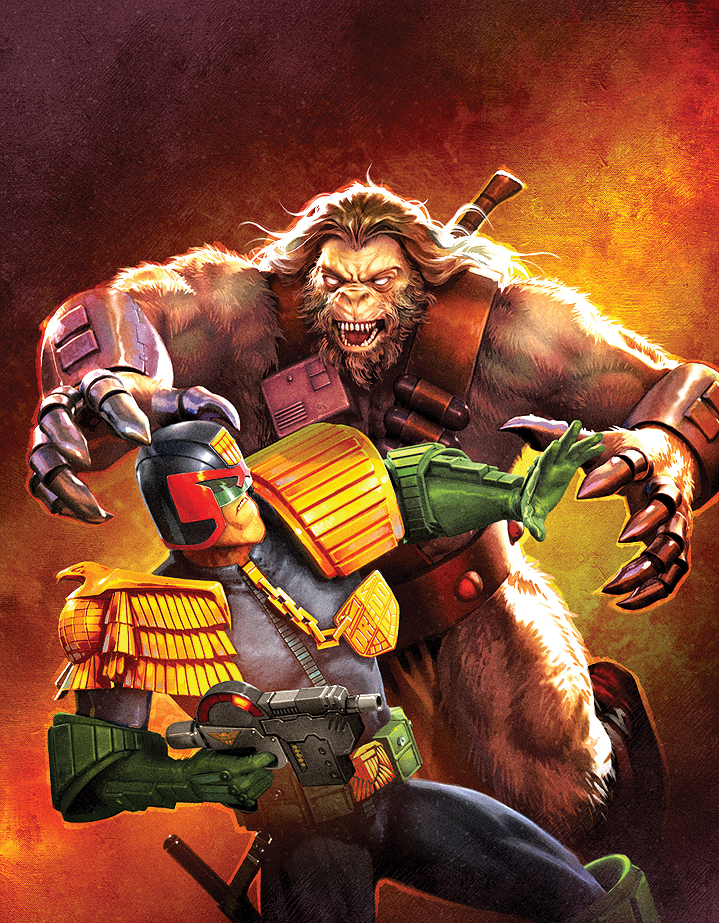
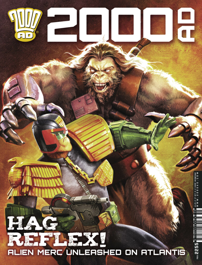
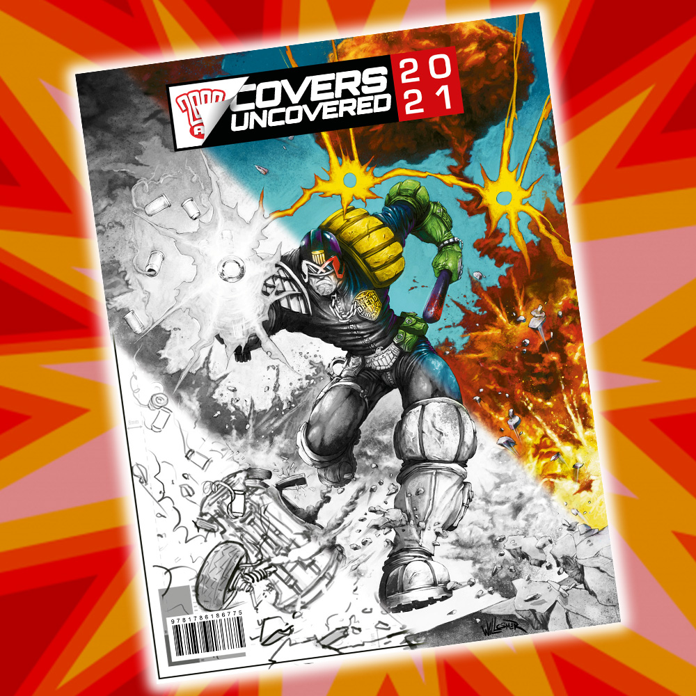
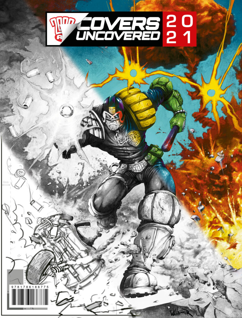
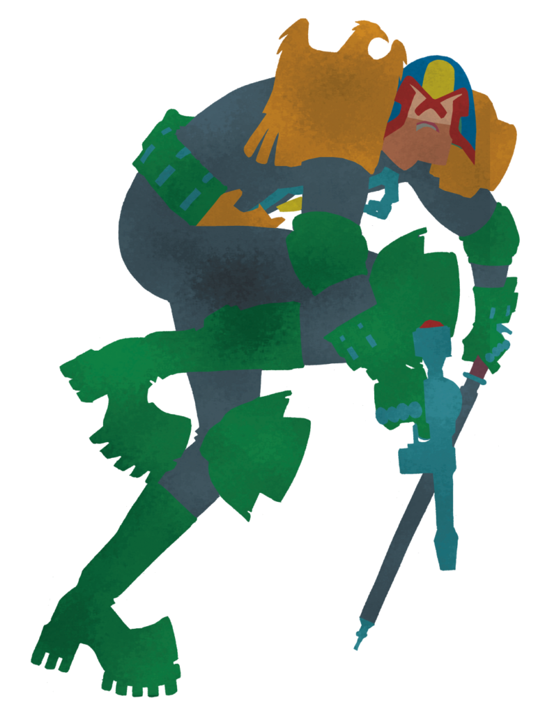
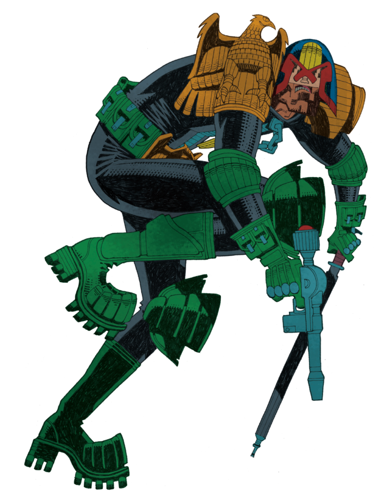
Okay then… settle in Earthlets, we’ve got a long one for you. But a damn good one. It’s the mystery of the missing cover to 2000 AD Prog 2239 by Stewart Kenneth Moore. Way, way, way back in July 2021, SK Moore did one of the covers of the year – a spectacular double-page spread of Dredd looking like this…
.
And Stewart was going to do a Covers Uncovered for us, but time and deadlines got the better of him. Oh well, can’t be helped, even though it’s a terrible shame not to see the process and read the process – because if you’ve read any of Stewart’s previous write-ups, you know he really does go the extra mile and goes deep into the creative process for you (have a look at the one for 2000 AD Prog 2179 and the special poster in the 2000 AD Sci-Fi Special 2020 to see what I mean.)
But we were chatting to him recently about the Covers Uncovered Annual 2021 (out November 24!) and he said that even though he’d not sent them over, he’d still got both the image files for Prog 2239 and also the original commentary he’d done somewhere – and would love to get them to us. Except then he went looking for them and couldn’t find the commentary anywhere.
As Stewart puts it… ‘I wrote a new text this morning. But then found my original text that I wrote for you maybe a year ago! So you have the option of modern, sedate, creative narration or ye olde, barking at the moon, ‘he’s driving us off a cliff’ lunacy engine.’
A few hours of editing, 4,000 words later, the images and screenshots Stewart sent over and highlights from the cover to illustrate his points… here we go.
So – strap yourselves in, get ready for the full-on, total immersion, in-your-face creativity blast of SK Moore talking about making the cover to Prog 2239. Okay then.
Get ready for SK Moore in 3… 2… 1…
.
SK MOORE: Going back through my files I see how hard it is to show my process, I was even confused by what I found lurking in my files. It’s a mess!
With ‘Covers Uncovered’ I’m always tempted to share only two pictures. The first, a rudimentary doodle, the second the finished picture. As though those are the only two stages involved!
There’s a meme like this, it’s called ‘How to Draw a Head’ and it never fails to make me laugh. The first picture is a roughly drawn circle with the words ‘First draw a circle’. The second picture is what appears to be an excellent finished 19th century pencil drawing of a human head with the words ‘Now draw the rest of the f*#@ing head.’
I always feel I should do that here but then I remember there are readers out there who really might benefit from the process. People who will one day be doing this job, great artists yet to emerge and they need all the help they can get. I learned that from Jim Baikie (artist on Judge Dredd, Skizz and many more), because that was like his attitude. Help young artists. He even spoke of an idea to start a comics colony in the Orkneys (his home turf). Can you imagine what fun that could have been? I was fortunate enough to do some studio assistance with Jim, he would have been a great influence on any young group. So this is especially for you artists, because we are in this together. Here are the stages…
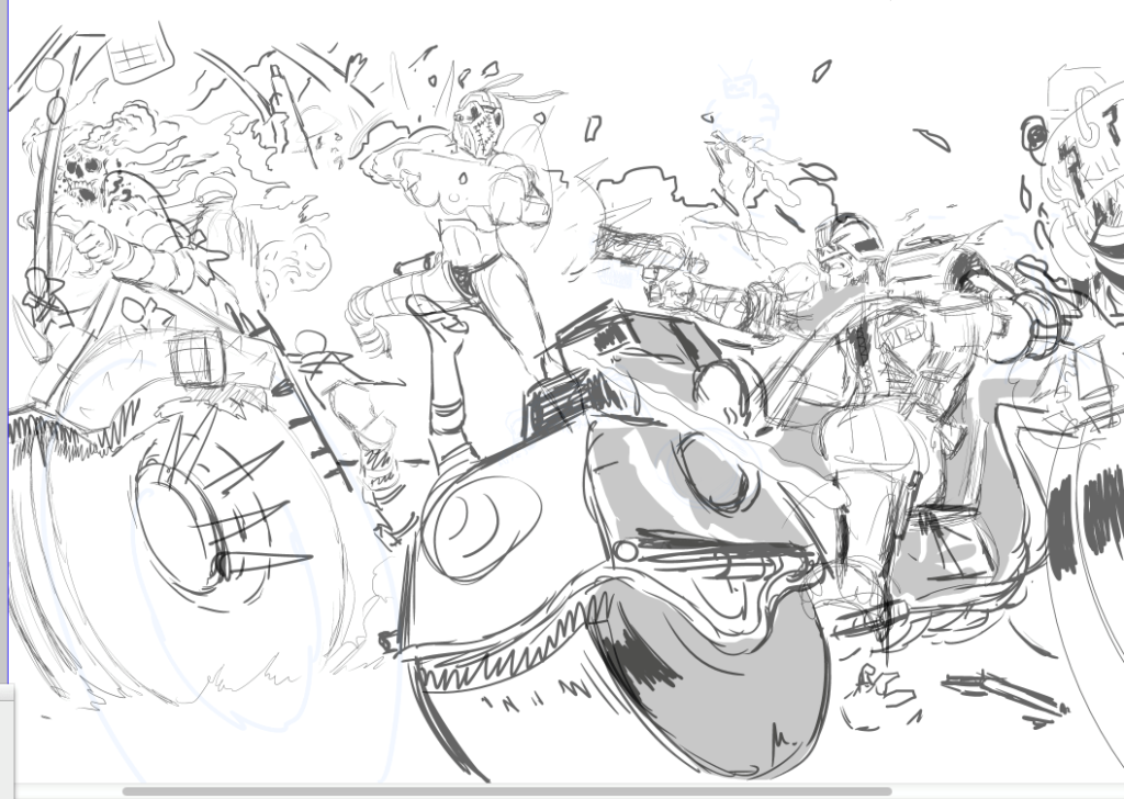
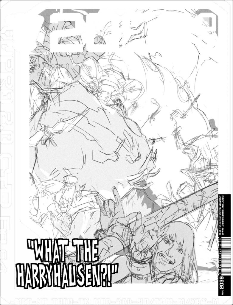
SK Moore’s doodle sketch that went off to Tharg for approval
.
Stage 1 – Don’t push it, dwell on it.
I decided to let my subconscious do this one. I knew I wanted something spectacular, I’d been dwelling on the idea of something ‘rampant’ for months, just letting it percolate in my mind, a few minutes every day just letting my mind wander on the subject.
I couldn’t see it though, nothing was jumping out at me, not yet. But any time I turned my thoughts to 2000 AD I would try and imagine a scenario with a variety of big shapes moving across its cover.
The only fixed image was a Judge and very possibly a Lawmaster (followed by a dim sense of dread, no pun intended, but any prominent bike is going to be tough to get right, hence the sense of dread.) The other components fltted into my mind – from robots, to mutants, to giants, to aliens and so on – but none of it slammed into place.
Weeks and weeks…nada. But I didn’t sketch it, didn’t ‘work’ on it. I just mulled on it.
Stage 2 – I like my covers to pay off in different ways
They’ve got to be eye-catching, working from a distance and up close, and when a potential reader picks it up it should offer a one-two punch with a surprise back-cover. In this way my covers act like sequences. My covers are sequences!! …and will continue to be that way, Tharg willing. Making an effective cover means first I ask myself how do I make it stand out on the shelves? How do I grab someone from the other end of the shop? How do I fight the tall grass that is the packed shelves of the newsagents? Next time you are in one of these places look at the shelves and ask yourself how you could make something stand out against so many other titles. This is the graphic-design mind at work.
Stage 3 – One morning I woke up and it was right there in my mind.
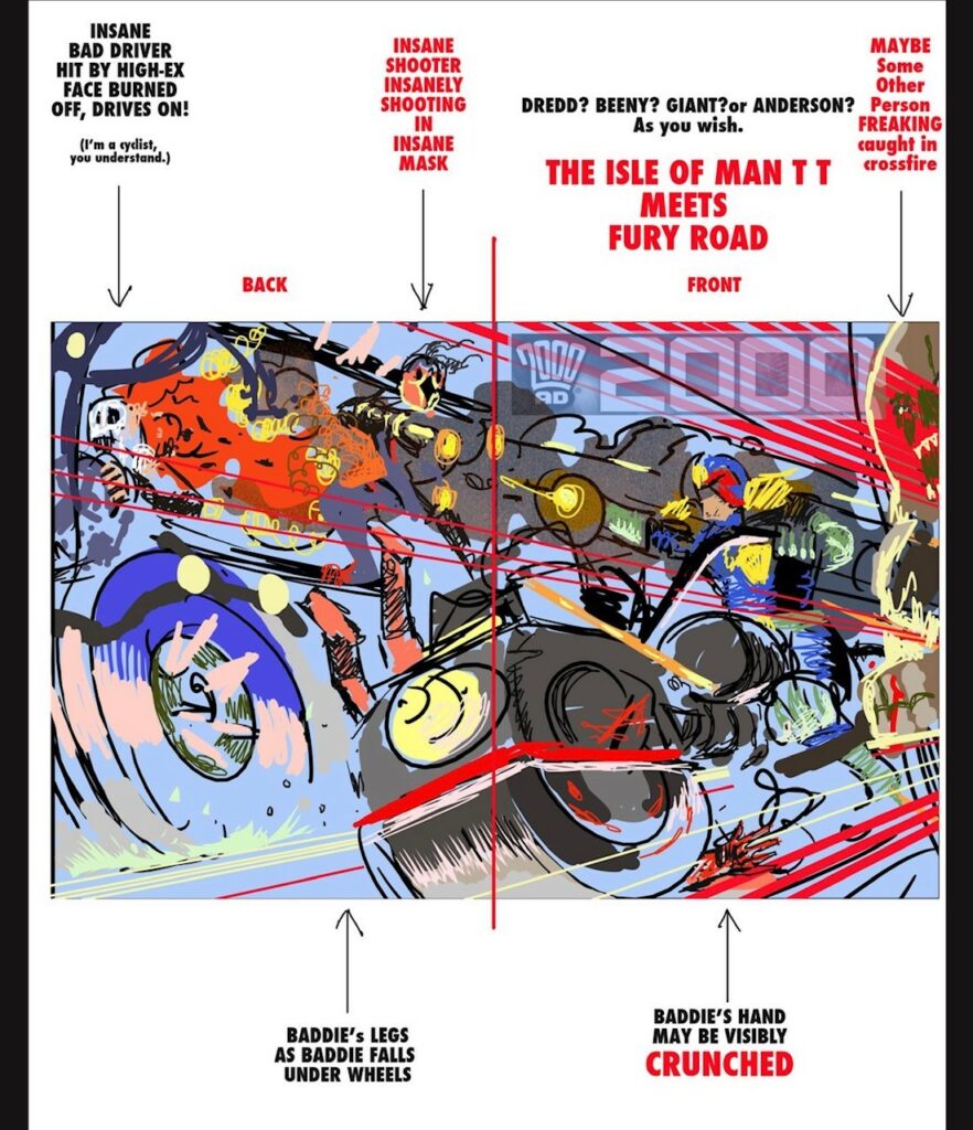
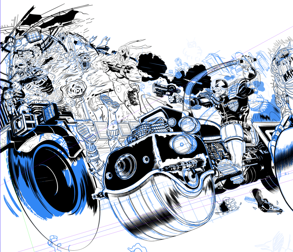
Maybe after a month I woke up with this image springing toward me, coming right at me! WHAMMO. A triangle, a rainbow, a truck full of bastards, it’s Jean val Jean watching the pre-dawn criminal convoy, only it’s coming at us at 500 miles an hour. Above all it’s an incendiary bullet, fired on the cover and exploding on the back (the one-two punch!)
I have a good feeling about the concept – seems very Dredd, it’s ‘hell on wheels’, where Dredd represents order and the burning truck absolute and total chaos….high-explosive bullets are not the wisest way to deal with traffic violations, so it’s a bit satirical, I guess.
.
Stage 4 – Finally – a sketch!
I did the sketch in 42 nanobause (Scottish unit of time). This is why artists are misunderstood. Anyone seeing a sketch or a finished piece (and especially if it’s swiftly created) can dismiss artists as having it easy. But, as I’ve just explained, it took months to just see it. But you know that because you are an artist too. No, you are! Get over that!! YOU ARE!
So I got sketching in blue pencil, refined the sketch and refined again, only using a ‘Guesspective’ at this stage. I went for the classic Lawmaster look… BREAKING NEWS… I think that’s the last I’ll draw that bike. A more modern design is doing the rounds and I’ll be aiming at that from now on. But I did want to do a good example of the classic in action.
Once happy with the general thrust I set up my perspective rulers and started laying in the machines. Things were going surprisingly well, ratios and scales were adding up. Usually with extreme perspectives issues of scale arise, but there was nothing here that wasn’t working. I felt quite lucky with the Lawmaster, it all worked first time. Perspective is a tool that you need to know when to stop using, it can kill a picture, but somehow I had no issues. Pure luck.
.
.
But a problem did emerge. The handlebars of the bike. Did I do them low so as not to intersect with the badge – and in this case we need to see the badge – but then they’d also be lower than they should be on a MK2 Lawmaster. Or the other option was raising the bars so they arch out at the higher end of what we’ve seen of these bikes over the years.
That’s not a problem in itself, high arches are common in drawings of Lawmasters and my low angle of view further justified this. But Dredd’s gun arm was more ‘badass’ when the handlebars didn’t cut across the view and his posture with the lowered arm on the left meant he was extra ‘badass’ because it gave him a slouch. I liked the attitude a lot.
.
But with the attitude of the higher handlebars I had two big challenges – make the gun-arm work and expose the underarm of Dredd on the left. This would mean careful anatomy. I’m a sucker for a challenge and especially with anatomy. Going this route was harder but it did neat things – it deepened the perspective effect and, by crossing the gun arm with the handlebar, it made the scene more convincing. (Another Jim Baikie tip here: Don’t be afraid to obscure things. When anatomy drawing raises arms across faces, move limbs in ways to obscure other body parts – it lends the image realism, dynamism.)
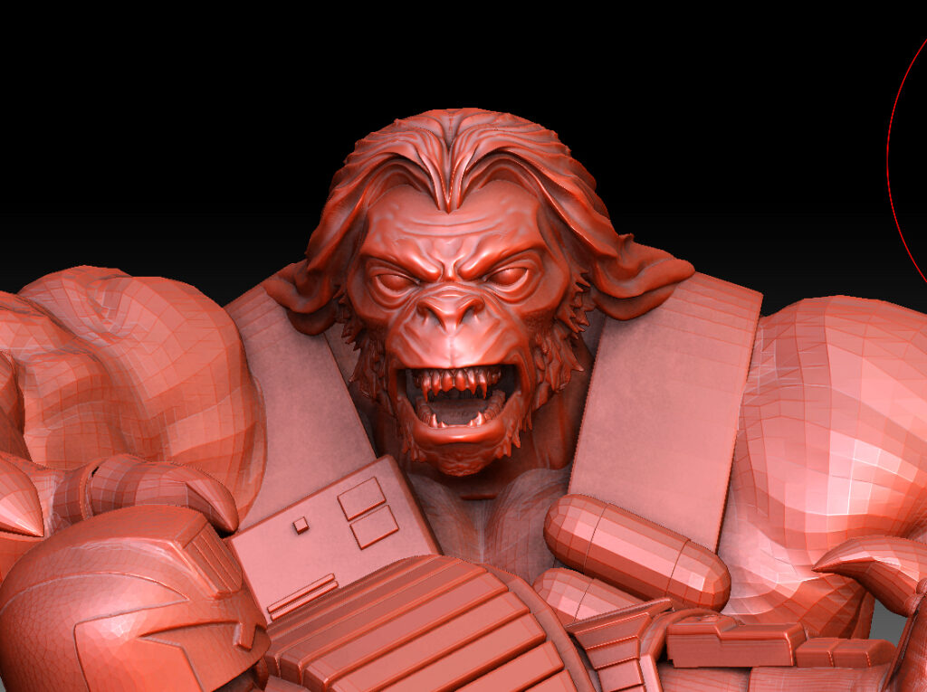
Above all, without gun or bike, the arms raised make Dredd triumphal, like a silver-back gorilla raising its arms in a sign of confidence. No one apes the law!
Stage 5 – The finished idea isn’t a complex idea, not the idea itself.
One thing that is kinda complicated though is knowing that you’re aiming for a cover that’s new and memorable and unique. The idea can be so strong and immediate that you doubt yourself – even I start thinking that the image came to me ‘way too easy’. ‘Someone has done that before!!!’ And I am militantly against that kind of laziness. So, to spare my blushes at this point I trawl the Progs looking for similar to this Dredd on his Lawmaster.
If this were a film this would be the scene in which a bafflingly handsome young man, undamaged by years of booze and hard labour (art) is shown crouched over thousands of Progs as images of spaghetti monsters, pregnant gangsters, apes aping the law, and alien zealots flit across the screen before he sits back, exhausted, to puff to death a Gauloises stub, behind him the Eiffel tower stands firm over his shoulder – that kind of thing!
Stage 6 – Bite the bullet and hit send!
But I haven’t got all the Progs so I have to hope this doodle is fresh…I then bury my head under a cushion and grope for the keyboard and hit ‘SEND’… I send it to TMO as a jpeg. Some you win, some you lose….but this I win, it’s green lit! (his skin that is!).
One caveat is that this has to be off-the-clock, no deadline, because all my weekday workdays are spent drawing PROJECT MK UlTRA: Sex, Drugs, and the CIA Volume 1. Fortunately, that’s ok with The Mighty One, so we’re off… for weekends and the Christmas holiday at least, much of it assembled in 5 days around Christmas 2020. Assembled, not inked, not painted.
Time can screw everything up and I think the open deadline really helped here but, y’know, too much time can easily kill a picture too, but it worked to the picture’s advantage here.
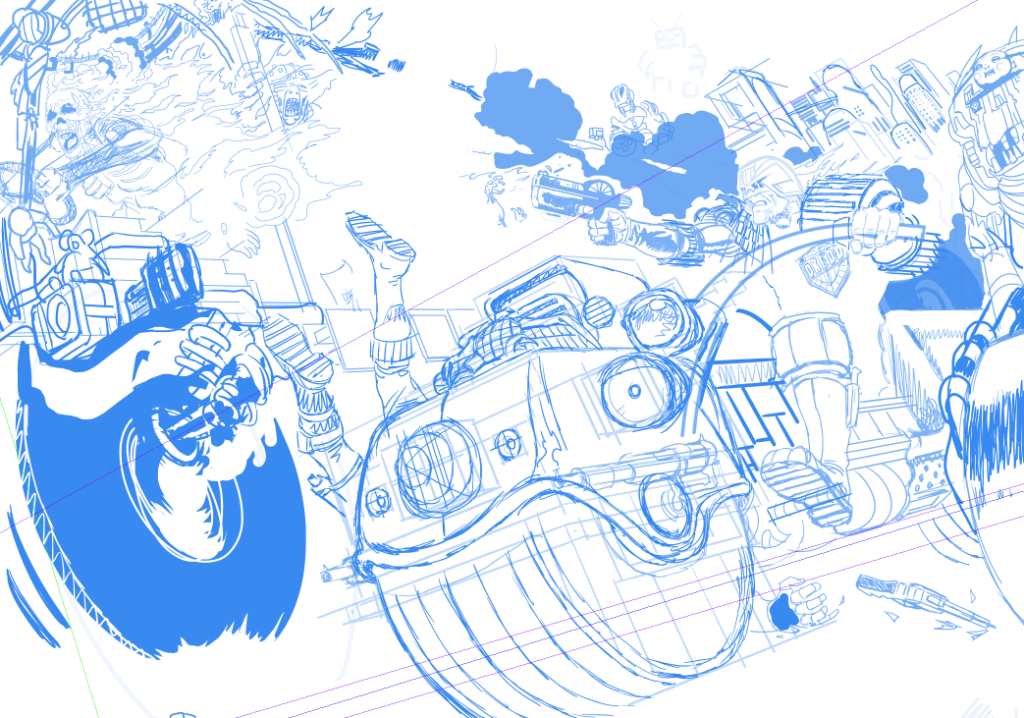
Stage 7 – Now I draw the rest of the f*%#ing cover.
.
Stage 8 – What? You want details?
Okay – just kidding. My digital method is as follows… I blow up the thumbnail and fade it out so I almost can’t see it and draw over it in a new layer with a more refined attention to detail, but still very rough shapes. I do this repeatedly and slowly bring myself close to inking… until I do it finally in ink. I think I see other stuff, more than is actually there, when I fade it out, my imagination engages somehow with the vague lines and I see stuff that I never sketched. I know that’s not a good explanation, just try it, fade right down and refine. You just have to do it to get it. I’m going to repeat for the artists…if you fade that sketch almost to oblivion and begin to work up a new layer, trust me, your imagination will see what is not there yet. Between what is there and what you want to be there stuff will also appear. This is not science, it’s magic – do it, relax and trust your imagination!
Stage 9 – The sketch is energy and information, refining sketches kills the energy….stone dead.
So I have to step very carefully here. The anatomy of Dredd has to be right on, if he looks silly it’s all out the window. And that foreshortening of his leg may kill this image yet. Luckily, somehow, it works ok. But that’s just one of many considerations.
Stage 10 – That damn engine.
The front cover is the priority. I’ve made a conscious decision to do a classic Lawmaster so I look at drawings of it by Carlos Ezquerra, Mick McMahon, Cam Kennedy, Brian Bolland and Ron Smith. But the only place I find a glimpse of a consistent engine design is on a small toy model. So I decide that’s probably cannon…but I don’t know exactly. I then look at real bike engines and use some of those features, I decide to add part of a standard bike radiator (if that’s what it is – I’m an artist not a damn mechanic!)
.
Anyway, somehow the engine and leg and everything else works out ok. Hell knows how I did that. I don’t have a model and had to imagine the whole thing and it had to look functional…and somehow it worked.
Stage 11 – My son shows me a car by George Barris…
…and I become obsessed with putting my wife in that little green car on the highway at the very edge of the picture on the mega-highway. I then decide that’s a stupid idea, because it is. Then I decide it isn’t…and, later that it is… isn’t, is, isn’t, is…
It’s a George Barris car. He designed it and the Munsters cars and the TV Batmobile and many more. His designs would not look out of place in MC-1. So, for my own amusement I put that in there… but, you’ know, it amused the kids.
.
Stage 12 – Fires – the world is horrible.
I look at images of fires and I see some things on the internet that I regret, people on fire, truly horrible. The world is horrible. I remember a journalist telling me, while embedded in Iraq, that he watched people melt in the cab of a truck and I wonder if this memory of this awkward conversation (at a buffet table, no kidding, bon appetite) has been at the back of my mind all along. People are horrible too. Truly horrible.
.
Stage 13 – I draw and I draw and I draw.
I try and remember that fire moves like water as I draw the flames. I decide to make faded airbrushed flames and flat colour flames to mix it up.
I draw a strong female body-builder shooting at Dredd. I had one crazy character with the beginnings of a vicious chastity belt, an idea I obviously abandoned.
Somebody on a 2000 AD podcast or thread mentioned ‘The Green Children’ as I was drawing one of the dolls. So, that’s why that T-shirt ended up there.
.
Stage 14 – When the energy slips away… widen.
I draw and I draw and I draw. I fade out, add a new layer and re-draw. But in most cases things just fall in to place. Somehow.
I realise that the energy is slipping away from the finished image and this prompts me to widen the canvas and widen the scene. This is tricky because it shifts the composition of the front cover, the bodybuilder now drifts to the back cover. I can live with that. I open up a whole new field and find I have room for Mega-City One, other drivers, and that Barris car on the highway (dumb idea, no it isn’t, yes it is!)
Suffice to say I clearly didn’t know how to widen my drawing page in Manga Studio when I drew this. I really don’t know much about the software. I’m not alone, I think many of us just learn enough to get on with it. But I ran into the page edges and so, I rotated the whole image to extend the field of play. I kept extending the image, that is I would open up areas and then have to match up the inks so that it looked like it was always that way. I would scale up my page template accordingly, I know, I know – masochist.
I’d export inks from Manga Studio (Clip Studio Paint…or whatever they are calling it this week) into Photoshop where I would stick them together in a definitive page layout. Then (and I know this is nuts) I’d take screen shots and import those to Manga Studio where I would draw in new inky bits where I found openings.
You might note the many layers of perspective rulers. Let me explain that. The ‘back’ button (or whatever it’s called, who cares!) is sadistically close to a button that makes the bloody rulers jump to a different position. So it’s very easy to hit that button and not know you’ve moved the rulers until you are well into a new part of the drawing. This may be digital, but you really are drawing and it can take ages before you realise the lines are off… grrrr.
So, as a precaution, If I’m happy with a ruler I make 2 copies. This way when one I’m using jumps (and it will!) I can dump it and revert to the saved one and not bother trying to match vanishing points up again…..god that aggravates me. Yes, I’m looking at you CLIP STUDIO PAINT.
Stage 15 – A million tweaks later…
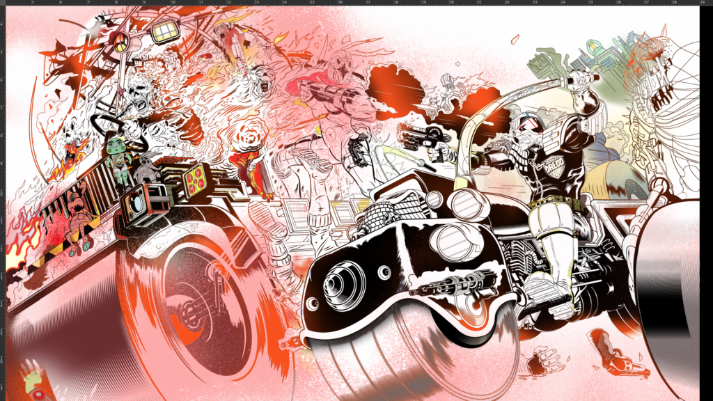
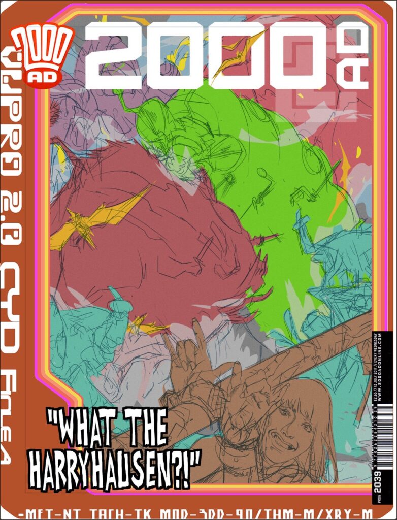
I also realise I can enhance the punch by bringing in more ‘BRAIN BIKE’. That’s something I’m a bit obsessed with — brains in jars! Only this jar is all motorbike!! Has anyone done a brain bike? Well I just did!!
I then I cut out and enlarge ‘brain bike’ and paint him again on a new Photoshop layer with the print instruction that he goes over the ‘AD’ in ‘2000 AD’… fingers crossed! I use composition (the triangles!) and I employ some ‘aerial perspective’ (over distance colours fade to blue/ grey) and I use ‘accelerated perspective’ (used in stage design to cheat shapes to enhance the illusion of depth of field).
.
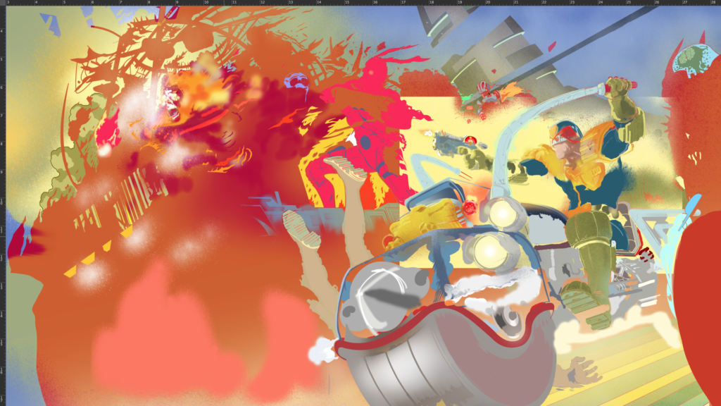
Stage 16 – Colours and the miracle of Photoshop
I’ve said it before but the miracle of Photoshop is how the tools work so well that I can transfer knowledge learned over many years on canvas and Bristol board to digital. It stuns me, quite frankly.
Anyway, colouring is done under the ink layer and it is done on many layers. I tint in the major colour areas. I look over the Progs of yesteryear for Dredd and Lawmaster colours and approximate them.
Expanding the view or reducing the image on the cover so as to add city and road glimpses has proved a good move especially because the black shadowed city blocks now push the burning truck at us enhancing the colours.
.
Stage 17 – Leave it, leave it, leave it.
I leave the file on my HD for about 3 weeks before opening it to see if fresh eyes find problems. Not really. I do this again for another week or so. Nope. There are things I could pick at but nothing I need to change. In most cases there is no time for this but there’s only so much you can work out consciously and having no time limit is a luxury but it allows things to work themselves out.
And that is that – DONE!
The finished image seemed to go down very well, but you must primarily aim to meet or surpass your own expectations first and, if it works for you and the editor, you can only hope some readers will dig it.
Oh, a final note for whipper-snapper artists…
All the figure drawing, all of it, is based on years of learning how to draw figures at any angle, many artists use digital models and photographs and these tools can really help you. I’ve made my own models using the free Sculptris app, very helpful, I’ve used photo references. Anything goes if it helps you get the picture right.
With Defoe I made digital sculptures of the characters faces. I rarely do that now, and I never use digital figure models, I’m not against it, I’ve just never seen any that worked well. As a youngster I started buying a comics ‘how to’ series and it was a demo on drawing shadows and figures in perspective that really opened my eyes to the power of perspective. So, if you want to be a versatile artist, study it.
Nothing liberates you like knowing how to draw a human being at any angle. That will free you up forever, it sounds like a chore and it takes time but it will free you to draw anything and everything possible. Drawing the human form is the language you need to speak fluently. I am also a painter, probably best known for my oil painting work but can use any media. Learn these things and you’ll be free as a bird and you can transfer to any medium.
My digital process is fairly simple. I might doodle on paper, but I do a digital sketch in photoshop that I pitch to 2000AD. I draw and colour with a pen on a wacom tablet. I draw and ink comics using ‘Manga Studio 5’ on an iMac. I sketch in ‘blue pencil’. Once my inking is done I export the pages to Photoshop (again an old version) and I adjust page design, colour and letter (If I letter) with that app.
MS5 is probably the easier app for editing and smoother for a number of reasons but, as far as I’m concerned, you can use the best of gear and turn out pure rubbish. Concentrate on visual quality and you can use any tool – or none. It doesn’t matter what toys you have – it comes down to doing, commitment and study.
Know what you want, go for it, but be aware of what’s happening in the industry, what’s cool and what’s old hat…as best you can. Be open-minded. Look to the very best and strive to be better than you think you can be – because you can improve and you will. You will improve if you work hard or if you work easy, doesn’t matter, just as long as you prioritise drawing you will get better. At some point, it might start getting easy and that’s maybe when you have to make it harder again, look for new improvements. You know better than anyone what’s wrong in your work so zero in on those weaknesses. Focus on them. Be strict.
If you are an artist I hope this helped. And you are! No, YOU ARE.
See – Told you this was a good one! I think you’ve got agree that that was a bit of a special for Covers Uncovered! It may have been late, but damn, that’s a call to arms for artists and a little glimpse into the mind of an artist at work!
Thanks, as always to Stewart for going above and beyond there to (finally) get it over to us! It was well worth the wait!
Every week, 2000 AD brings you the galaxy’s greatest artwork and 2000 AD Covers Uncovered takes you behind-the-scenes with the headline artists responsible for our top cover art – join bloggers Richard Bruton and Pete Wells as they uncover the greatest covers from 2000 AD!
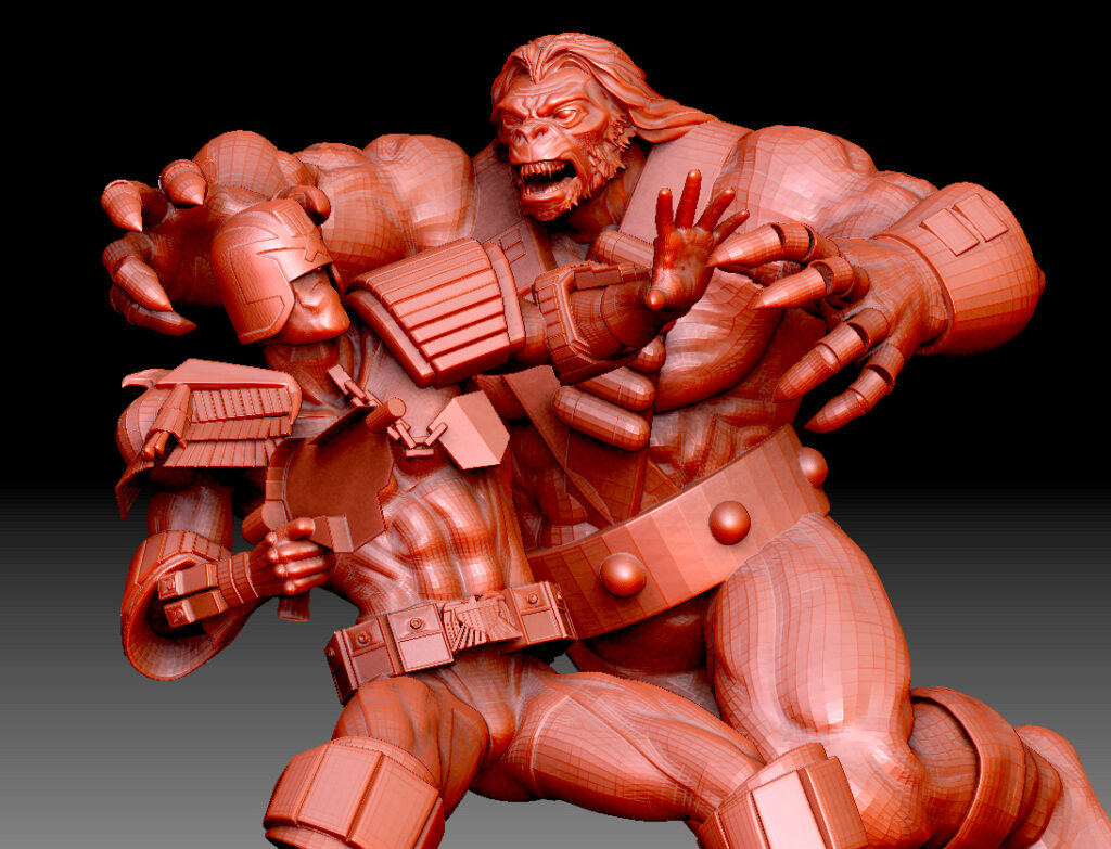
This week we have the thrill-powered delights of 2000 AD Prog 2255, where we have the pulse-pounding finale to the latest Judge Dredd serial, The Hard Way, with Dredd and Maitland under attack from all sides from the team of assassins sent their way by La Reine Rouge, including the Hag… captured perfectly on the Prog cover by that master of 2000 AD covers, Alex Ronald!
.
ALEX RONALD: Matt had suggested a scene with Trapper Hag charging at Dredd and supplied a few refs from the strip.
For the initial 3D part of the job I already had a Dredd model which I reposed, but Trapper Hag was a new custom build in Z Brush and I used various refs to get the right look.
It’s Hag Attack For Dredd – Alex Ronald’s 3D Custom Build!
Up Close & Personal – Dredd’s Dates Never Seem To Go Well.
.
Once I had a pose I liked I roughed over it in Photoshop with a basic colour scheme.
Yep – That’s What Alex Calls A Rough!
.
On approval of this pose by Matt it was onto embellishing the rough to a final level.
Great to be working on Dredd again, doubly so when it’s a classic villain.
.
Thank you so much to Alex Ronald for taking the time to send that art through to us – and to you! You can find his cover adorning the front of 2000 AD Prog 2255 – in comic shops, newsagents, and from the 2000 AD web shop from 27 October!
Every week, 2000 AD brings you the galaxy’s greatest artwork and 2000 AD Covers Uncovered takes you behind-the-scenes with the headline artists responsible for our top cover art – join bloggers Richard Bruton and Pete Wells as they uncover the greatest covers from 2000 AD!
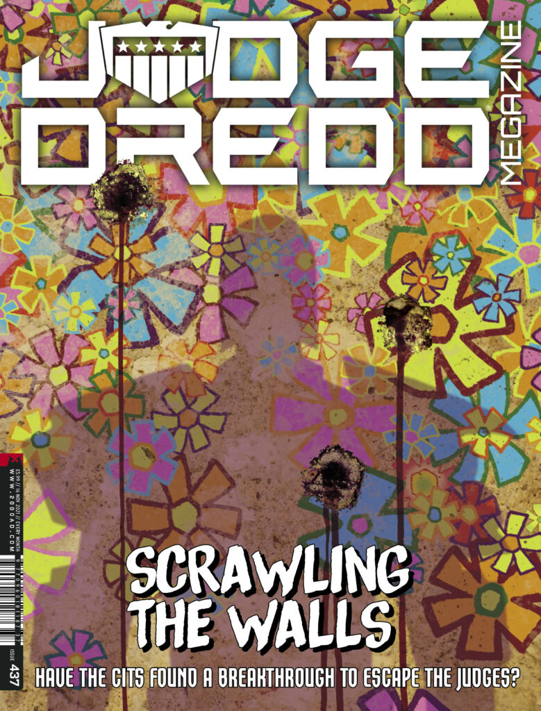
The latest Judge Dredd Megazine has plenty of thrillpower blasting out of its pages, with the penultimate installments of Devlin Waugh, The Returners and Angelic, and a done-in-one Tale From the Black Museum. But opening the Megazine, you get a very special complete Judge Dredd thriller from Ken Niemand and Colin MacNeil.
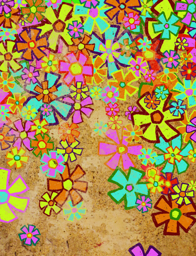
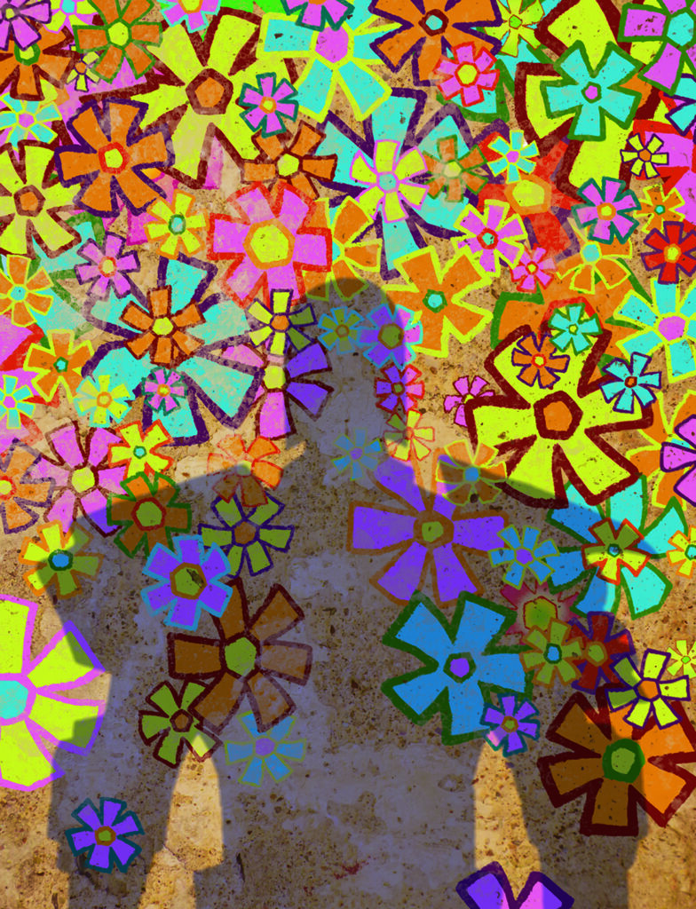
And it’s all to be found underneath a stunning, if rather different, cover from Colin MacNeil to begin the tale of A Dream of a Thousand Flowers.
.
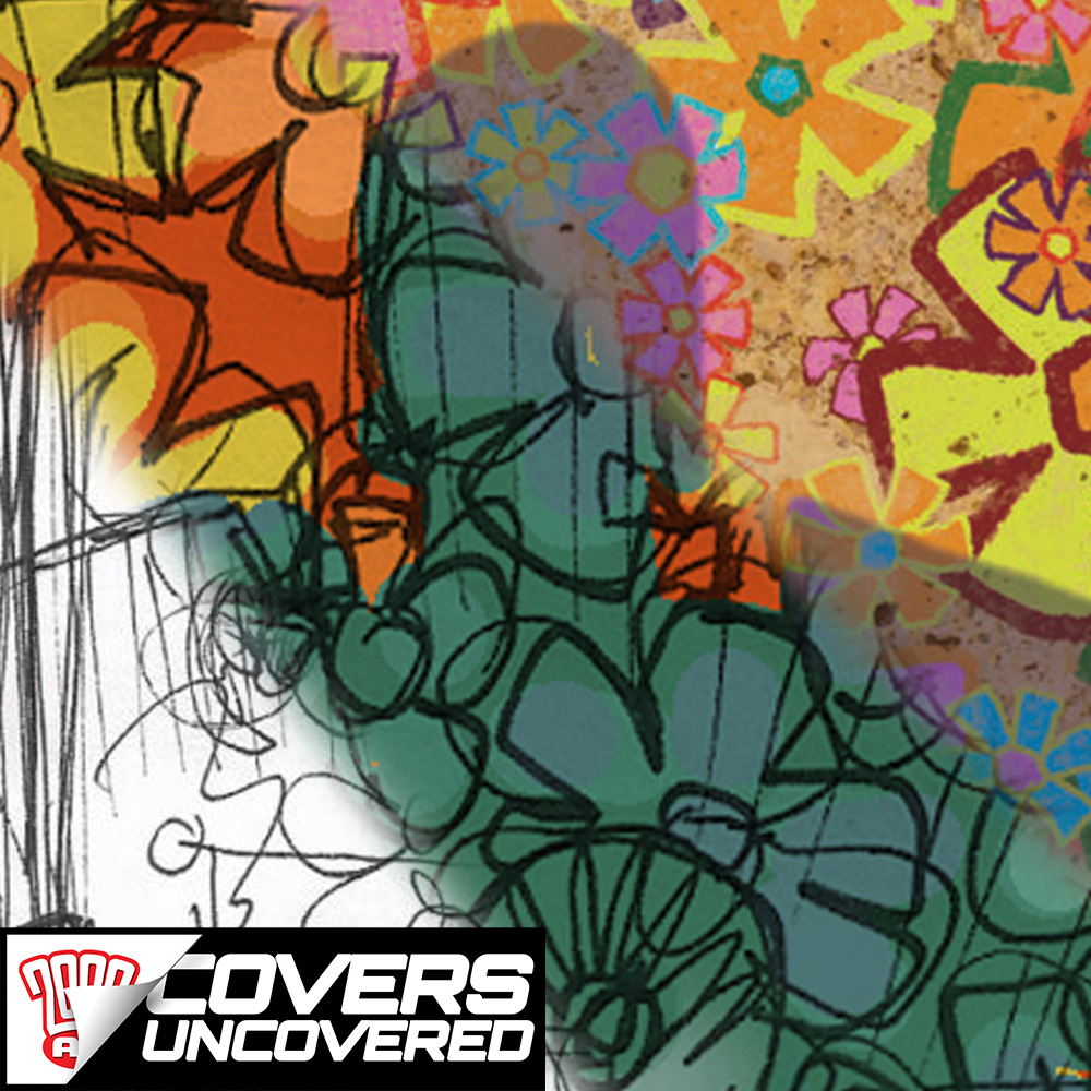
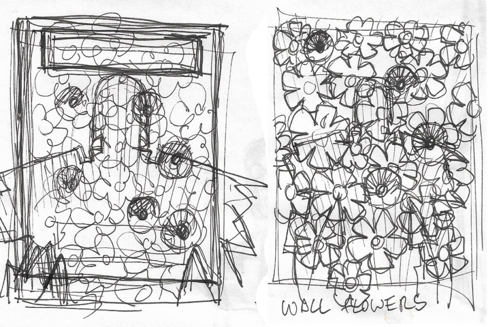
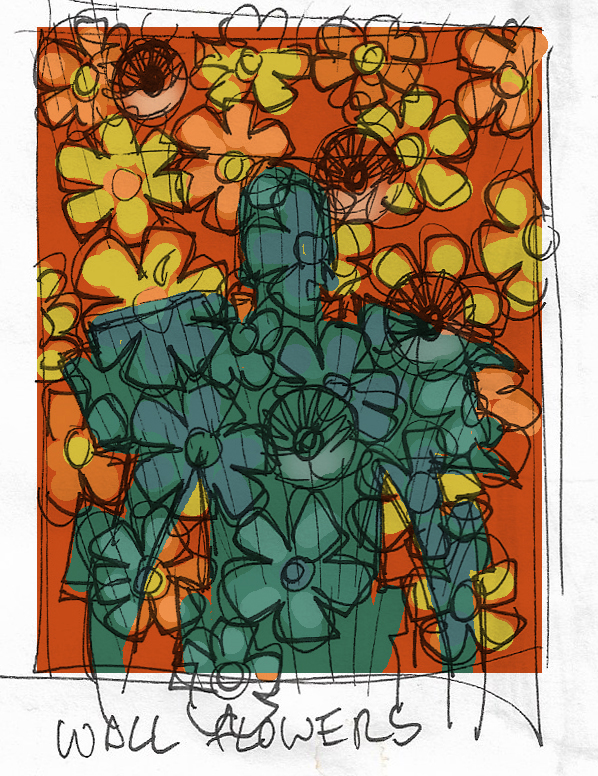
COLIN MACNEIL: I was asked to do a cover for the Megazine based on the strip Dream of a Thousand Flowers, drawn by me and written by Kenneth Niemand.
The idea I had was of Dredd’s shadow falling across a wall that had flowers painted over it, just like in the strip. A nice big, bold, but odd image. Perfect for a cover.
.
Once I had a sketch approved by the editor I took the decision to paint it, or at least try. It had been a number of years since I last used a paintbrush. It was taking forever, so I decided to switch to digital!
.
The first task was finding a texture for the wall. I eventually found a nice texture on the wall of an old building near where I live.
Rather than drawing every individual flower, I drew several different types then just copy and pasted them across the image till it looked appropriate.
.
The bullet holes were natural dents in the wall, which I had photographed, that I manipulated digitally to look like bullet holes. The blood trails were from scans of ink trails on a bit of paper. Again, a bit of digital jiggery-pokery and they became blood. Dredd’s shadow came from a photo of the painting I started.
.
After that, it was a case of playing with levels and filters till it became the final result.
… And that’s how the cover was done!
.
And what a beautiful cover it is. Just like Colin says, sometimes it’s the covers that are wonderfully big, bold AND odd that are the very best. And this one is right up there with the best covers of the year!
Thanks to Colin for sending all that work along and telling us all about it. You can find that gorgeous cover on the shelves of all good comic shops and newsagents, as well as the 2000 AD web shop.
Every week, 2000 AD brings you the galaxy’s greatest artwork and 2000 AD Covers Uncovered takes you behind-the-scenes with the headline artists responsible for our top cover art – join bloggers Richard Bruton and Pete Wells as they uncover the greatest covers from 2000 AD!
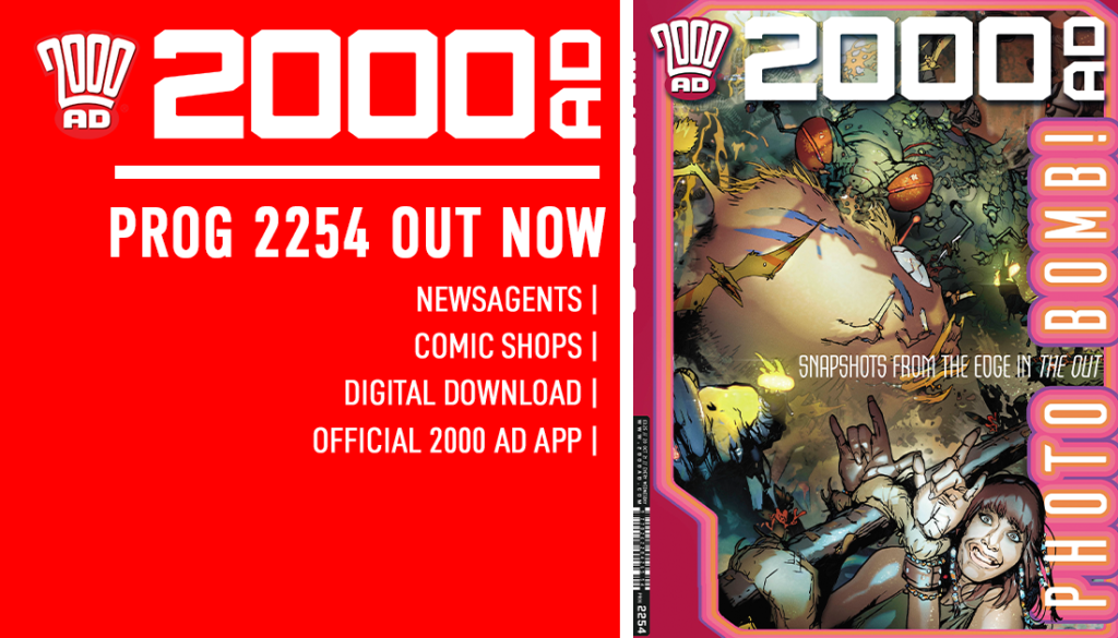
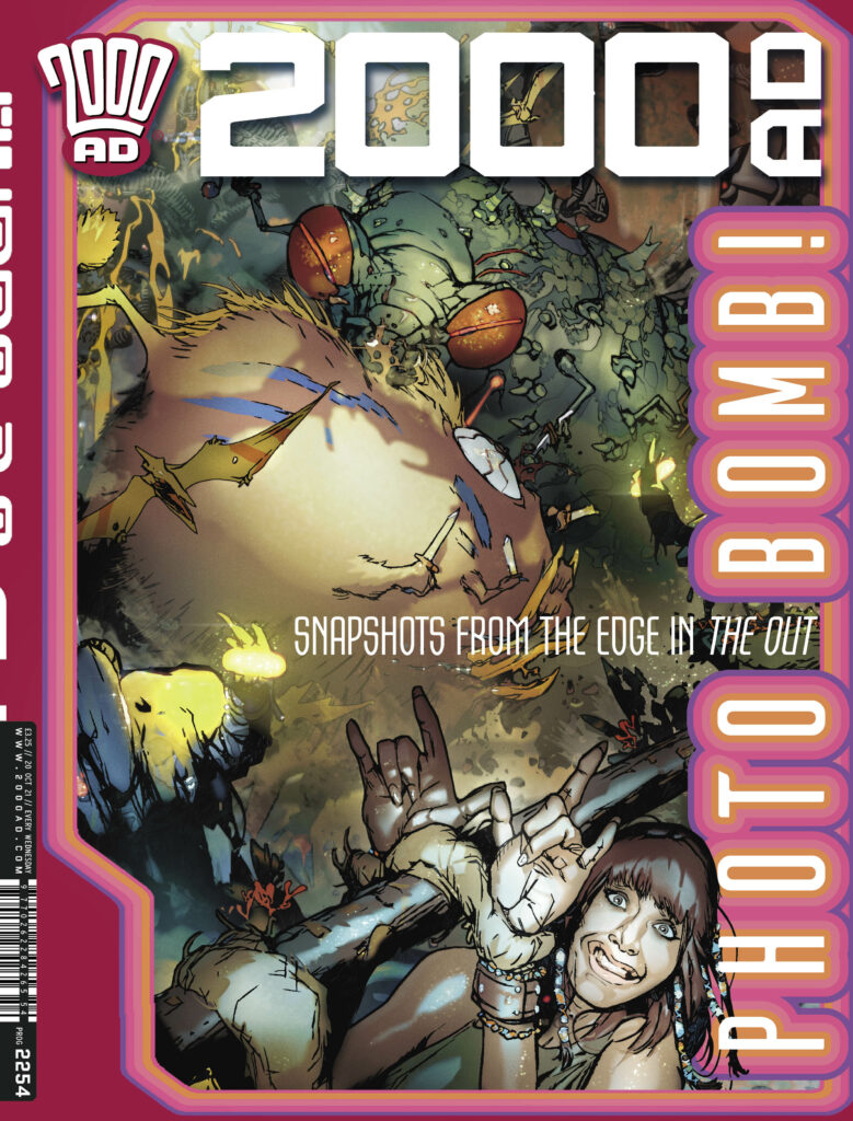
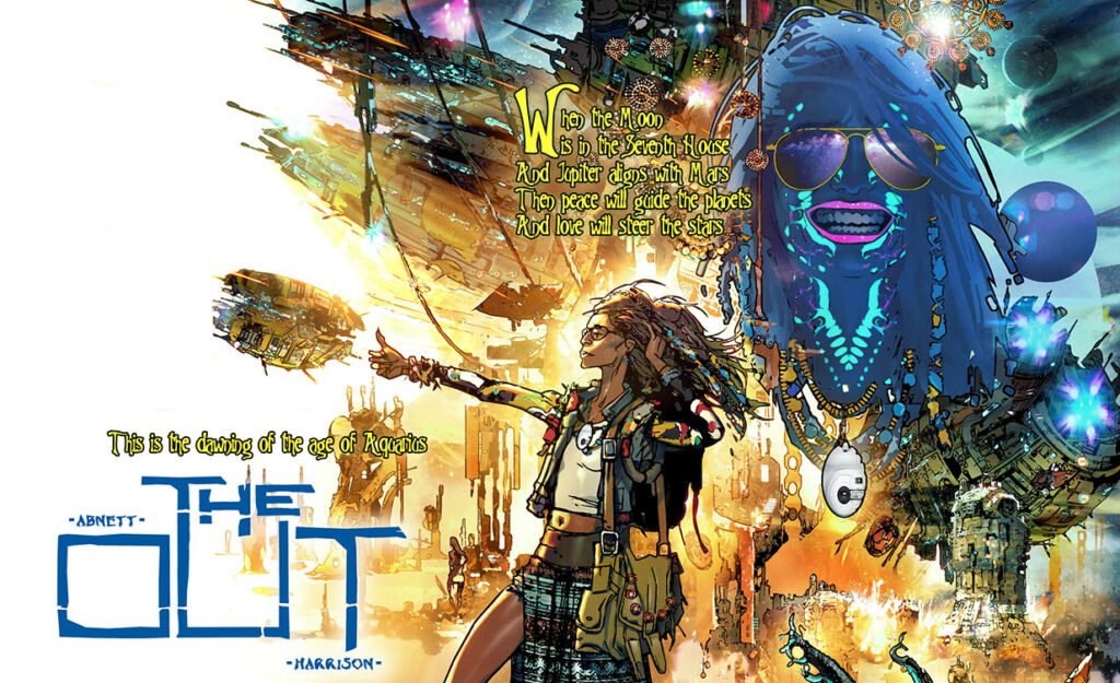
This week, it’s the return of The OUT to the cover of 2000 AD Prog 2254! And with it, that means the return of Mark Harrison to Covers Uncovered, less than a month after he graced us with his entertaining explanations to putting the latest cover together.
The OUT Book Two is flying high in the pages of 2000 AD right now – don’t miss one of the most acclaimed series of recent years! And whatever you do, don’t miss out on Mark Harrison telling us just how the cover to Prog 2254 was put together!
.
MARK HARRISON: Hi again all! I took time out from the drawing board to discuss the cover – it’s a nice reminiscence and meander down memory lane (I wonder if it’s going to be a similar experience for you!).
SPOILER WARNING FROM MARK – DON’T READ IF YOU HAVEN’T READ THE STORY!
I grew up in the late 60s and 70s and the Summer school holidays were a time of endless sunshine, scuffed knees smelling of grass, and morning TV for kids before the BBC testcard sent us outside to play. And that 70s morning TV for kids was perhaps completely unacceptable by today’s standards.
This was best typified by 1930s Tarzan films of Johnny Weissmuller that ran in the early mornings during the holidays and filled impressionable minds with monochrome horrors – all those deaths at the hands of wildlife, cannibals, or even the jungle itself, even at a distance and off-camera still terrified at a young age.
You could experience the foolhardy eaten alive (piranha, crocodiles, lions, etc), drowned, burnt alive, or torn to pieces (ritualistic tribal contraptions). If there was a bridge over a pool of lava or a seemingly bottomless crevasse you just knew some less than sure-footed fellow would be providing us with a Wilhelm scream at some point as he fell flailing to his death.
And all before 10am in our living rooms.We as a generation turned out mostly fine. Mostly. Our planetary husbandry might leave a bit to be desired.
Part and parcel of these serialised films was the perilous quest or trek. This was a lethal undertaking, across quicksand swamps, along treacherous ravine ledges, or hacking through jungles where giant spiders or man-eating plants lurked to trap the unwary.
Invariably there would be the loss of many an expendable character, typically the wide-eyed panicking native bearers of some private army expedition (the red shirts; the NPC of Tarzan films).
And this tradition of showing what dangers the heroes had faced and had just escaped by virtue of their being higher up the cast list extended to science fiction and fantasy films where you could expect to see a montage Trek of Terror where our intrepid party wanders in front of a cinema back-projection only for one hapless soul to be plucked off the path by a dinosaur or dueling monster ready to fight over their still warm corpse as their companions scurried to safety.
It would also provide our hero (probably Doug McClure but not exclusively) with my favourite movie hero line:“That could have been me.”
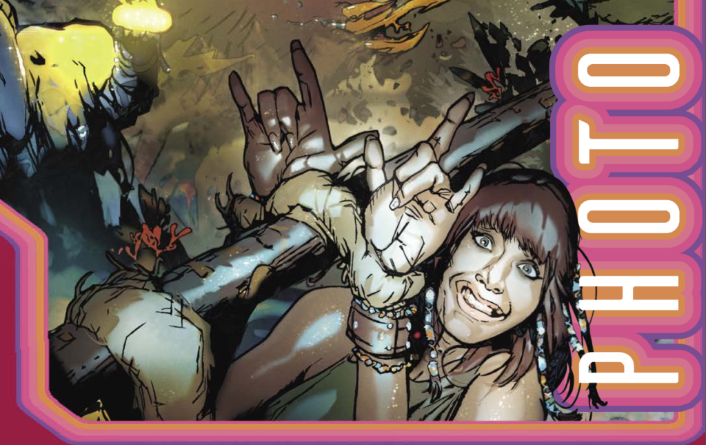
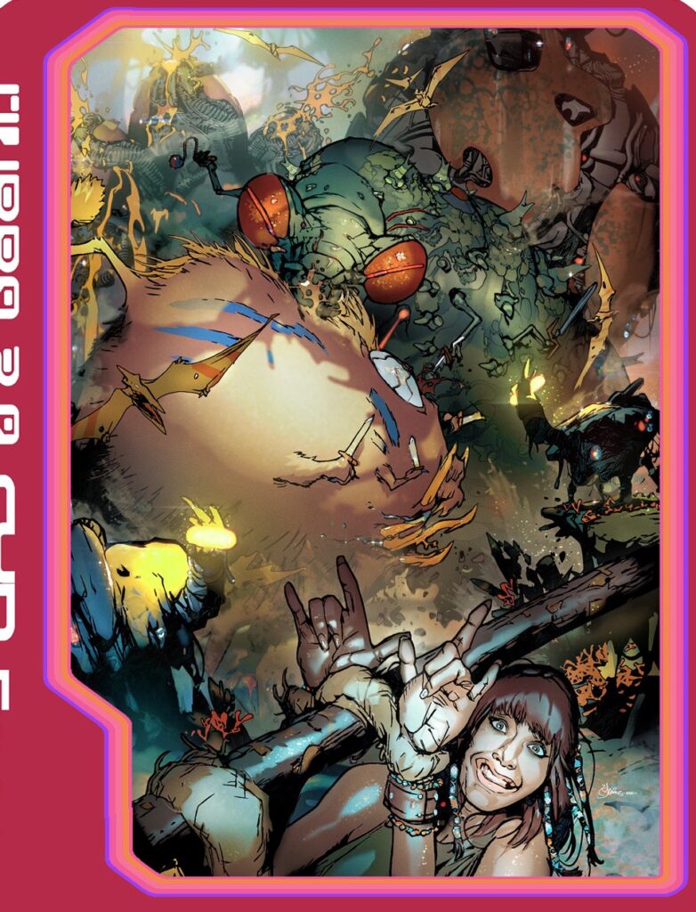
This is the stuff I grew up on, the McClure/ Ray Harryhausen movies that informed my childhood and that was the inspiration and the homage that Dan and I brought to this episode of The OUT, only with a modern twist – because what would anyone connected to social media do these days when faced with a possible life and death scenario? Why take a selfie of course! Which is just what we have Cyd doing here!
Captured by natives, with dueling monsters dwarfing her – Cyd’s response? A selfie of course!
.
The camera disconnect from reality as we become stars and ‘content’ in what might be our imminent demise is something I can see happening. Not desired of course! (for more on this idea see this Reading The Pictures article.) But it’s the 21st Century human need to matter in the Universe. No matter how small and insignificant we might be!
For the cover I knew I wanted the layout to reflect something ‘Pulpy,’ as if illustrating one of those early sci-fi/fantasy stories, with Cyd low in the frame, craning to get into shot being taken by the floating Vuepro camera.
Caught in the flash throwing up ironic ‘love’ hand gestures with a somewhat forced rictus smile as she tries to ignore the danger behind her.
The ultimate ‘Hey- look at me!’ holiday postcard shot you might take and underplay to look cool.
This was a cover I saw in mind right from the planning of book 2 of The OUT, so you could even say it had the unusual effect of dictating the content of the story, not reflecting it or being a scene from it.
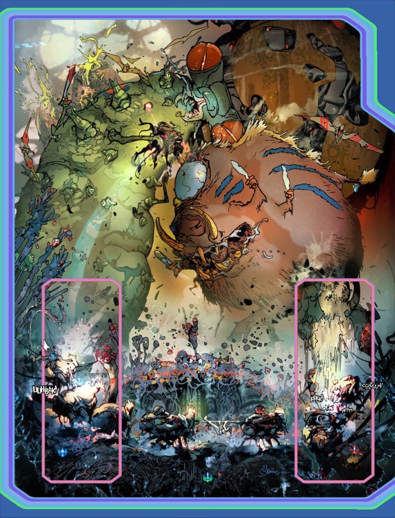
Wanting a travel montage of doom, Dan happily provided one in the story – Although with a blasé Cyd becoming bored with it all. ‘Dueling monsters, hey ho. Next!’
The in-strip moment added in to this week’s episode of the OUT – just so that Mark’s cover could happen!
.
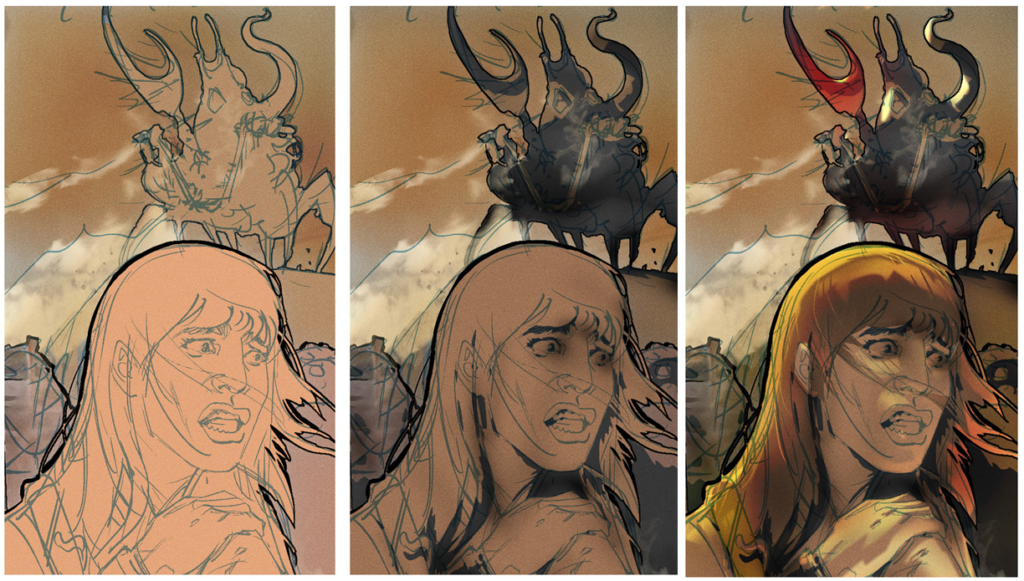
This cover and episode also marked a significant change in how I was rendering my art, in that I would outline or ‘Cut out’ in colour the characters and scenes and assign them to different layers in PhotoShop. A rough idea of smoke and dust too.
This would lead to me ultimately drawing in colour and adding the line art later as a final pass.
Here’s a sneak peak look at a future episode to illustrate my current process (subject to inevitable change!). I’m almost fully rendering the tone and colour and still I haven’t started inking the line art.
Steps 1, 2, and 3 of Mark’s new process – different way of doing it, same damn fine art as a result!
.
Theoretically (The jury is still out on this) this minimises unnecessary line art that might get painted over in a shadow and tonal pass and speeds up my work.
The tone and colours can be contained to the layer’s cutout helping me ‘stay within the lines.’
Pencil layouts for the cover
And then Mark’s new process kicks in over the pencilled lines, adding tones and colours.
.
The tag line: “What the Harryhausen? ” was stolen from Bruce Campbell in the TV Series Ash vs Evil Dead and I didn’t expect 2000 AD to use it; too on the nose.
But they did keep the Vue Pro framing which I’m grateful for as it’s again a throwback to the 2000 AD sci-f graphics of old.
The final cover – Harryhausen would approve!
And then adding in those now-familiar Vue Pro framing making it unmistakeably an OUT cover!
.
In a sense, if The OUT is a love letter to the science fiction Dan and I grew up with as kids (the books, the films, the TV) then this cover also harkens back to those 2000 AD covers of old when hyperbole was ‘Hyper-powered’ (Remember when everything was ‘Hyper’?)
By the way, credit to Susha Matthews for the original monster designs included here that came with wonderfully imaginative backstories. ‘Back off, kid, this is my story…’
(More artistic brilliance from Sasha Matthews – who also contributed to Mark’s cover for Prog 2251)
.
Oh, one more thing that the readers might like…
A possible episode ending (lost due to space constraints) was of Cyd being released by the gangster aliens to return to the surface and contemplating the return journey: “What- go back through all THAT again!?!!”
To which the gangster boss would say: “No, no- you can use the stairs.” Indicating a staircase shortcut to the surface, to make the earlier perilous journeys even more ludicrous and the losses even more comically tragic and unnecessary.
But we already had so much going on in an already packed episode.
Okay then, back to Infinity and beyond! (3 episodes to go and we haven’t even plotted book 3 yet! But hey, what’s new?!)
.
Thank you, as always, to Mark Harrison. I know Covers Uncovered is all about the imagery, but I always love getting something through from Mark, as I know it’s going to be full of wonderful ideas, crazy asides, amazing flights of fancy… and that’s usually just in his first paragraph!
You can find the Harryhausen-tastic cover by Mark on the front of 2000 AD Prog 2254, out on the shelves of all fine newsagents and comic shops, as well as the 2000 AD web shop, from 20 October!
The secrets behind the greatest comic book covers in the galaxy – revealed in a brand new annual!
Every week, 2000 AD Covers Uncovered takes readers of the 2000 AD website behind-the-scenes on the covers of both 2000 AD and the Judge Dredd Megazine. From idea to pencils, from inks to colours, 2000 AD Covers Uncovered reveals the processes behind the jaw-dropping, genre-defining art that graces the covers of the Galaxy’s Greatest Comics!
For the first time, this new annual collects the artwork for every 2000 AD and Megazine cover from a single year in a square-bound bookazine format. Each cover is presented without logos and cover furniture, allowing readers to savour each image in all its glory.
Alongside, step-by-step images such as wireframes, pencils, inks, and inspiration are presented alongside commentary from the artists themselves, providing fascinating detail about the process behind their covers
Written and curated by blogger Richard Bruton, the 2000 AD Covers UncoveredAnnual 2021 is not only an enthralling collection of stellar art but also an indispensable insight into the artistic process.
Every week, 2000 AD brings you the galaxy’s greatest artwork and 2000 AD Covers Uncovered takes you behind-the-scenes with the headline artists responsible for our top cover art – join bloggers Richard Bruton and Pete Wells as they uncover the greatest covers from 2000 AD!
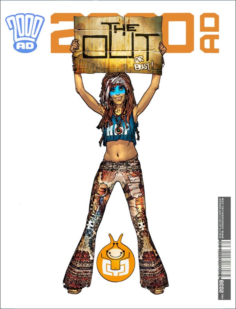
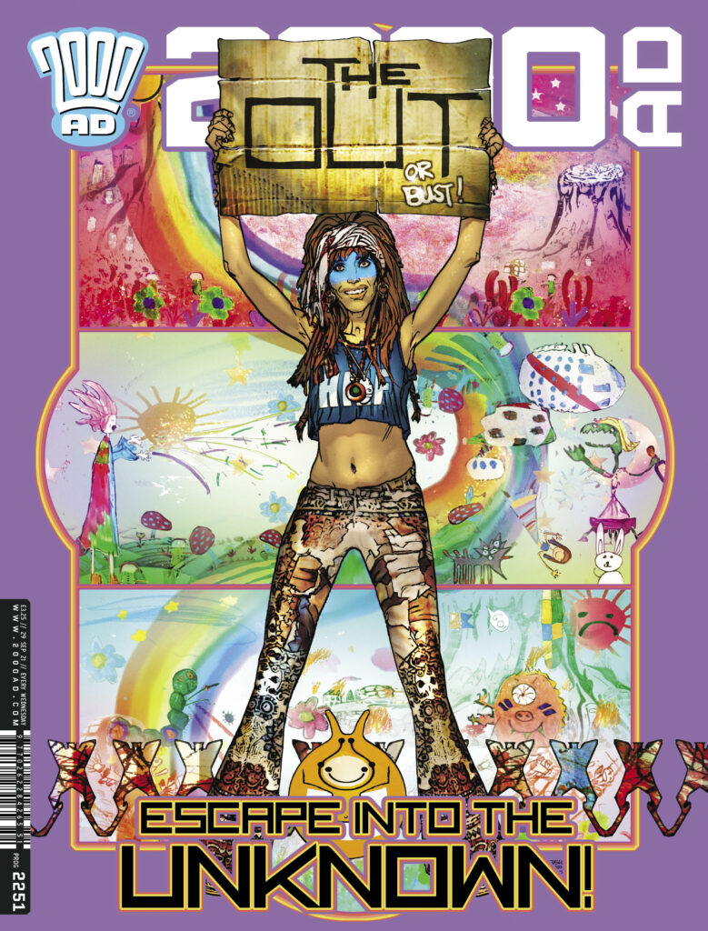
The new 2000 AD, Prog 2251 is out on 29 September and it’s got a doozy of a thrill-powered cover by Mark Harrison, artist on The OUT, the stunning series taking us far, far across space, out to the furthest edge of the universe, and far into the future, where photo-journalist Cyd Finlea has been cataloguing the alien societies she’s been encountering for a long 10 years now. She’s lost track of how far she is from home, but she’s keeping going, just her and her sentient flatspace bag, seeking out other ex-pat humans.
.
Now… over to Mark Harrison – this one’s a great one!
MARK HARRISON: So…. I was expecting this but not so soon!I thought this was seeing light in October- November so it’s a bit of a shock to me it’s being published now. I’d better get my skates on for the last few episodes!
And weirdly this particular cover has relevance to those last episodes. Let me make explain why.
Or NOT as you will see.
I have to be deliberately opaque with this cover and temper my disclosure.
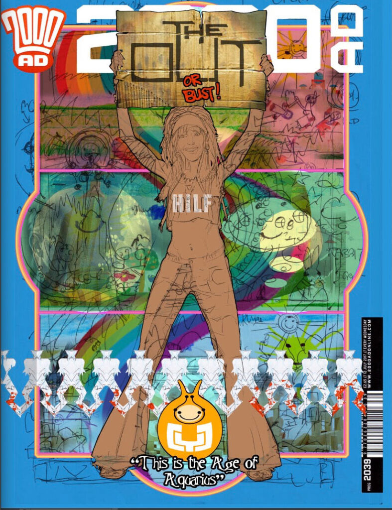
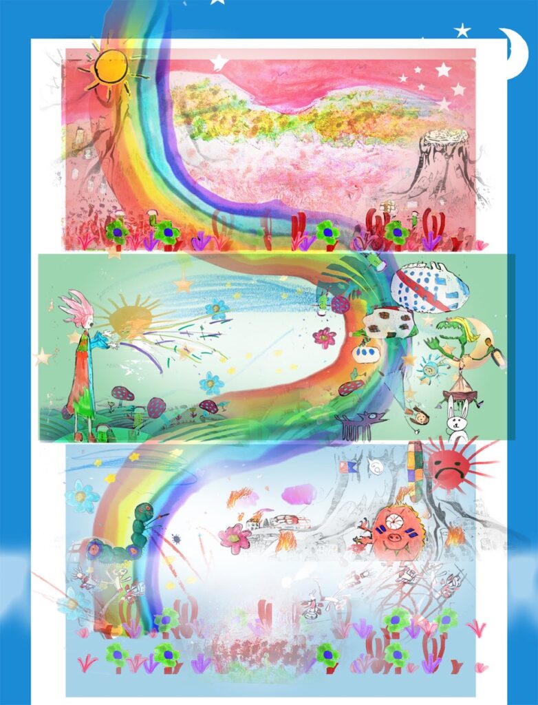
“THE OUT…or Bust!” ( A reference to the “Klondike or bust” Gold rush prospectors seeking fortune in a far off land. Everything or nothing. Risk it all.And for Cyd Finlea this is risking herself to find her long-lost daughter.
The first cover heralding the new book of The OUT turned a simple idea into a very complex one that required long-term careful planning and calculated vagueness that even now, nearly a year after doing it, I have to maintain.
Before I even considered doing a new cover I had contemplated resubmitting the pitch artwork that was used to first generate interest in The OUT.
That would be this one – although, as Mark will tell us, this is just some of that pitch artwork…
(Just some of Mark Harrison’s original pitch art for The OUT.)
.
MARK HARRISON:This was unpaid work done by myself about three years ago in consultation with Dan Abnett as a possible original story after concluding our run on Grey Area.
It was just ideas I had, a wandering space hippie traveling the stars and had elements of a storyline within the art, some of which was a little too revelatory and relevant to the current storyline (so the pitch art included here is cropped).
So, as the pitch art (in full) was too on the nose I went about designing a new original cover.
Originally I was going to have a simple bleached out image of a bored Cyd sitting with Bag by a dusty roadside at an Alien bus stop waiting for a galactic bus, a personal recollection of myself and my brother waiting for a rural bus in the Summer sun that would seemingly take hours to arrive.
And that was the cover. Very stark, so much white. But ultimately I wimped out and didn’t present that version. Plus it was reminiscent in feel to a Grey Area cover I had done of alien immigrants escaping through a border wall.
(Mark’s image of Cyd and her sign, prior to thinking about the background.)
.
MARK HARRISON: I still wanted Cyd holding up a cardboard sign she carried with her as she thumbed a lift to somewhere other than here, but I was stumped for a background.
Then I thought why not show the whole adventure yet to come as a sort of sequence of scenes, three in total, a Triptych? In a sort of traffic light of three colours representing… something.
And within these three panels would be the entire story. The twist was it would be realised by children or represented by the things a child could identify with. Why children? Ahhhh…
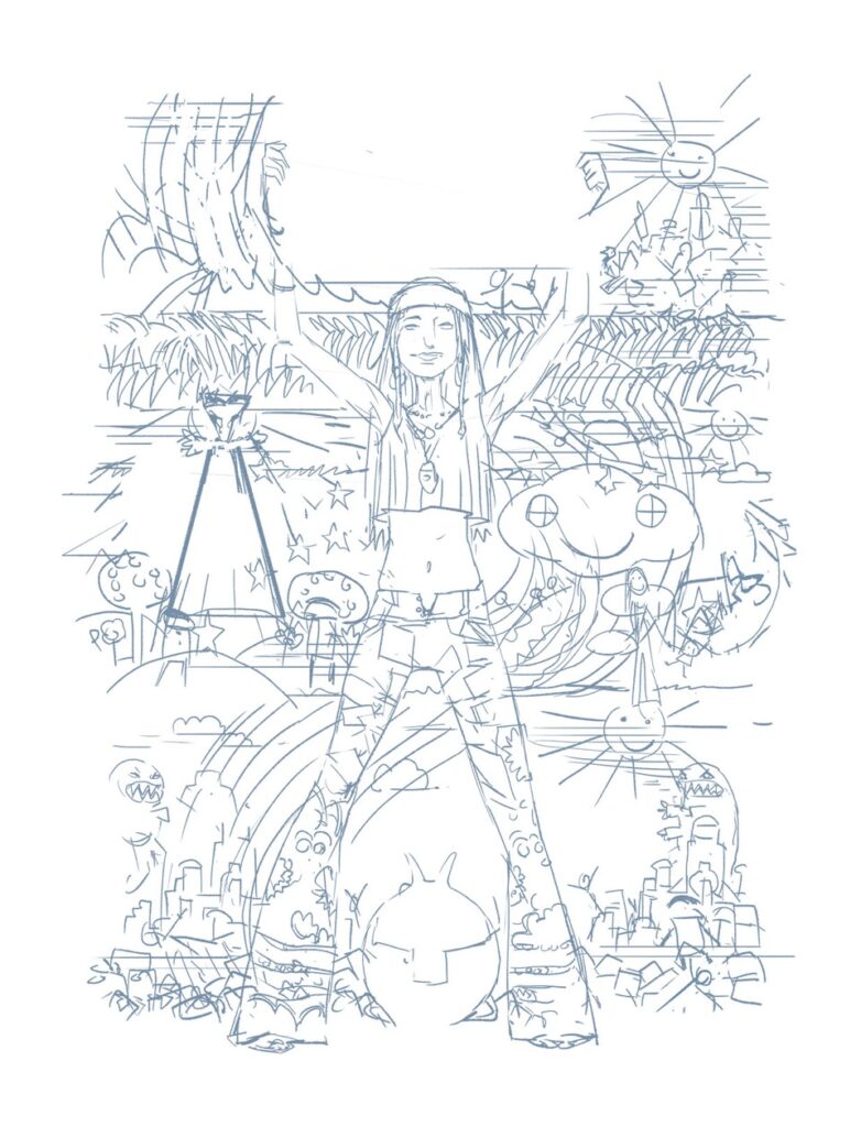
In an early sketch I had ideas for wooden building blocks, dolls, teddy bears, monsters etc. Glow in the dark 5 pointed stars and suns and moons that might make up a hanging mobile above a cot. Stick figures made of pipe cleaners.
And a daisy chain of aliens.
(The original sketch idea for the fleshed-out cover version)
.
MARK HARRISON: There was one slight problem. The story only existed as a synopsis and none of this had been scripted, fully discussed and certainly not designed! Now I was being asked to guess what things might look like or even if they would be relevant months from now.
Kind of putting the cart before the horse but that’s how Dan and I like to roll!
Also, the imagery in the background had to be vague but enough to suggest a scope and diversity. This is also about making the strip/comic attractive and intriguing to the reader/comic buyer.
(Fleshing out the backgrounds for the cover.)
.
MARK HARRISON: After the first initial sketch, I discounted using the playthings of children to represent scenes as it was too specific and would require a lot of work trying to get it to feel right.
(Although the paper daisy chain remained as a graphic overlay, with a design change to make it look less like a chorus line!)
Then I hit on the idea of a single specific child telling the story through their drawings.
Be it in crayon, pen or chalk. Simplistic and yet also poignant.
The book as seen through the imagination and emotions of a child. So there is comedic imagery, safe and happy for fun moments… then more uncontrolled scribbling, to suggest anger, frustration, upset for the darker times.
It was all a little delicate and needing clear, simple ideas and style, unencumbered by a lifetime of influence and the obvious clichés that an artist can subliminally fall back on.
What better artist to turn to than a child! Two, in fact, the daughters of a friend who provided the bulk of background drawings with the briefest of direction from me as to what was required. I wanted their imaginations unfettered...
(The new background to The OUT cover – courtesy of Anya and Susha.)
>
These would be photographed and PhotoShop manipulated to something approximating what I had already sketched out (and not shown the girls).
Sometimes I was challenged by their choices, but then I thought why not? Go there. Figure out how to make it work later!
It was an interesting and exciting approach that came up with ideas and designs my rational adult mind wouldn’t have contemplated. Like the dueling monsters, already formidable with tooth and claw, but still feeling the need to also arm themselves with medieval weapons!
I was tickled by the idea that somewhere there was a place giant monsters could source oversized swords and mace! I loved their inventiveness that was unshackled from the self-conscious constraints of logic and “realism”, something that can hamper us in later life as we second guess our decisions.
Fantasy for the pure sake of it.
After all, this was The OUT. We can do what we like!
Of course, such invaluable artistic assistance should not go uncredited. Thank you, Anya and Susha. You’re stars!
(But not paid ones, remember???)
(That early Harrison original!)
The cover underwent a process of moving things around, adding additional art, keeping it deceptively simple and seemingly random.
Finally, as an aside, the cover also incorporates a special personal touch, namely the earliest existing “drawing” of mine appropriately on the inside cover of a book of fairy tales, fables, and abridged stories (hence it surviving all these years)
I happened across it purely by chance and thought why not include it. From crayon scribble to digital cover… and a whole lifetime in between.
Funnily enough, my favourite colour turned out to be blue. (Still a child at heart!)
.
And that’s it – a strangely and unexpectedly personal cover whose publication has been eagerly awaited by two young girls – despite their critical comments on how I changed their art! (Artists! )
Now THAT was a particularly stunning Covers Uncovered! Thank you so much to Mark Harrison for sending it through to us. You can find his stunning The OUT cover on the front of 2000 AD Prog 2251 – in comic shops, newsagents, and from the 2000 AD web shop from 29 September!
Every week, 2000 AD brings you the galaxy’s greatest artwork and 2000 AD Covers Uncovered takes you behind-the-scenes with the headline artists responsible for our top cover art – join bloggers Richard Bruton and Pete Wells as they uncover the greatest covers from 2000 AD!
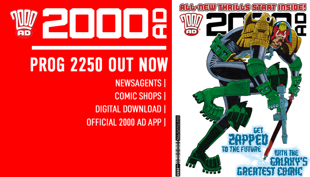
And this week we not only get the thrill-powered jumping-on Prog for you with 2000 AD Prog 2250, featuring 48-pages with FIVE new on-going stories and two great one-offs, but a return of the absolute 2000 AD legend that is Mick McMahon on the cover!
It’s all coming out on 22 September! Just look for the big boots of Dredd on the cover!
We were honoured to chat to Mick McMahon about putting together yet another iconic cover featuring the one and only Judge Dredd, that looks just like this…
.
So, without further ado… Mick McMahon!
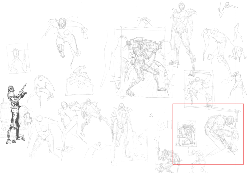
MICK MCMAHON: The brief is Dredd in action, so pretty open-ended. My first move is to draw some Dredds and hope that one of them feels ‘right’. As I sketch on these first sheets I gradually start leaning towards the idea of a big Dredd filling the cover with a white background.
.
And here’s the three Dredd’s that Mick’s highlighted on those initial sketch pages… where you can see the whole thing really coming together, from basic shapes to complete cover idea in miniature…
.
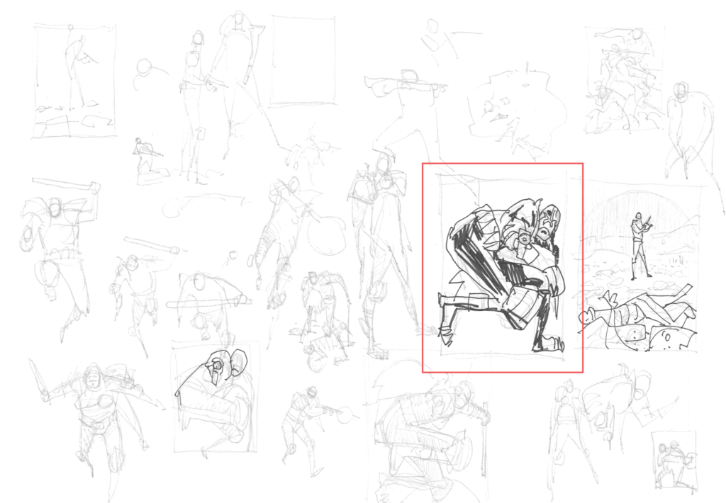
MICK MCMAHON:Just for once I get it ‘right’ more or less first time. I can sometimes spend a week faffing around with this stage.
Oh yes… and when it comes together this way, the McMahon-ness of Dredd just screams out from even the sketch stages – it’s unmistakenly, brilliantly McMahon! All of which gives us this… the rough drawing of the cover…
.
MICK MCMAHON:I scan the sketch into photoshop and make up a dummy of the cover, and mail it to Matt.
.
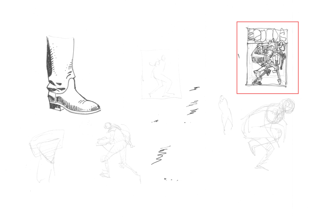
MICK MCMAHON: Matt likes it, so I proceed with the pencils. All the drawings so far have been done on Staples A4 copy paper. The pencils will be drawn on Staples A3 copy paper. I print out the rough drawing in blue and use this as a base for the pencils. I use a Derwent Graphic HB pencil for all my pencil work.
.
MICK MCMAHON: I usually use Daler Rowney Bristol Board for the inks, but this time I decided to experiment with Arches 140lb hot press watercolour paper.
I print out the pencils in blue and ink them with Pilot size 10 lettering pens.
.
MICK MCMAHON:I scan the inks into Photoshop and proceed with the colouring.
.
And that, 2000 AD fans, is how an absolute legend gets the cover done!
Thank you so much to Mick for sharing just how he does it. It’s a stunner of a cover, unique, stylish, striking, something that can only come from an absolute legend of 2000 AD!
You can see Mick’s incredible cover on the front of 2000 AD Prog 2250, available at the 2000 ADweb shop from 22 September.
Every week, 2000 AD brings you the galaxy’s greatest artwork and 2000 AD Covers Uncovered takes you behind-the-scenes with the headline artists responsible for our top cover art – join bloggers Richard Bruton and Pete Wells as they uncover the greatest covers from 2000 AD!
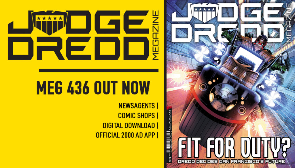
This week, we chat to art droid Paul Williams about his latest cover – Judge Dredd Megazine #436.
Since winning the 2000 AD art search competition at Thought Bubble 2017, this is the fourth time Paul’s art has graced the covers of both the Prog and the Judge Dredd Megazine, as well as providing art for Prog 2072’s Future Shock: Sunday Scientist. and the DeMarco, P.I. 3-parter, An Eye, in Megazine issue 410-413, both scripted by Laura Bailey.
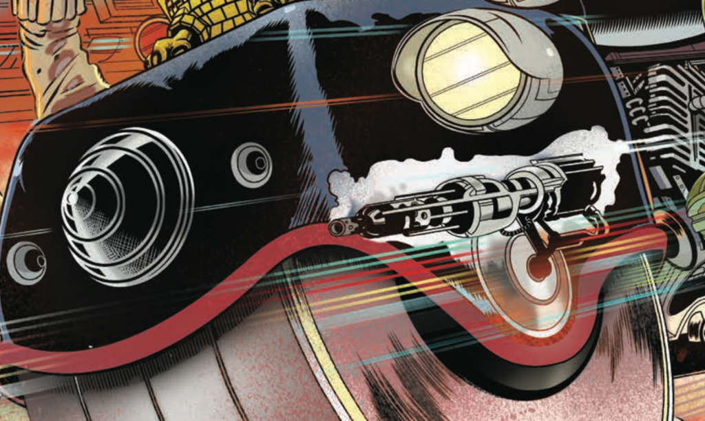
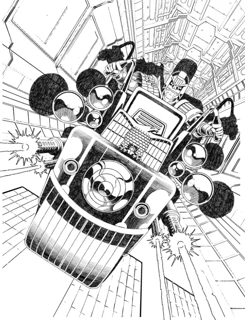
This latest from Paul gives us a twist on the classic image of Dredd astride his Lawmaster, looking just like this…
PAUL WILLIAMS: This cover came about after I’d been kicking the kernel of an idea around my head for several months before Christmas, not quite finding the version of it that was unique enough to retain my interest for quite some time.
There are plenty of ‘Dredd on a Lawmaster’ covers in 2000 AD’s history, most of which were drawn by some of the all-time greats and so I didn’t want to go down that route unless there was something in the design that would make it different or memorable, even as a more generic ‘pin-up’ style image. Eventually, I hit upon the idea of Dredd being framed by his shadow, cast from the Lawmaster’s bike cannons and that piqued my interest enough for it to stick.
My style has naturally evolved towards a focus on heavy contrast in the past year (as evident below in an unsuccessful cover pitch from 2020) and I knew that this concept would give me the perfect opportunity to play with that some more.
Like all artists who have depicted Dredd (albeit only on covers, in my case), you want to put a bit of your own touch on how the equipment and uniform are designed and the above gives a good idea of where I was at with that going into this pitch, even though most of it will be hidden out of view. The shoulder eagle is pretty consistent now with how most artists draw it but all of the other pads have a raised border surrounding the central panels.
For some reason, I’ve always struggled to find a way to draw the more traditional left shoulder pad with the bars over the top in a way that looks good and so one day I decided to try it Kev Walker style from the Judge Dredd story “Fast Food” (see below) and found that worked well.
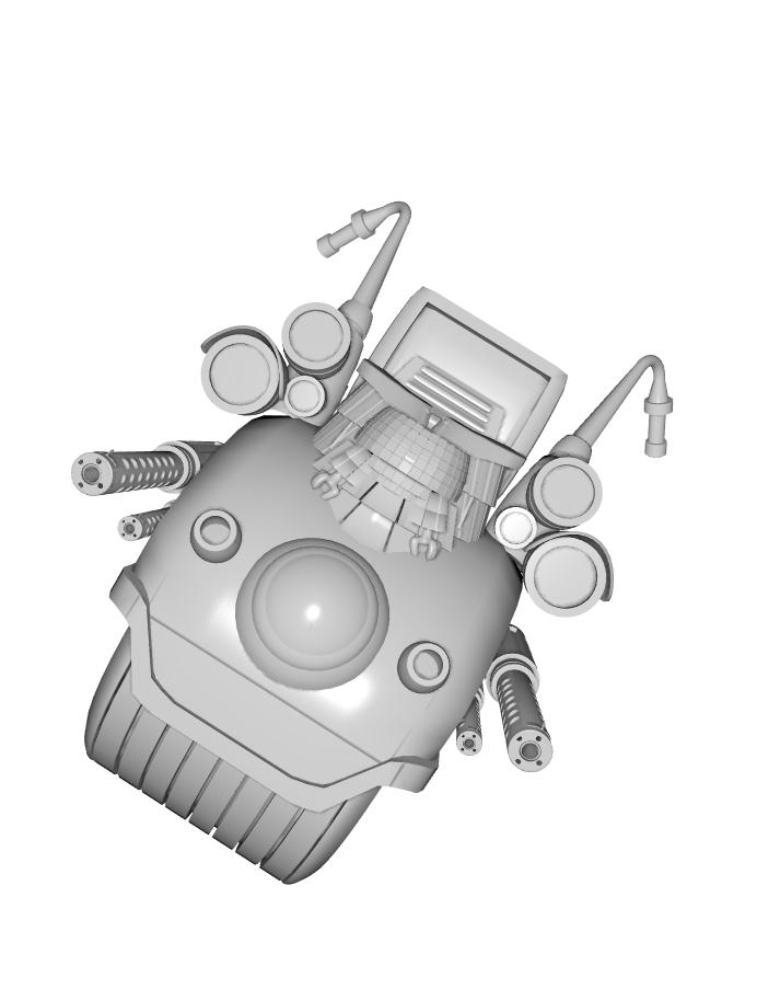
Uniform aside, obviously the more important design when you’re showcasing the Lawmaster is the bike itself. I have my own 3D model that I built for drawing reference which is largely ‘classic’ in appearance and I had intended that this would be my basis for the image.
If I may go on a tangent for a second, one side of illustration that I do like to employ is the use of 3D modelling software. Almost everything I use for reference is something I have created myself (unless I need reference for a specific item or vehicle, such as when I had to draw a military MRAP from multiple angles for a project and it was just a matter of saving time by downloading an existing model rather than needlessly making my own) and the reason I do this rather than drawing everything from scratch is because, honestly, I get bored only ever working in one medium all the time. Switching between 2D and 3D goes a long way to keeping me creatively stimulated, which is important when you’re working on bigger projects that potentially have you in it for the long haul.
When I started work on this cover, however, I discovered that this design (shown above) wasn’t really suiting the composition I had imagined, which should be more angular and a distinct set of geometric shapes. I normally prefer the more rounded front on the bike but I felt it would definitely take away from the impact I wanted this image to have so I decided to scrap the reference and draw the Lawmaster from scratch.
After coming up with a front view that I was happy with, I combined a few existing 3D design elements to create the background reference that would also provide me with the perspective lines (and sense of motion) for later on. I’ve also made the decision to switch out the U-shaped (when viewed from above) Eagle that I typically use on the front of the Lawmaster for the flat one which I feel will ‘read’ more easily in this composition.
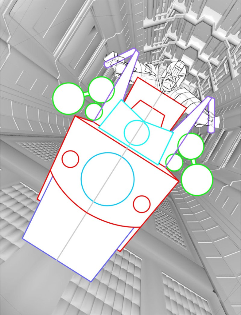
The final touch was, of course, adding Dredd behind it all, nice and comfy in his bike seat…. what’s he looking so miffed about?
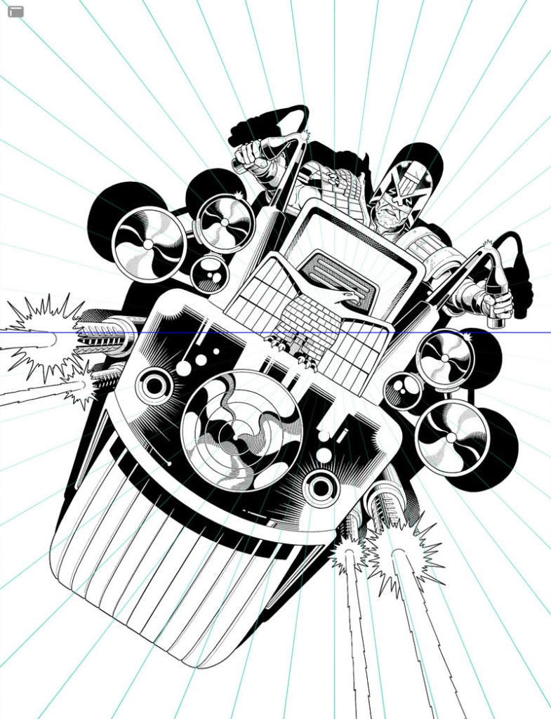
Next step was to pencil up a rough that I felt confident was good enough to send to Tharg’s delegate on earth, Matt Smith (see below). I threw a simple line-art filter over that background reference to give a general gist of how that would look, knowing I could save myself some wasted time if Matt didn’t deem it worthy enough to adorn the cover of 2000AD or the Judge Dredd Megazine but luckily that was not the case and I was well on my way towards creating my 4th cover for the Galaxy’s Greatest Comic!
I took the rough into Procreate on my iPad Pro and commenced the inking, making small changes along with the way such as improving Dredd’s expression and fine-tuning the shading on the bike’s front.
As you can see, I initially envisioned the shadow to be much more prominent a part of the design. But at this stage, I was finding it less impactful (partly because I changed the positioning slightly) and, if anything, was taking away from the sense of movement I had hoped this illustration would have.
That’s one of the ways I’m still learning as an artist; I can ink a lot of precise detail into a piece but that’s often to the detriment of any sense of action, when looser brush strokes and mark-making would better suit but I do struggle to let go of that need for tight control of the pen line.
That’s when I had the idea not to draw the shadow as a full, blocked-out shape but to ink it as speed lines protruding out all around Dredd, which I hoped would help make it feel like the Lawmaster is leaping right off the page at you. So I set up Procreate’s useful perspective tool (see above) and started to carve out those lines.
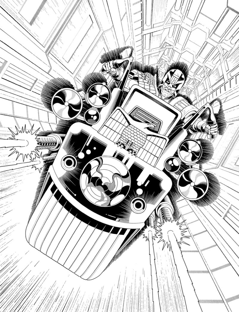
Next up was the background and the bit that I had been privately dreading, because to be honest, I didn’t really have a clue how I was going to ink it. I knew that I wanted the lineart to have an element of motion blur but – with the limitations of my style that I previously mentioned in mind – I wasn’t entirely sure of the best method. I was also wary of making the background too difficult for the colourist to interpret so I didn’t want to lose too much of the forms within it, whilst also attempting to do exactly that.
Eventually, I settled upon a technique that I was happy with and which I felt conveyed the motion in the way I had hoped and, once that was locked in, it was just a case of filling out the rest.
I really enjoyed the entire day I spent meticulously inking in all those dots and blur lines, as followers of my instagram account (@sketchymagpie) will tell you…
But as with all things we achieve, the hard work along the way is part of what makes it so satisfying to eventually finish!
Thank you once more to Paul Williams and congratulations to him for getting Tharg to say yes to that fourth cover. And honestly, he might be regretting his decision to painstakingly ink all the dots and blurs, but we think it’s come out beautifully! So stop complaining Williams Droid, otherwise, Tharg will just make you do more details!
You can see Paul’s cover adorning Megazine Issue 436, available at the 2000 ADweb shop from 15 September.
There’s more Covers Uncovered from Paul for Prog 2199 (the rather iconic cover that marked the end of End of Days) and Megazine 422. Plus, you can read an interview with Paul and fellow Thought Bubble winner, script-droid Laura Bailey, here and both Paul and Laura talk about their DeMarco strip on the Thrill-Cast here. And catch up with the latest from Paul over at his Twitter, Instagram, and his website.