Every week, 2000 AD brings you the galaxy’s greatest artwork and 2000 AD Covers Uncovered takes you behind-the-scenes with the headline artists responsible for our top cover art – join bloggers Richard Bruton and Pete Wells as they uncover the greatest covers from 2000 AD!
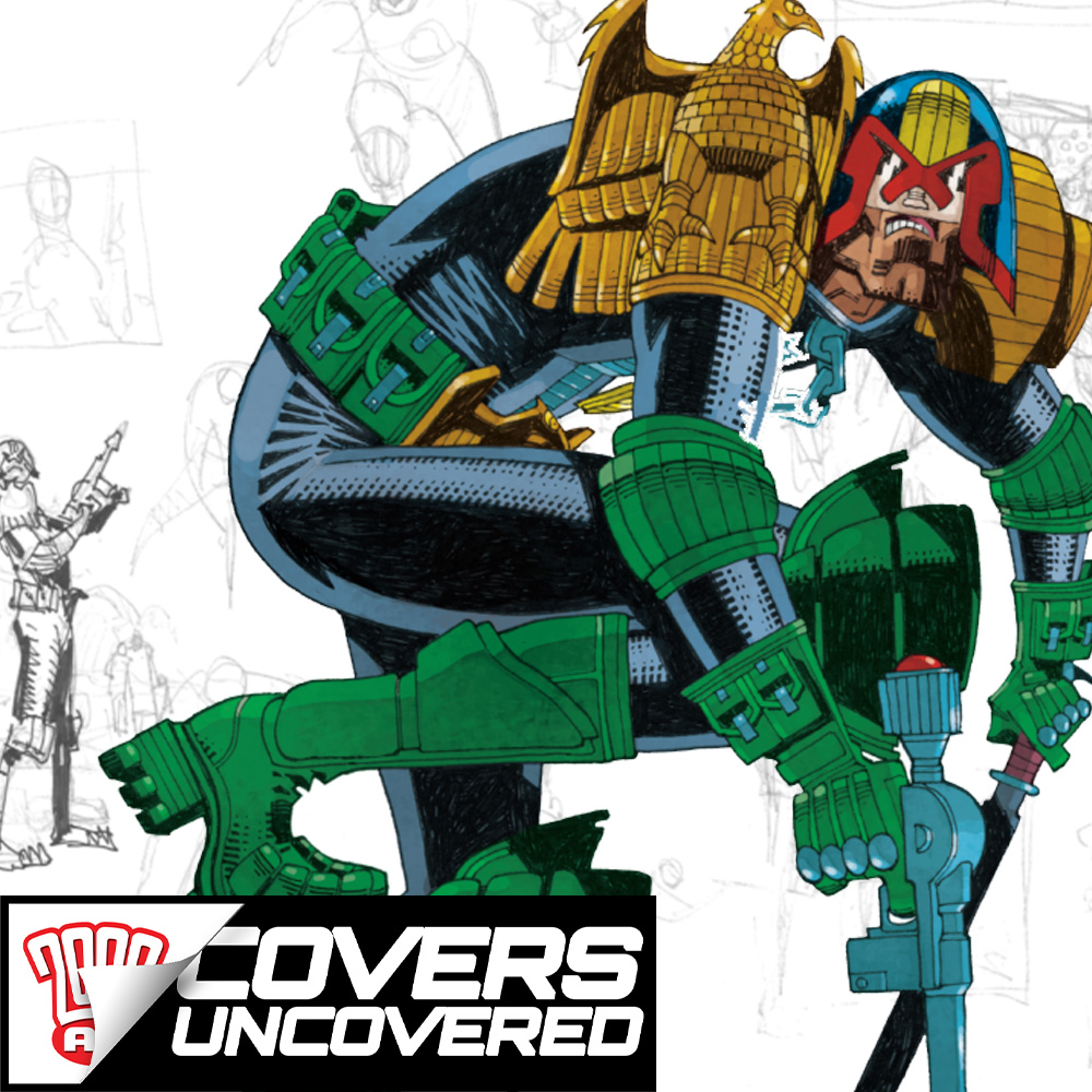
And this week we not only get the thrill-powered jumping-on Prog for you with 2000 AD Prog 2250, featuring 48-pages with FIVE new on-going stories and two great one-offs, but a return of the absolute 2000 AD legend that is Mick McMahon on the cover!
It’s all coming out on 22 September! Just look for the big boots of Dredd on the cover!
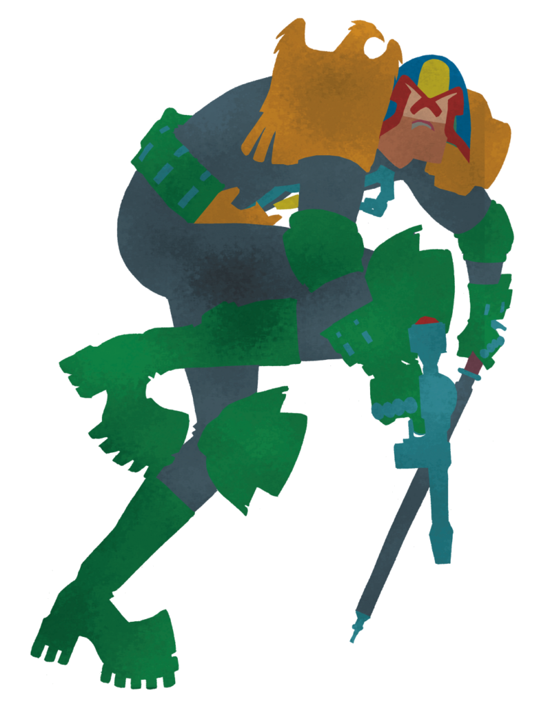
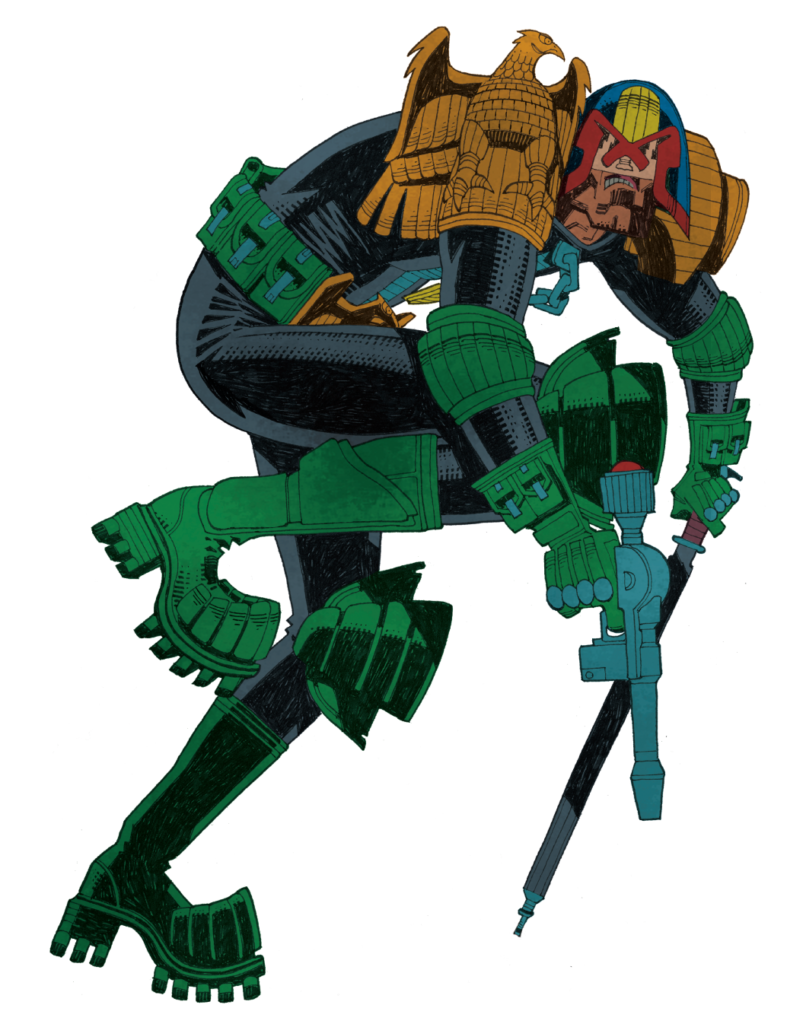
We were honoured to chat to Mick McMahon about putting together yet another iconic cover featuring the one and only Judge Dredd, that looks just like this…
.
So, without further ado… Mick McMahon!
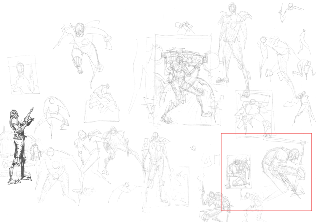
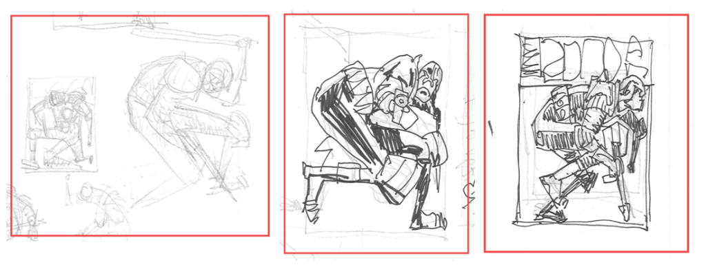
MICK MCMAHON: The brief is Dredd in action, so pretty open-ended. My first move is to draw some Dredds and hope that one of them feels ‘right’. As I sketch on these first sheets I gradually start leaning towards the idea of a big Dredd filling the cover with a white background.
.
And here’s the three Dredd’s that Mick’s highlighted on those initial sketch pages… where you can see the whole thing really coming together, from basic shapes to complete cover idea in miniature…
.
MICK MCMAHON:Just for once I get it ‘right’ more or less first time. I can sometimes spend a week faffing around with this stage.
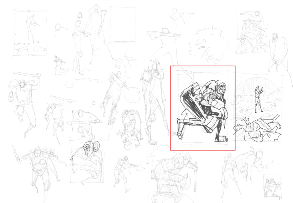
Oh yes… and when it comes together this way, the McMahon-ness of Dredd just screams out from even the sketch stages – it’s unmistakenly, brilliantly McMahon! All of which gives us this… the rough drawing of the cover…
.
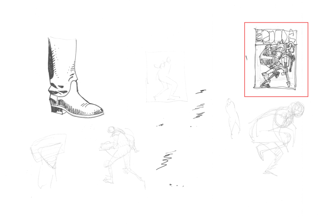
MICK MCMAHON:I scan the sketch into photoshop and make up a dummy of the cover, and mail it to Matt.
.
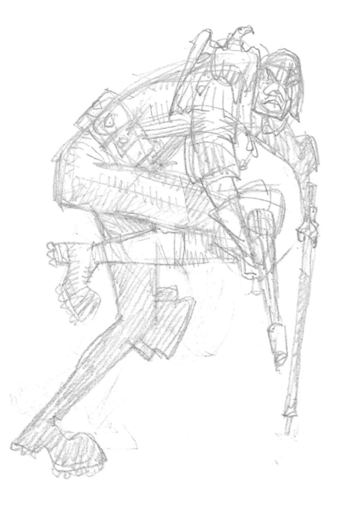
MICK MCMAHON: Matt likes it, so I proceed with the pencils. All the drawings so far have been done on Staples A4 copy paper. The pencils will be drawn on Staples A3 copy paper. I print out the rough drawing in blue and use this as a base for the pencils. I use a Derwent Graphic HB pencil for all my pencil work.
.
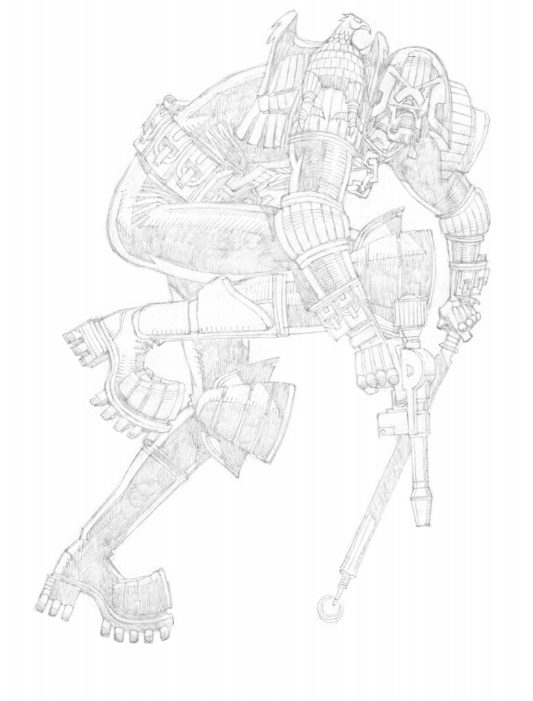
MICK MCMAHON: I usually use Daler Rowney Bristol Board for the inks, but this time I decided to experiment with Arches 140lb hot press watercolour paper.
I print out the pencils in blue and ink them with Pilot size 10 lettering pens.
.
MICK MCMAHON:I scan the inks into Photoshop and proceed with the colouring.
.
And that, 2000 AD fans, is how an absolute legend gets the cover done!
Thank you so much to Mick for sharing just how he does it. It’s a stunner of a cover, unique, stylish, striking, something that can only come from an absolute legend of 2000 AD!
You can see Mick’s incredible cover on the front of 2000 AD Prog 2250, available at the 2000 ADweb shop from 22 September.
Every week, 2000 AD brings you the galaxy’s greatest artwork and 2000 AD Covers Uncovered takes you behind-the-scenes with the headline artists responsible for our top cover art – join bloggers Richard Bruton and Pete Wells as they uncover the greatest covers from 2000 AD!
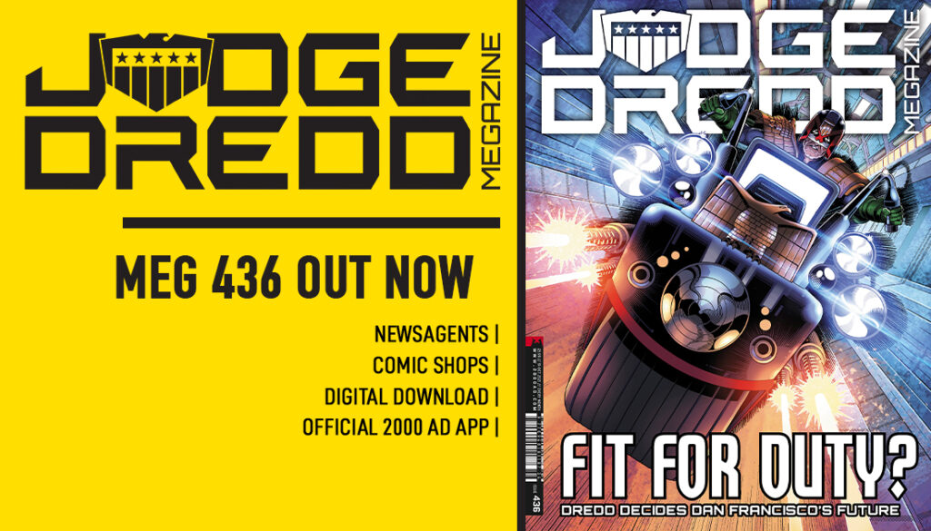
This week, we chat to art droid Paul Williams about his latest cover – Judge Dredd Megazine #436.
Since winning the 2000 AD art search competition at Thought Bubble 2017, this is the fourth time Paul’s art has graced the covers of both the Prog and the Judge Dredd Megazine, as well as providing art for Prog 2072’s Future Shock: Sunday Scientist. and the DeMarco, P.I. 3-parter, An Eye, in Megazine issue 410-413, both scripted by Laura Bailey.
This latest from Paul gives us a twist on the classic image of Dredd astride his Lawmaster, looking just like this…
PAUL WILLIAMS: This cover came about after I’d been kicking the kernel of an idea around my head for several months before Christmas, not quite finding the version of it that was unique enough to retain my interest for quite some time.
There are plenty of ‘Dredd on a Lawmaster’ covers in 2000 AD’s history, most of which were drawn by some of the all-time greats and so I didn’t want to go down that route unless there was something in the design that would make it different or memorable, even as a more generic ‘pin-up’ style image. Eventually, I hit upon the idea of Dredd being framed by his shadow, cast from the Lawmaster’s bike cannons and that piqued my interest enough for it to stick.
My style has naturally evolved towards a focus on heavy contrast in the past year (as evident below in an unsuccessful cover pitch from 2020) and I knew that this concept would give me the perfect opportunity to play with that some more.
Like all artists who have depicted Dredd (albeit only on covers, in my case), you want to put a bit of your own touch on how the equipment and uniform are designed and the above gives a good idea of where I was at with that going into this pitch, even though most of it will be hidden out of view. The shoulder eagle is pretty consistent now with how most artists draw it but all of the other pads have a raised border surrounding the central panels.
For some reason, I’ve always struggled to find a way to draw the more traditional left shoulder pad with the bars over the top in a way that looks good and so one day I decided to try it Kev Walker style from the Judge Dredd story “Fast Food” (see below) and found that worked well.
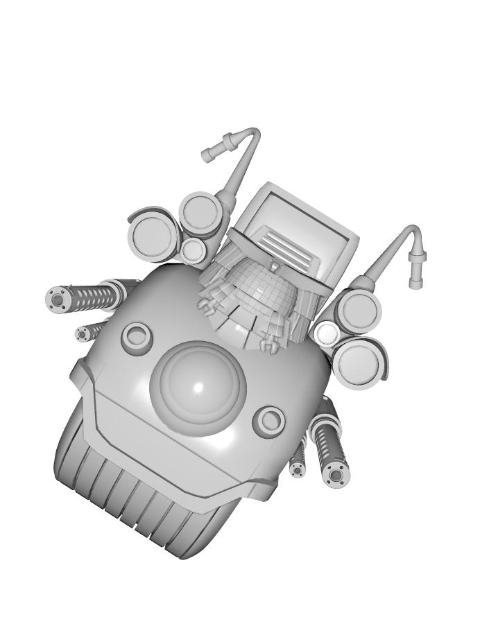
Uniform aside, obviously the more important design when you’re showcasing the Lawmaster is the bike itself. I have my own 3D model that I built for drawing reference which is largely ‘classic’ in appearance and I had intended that this would be my basis for the image.
If I may go on a tangent for a second, one side of illustration that I do like to employ is the use of 3D modelling software. Almost everything I use for reference is something I have created myself (unless I need reference for a specific item or vehicle, such as when I had to draw a military MRAP from multiple angles for a project and it was just a matter of saving time by downloading an existing model rather than needlessly making my own) and the reason I do this rather than drawing everything from scratch is because, honestly, I get bored only ever working in one medium all the time. Switching between 2D and 3D goes a long way to keeping me creatively stimulated, which is important when you’re working on bigger projects that potentially have you in it for the long haul.
When I started work on this cover, however, I discovered that this design (shown above) wasn’t really suiting the composition I had imagined, which should be more angular and a distinct set of geometric shapes. I normally prefer the more rounded front on the bike but I felt it would definitely take away from the impact I wanted this image to have so I decided to scrap the reference and draw the Lawmaster from scratch.
After coming up with a front view that I was happy with, I combined a few existing 3D design elements to create the background reference that would also provide me with the perspective lines (and sense of motion) for later on. I’ve also made the decision to switch out the U-shaped (when viewed from above) Eagle that I typically use on the front of the Lawmaster for the flat one which I feel will ‘read’ more easily in this composition.
The final touch was, of course, adding Dredd behind it all, nice and comfy in his bike seat…. what’s he looking so miffed about?
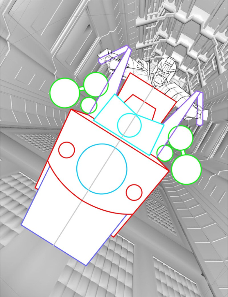
Next step was to pencil up a rough that I felt confident was good enough to send to Tharg’s delegate on earth, Matt Smith (see below). I threw a simple line-art filter over that background reference to give a general gist of how that would look, knowing I could save myself some wasted time if Matt didn’t deem it worthy enough to adorn the cover of 2000AD or the Judge Dredd Megazine but luckily that was not the case and I was well on my way towards creating my 4th cover for the Galaxy’s Greatest Comic!
I took the rough into Procreate on my iPad Pro and commenced the inking, making small changes along with the way such as improving Dredd’s expression and fine-tuning the shading on the bike’s front.
As you can see, I initially envisioned the shadow to be much more prominent a part of the design. But at this stage, I was finding it less impactful (partly because I changed the positioning slightly) and, if anything, was taking away from the sense of movement I had hoped this illustration would have.
That’s one of the ways I’m still learning as an artist; I can ink a lot of precise detail into a piece but that’s often to the detriment of any sense of action, when looser brush strokes and mark-making would better suit but I do struggle to let go of that need for tight control of the pen line.
That’s when I had the idea not to draw the shadow as a full, blocked-out shape but to ink it as speed lines protruding out all around Dredd, which I hoped would help make it feel like the Lawmaster is leaping right off the page at you. So I set up Procreate’s useful perspective tool (see above) and started to carve out those lines.
Next up was the background and the bit that I had been privately dreading, because to be honest, I didn’t really have a clue how I was going to ink it. I knew that I wanted the lineart to have an element of motion blur but – with the limitations of my style that I previously mentioned in mind – I wasn’t entirely sure of the best method. I was also wary of making the background too difficult for the colourist to interpret so I didn’t want to lose too much of the forms within it, whilst also attempting to do exactly that.
Eventually, I settled upon a technique that I was happy with and which I felt conveyed the motion in the way I had hoped and, once that was locked in, it was just a case of filling out the rest.
I really enjoyed the entire day I spent meticulously inking in all those dots and blur lines, as followers of my instagram account (@sketchymagpie) will tell you…
But as with all things we achieve, the hard work along the way is part of what makes it so satisfying to eventually finish!
Thank you once more to Paul Williams and congratulations to him for getting Tharg to say yes to that fourth cover. And honestly, he might be regretting his decision to painstakingly ink all the dots and blurs, but we think it’s come out beautifully! So stop complaining Williams Droid, otherwise, Tharg will just make you do more details!
You can see Paul’s cover adorning Megazine Issue 436, available at the 2000 ADweb shop from 15 September.
There’s more Covers Uncovered from Paul for Prog 2199 (the rather iconic cover that marked the end of End of Days) and Megazine 422. Plus, you can read an interview with Paul and fellow Thought Bubble winner, script-droid Laura Bailey, here and both Paul and Laura talk about their DeMarco strip on the Thrill-Cast here. And catch up with the latest from Paul over at his Twitter, Instagram, and his website.
Every week, 2000 AD brings you the galaxy’s greatest artwork and 2000 AD Covers Uncovered takes you behind-the-scenes with the headline artists responsible for our top cover art – join bloggers Richard Bruton and Pete Wells as they uncover the greatest covers from 2000 AD!
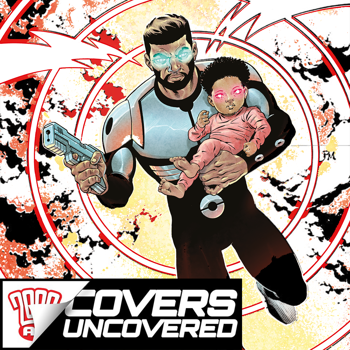
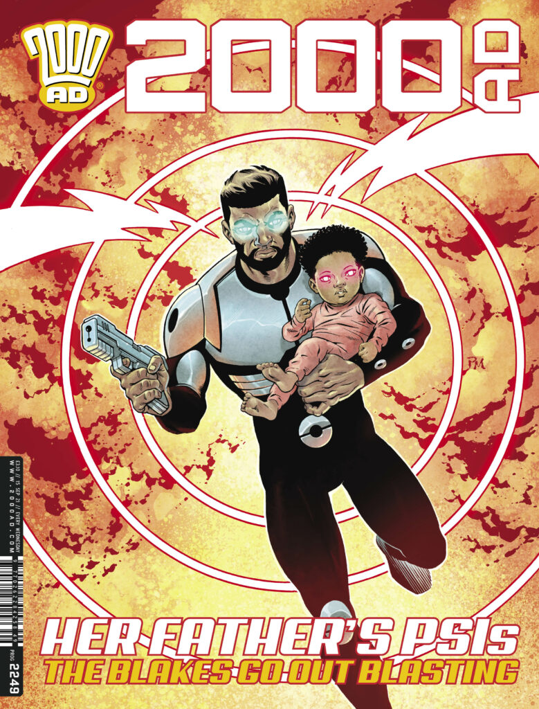
2000 AD Prog 2249 is out now! Featuring endings, endings, and more endings, as we bid farewell to the current thrill-powered line-up to make way for all-new strips in the jumping on Prog 2250. But before we get to that, it’s time to take a moment to enjoy the brilliance of Paul Marshall‘s Skip Tracer cover to 2000 AD Prog 2249…
Over the last 12 episodes of Skip Tracer: Eden, Nolan Blake’s been put through the wringer by the creative team of James Peaty and Paul Marshall – action, adventure, a classic villain, and a military-industrial complex looking to use his newfound daughter as a living weapon. And now, it’s all coming to an end here in Prog 2249. So, it’s our great pleasure that Paul grabbed a little time between those ever-approaching deadlines to send over his art for the cover…
First, how it all came about…
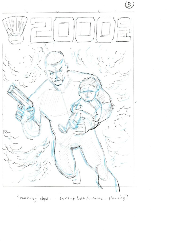
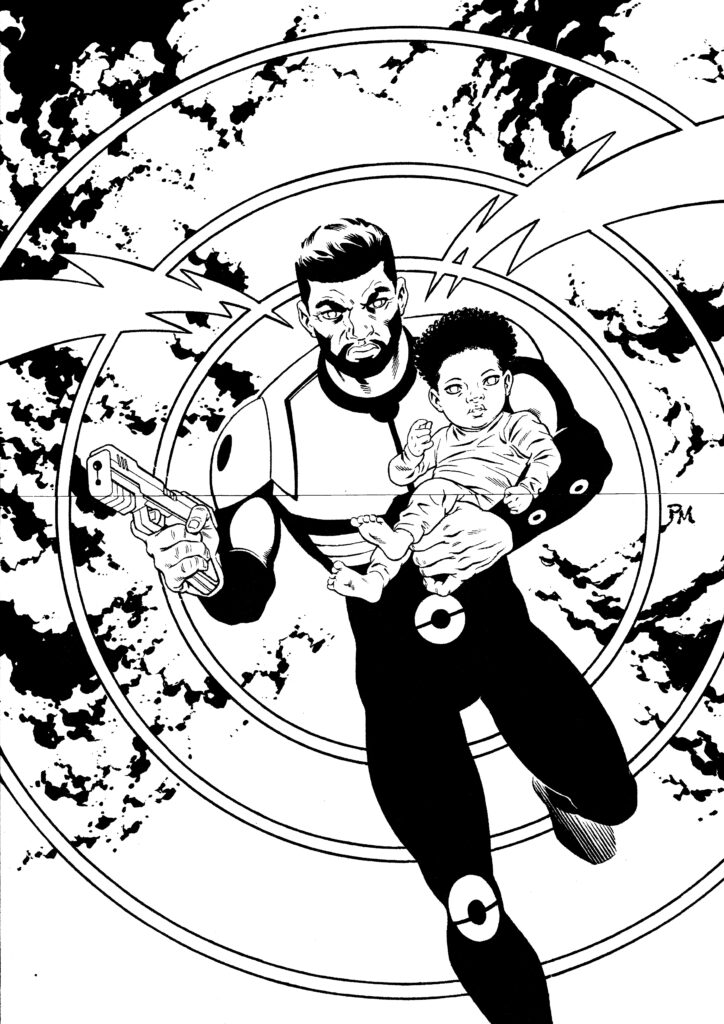
PAUL MARSHALL: Matt asked if I could provide a cover for the last episode of the current Skip Tracer storyline.
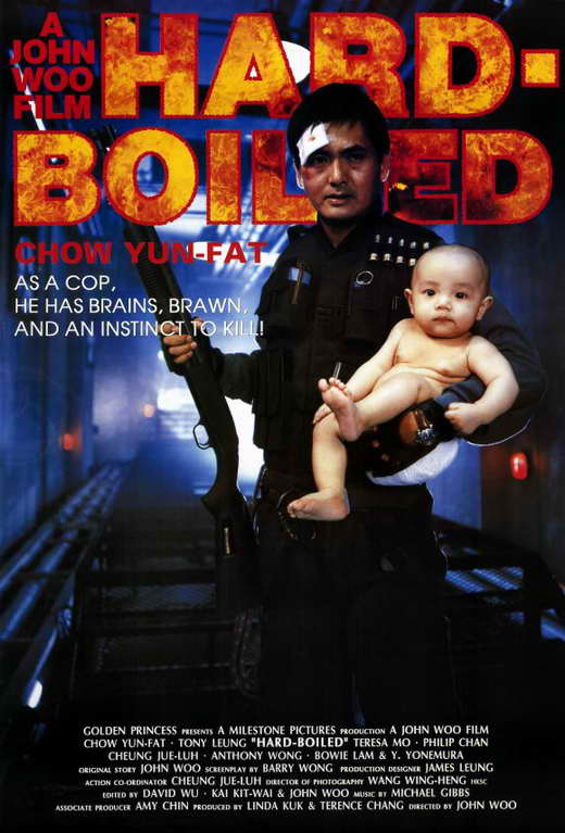
The brief was to show Nolan holding baby Eden in a similar fashion to the old ‘Hard Boiled’ movie poster.
That would be this one…
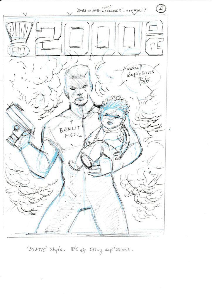
PAUL MARSHALL: I provided a couple of roughs, one a static pose and the other a running/ action image. Matt went with the latter idea, so it was all quite straightforward really!
And that’s it! Hey, sometimes these covers have a long and involved story behind them, and other times it’s all just about the artist getting it done!
So, here’s Paul’s roughs and inked/final version of the cover, with and without colours by the ever-magnificent Dylan Teague!
Thanks to Paul for sending that along – Skip Tracer:Eden might have finished, but there’s going to be more to come from Nolan Blake in the future!
Every week, 2000 AD brings you the galaxy’s greatest artwork and 2000 AD Covers Uncovered takes you behind-the-scenes with the headline artists responsible for our top cover art – join bloggers Richard Bruton and Pete Wells as they uncover the greatest covers from 2000 AD!
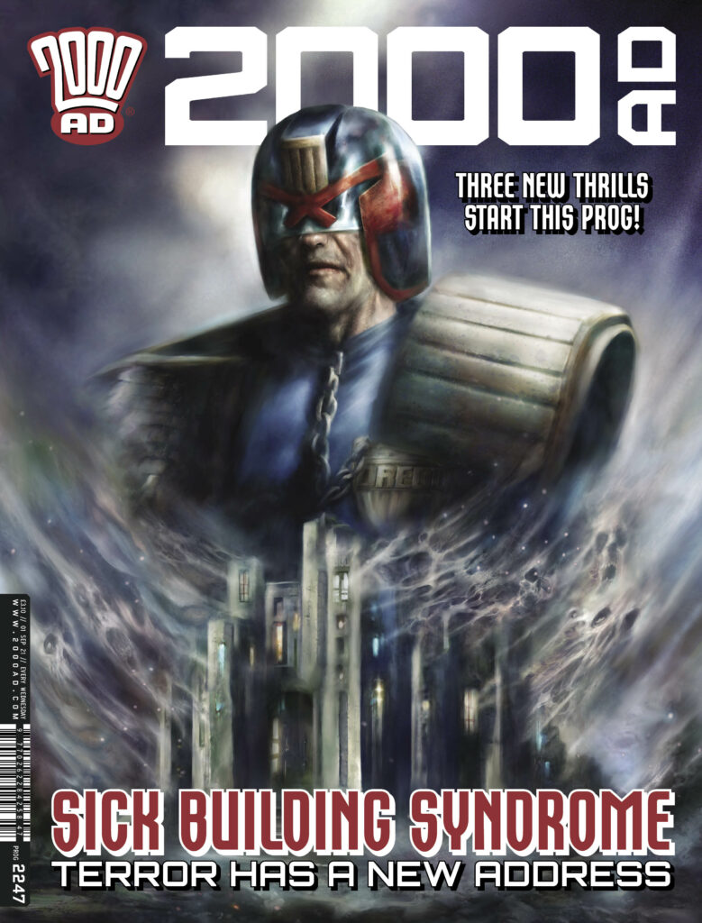
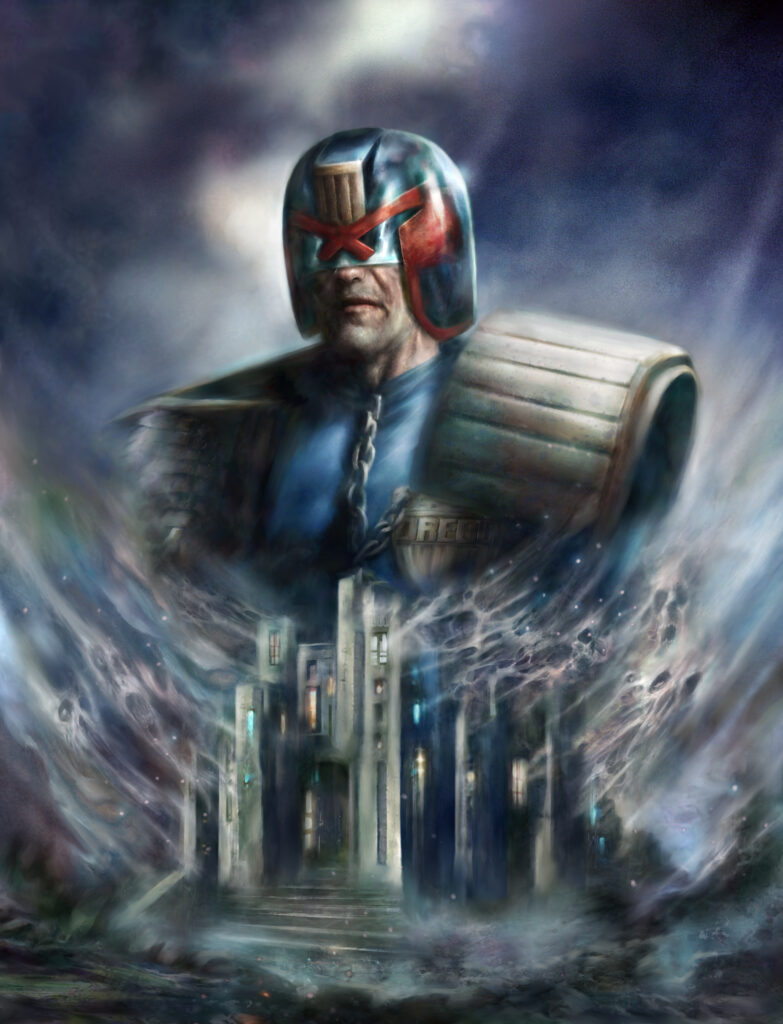
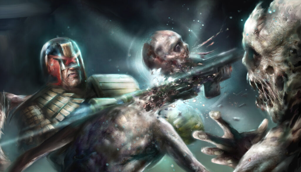
This week, it’s 2000 AD Prog 2247, featuring a creepy and kooky Nick Percival cover for the beginning of the three-part Judge Dredd tale, The House On Bleaker Street, written by Kenneth Niemand and with suitably terrifying art from Nick Percival.
So… let’s hand it over to Nick Percival for the tale of making the cover…
NICK PERCIVAL: It’s always good to return to Dredd now and again and this spooky story was a good palette cleanser after a year of Dark Judges shenanigans.
The House on Bleaker Street (which is a sly wink for people that’ll get the reference) is a great script by Kenneth Niemand (first time I’ve worked with him) and totally tailored to the stuff I like to illustrate, so a nice, dark, horror tale for Dredd.
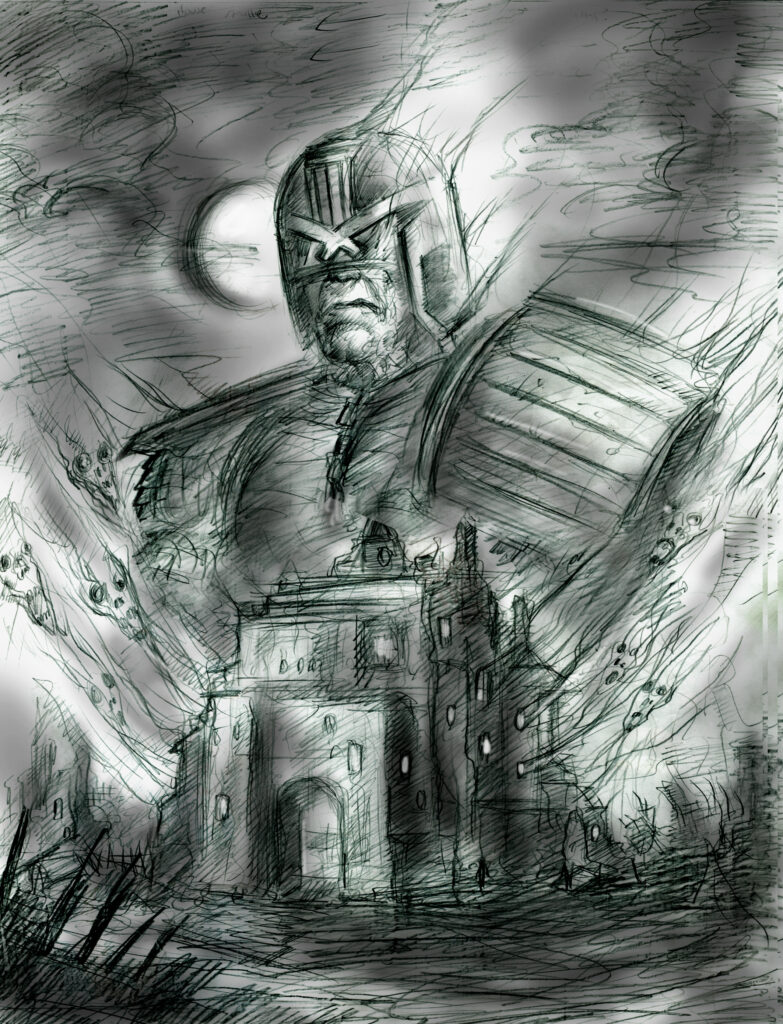
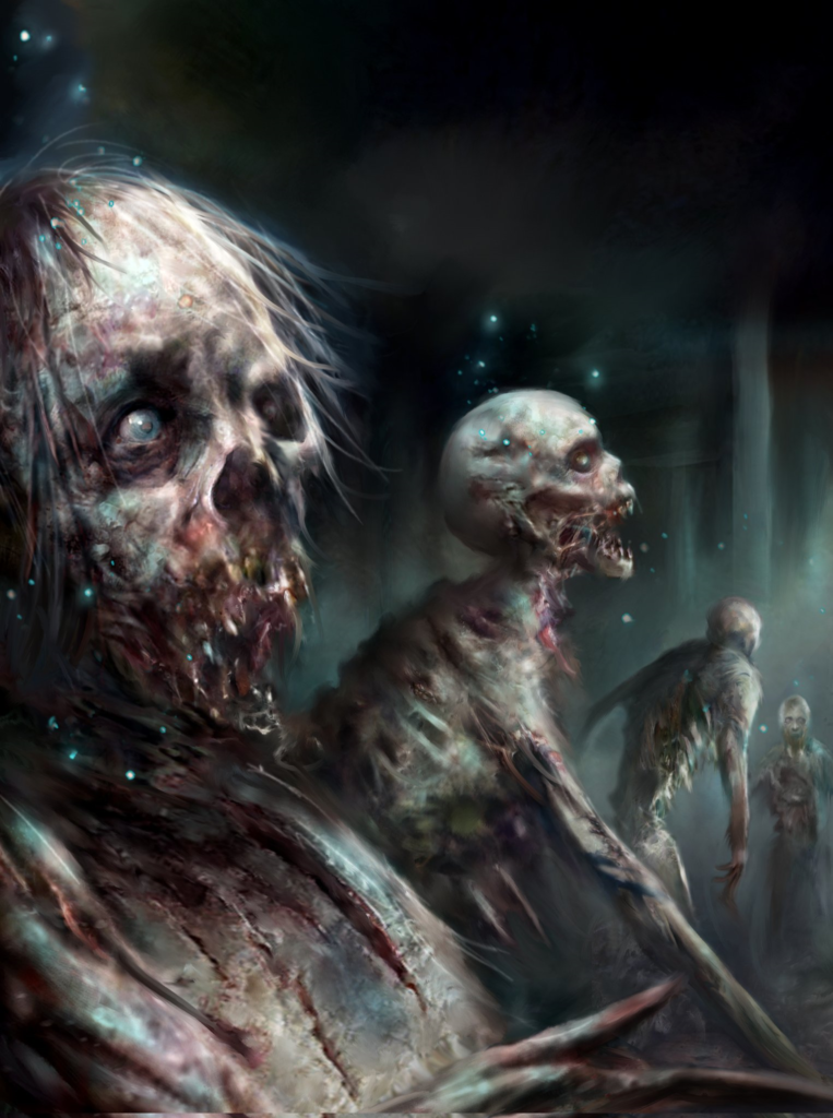
I couldn’t really give too much away on the cover image, since this three-parter reveals a new nemesis for Dredd that we don’t see until Part 2, so it’s a fairly generic layout but still gives a Scooby-Doo ‘haunted house’ type spooky vibe. So, a nice big image of Dredd with the mysterious House on Bleaker Street below with some hint of supernatural forces at work. (Cough..zombies..cough!)
(Damn, nasty cough you’ve got there, Nick!)
And that’s what Nick has the temerity to describe as a SKETCH!
Nick Percival: I wanted a ghost-like, ethereal feel to the piece with lots of mist and soft edges, giving it an otherworldly feel. Really enjoyed working on this one and it sets up some potential for things that can be developed further down the line for Dredd which world be fun to do.
Jinkies!
The finished cover to Prog 2247 – giving that Scooby-Doo vibe, Dredd style!
Thanks to Nick for sending along the imagery to what is SO much a Nick Percival cover! There’s no one better to give the readers the scares as Percival, let’s face it!
2000 AD Prog 2247 is out on 1 September from everywhere thrill-powered comic books are sold, including the 2000 AD web shop!
As for what you can expect from The House on Bleaker Street, Nick was kind enough to send us along a couple of images… try not to have nightmares!
Every week, 2000 AD brings you the galaxy’s greatest artwork and 2000 AD Covers Uncovered takes you behind-the-scenes with the headline artists responsible for our top cover art – join bloggers Richard Bruton and Pete Wells as they uncover the greatest covers from 2000 AD!
This week it’s the return of 2000 AD Regened, with Joko Jargo taking over the Prog to deliver 48 pages of all-ages thrill-power, including more adventures with Cadet Dredd, the latest from the Rogue Trooper-verse in Mayflies, the next generation of Survival Geeks in ‘Splorers, and go right back to the beginning of Marlon Shakespeare’s story in Chopper Don’t Surf.
And to round out this Regened Prog, we have a new Future Shock from Karl Stock and Steve Roberts, the art-droid co-creator of Bec & Kawl and the only art-droid to have won a Bafta for his TV work on the CBeebies series DIPDAP!
Not only that, but Steve’s also responsible for the fabulously monstrous cover to this latest Regened Prog… so, time for Steve to talk Covers Uncovered…
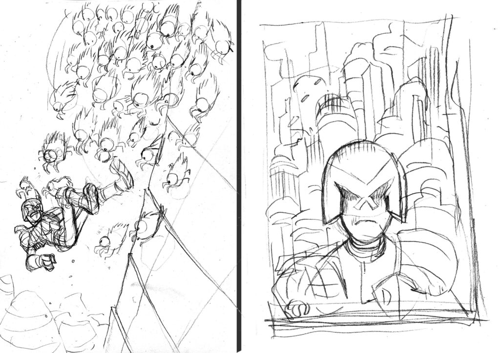
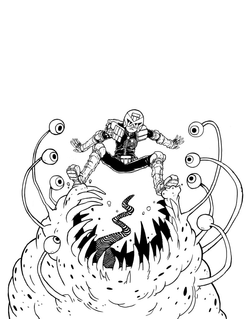
STEVE ROBERTS: I was really chuffed to get the chance to draw a cover for Regened. When Matt asked for a Cadet Dredd cover I did get a bit nervous because it had been a long time since I had drawn Dredd and I had to make sure I got it right. Especially as this was young Dredd.
It was a nicely open brief so here are some ideas that I sent over. One featuring a pack of some sort of alien spider creatures which sort of reminds me of Die Hard. A too static moody Head and shoulders shot that I thought I could attempt an Akira style city with. Then I sketched some sort of ridiculous mutie and finally we have the one that was chosen – a multi-eyed slug alien!
I think Matt was right to go with this one it had the most oomph. These are very sketchy but my preparatory drawing has definitely loosened up over time. I do feel that my drawing can lose a bit of energy as it goes through the various stages on the way to the final art. But I guess that is the way it goes!
Steve’s ideas #1 & 2 – Yippee Ki Yay for Cadet Dredd and Dredd goes all Akira.
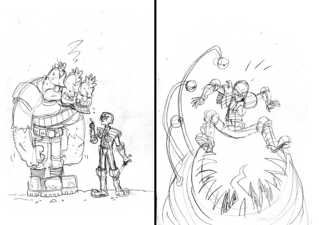
Ideas #3 & 4 – Excess head violation and the final version – Cadet Dredd about to make a monstrous arrest.
.
I would like to experiment more with a looser style in my finished comics in the future if possible. But I am a bit torn because I do love trying to ink really smoothly and clearly. Design-wise, I was quite keen to draw Dredd’s helmet like a slightly 70s motorbike helmet, so quite round, but I didn’t go the whole way with that.
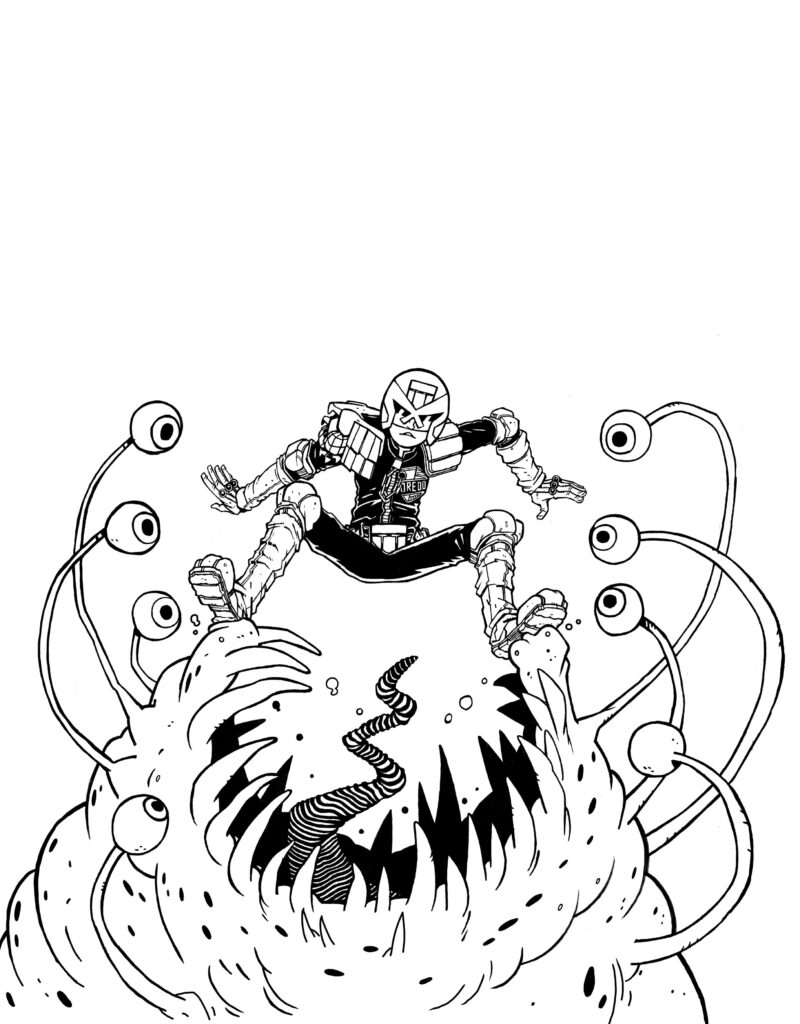
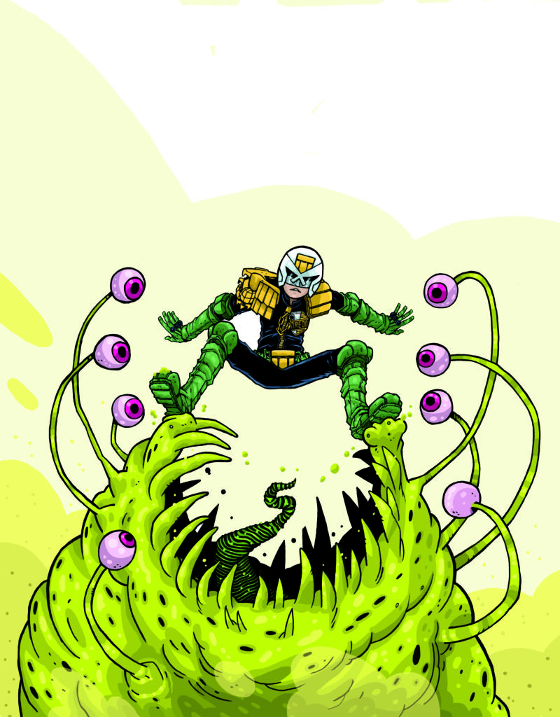
I pencil and ink on paper as I have always done and then scan it in and patch it together if needed. Then I clean up the line art on the computer. I made a conscious effort to not use too much solid black shadow. I wanted to keep the image light and clear.
The Mega-City Meal Deal – But does Dredd come with fries and a coke?
.
Dredd’s arm was very wrong so I fixed it and had it outstretched which I think works a lot better – It was looking a little dislocated! I hadn’t noticed until I got the drawing scanned in and started working on it.
The composition worked well on the rough sketch but not so much on the final art.
Attempting to eat a Judge? Gotta be 30 years in the iso cubes.
.
I got colouring in the way I always do with comic strip pages. This is with a nice solid black line art sitting on the top of flat colours. I also like to avoid using any gradients and airbrush tools. I like flat blocks of colour. I am always aware of not getting carried away when I’m colouring.
.
When I looked at it though it felt a bit unfinished somehow. I felt I had played it safe so I decided to try something new and lose the line art completely and paint it digitally. I definitely hadn’t done this before for anything 2000 AD but it was an enjoyable process and as it had been so long since I had drawn anything for the comic, it seemed right to try something new.
It did take a little longer than expected so I’m not sure I’m up for doing a whole strip like it but I will definitely develop it further in the future. It would have been sensible to have had it mind from the beginning though as I wouldn’t have needed to ink it and could have painted digitally right on top of the pencils.
.
And that’s the cover!
Thanks so much to Steve Roberts for sharing the latest Regened cover with us here, it’s great to see his work back in the Prog!
You can get hold of the Regened Prog 2246 from your local comic shops and newsagents and from the 2000 AD web shop.
Every week, 2000 AD brings you the galaxy’s greatest artwork and 2000 AD Covers Uncovered takes you behind-the-scenes with the headline artists responsible for our top cover art – join bloggers Richard Bruton and Pete Wells as they uncover the greatest covers from 2000 AD!
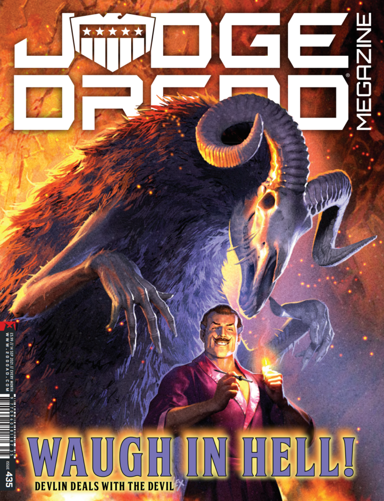
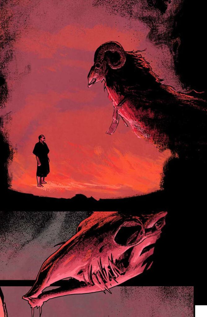
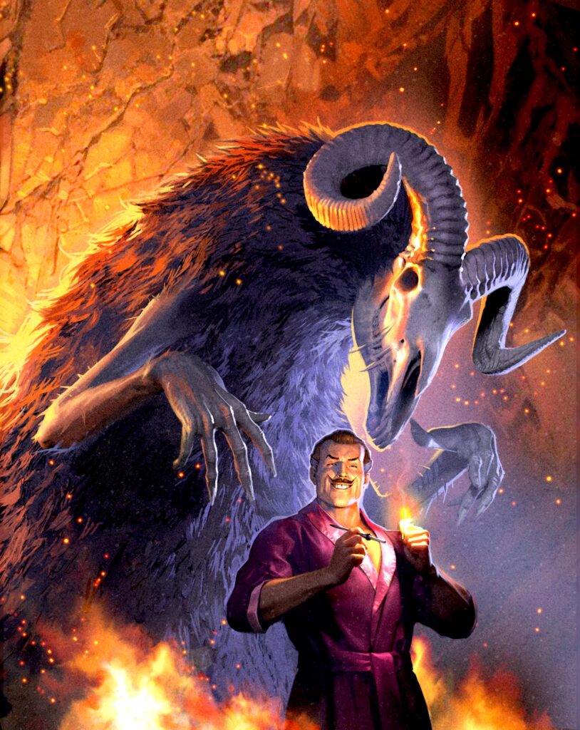
This week – time to check out the devilishly good cover to Judge Dredd Megazine issue 435 – out on 18 August! The incredibly talented Alex Ronald supplies the Devlin Waugh cover, as everyone’s favourite bon vivant vamp has a date with the devil…
Devlin Waugh‘s latest adventure, The Reckoning, reaches episode four, with the scandalously louche lothario finding himself in deep trouble as he and the Devil settle down for a little chat. Devlin Waugh:The Reckoning comes to you courtesy of Ales Kot and Mike Dowling, and Alex has taken inspiration for the cover straight from Mike Dowling’s incredible work inside, giving us a cover that’s the epitome of everything Devlin.
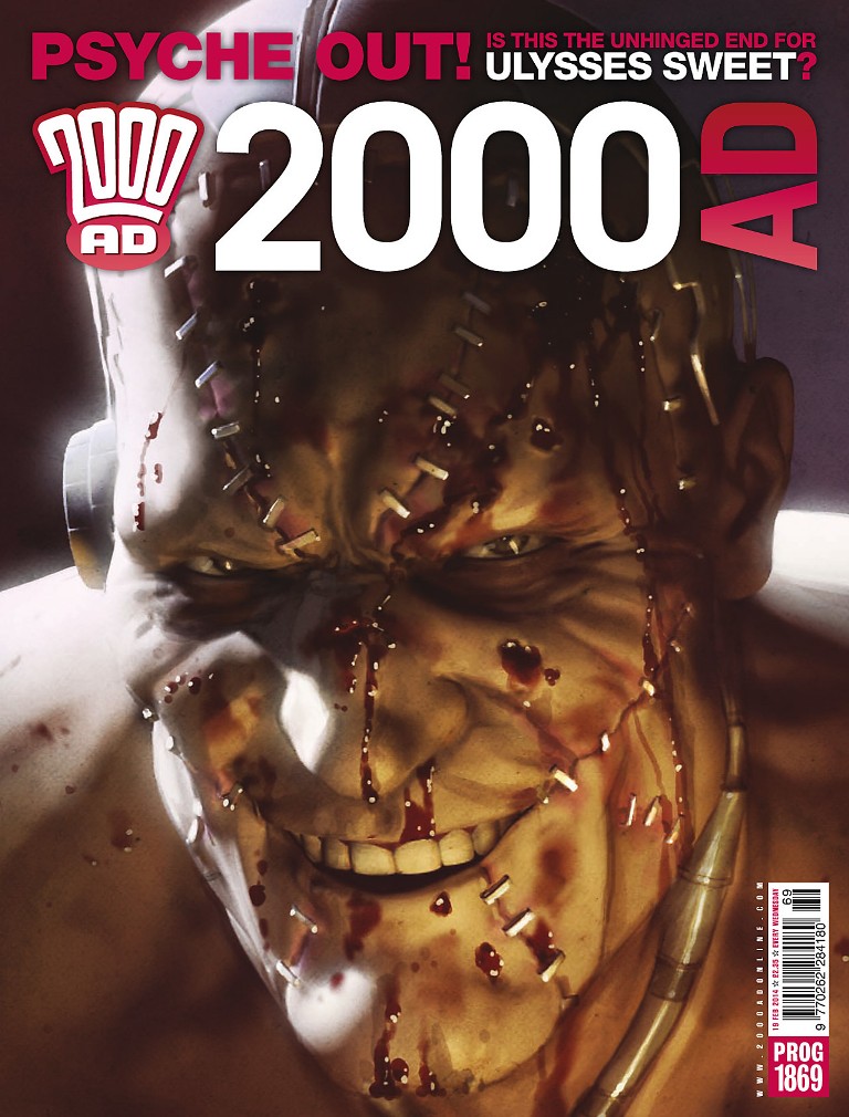
Alex Ronald had his start at 2000 AD back in Prog 984 on Judge Dredd, with his first cover coming on Prog 1869. His earlier work included Dredd, Vector 13, Rogue Trooper, and Sinister Dexter, before heading off for pastures new, including working in the CG industry as both illustrator and 3D modeller. His return marked a very different style that’s seen him work exclusively on 2000 AD and Megazine covers, giving a gorgeous look to some of the most stylish covers of recent years.
Now, over to Alex to tell us about having Devlin come face to face with the Devil…
ALEX RONALD: Matt was looking for a cover depicting the conversation between the Devil and Devlin In Hell.
I opted for something that was a mix between two panels in the comic, one which had an armless Devil leering over the smoking hero and another where we saw the Devil’s arms...
Blind date from hell? Devlin meets the Devil – from Judge Dredd Megazine, art by Mike Dowling.
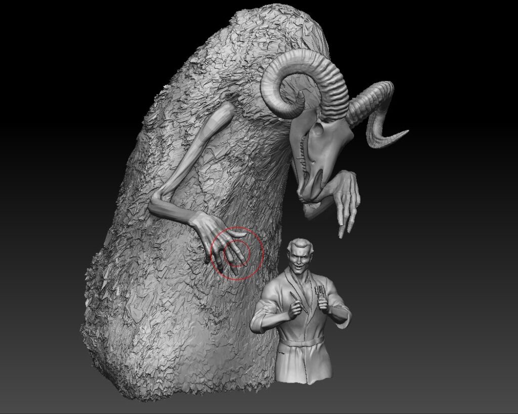
As usual with my covers I initially sculpt the figures in Z brush. I already had a full figure Devlin model from 2017 so I just had to repose and create the new clothing. The Devil itself was a new sculpt.
I set the models up in a 3D scene with lights and once I found a good camera angle, saved out the image to sketch over.
On approval it was down to my favourite part – the paint over.
I hope the readers like what I’ve done with it!
Oh, we’re sure they will!
Thanks so much to Alex for sending along the artwork – you can catch his Megazine cover, featuring the vampiest of vamps possibly meeting his devilish match, on the front of issue 435, available everywhere the best comics are sold, including in the 2000 AD web shop.
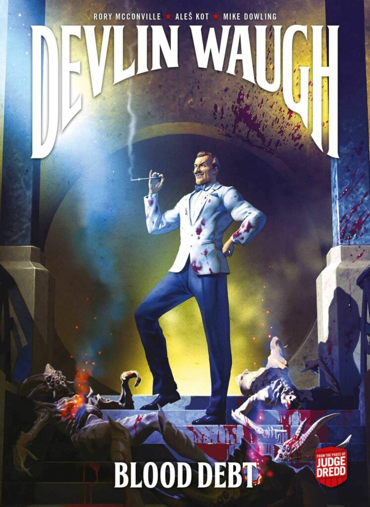
Now, if that wasn’t enough… a little more of Alex’s work on our beloved vampire dandy, with his cover to Devlin Waugh: Blood Debt, the essential collection of recent Devlin tales from Rory McConville, Ales Kot and Mike Dowling.
And now a few of those great Alex Ronald moments from 2000 AD past… beginning with his very first work for Tharg, 2000 AD Prog 984…
And then his very first 2000 AD cover – Prog 1869…
Now a few more recent covers – first the 2019 Christmas 2000 AD Prog 2162 – and you can see more of that one in Alex’s Covers Uncovered for that Prog here.
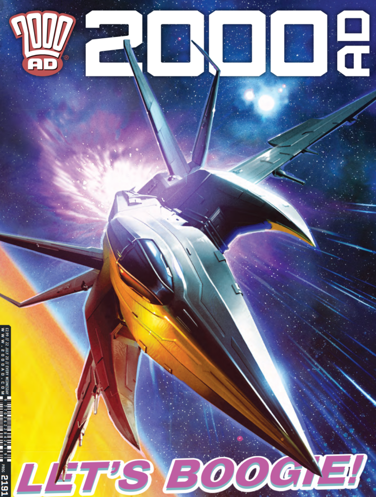
Next, covering the great Full Tilt Boogie for 2000 AD Prog 2191 – again, read his Covers Uncovered for this one here.
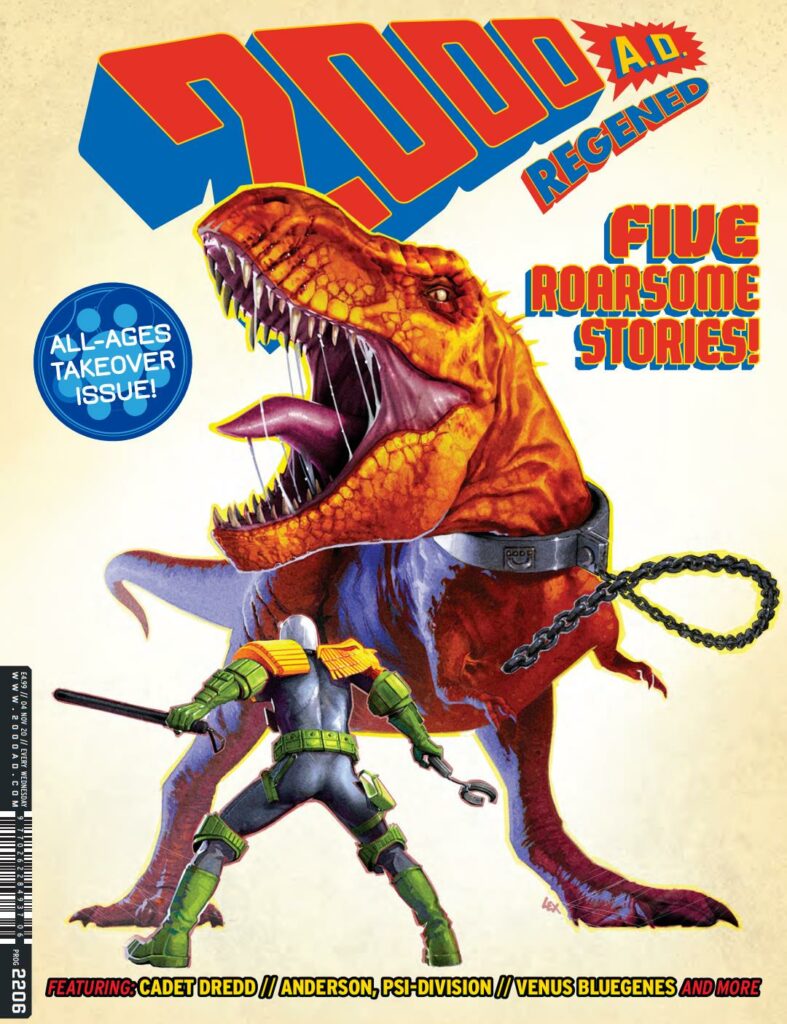
And finally, his latest Regened cover to 2000 AD Prog 2206, with another great Covers Uncovered here.
Every week, 2000 AD brings you the galaxy’s greatest artwork and 2000 AD Covers Uncovered takes you behind-the-scenes with the headline artists responsible for our top cover art – join bloggers Richard Bruton and Pete Wells as they uncover the greatest covers from 2000 AD!
This week, it’s the triumphant return to the pages of the Galaxy’s Greatest to art-droid Mark Harrison, usually found beavering away on The Out, his incredible outer space adventure with Dan Abnett, their ‘love letter to the SF book-jacket art’, which returns soon for its second series!
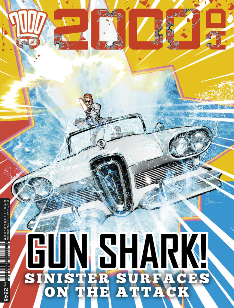
But on the cover of 2000 AD Prog 2245, Mark’s turning his artistic talents to one Finnigan Sinister, freshly back from the dead and out for the blood of Dexter in the Sinister Dexter saga, Bulletopia Chapter Six, Somewhere Beyond The Sea, the series written by Dan Abnett with art from Tazio Bettin.
We chatted to Mark about all things Sinister and why shooting the reader is always a great thing!
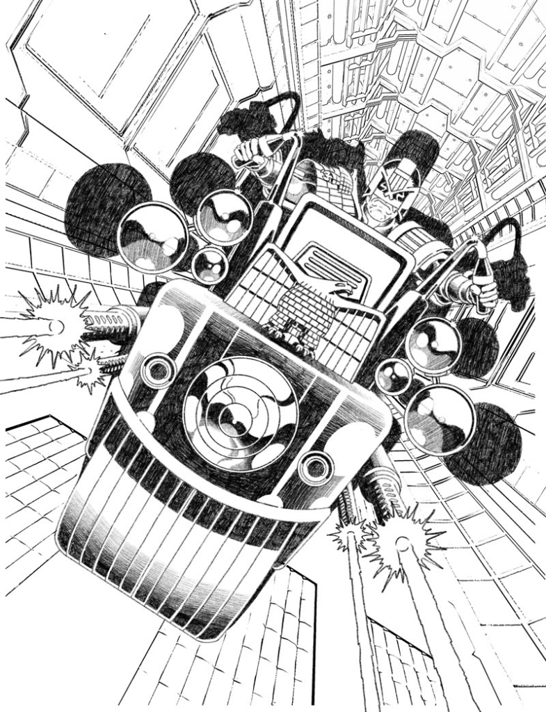
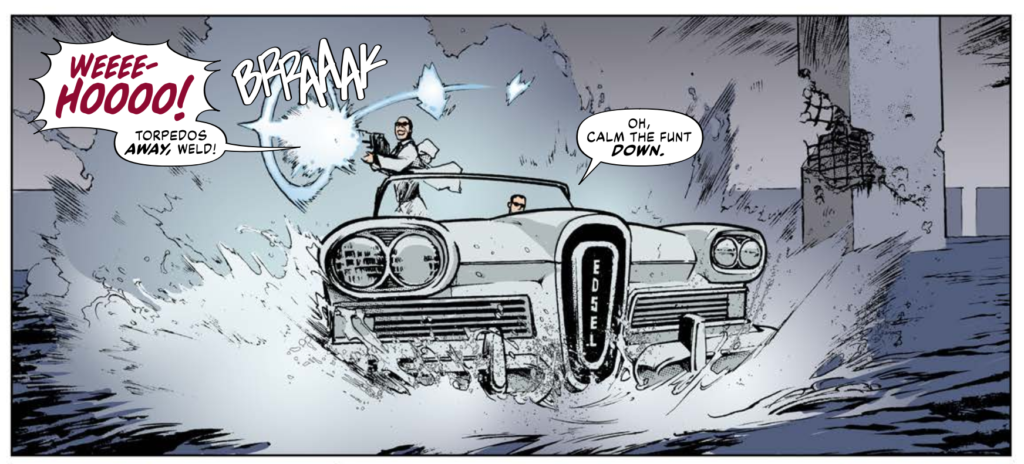
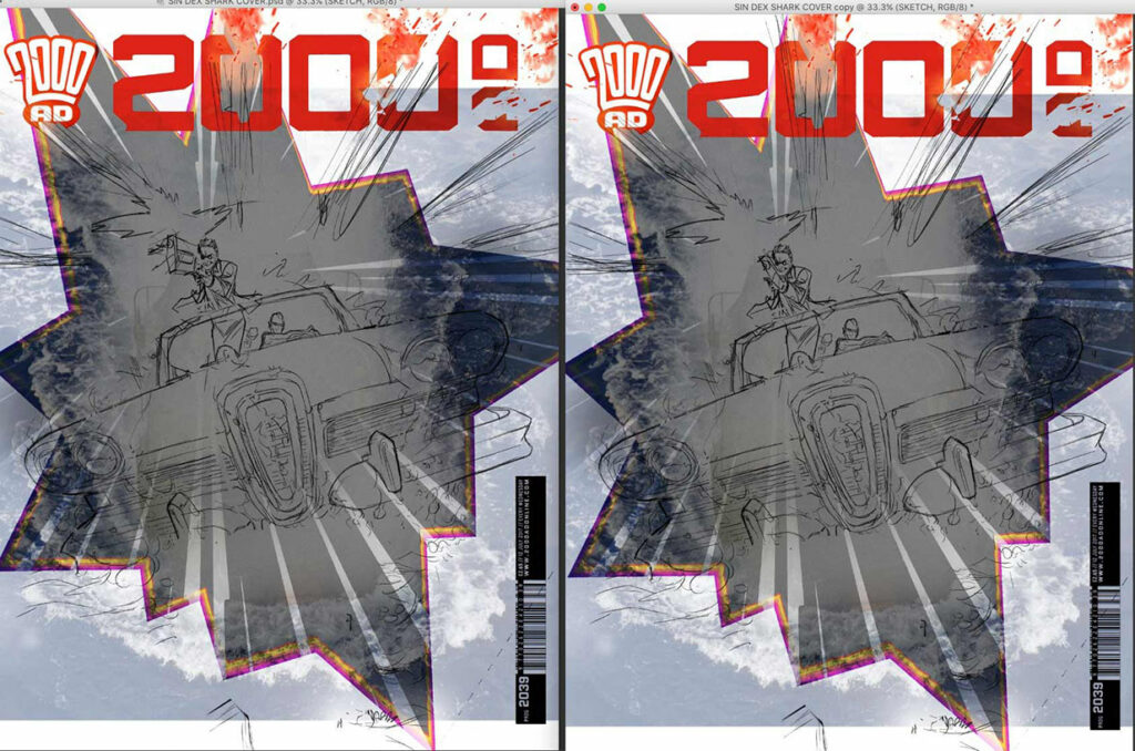
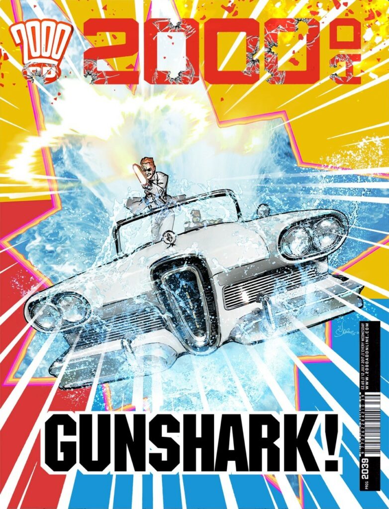
MARK HARRISON: The brief from Tharg/Matt was to go with one of Tazio Bettin’s images from the strip; a shot of the Edsel Car in amphibious mode skimming across the sea, Sinister firing a BFG.
(Love the way Tazio did the gun flash; an expanding plasma shockwave and an energy blast exiting along one plane. Nice energy. Sorry, artist appreciating something another artist has done and inevitably stealing it… which I did! 😉
And that would be this image of Tazio’s…
The inspiration for a cover – Tazio Bettin’s ‘Portrait of Gun Shark atop Edsel, with BFG.’
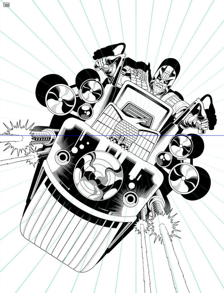
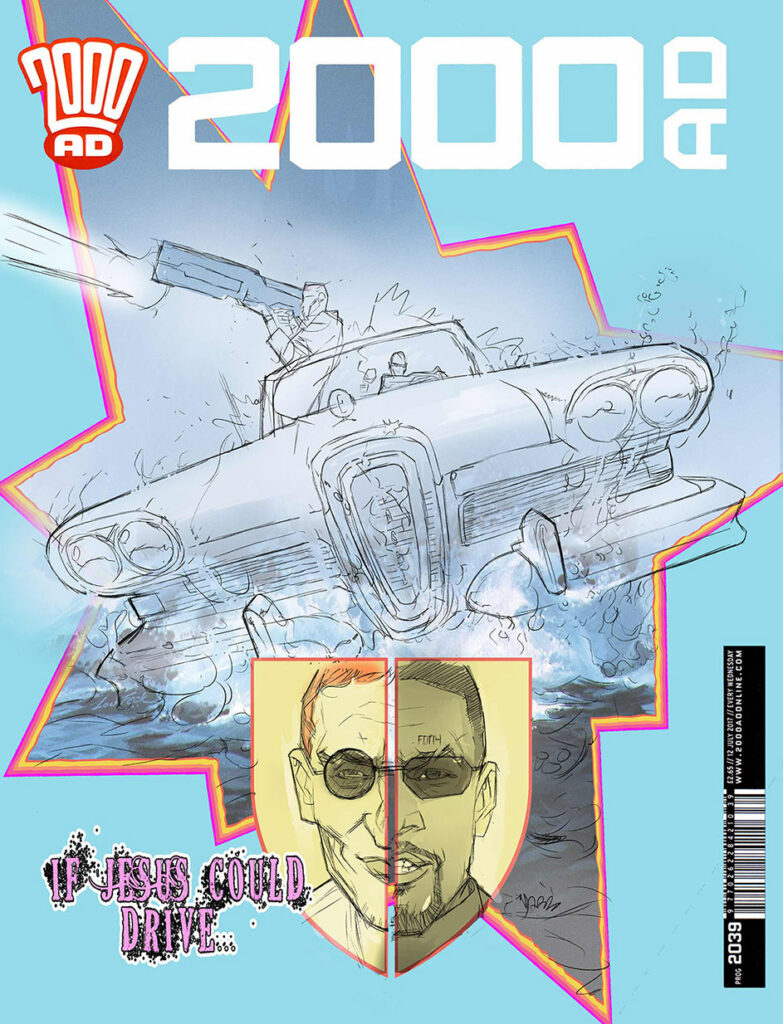
MARK HARRISON: The car was kind of skimming across the surface of the water like a hydroplane boat and I originally had it in that orientation, with Evil Sinister blasting to the side.
I thought I could do more with the cover. Sinister Dexter is latin for left and right and was used to denote sides of a shield in heraldry. I was also thinking of a graphic or shield/badge to do with a car, an emblem like Ferrari, so I also overlaid an insert image of Sinister and Dexter, to flip sides of a face, a contrast.
Mark Harrison’s version of Bettin’s Gun-Shark with Edsel and BFG plus added heraldry
Sinister in the strip had been taken over, was a bad guy, dressed in white. I had noted that for it to work, Sinister should have been on the right of the cover, but before I could make that change Tharg/Matt suggested dropping all that for a less fussy approach and with Sinister “shooting the reader”.
Shooting AT the reader is good.
There are rules in comics and particularly in regard to eye-catching covers; a psychology. I’ve been told by editors/marketing over the years: “Have the character make eye contact with the reader”. “Shoot AT the reader.”’ Explode the frame”. I’m assuming that the confrontational aspect of the image arrests the reader or casual comic buyer. It “connects”. It’s not a passive image.
SHOOT the Reader! Sinister takes aim!
Some editors have interesting preferences. One time 2000 AD editor Dave Bishop had a penchant for headshots; (not literally shooting someone in the head… although I don’t know) and Paul Neary at Marvel UK would ask me to have the combatants look out at the reader… which was kinda odd if they were punching someone page left or right: “Look at me, I’m punching his face!”
I don’t always agree with their choices but I can see their point of view.
Of course, this cover became an exercise in revisiting some of those techniques that were used back in the day when layout artists and comic artists had to maximise the limited resources (colours and fidelity) of comics at the time and be contrary to their surrounding, safer imagery.
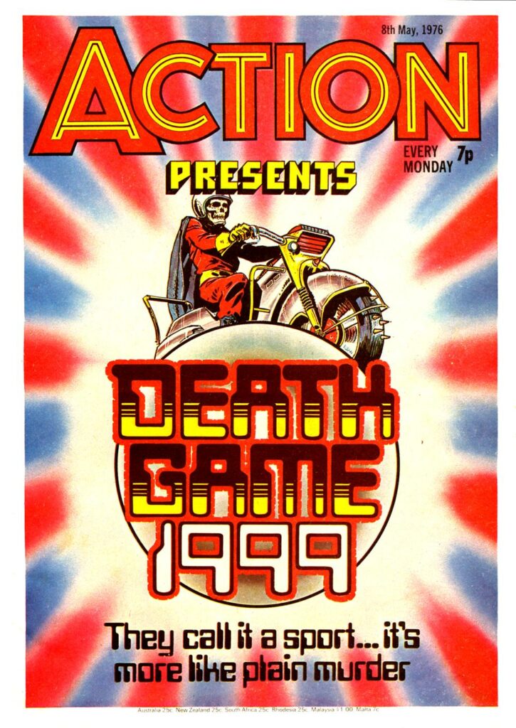
Comic shelves in WH Smiths were a crowded place back in the ’70s as children had little in the way of alternative distraction. So your comic had to leap off the shelf, kick the reader to the ground, lose some teeth before pumping a few caps into his wide, disbelieving eyes. Figuratively speaking. The go-to comic for this “Boot in the face” subtlety was of course 1970’s boy’s comic ACTION.
Doug Church (I think) was the ACTION layout artist to deliver the goods, covers that EXPLODED in you face like an IED, images that broke the frame, three primary colours to disrupt the synapses, whoosh lines and jagged caption boxes that SCREAMED at you. It all had to say… well “ACTION”. Along with “Blood” and “Death” and “Disembowelled”. (Different times).
Yes, Doug Church was a legendary contributor to Brit comics – Action, Battle, and 2000 AD, to name but three, all benefitted so much from his design work. And this is a perfect cover to show you what Mark’s talking about – ‘Covers that EXPLODED in you face like an IED, images that broke the frame, three primary colours to disrupt the synapses…’ Oh yes, just like this…
ACTION! – Doug Church’s cover designs that reached out and grabbed a young Mark Harrison by the throat!
MARK HARRISON: Oh, I could wax lyrical about British comic art page layout which I consider to be the best in the world.
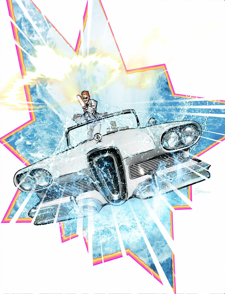
With that legacy in mind and remembering how it grabbed me as kid, I redesigned the cover to be more punchy.
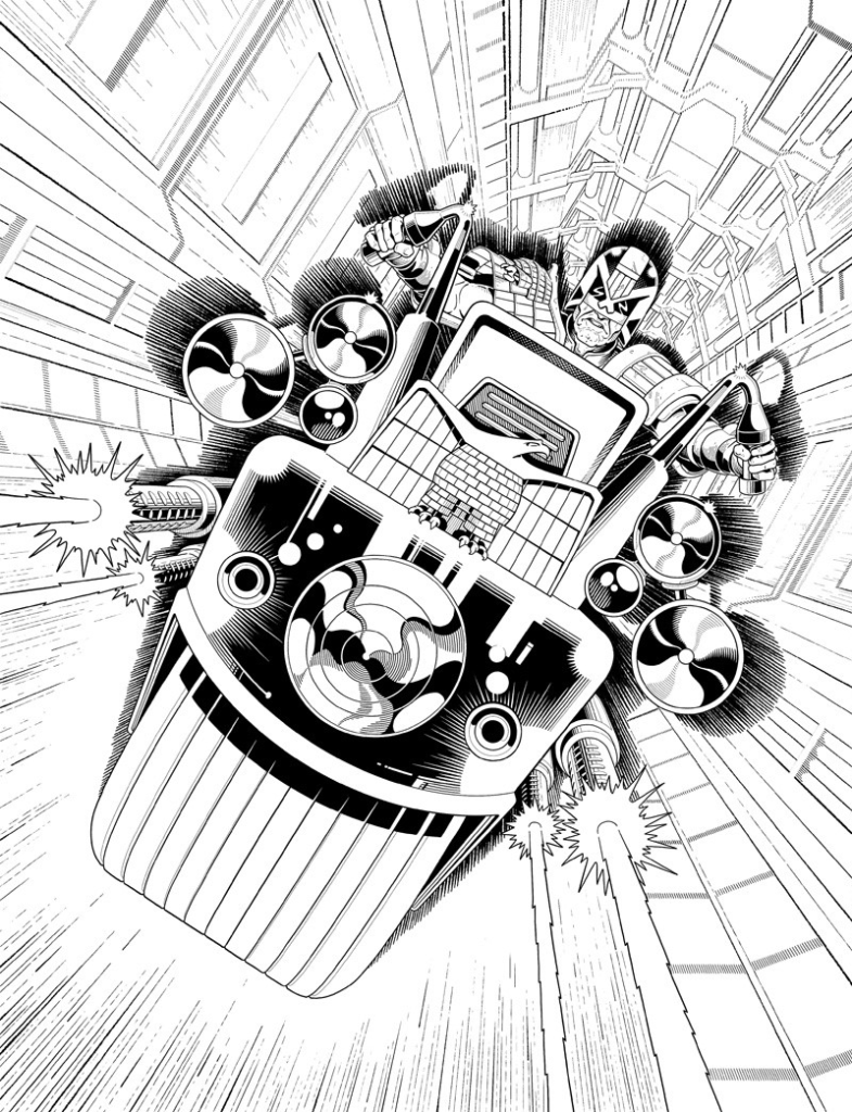
The re-design – more punchy, just as shooty
Gone was the hydroplane angle on the car (which had been inspired by the JAWS 2 movie poster) This was more an aerial shot looking down, the car launching from the water towards us like Stingray from the Gerry Anderson show of the same name.
The car I partially sourced from an image online and exaggerated the perspective on the final image, to suggest a distorted stretched wide-angle, again, to create more dynamism.
The car’s top had collapsed back into morphing tech and Sinister had seemingly hauled himself into a firing position over the windshield defeating both gravity and acceleration (it’s comics) to blow away the reader.
Not just us, but the 2000 AD logo too! What a bastard.
Backgrounds added – Sinister bursting out right at ya!
The background of the cover would be rent apart in a stylised “Kapow!” framing, as if he had blasted through the cover, overlaying the frame with the car to create that illusion of depth. Whoosh lines emphasised the speed and energy. (It’s why you have particulate matter streaking past the USS Enterprise in Star Trek; otherwise it would look like it was hardly moving. By the way: Particulate matter in space to suggest motion: Good. Shaking a camera with the so called “wake” caused by the ship in the vacuum of space: bad.)
The seafoam (actually the second most difficult thing to get right on the cover and to look suitably translucent) helped suggest a snapped freeze frame, or a moment where the car hangs before dropping back.
The most difficult thing was nailing the angle of the car. I went through several versions of just rotating the image. Even upside down How much is too much? But ultimately (and a good rule of thumb) the simplest way is the best way. So a slight tilt. Don’t overthink it. “Thinking slows you down, Logan.”
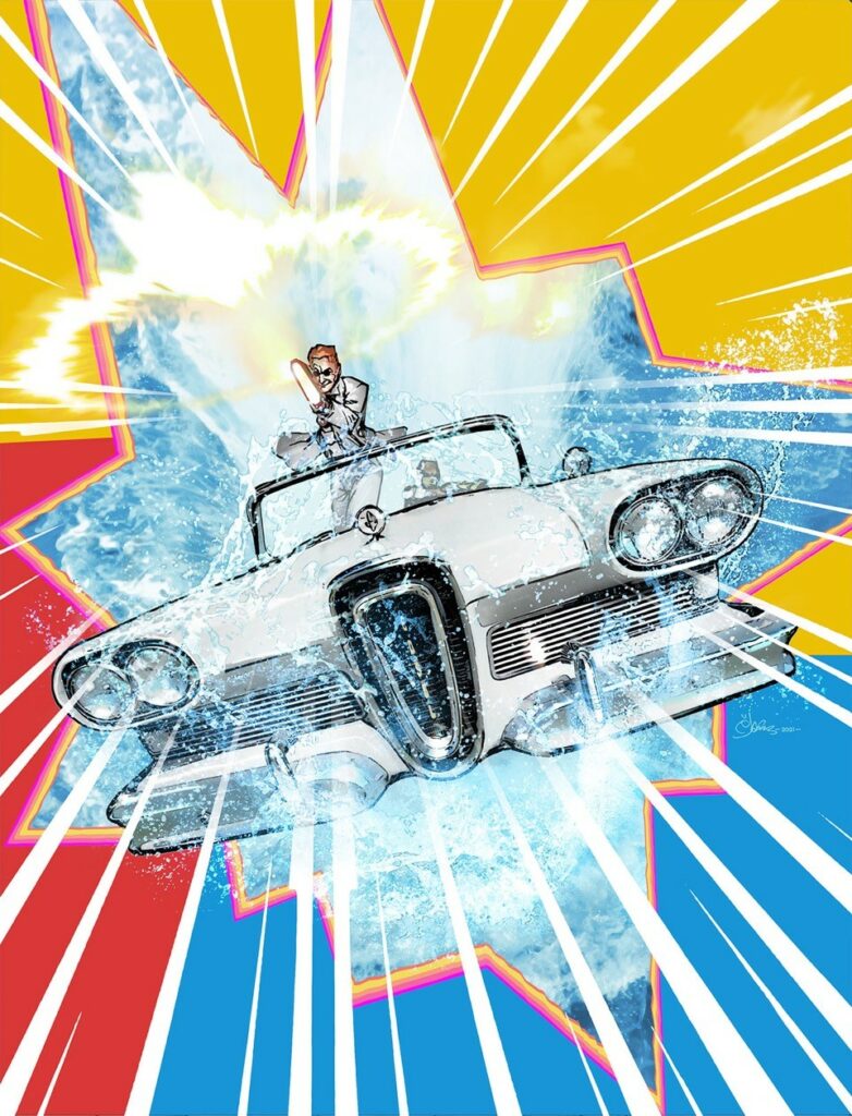
The final(ish) version – Gunshark, Edsel, BFG, all ready to blow everything, including the logo, away!
The car and Sinister shooting was the main impetus. What remained was how to finesse the image with graphical choices so I provided a couple of iterations. I think Tharg/Matt chose my fave version; the three colour background; a nod back to the classic covers of ACTION which works better with the white car. But I also like the starkness of the just white background.
There were other ideas. To overlay a texture of grainy Grindhouse film (flecks of dust, a trapped hair, film stripes) but that’s mixing the metaphors as it were, or styles. This was old school comic book, not old school film. Maybe for another cover!
And there we go – (one Finiggan + one Edsel + one BFG) x one Mark Harrison = one funting incredible cover.
You can find 2000 AD Prog 2245 on the shelves of comic shops and newsagents as well as the virtual shelves of the 2000 AD web shop from 18 August!
Every week, 2000 AD brings you the galaxy’s greatest artwork and 2000 AD Covers Uncovered takes you behind-the-scenes with the headline artists responsible for our top cover art – join bloggers Richard Bruton and Pete Wells as they uncover the greatest covers from 2000 AD!
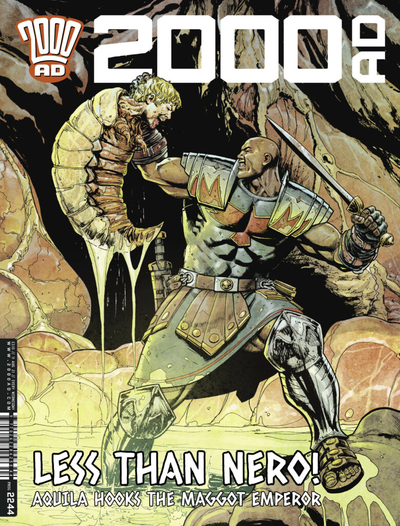
This week, it’s the return of Patrick Goddard and Dylan Teague to grace the cover of 2000 AD Prog 2244, as Aquila puts Nero to the sword…
Goddard’s on art duties on the inside as well, as the latest Aquila strip, The Rivers of Hades Part One gets to episode 7 with Aquila deep in hell looking for the whereabouts of Emperor Nero in his continuing quest to get hold of Ammit the Devourer.
So, without further ado, here’s Patrick Goddard with the lowdown on putting together the cover before sending it over to Dylan Teague to add his magical colours…
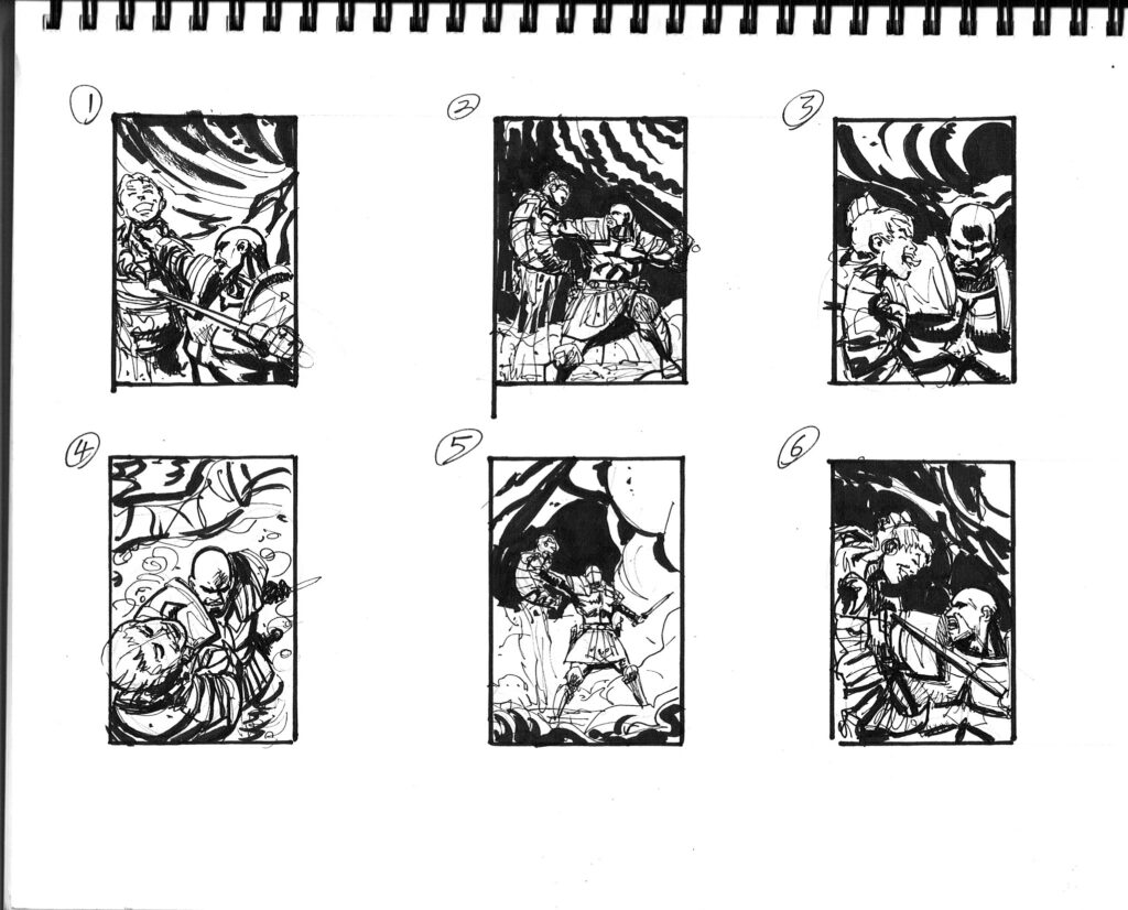
PATRICK GODDARD: It was a fairly simple brief, Aquila holding onto the slug-like Nero who seems to be showing him the kind of disdain that only he could!
Cover roughs – Aquila versus the slug Emperor
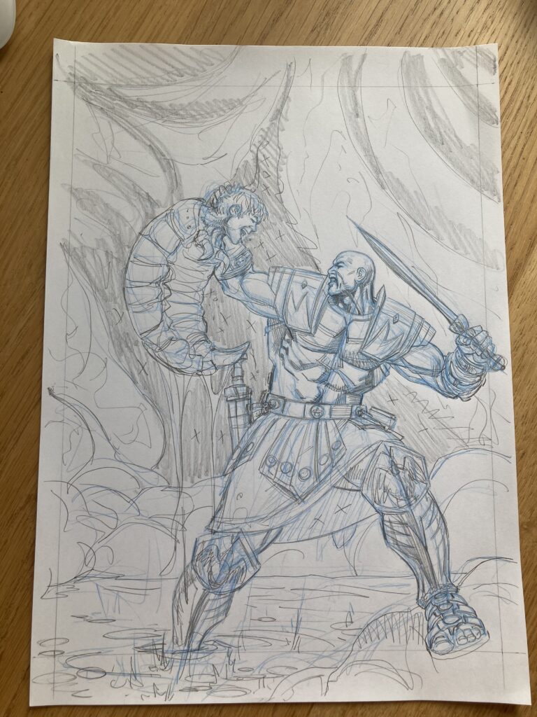
I sent off my usual 6 ideas and No.2 was chosen, I quickly drew it up at A4 and enlarged it to draw onto the artboard full size using my lightbox.
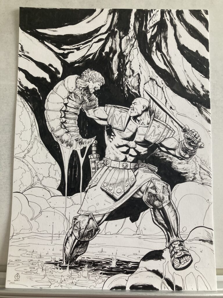
It was just a matter of inking it up and sending it off to Dylan to work his magic!
I think I got the brief Monday afternoon and I sent off the final artwork by Tuesday tea time, so pretty quick for me.
I hope that’s ok? It was a pretty simple brief so I didn’t have to stress too much about it, even Dylan found it stress free!!
And there we have it – from initial ideas through to finished image all ready to send off to the colour magician Dylan Teague to give us the final cover version!
You can catch Patrick and Dylan’s work on the cover of 2000 AD Prog 2244 from 11 August in comic shops, newsagents, and from the 2000 AD web shop.
Every week, 2000 AD brings you the galaxy’s greatest artwork and 2000 AD Covers Uncovered takes you behind-the-scenes with the headline artists responsible for our top cover art – join bloggers Richard Bruton and Pete Wells as they uncover the greatest covers from 2000 AD!
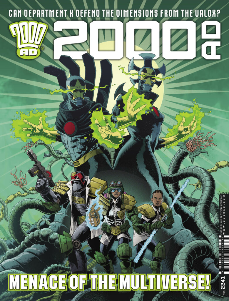
This week, it’s time to take a trip to the weird side of the Justice Department, with Dan Cornwell on the cover of 2000 AD Prog 2241 as Department K defend the dimensions from the Valox…
Since first appearing in 2000 AD RegenedProg 2196, you’ve been loving the reality preserving wonderful weirdos of Department K, whose simple (hah!) brief is to tackle interdimensional enemies that are looking to burst through into the reality of MC-1. Created by Rory McConville and PJ Holden, that first 2-parter (in Prog 2196 and RegenedProg 2233) introduced us to the wonders overseen by Judge Kirby and her team… Judge Estabon, the new intern Afua, and the ‘what the hell is he anyway?’ Judge Raspberry, as they kept MC-1 safe from all manner of cosmic beastie.
In 2000 ADProg 2234, Dan Cornwell hopped on board the thrill ride, taking over art from PJ, and joined Rory in Department K‘s first long-form adventure, Cosmic Chaos, which has involved the Dept getting very up close and personal with a load of very large, very powerful, and very cosmic entities and those who try to kill them. Which is where Dan’s incredible cover to 2000 AD Prog 2241 comes in, as we get set to meet the Valox, whose only role in life is to go around destroying the increasingly sick multiverse. I mean, a goal in life is great, for sure, but maybe not that goal?
As for Mr Dan Cornwell, well he’s one of a number of great breakthrough 2000 AD artists in the last few years, ever since he got his first big break with the art on Rok of the Reds (and its follow up, Rok the God) with a certain couple of gentlemen you may well know, going by the names of John Wagner and Alan Grant. Since then, he’s become a much in demand art droid here at the Nerve Centre, with art on Judge Dredd and Max Normal. And now we get to see his fabulous work on the cover to 2000 AD Prog 2241, out right now…
So, without further ado… Dan Cornwell to tell us how he put that little beauty together…
DAN CORNWELL: Matt asked me if I could provide a new cover for the Department K story I’ve been doing for the prog. Obviously, I jumped at the chance as it’ll be only my second cover to date.
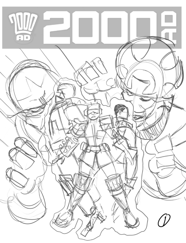
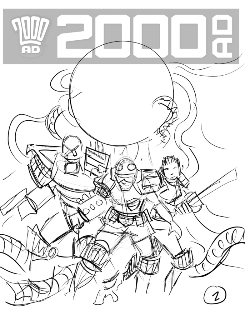
First off I had to provide some roughs for Tharg to view and chose which he felt would work best for a cover. I sent 4 simple design ideas. They were all of a similar design but each slightly different.
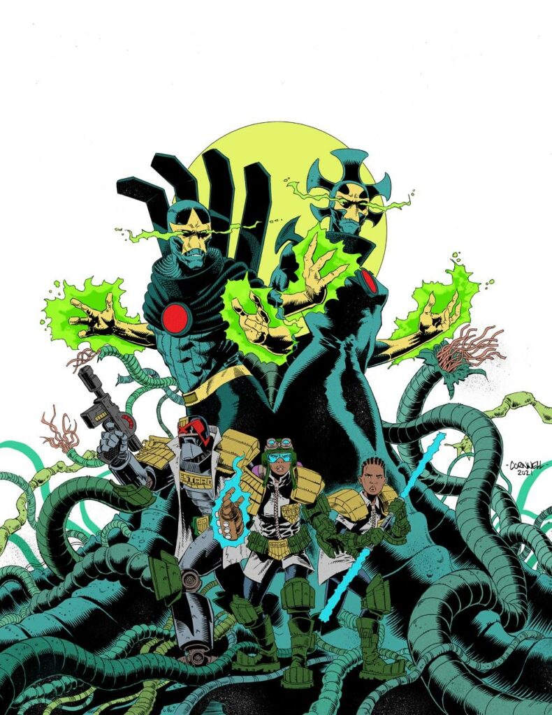
Okay… just insert your own ‘BEHIND YOU’ gag right here! Dan Cornwell’s four original pitches to Tharg for the Dept K cover.
.
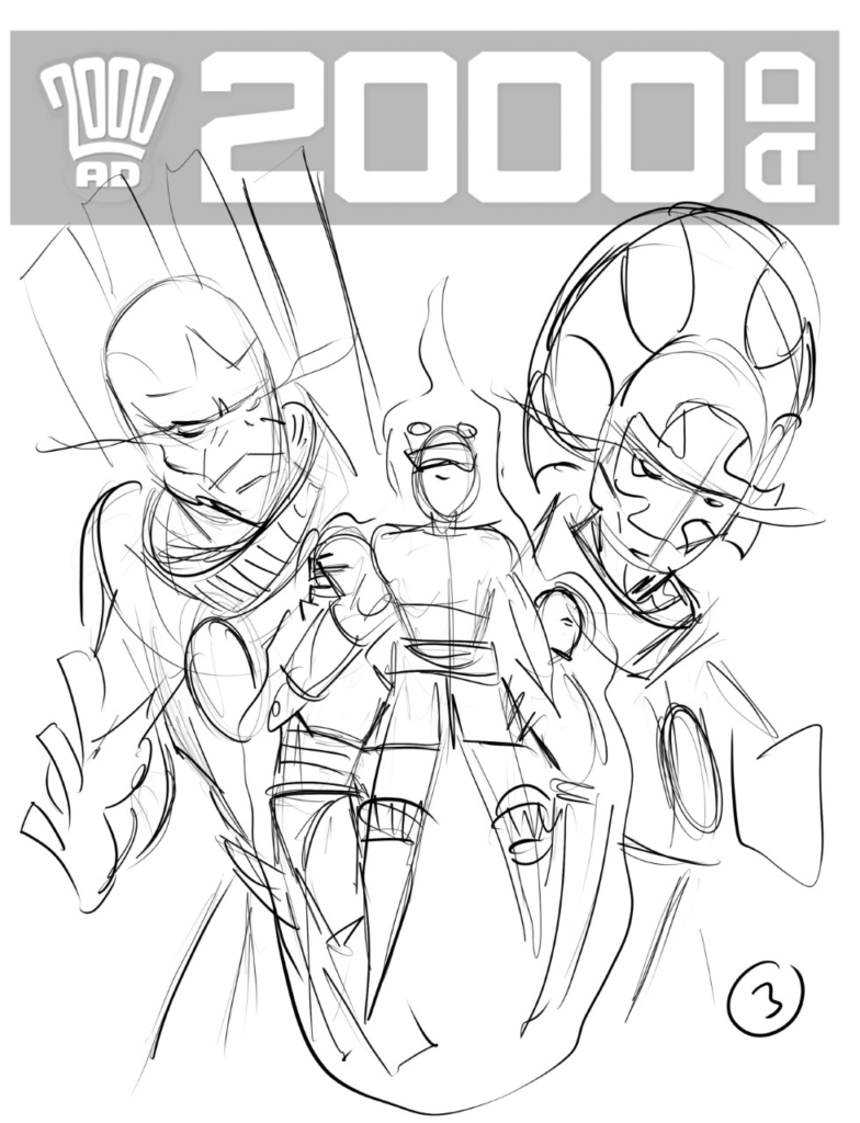
The final consensus was the fourth image worked best with the team in the foreground with the two Valox and the egg behind. It worked well compositionally and left enough room for all the masthead logos, coverline etc.
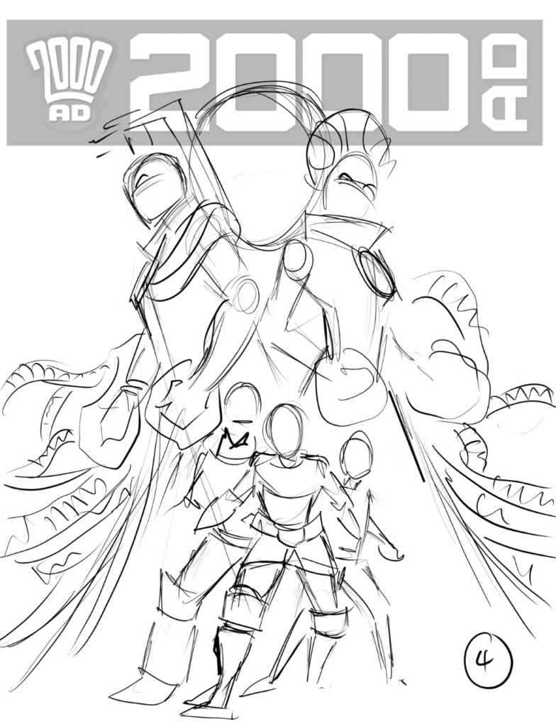
Once I was given the green light I then pencilled the final image on larger than normal stock paper. I used Strathmore 400 series Bristol. This is slightly larger – and more expensive – Tharg’s worth it though – than the normal board I use which is A3 in size. I also normally use extra smooth heavy stock cartridge paper but I pushed the boat out for this one. (And it needed using up at some point)
Unfortunately, I forgot to scan the pencil stage as I got too keen and just went straight into inking.
Onto inking – tentacles, tentacles, tentacles, and more tentacles.
.
The inks were then scanned, cleaned up, some splatter and texture added here and there and then sized up.
Next up I added colours. Starting with the flats. The colour scheme I had envisaged was quite a bold one with a bright red background, but I left the final decision for later on in the process.
Onto adding the flats for the cover – and no, they still haven’t noticed what’s behind them.
At this point, I didn’t have any idea as to what colours Len O’Grady was using on the Valox or the egg as he was in the process of colouring the pages himself. This is when the colour scheme changed.
Apocalypse Wow… adding in a hell of a lot of red!
.
I decided that I would go for a limited palette. Remove the red background and go for a more uniform colour all over. As the image progressed I gravitated towards a green theme. (I sound like Simon Bisley from that late 80’s Green Man documentary)
Meaner, moodier… giving it the green
.
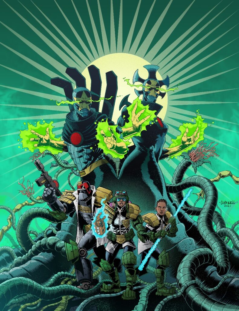
I added texture to the background then I decided to add a design element to the light coming from the egg. Once I was content with how it was going I then added all the extra stuff such as mist, dust and scratches and some colour holds to push the Valox back a bit making the team pop a little more. Then I stopped because I could have gone on and on and on… You have to know when to stop.
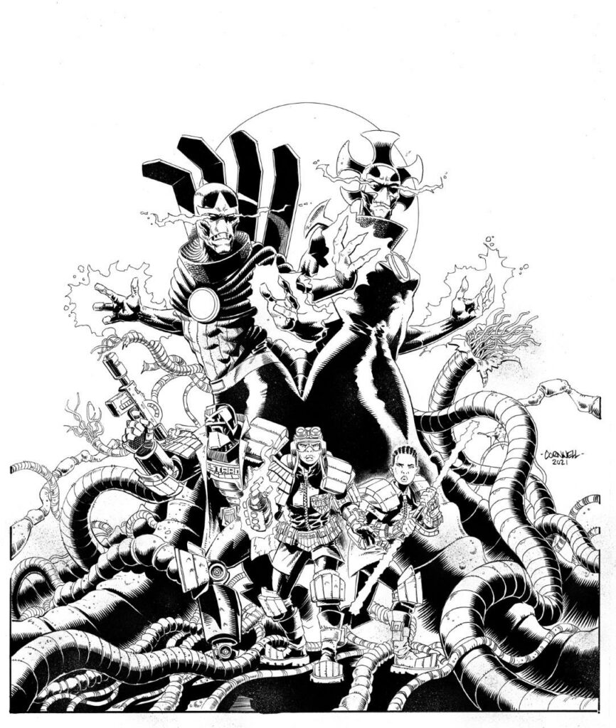
Until finally, there’s the finished cover!
And stop he did, but only before giving us a really great cover to match a really great series. Thanks so much to Dan Cornwell for sharing that with us. You can catch 2000 AD Prog 2241 everywhere the Galaxy’s Greatest comic is sold right now!
And for more on Department K, be sure to look up these interviews with the creative teams, first this one on Prog 2196 with Rory McConville and PJ Holden, and then a triple-header of Department K chat with McConville, Holden, and new boy Dan Cornwell.
Every week, 2000 AD brings you the galaxy’s greatest artwork and 2000 AD Covers Uncovered takes you behind-the-scenes with the headline artists responsible for our top cover art – join bloggers Richard Bruton and Pete Wells as they uncover the greatest covers from 2000 AD!
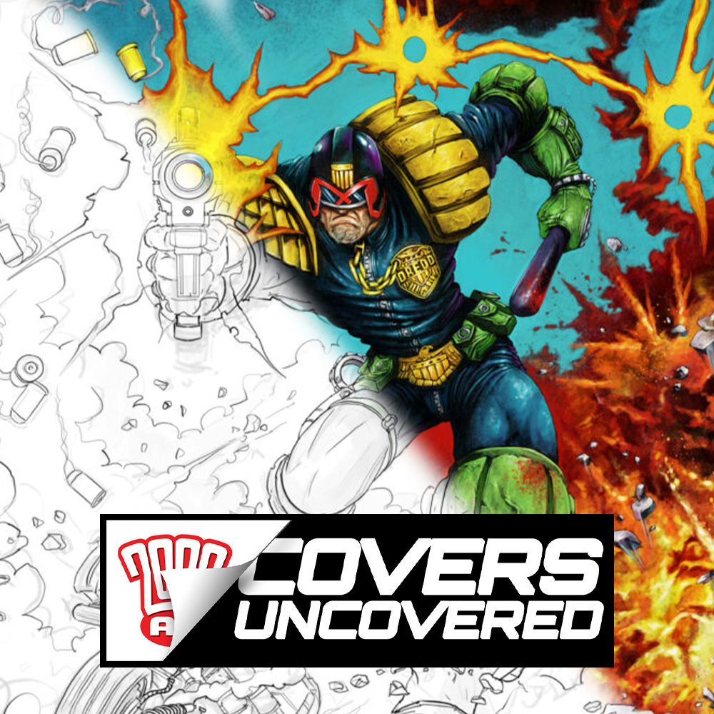
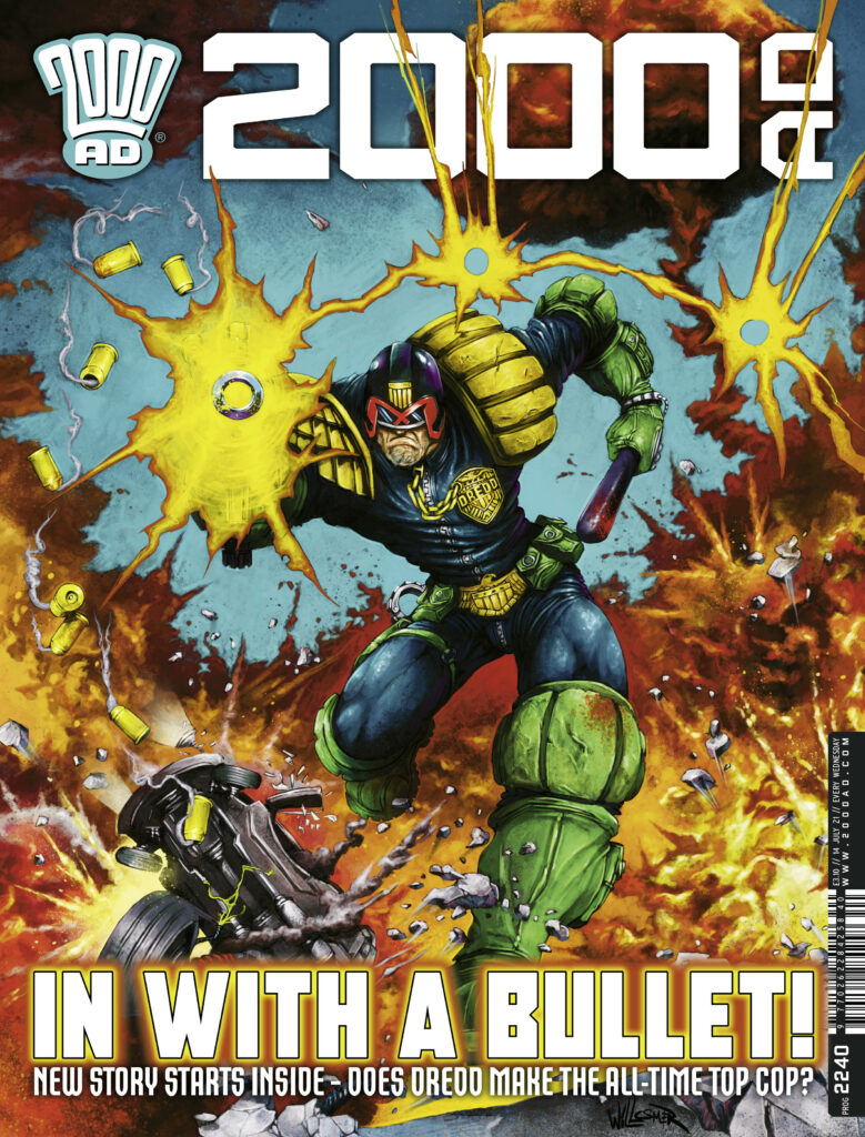
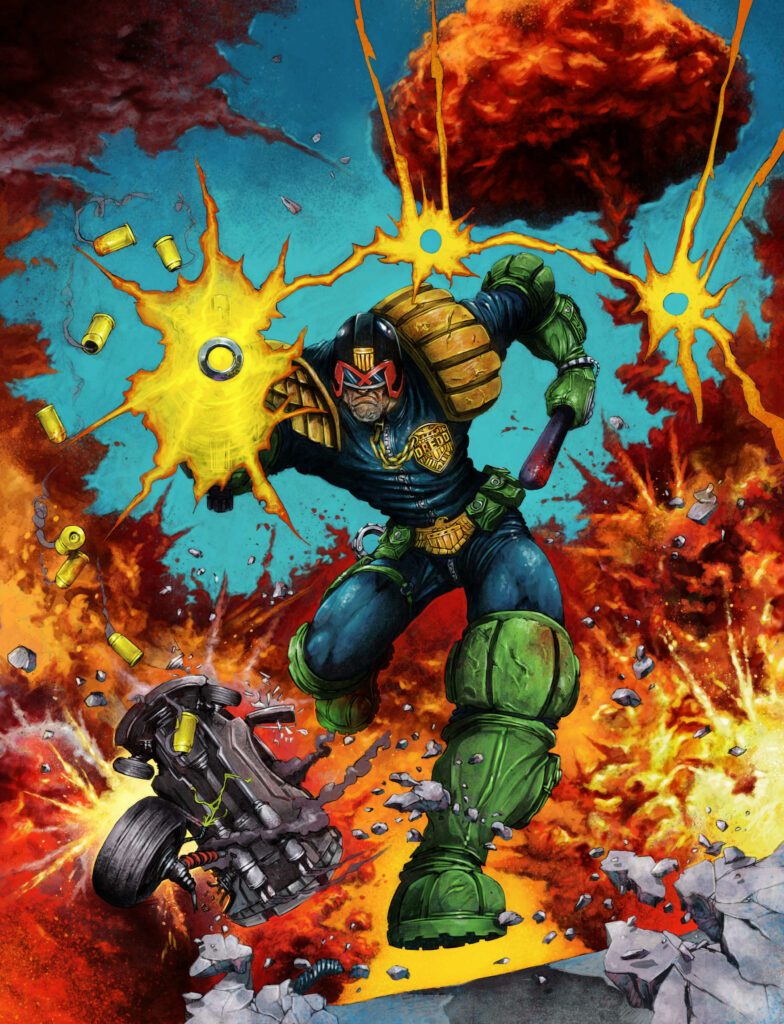
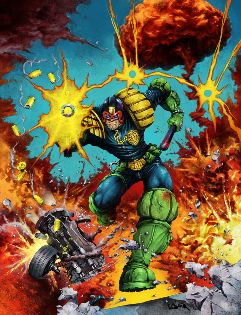
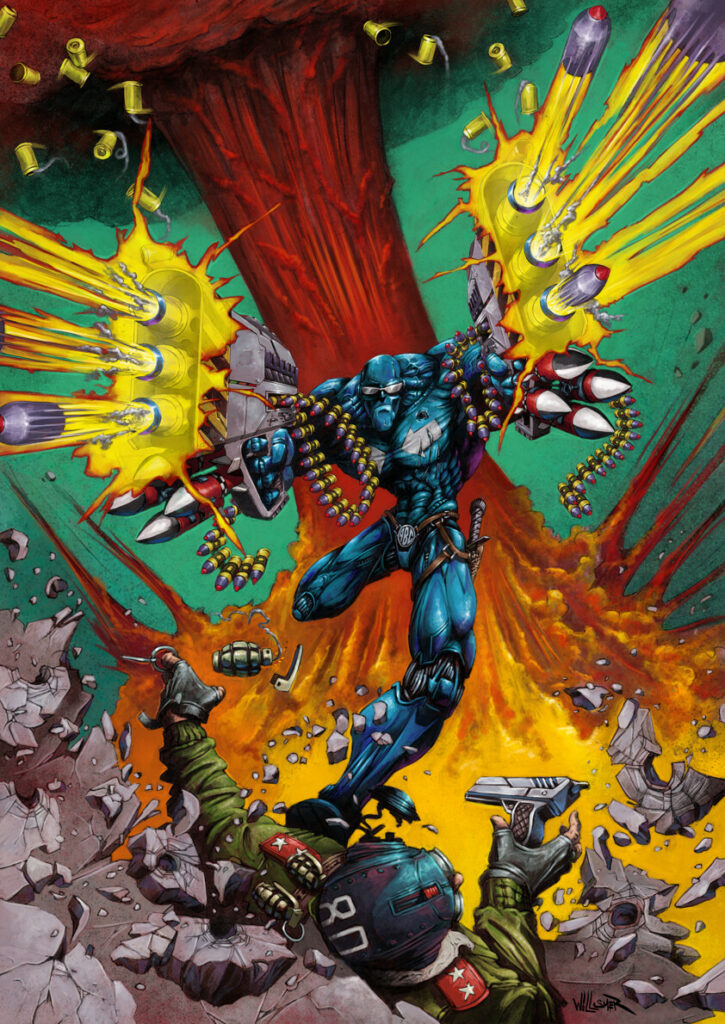
This week, the debut of a brand-new art droid… Toby Willsmer on the cover of 2000 AD Prog 2240 giving us his bullet-ridden look at Dredd in action…
Toby is an illustrator based down in New Zealand, but he was a child of Britain in the ’70s and 2000 AD runs in his comics blood. He was the winner of the January 2000 ADArt Stars contest, with a great looking Sam Slade Robo-Hunter, which led to this, his very first work here at 2000 AD… and a rather fine debut it is as well!
You can get hold of 2000 AD Prog 2240 from the 2000 AD web shop, as well as all good newsagents and comic shops, from 14 July.
TOBY WILLSMER:I’d shown Matt a piece I had done with explosions and a character shooting face on and he asked me if I would like to do a 2000 AD Dredd cover with a similar dynamic. As my first 2000 AD cover the answer was a yes from me!
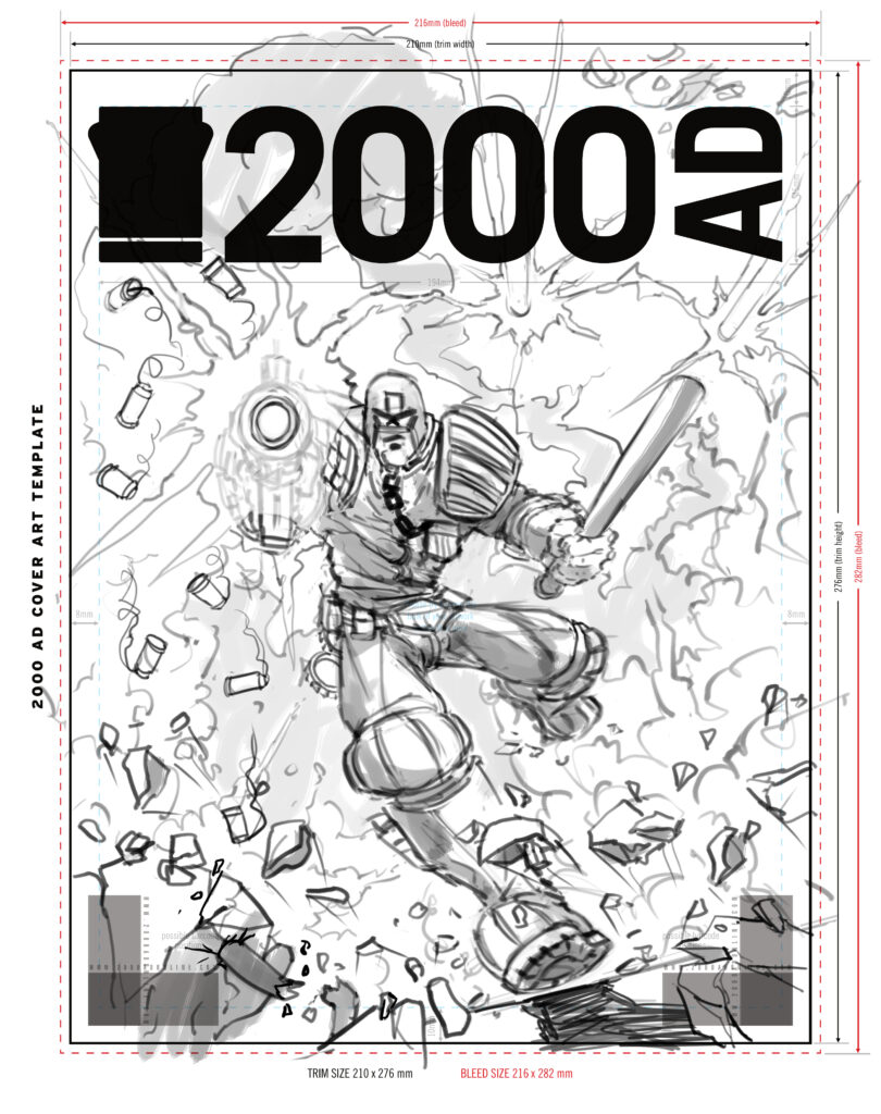
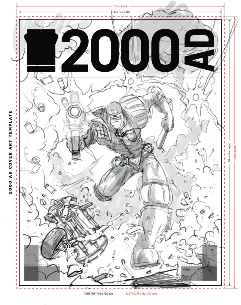
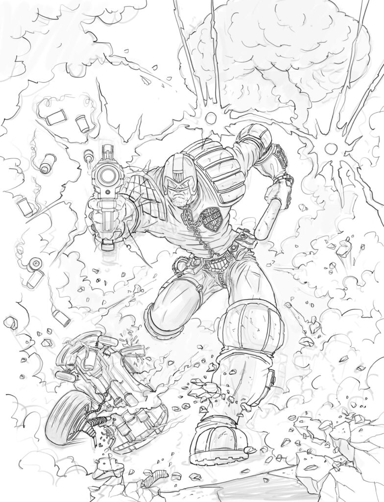
Matt’s brief was “Dredd racing towards us, guns blazing, big explosions in the background, etc”. After a quick back ‘n’ forth regarding the background scene I started to come up with an image in my head of how it would look and scribbled some really quick ideas to make into roughs. I came up with a couple of roughs (above and below) for Matt to look at and he liked the dynamic of the second rough and gave me the go-ahead to work it up.
I went ahead and did the linework for approval, leaving the background lines as just guidelines and explained that I would define and detail the explosions as I painted them.
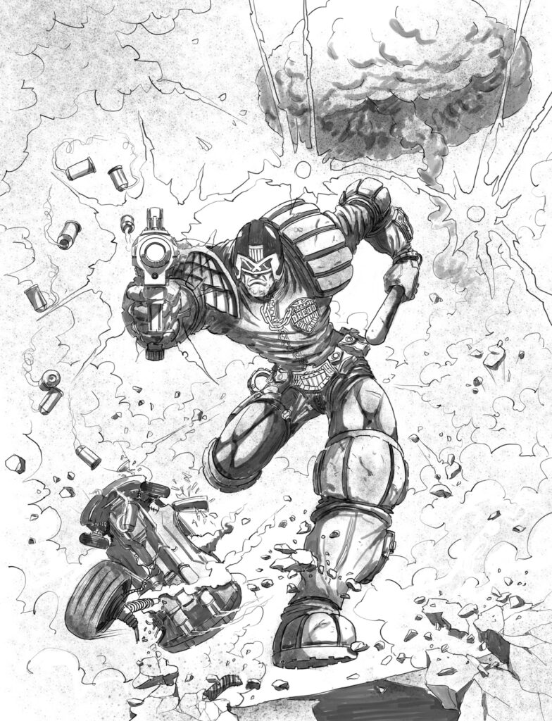
From here I added where I want the light source and shadows.
Next… add some base colour for the overall piece.
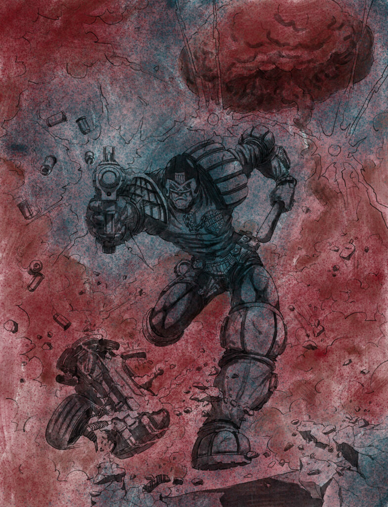
I start by adding thin colour to the foreground parts building up colour depth as I go along.
Once I’m ok with the initial colour stage I’ll start to add some basic background colours to make sure the foreground and background colours work together.
As the background was to be all explosions I blocked in large parts with rough colours knowing they would be mostly painted over in the next process as I start to add debris and movement into it.
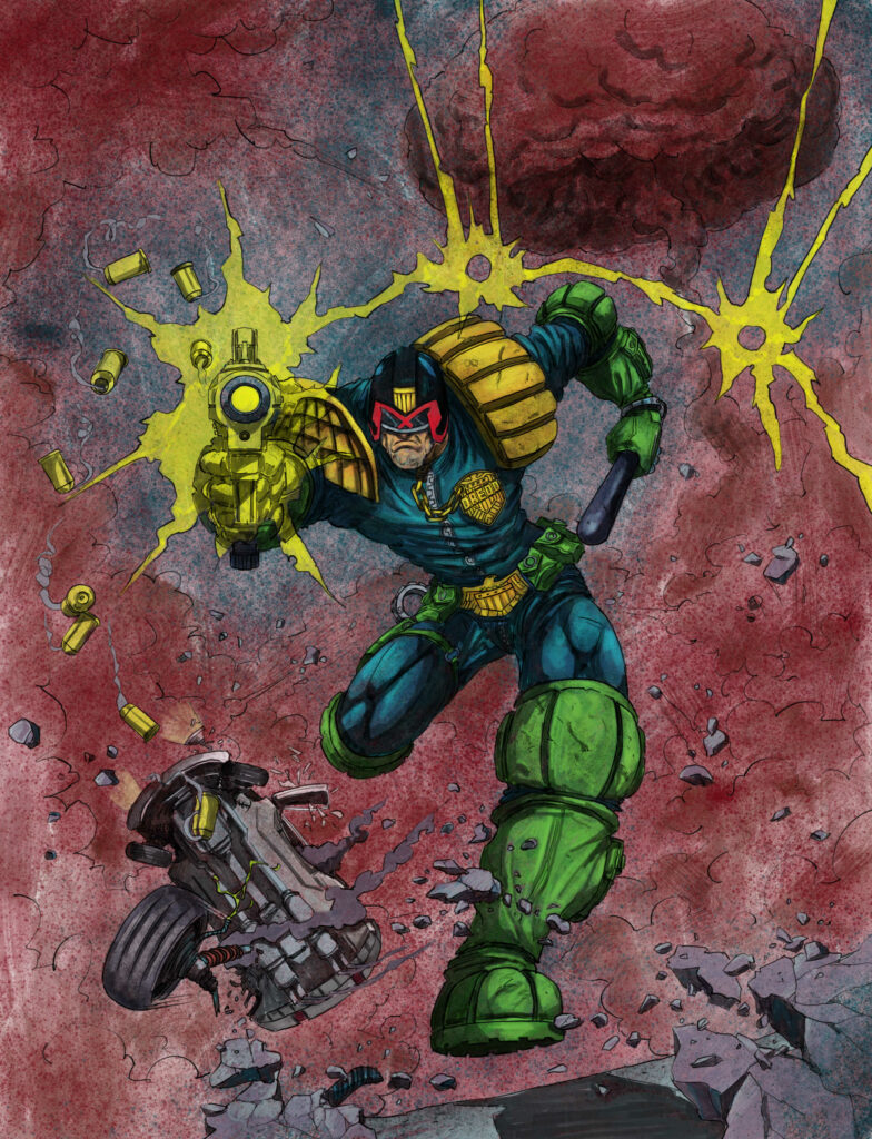
Here’s the fun bit, blow stuff up and throw stuff in the air. Adding as much depth and movement to the explosions as possible.
At this stage I decided to add Dredd’s boot to his trailing leg.
I sent the tweak over for approval and it was left in for the final piece.
By now I’m happy with how it’s all coming together and I’ll add all the details and bells and whistles to the overall piece until it’s done.
Then send the finished piece off to Matt and await his feedback.
Now that is a damn good Dredd cover, a classic debut! Thanks to Toby for sending all his process along for us all to see.
If you want to see more from Toby, head to his website, his Artstation site, and catch him on Instagram.