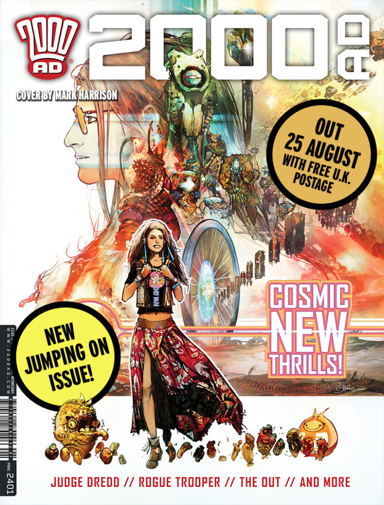
2000 AD Covers Uncovered: Leaping Beyond Logic with Mark Harrison for Prog 2401
26th September 2024
Every week, 2000 AD brings you the galaxy’s greatest artwork and 2000 AD Covers Uncovered takes you behind-the-scenes with the headline artists responsible for our top cover art – join bloggers Richard Bruton and Pete Wells as they uncover the greatest covers from 2000 AD!
Just as you think you might have recovered from the Thrill Power of the mega-multiversal crossover Nordland Rising in 2000 AD Prog 2400 & Judge Dredd Megazine, it’s time for Tharg to overload everyone’s thrill-circuits with Prog 2401, a new jumping-on Prog, including Book Four of Dan Abnett and Mark Harrison’s magnificently spectacular sci-fi space opera The OUT.
And speaking of Mark Harrison… that’s him behind the cover for this week…
.
It’s always a pleasure to get Mark talking about art. We’ve gone from the stage of actually talking about how he puts together the actual cover to far more abstract things, like where the ideas behind the cover and The Out in general come from – it’s always absolutely fascinating. And this one’s no different.
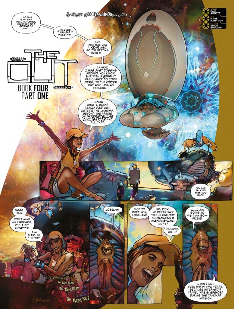
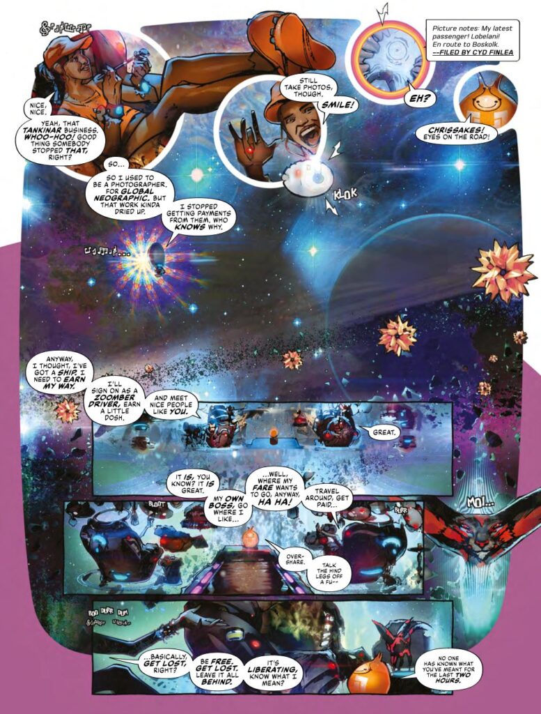
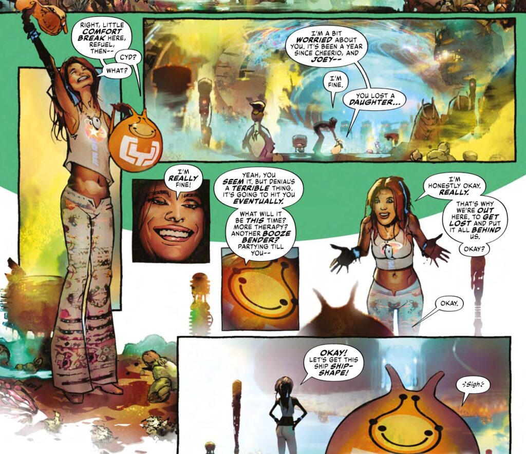
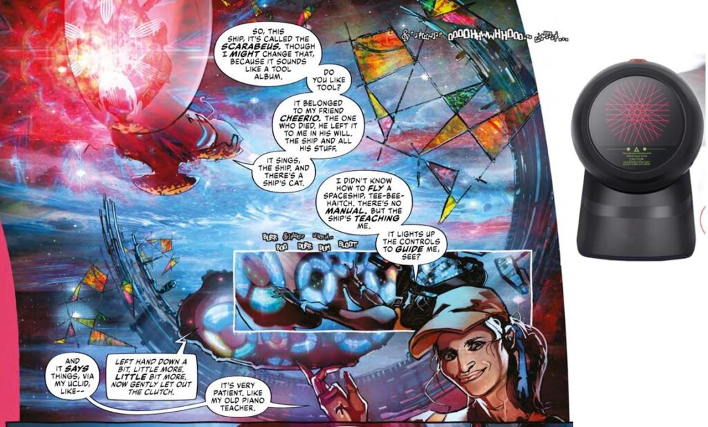
As for The Out Book Four, well, it’s back on the road with photojournalist (and now Zoomber driver) Cyd, travelling the furthest edges of the universe. In three books of The Out, she’s been so far and seen so much, cataloguing her encounters with all the alien societies and wondrous sights she encounters. But, having lost Cheerio, the nearest thing to a friend she’s ever had out here, and having said goodbye to her daughter Joey, it’s time for Cyd to go even further…
In fact, just as a treat, let’s hold off chatting to Mark for a mo’ and give you the first two pages of episode one of The Out Book Four as a particular treat and to show you what it’s all about and just how gorgeous it looks…
.
Yes, The Out is everything you could want from sci-fi – expansive, amazing, epic, whilst also focusing on the very deeply personal. It’s quite simply incredible. And of course, so much of this comes from the art of Harrison, doing so much on every single page, creating incredible beauty in the massive alien vistas he’s creating every single episode.
So, enough intro – let’s head over to talk to Mark about this latest cover, the return of The Out, ideas, sci-fi, film posters, sculpture, influences, the horror of ‘average’, and so much more… down the rabbit hole we go…
.
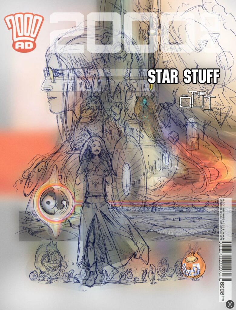
MARK HARRISON: It’ll be “interesting” to see what I recall on this one as the whole period has been a bit of a blur. In fact, I may be repeating myself here from other covers uncovered so take note!
Just finished book #4 of The OUT! Roll on Book 5!
Looking back on it it’s been quite the ride. More alien than alien weirdness where “humanoid” is definitely in the minority, with added intrigue, unpleasantness, loss, disconnection, shock, shock and awe… 40 Light years of bad space road.
And 16 months ago (probably more), I had a cover to do where none of this future story existed… but I had to allude to it somehow in another ‘film poster” inspired cover.
My inspiration for its layout came from the compositional brilliance of Bob Peak and his film posters of the 70’s. Great stuff worth hanging on your wall!
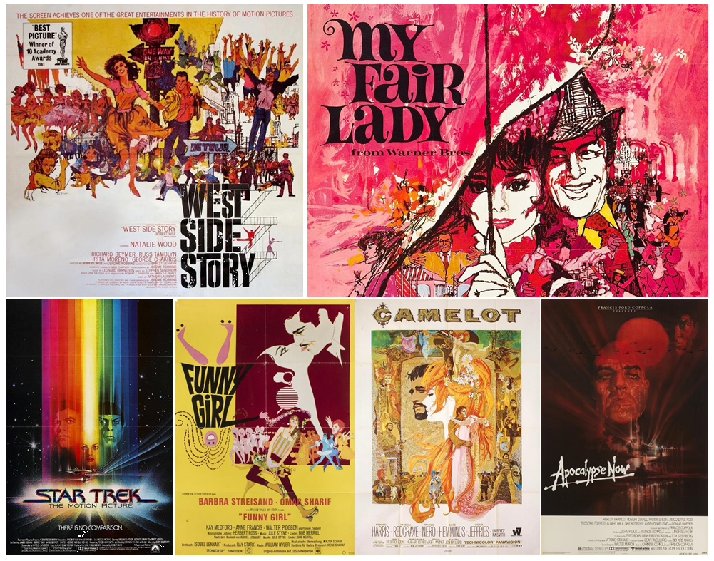
MARK HARRISON: It was to sell the reader a “promised future”, taking from the Roger Corman school of hyperbolic delights within, and hopefully delivering on some of that promise. [No money back – no refunds.]
So, looking back at it… what was I trying to do here? Well, suggest high concept and epicness! There are some “spoilers” on that cover but without context hopefully meaningless.
There is also a red herring or two (not literally but hmmm… note to self: Red Herring race, time wasters. Totally left alone because they are meaningless and an unnecessary distraction in the lives of other races.)
.
MARK HARRISON: The cover was based on the synopsis, which would be the broad strokes of the story, which is how Dan and I work on The Out. We kind of know where we’re going but how we get there is anyone’s guess.
It’s a “join the dots” approach, (the dots being ideas) describing a shape of story (as Tharg had to sign off on it) that allowed for a bit of colouring outside of the edges.
(A great process by the way- thoroughly recommend it for a super collaborative investment of artist and writer.)
.
MARK HARRISON: Such a process, fun as it is, does unfortunately jettison around 60% of the ideas I throw at Dan that don’t make it into the story (but they may get recycled in a later book).
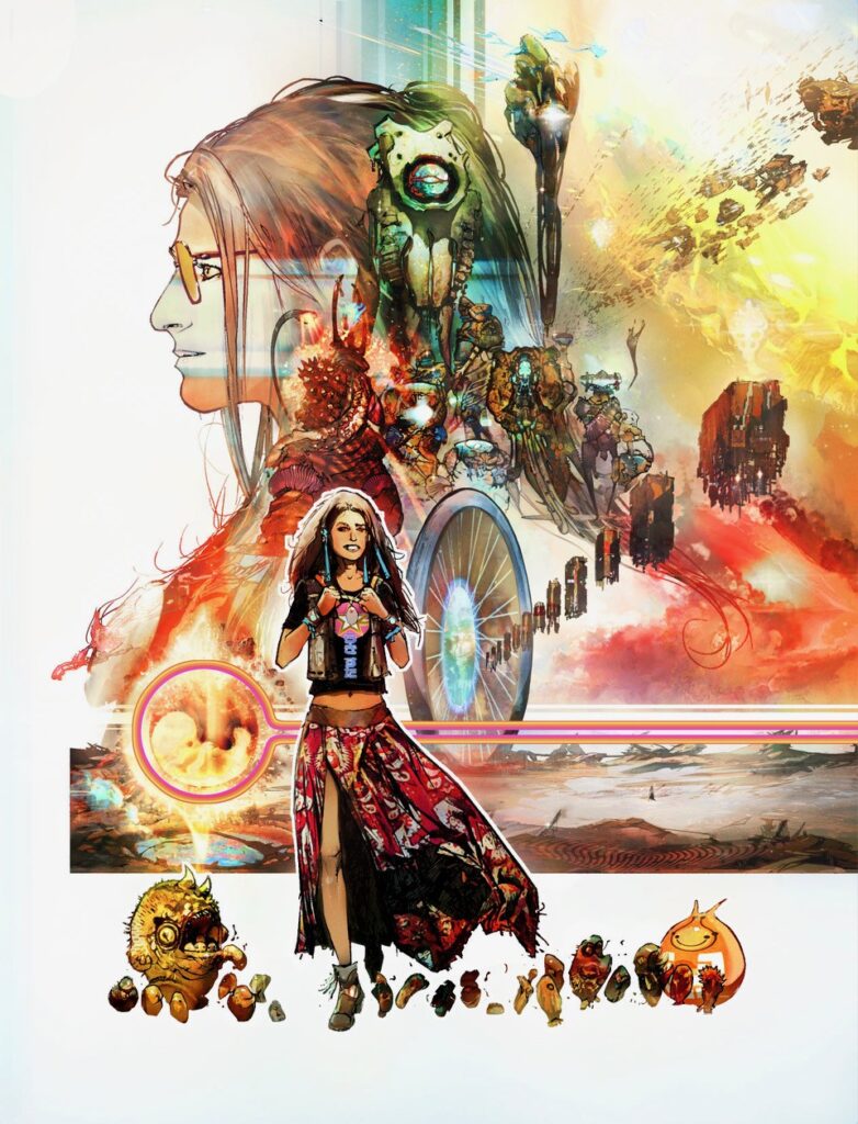
An example of that would be the significant ‘sci-fi’ image on this cover, namely the portal and how it went from fleshed-out idea, with script mechanics and otherworldliness, to ending up as mere background in the final strip.
Because of that I can talk about without spoiling the story, but you’ll see some things aren’t arbitrarily drawn, they had a purpose in a draft that was never realised.
It’s weird, because looking at this cover again, I could, like the reader, hypothesise what story could be behind the images.
Which, ironically, was the inspiration for The OUT; looking at old science fiction novel covers and coming up with our own ideas inspired by them.
The original idea was this planet was it was a junction planet, an in-between planet, a sort of airport baggage handling world. Perhaps a better analogy would be a warehouse world transporting goods via high‑floating trolleys that carried the goods thru stargates dotted over the planet – Stargates with laser barcode readers.
.
MARK HARRISON: The planet’s economy crashed or there was a catastrophe (isn’t there always?) leaving the Amazon World literally suspended in time. Over time (millennia) those monolithic trolleys of goods hanging in space (much how trolleys don’t) began to disintegrate and shed their loads to earth, creating oases in what was now a desert world, the planet nothing more than dust, bones and ruins.
Cyd would traipse across this landscape from oasis to oasis, encountering alien diversity and adversity in these areas supporting the only life.
But then we had another idea, a better idea – so that was all junked!
Maybe one day we’ll be able to see some alternative versions of The Out and you’ll get to do it finally? After all, that Abnett bloke seems to have a good enough imagination to do something with it?
MARK HARRISON: Just the background imagery and the cover remains, but hey, reading the story when you come to that bit you can go: “I know what’s going on in that background!” Additional bonus content.
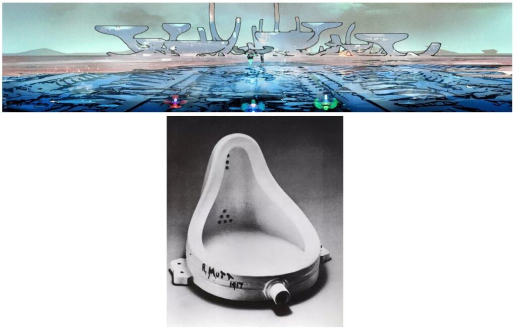
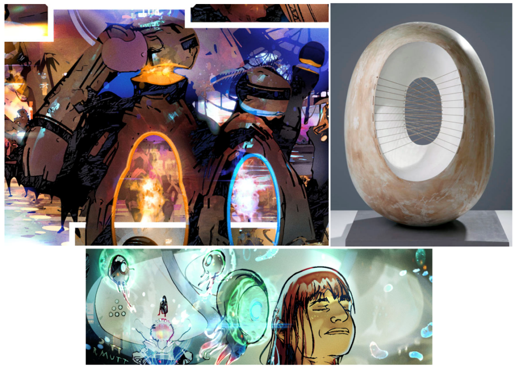
The oval portal was inspired (as has much of The OUT’s design) from modern art and sculpture, in this case the work of Barbara Hepworth. It came from my desire to be mischievous repurposing Modern Art.
One of the constants of every episode of the The Out has always been the inclusion of some reference modern art/ sculpture (which I think in particular lends itself to science fiction).
Yes, indeed it does – and Mark was good enough to play show and tell with us, highlighting the various ways he’s referenced so much art and sculpture through the series so far, starting with the Barbara Hepworth references…
.
MARK HARRISON: I might not be alone in this source of inspiration. I was struck walking around the Barbara Hepworth garden and museum in St Ives, Cornwall by a sense of deja vu. Something was familiar about these sculptures. The holes in ovals, the donuts and obelisks. It was like bits of an old Star Trek set.
I double checked the art magazines publishing her work in the early 1960’s (displayed in the museum) and it’s not a stretch to think Star Trek designer Matt Jefferies might possibly have had some of Hepworth’s work up on mood boards as inspiration. (Mood boards; a collage of other peoples work designed to springboard the imagination. Often concept artists would draw from the art around them at the time to “wet the canvas” at the start of a brainstorming process.)
I recommend all Star Trek fans to check out her stuff/ visit St Ives. Could this be a portal to another time and place? It won’t be the last time I pilfer from Hepworth’s work. Everyone stands on the shoulders of giants. Not getting caught is the trick.
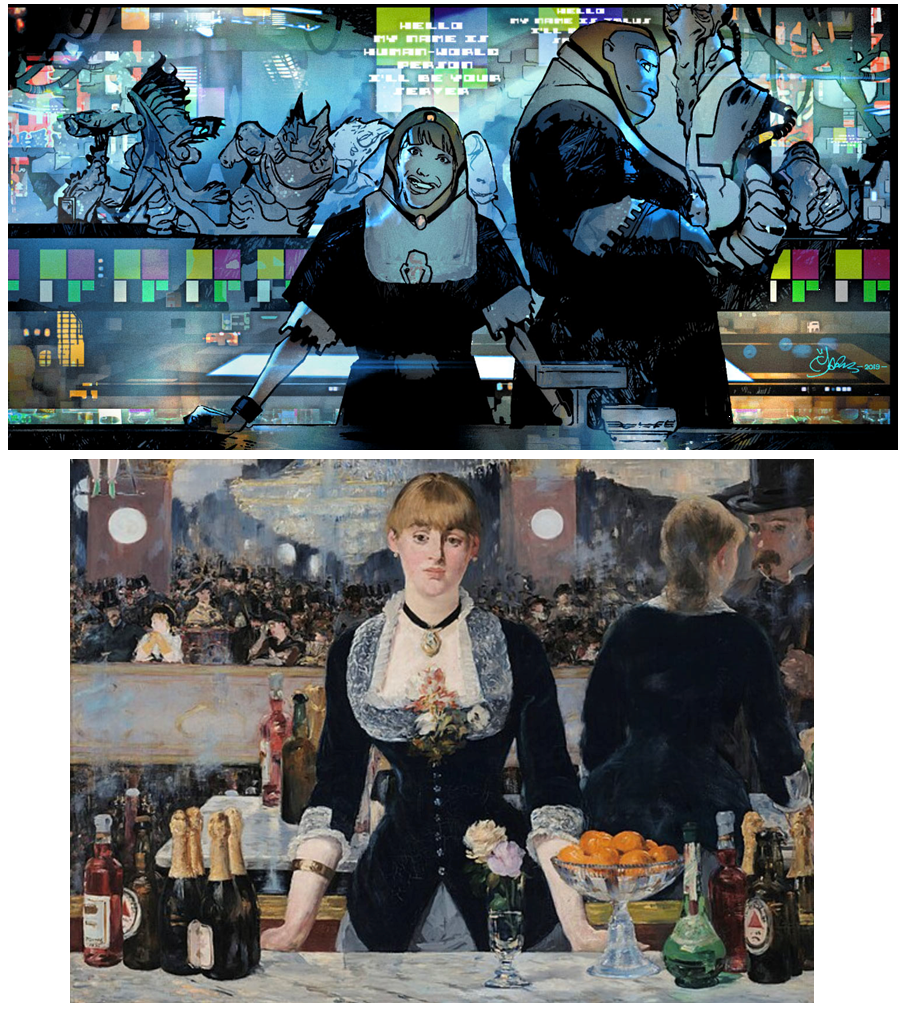
Well, yes, unless you point it out to us! … here’s another one – A Bar at the Folies-Bergère by Édouard Manet
.
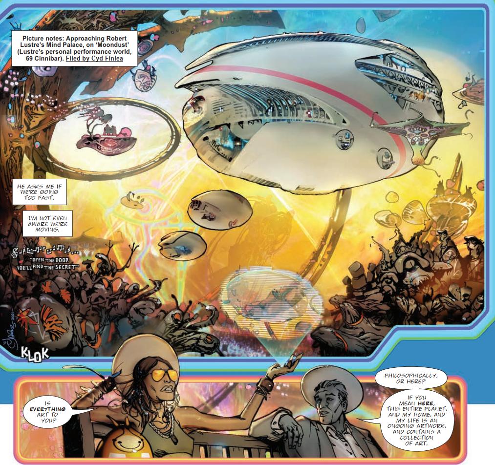
MARK HARRISON: In The Out Book 2, I pasted a series of quotes from artists in Lustra’s ‘Mind palace’ – that was a spaceship ‘thought balloon’ which I thought was quite cool… what ever happened to thought balloons in comics by the way?
In case you’re wondering… this was Mark’s ‘thought balloon’ spaceship – very cool indeed…
.
MARK HARRISON: One quote I think attributed to Picasso in the mind palace of that episode was: ‘Good Artists copy. Great Artists steal.’
And artists like myself use Google search.
It’s a useful leftfield way of thinking/realising the fantastic – something that that image generation A.I. is currently lagging far behind in. Ask for a spaceship and A.I. apps will probably data scrape all available images of spaceships on the internet, and even with additional prompts it’s going to be an approximation. An average! (Gawd, let’s hope A.I. doesn’t take over comics and we are conditioned to accept ‘an average’.)
A.I. is still logical and, to quote Capt James T. Kirk, machine learning needs “The ability to leap beyond logic” for a truly imaginative creation and the blending of disparate images. See a street lamp. See a spaceship. See Boba Fett’s Slave One born courtesy of Joe Johnson and some leftfield thinking.
Thanks to my art history teachers. It sunk in eventually.
.
So there you go, didn’t I promise you this would be just the sort of deep dive into art and artistry and so much more? Oh, Mark, you never let us down here at Covers Uncovered!
You will obviously be rushing down to wherever Thrill Power is sold to pick up 2000 AD Prog 2401, including the 2000 AD webshop.
And, seeing as The Out is one of the best things to come out of 2000 AD in the last couple of decades or more, we’d hate for you to miss out on it! So, if you did manage to pass it by first time round, be sure to pick up the first collection of The Out, containing Books One and Two of the series and available right here at the 2000 AD web shop.
And of course, there’s a lot more of Mark’s always enthralling explanations of making art and The Out in previous Covers Uncovered – Prog 2187, Prog 2193, Prog 2251, Prog 2254, Prog 2261, Prog 2314, and Prog 2333. And be sure to go back and read the interview with Dan Abnett and Mark Harrison all about The OUT right here.
.
Now, because Mark sent them along and we couldn’t fit them in – more of those modern art/sculpture references he’s brought into The Out…
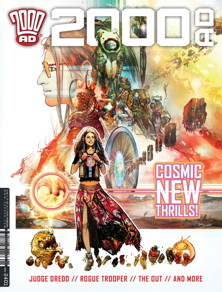
Francis Bacon – Study For Three Heads…
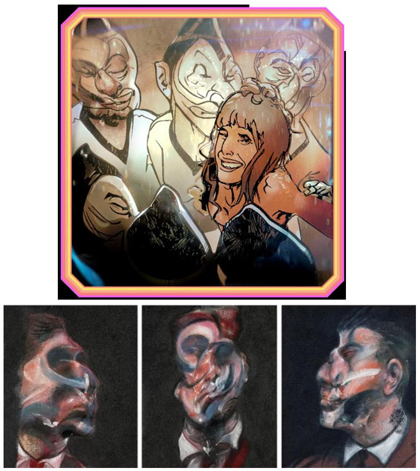
Arnold Böcklin – Isle of the Dead…
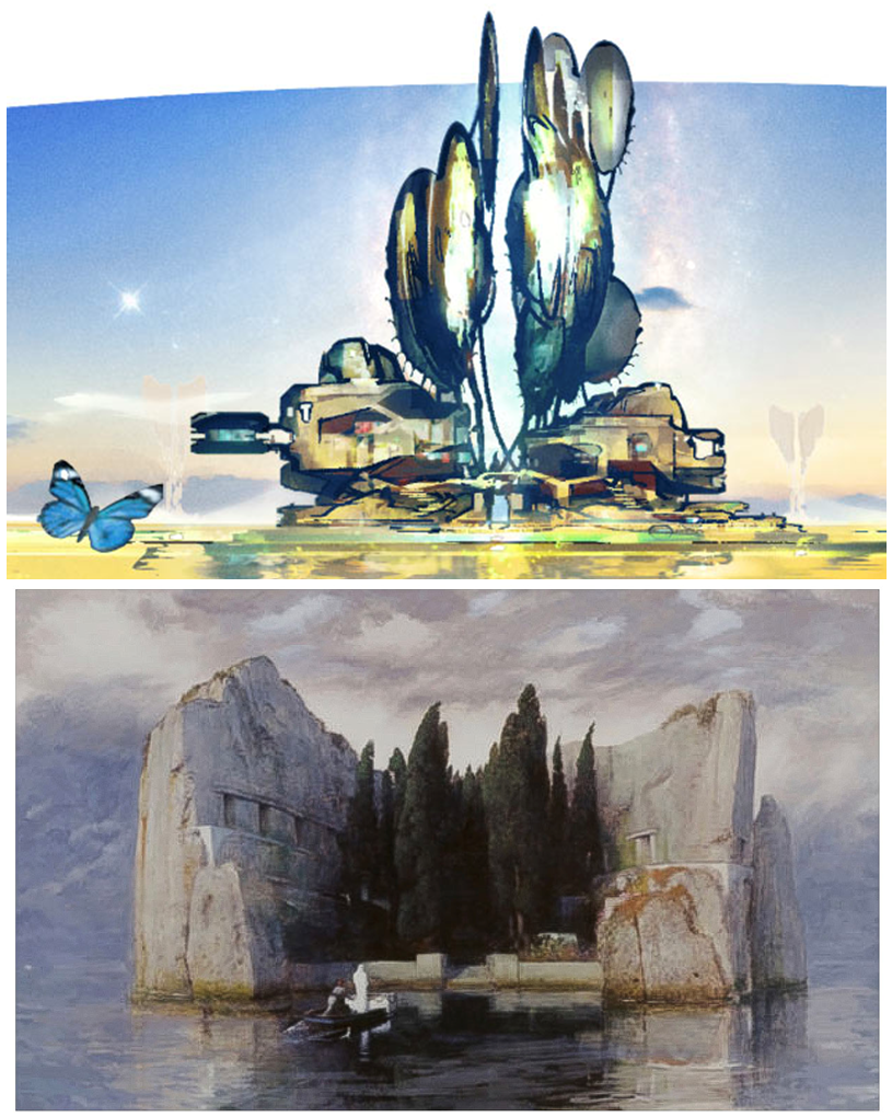
Antony Gormley’s Angel Of The North and The Out’s Tankinar War Fleet…
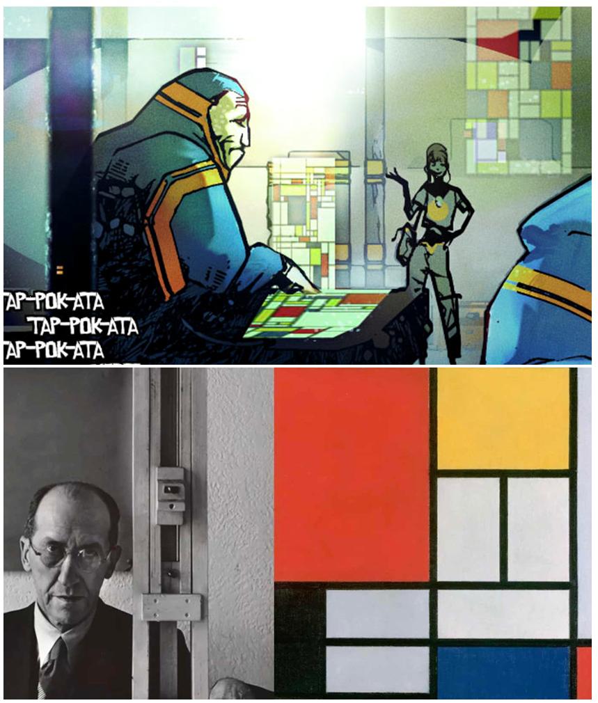
Piet Mondrian’s famous work repurposed for alien tech…
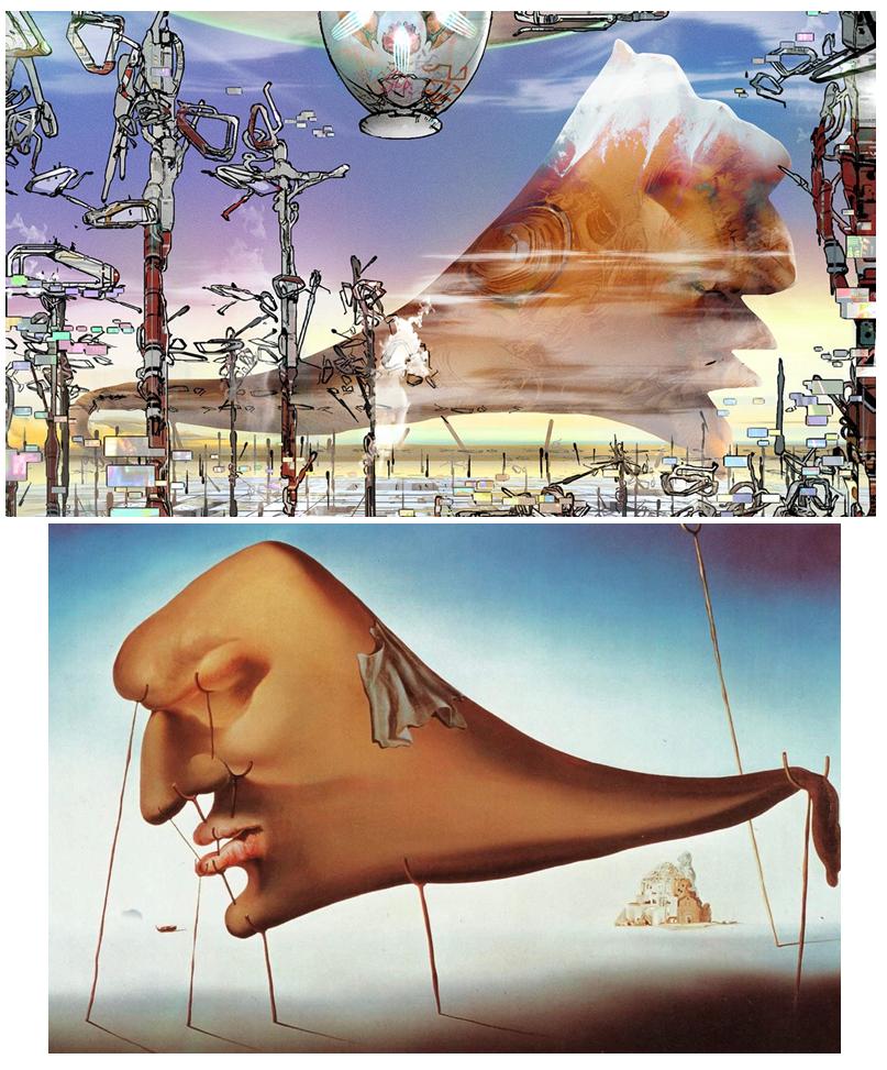
Salvador Dali – Le Sommeil (Sleep)…
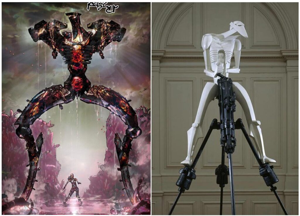
Jacob Epstein – Rock Drill and the Tankinar from The Out…
And finally, this one, possibly my favourite of them all – Marcel Duchamp’s Fountain, better known as the urinal of course, and Mark’s unique repurposing of it as Urinal City…