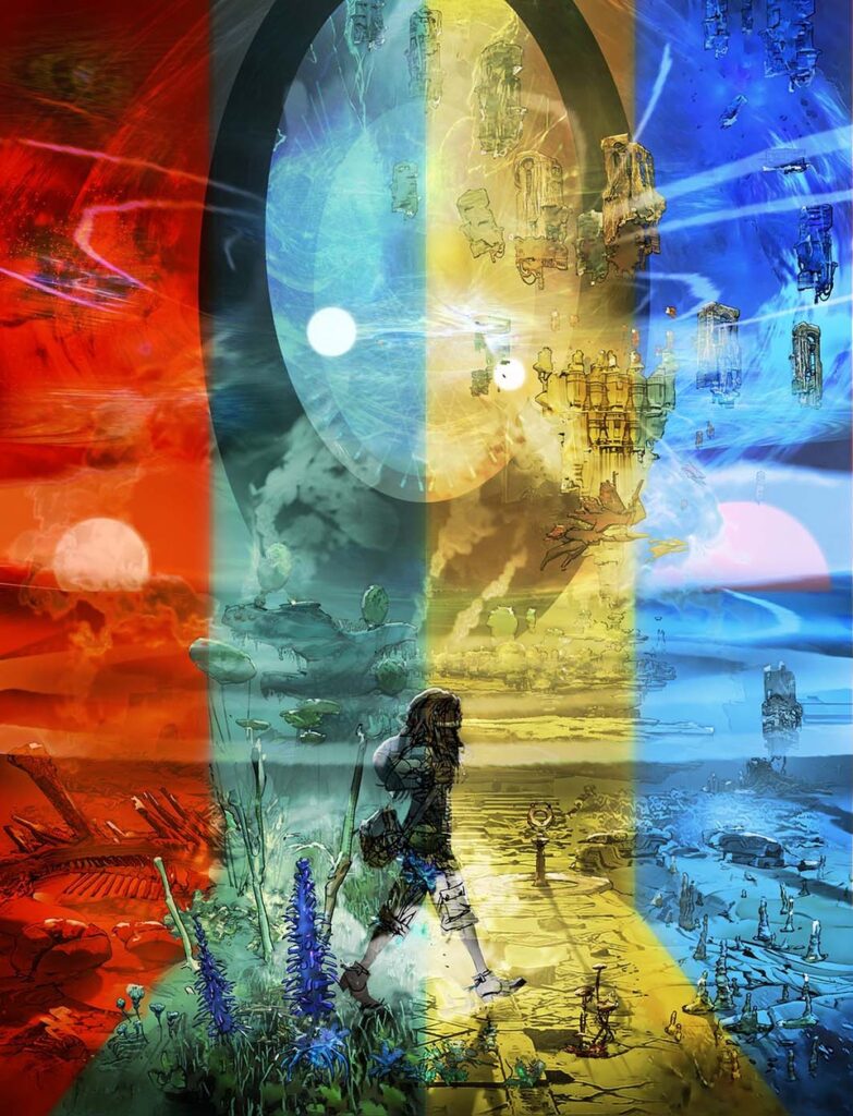
2000 AD Covers Uncovered: ‘Sometimes a cover is found’ – Mark Harrison goes further OUT with Prog 2410
27th November 2024
Every week, 2000 AD brings you the galaxy’s greatest artwork and 2000 AD Covers Uncovered takes you behind-the-scenes with the headline artists responsible for our top cover art – join bloggers Richard Bruton and Pete Wells as they uncover the greatest covers from 2000 AD!
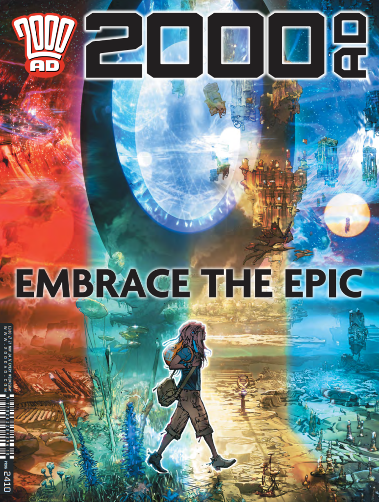
This week, a stunning cover for the Prog courtesy of Mark Harrison, as we walk in Cyd’s footsteps in The Out…
Get this cover as a print >>
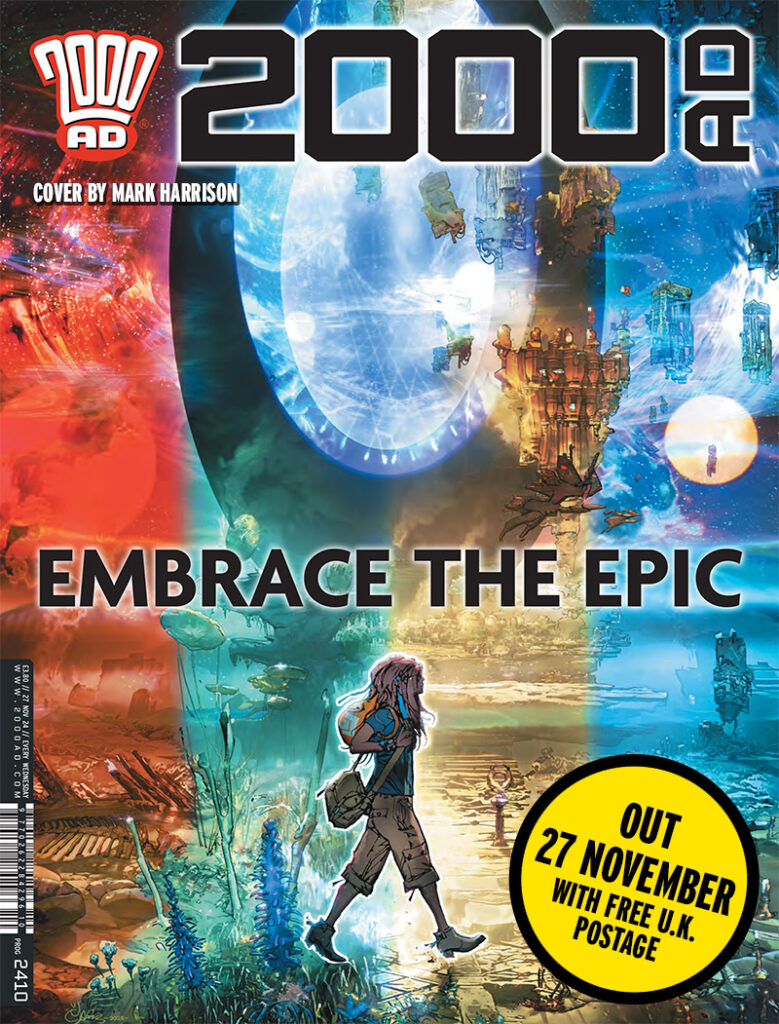
The Out Book IV gets to part 10 inside, with Dan Abnett and Mark Harrison working in perfect synergy to come up with a story so epic and vast that it’s something unlike anything else in the Prog, and has become a fan favourite, up there with the finest of thrills Tharg’s ever given us.
And as we’ve come to expect from Mark’s Covers Uncovered pieces, this is another that goes hither and yon, takes in creation and influences, paths not taken, until it slowly puts together the cover… and this is a cover that takes us back to Prog 2407 and Cyd’s trip to the Black Hole of Luramook.
So, without further ado, time to let Mark tell you all about it…
MARK HARRISON: You know, when I start one of these things I think I’ve got nothing to say, and you’re all going to be so disappointed! But then I find something in the cover that relates to the strip and then I can wax lyrical about someone else, in this case the late, great Richard Corben. This time, it’s his comic book storytelling prowess.
So, on with the show…
Sometimes a cover is “found”…
Like Cyd, the destination is sort of known but how we get there can be a series of false turns.
I kind of knew what I wanted… It took its cue from Part 7 of Book IV, the episode where Cyd goes walkabout on a planet caught in the ebb and flow of Time Tides.
Believe me, Dan and I debated the mechanism of how this could work and why Cyd wasn’t affected… lets just say she was “Out of time” and inoculated against the vortex’s effects in the short term. She had her “Time Shots”. See it like sunburn radiation— the longer you stay the more it affects you. The surroundings however wash away periodically replaced by another time period. Camping in an alien sculpture will see it eroded away in the night to be a primordial beach in the morning surrounded by “living sculpture”. That living sculpture surrounding Cyd was also a cover idea.
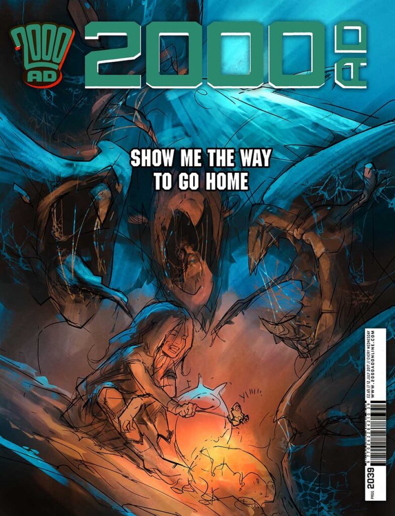
I liked both so I had Almighty Tharg choose. Here was my pitch and rough for both:
“Show me the way to go home” is a campfire scene where Cyd is roasting Mousemallows (alien delicacy) over a “Sprinkle Heat” rock she’s ignited, seemingly unaware of the terrible beasties surrounding and drooling over her. It looks like curtains for our blithely unaware heroine. Except they’re creatures caught in the Tides of Time dilation effect, slowed to almost statues. To the reader the cover is a moment before the kill. But reading the story it’s more like trolls caught in daylight and Cyd can spend the night there and leave in the morning unmolested.
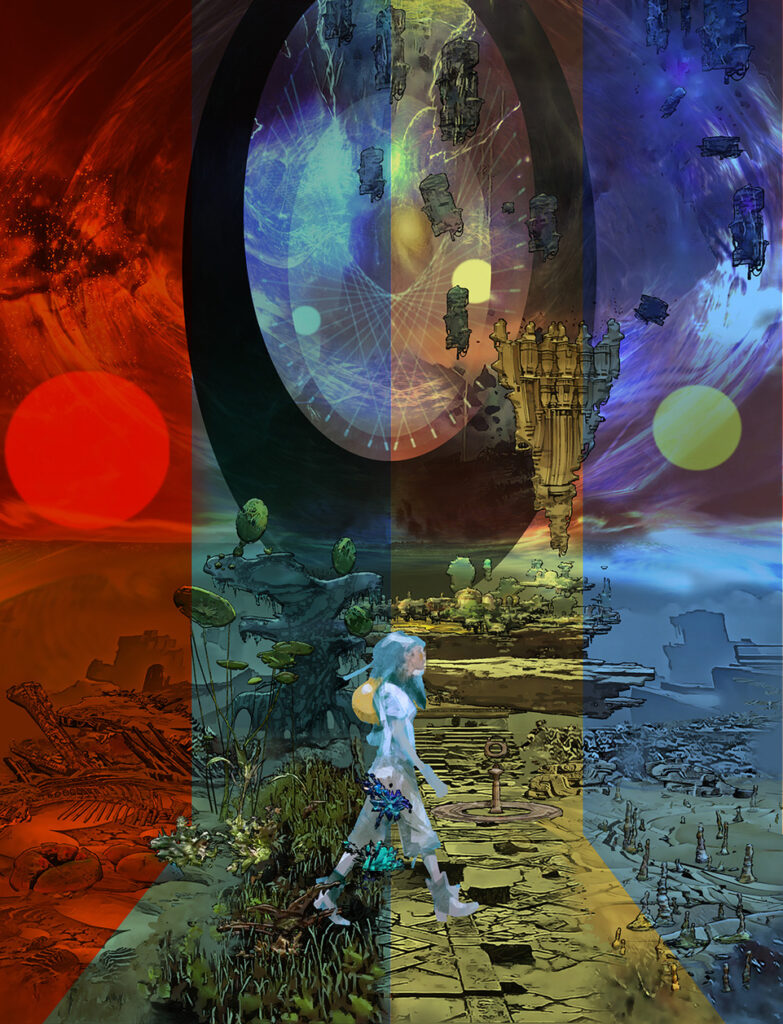
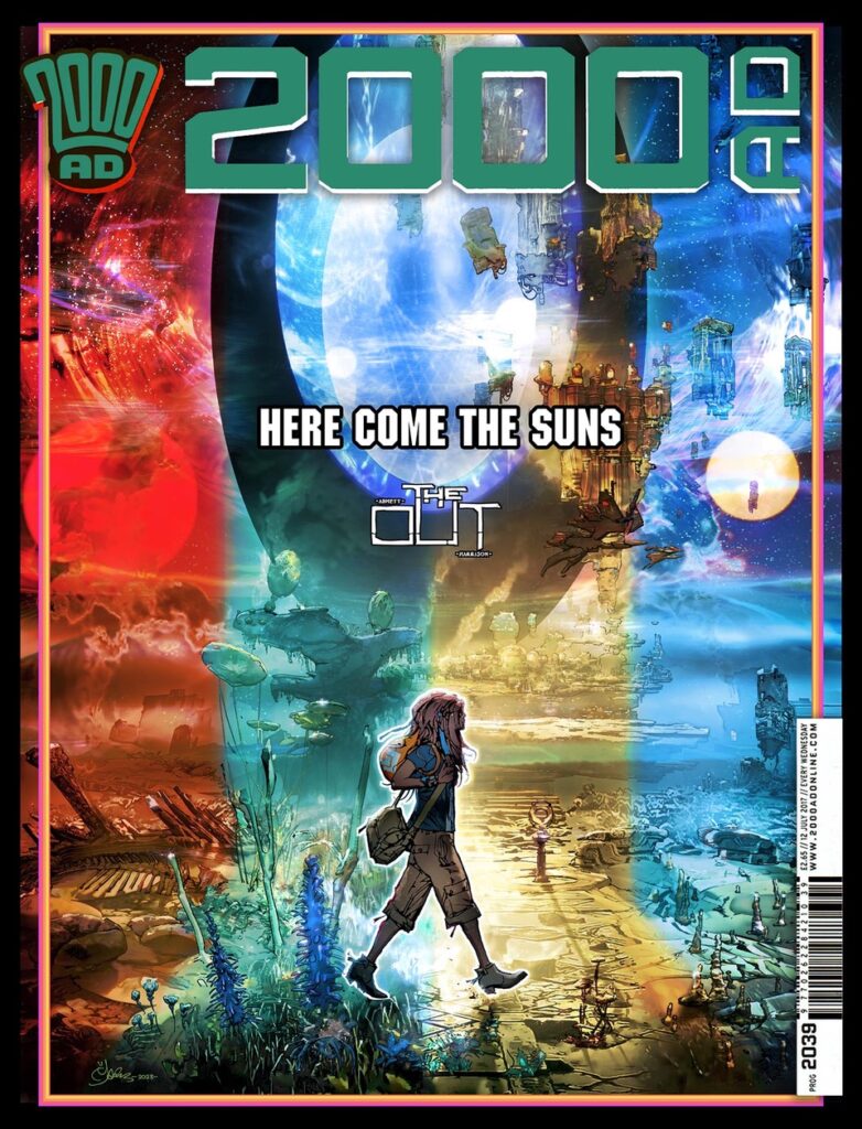
“Here Come The Suns” is a reference to The Beatles Abbey Road album (The Beatles replacing ABBA for this book’s soundtrack), and this is a homage to that in design with Cyd striding across the Tides of Time, in this instance colour banded to 4 epochs in the planet’s history.
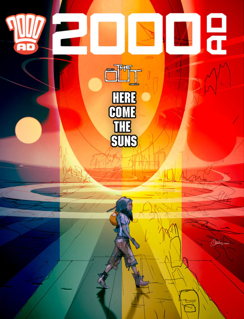
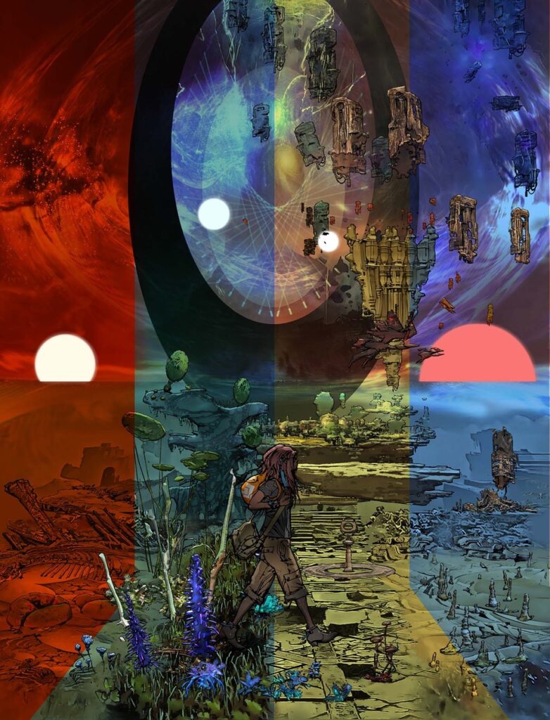
From left to right: Primordial Blue, Garden state Green, Technological Yellow, and Red Sun Death (present day to Cyd). A caught Black Hole bleeding its influence through an oval Stargate is responsible for the Time Tides that wash in and out over the planet allowing Cyd to walk along an Event Horizon beach thru time. As you do.
And of course, you all know the Beatles reference marks going with here, don’t you?
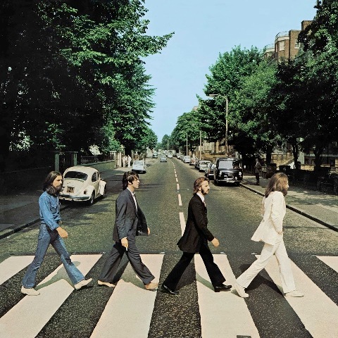
MARK HARRISON: The Hepworth gate and the four suns are the constants through each of the scenes, and since the backgrounds will be made up with whatever I come up with in the strip you’ll just have to trust me they will be awesome should you choose this variant.”
Tharg went with option 2, ‘Here Comes The Suns’ – the one that required more work – of course – as he likes to see his droids sweat oil.
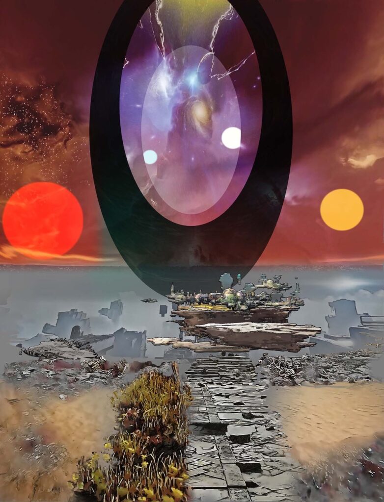
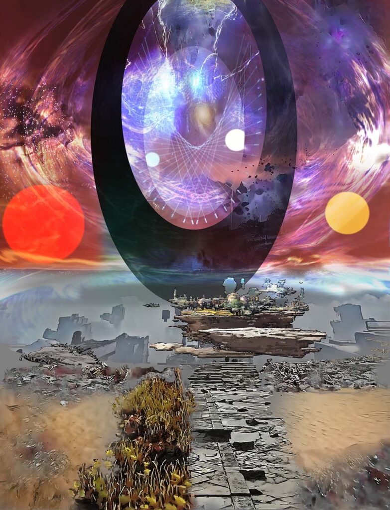
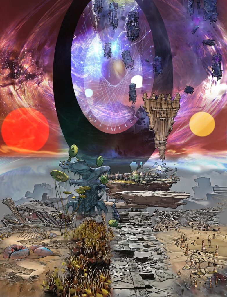
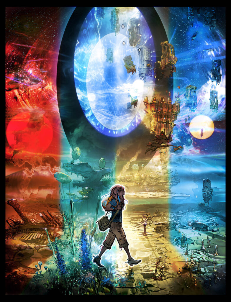
In truth I didn’t know what I was going to put on the cover but once I settled on “Time Slices” I had to make them distinctive from each other. I started adding artwork I had created independently of the cover (that was going to be layered into the strip) and used those elements to build up a background. The oval Stargate was the obvious centrepiece and then I wanted canyons and grassland and cities on plateaus and mudflat desolation.
I threw on some gravity warped light vortexes and the 4 suns. (The same sun in different ages from red giant to embryonic sun). The desert world I imagined was the bare bones of civilisations and animals, skeletons of both littered around, like sea groynes staggered out to sea. The grassy plains would have balloon‑like lily trees.
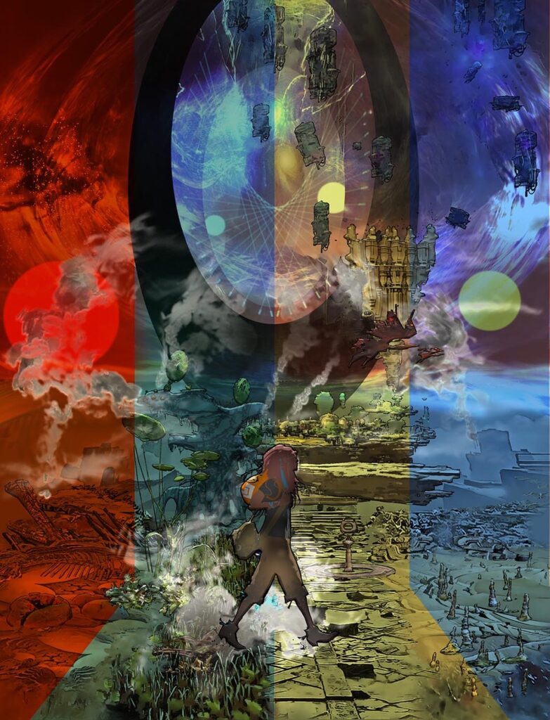
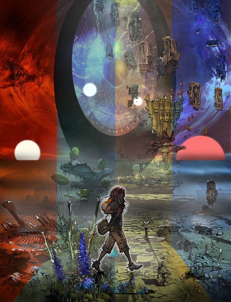
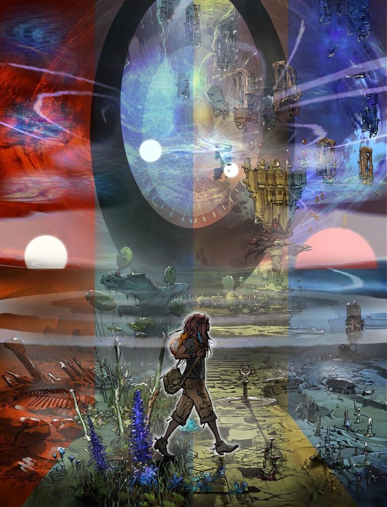
As for the process of building up all that glorious detail of the cover, Mark sent along nine images where the cover comes together. You can find the individual images at the bottom of this Covers Uncovered, but the best way to show you the process is by putting them all together like this…


.
All of which give you a final image that’s surely going to be up there in 2024’s best covers…
And… back to Mark…
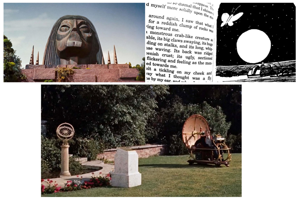
MARK HARRISON: The age of technology (in yellow) was created by a species of Eventual Worm (how we will all end up!) sporting a blonde mop-top, another Beatles reference but also the Eloi of George Pal’s The Time Machine, a beloved film of mine. In the book by HG Wells, The Traveller journeys to Earth’s end and encounters a giant crab-like creature, and I put that in the strip as a homage, as well as the influence of fluted sirens of the Morlocks that, in the film, called the Eloi to slaughter. (Buildings making sound or music is something I’ve been trying to get into the book to unintentionally affect a population and send them crazy – maybe for book 5!)
I also include a sundial both in the comic and cover as a nod to the one in the Time Machine film. The floating “shopping trollies” (massive Manhattan‑sized) are hanging in frozen time like a halted conveyor belt feeding the Stargate, eroded over the eons.
Mark kindly added a few images to illustrate the point from The Time Machine – it’s a great film, and one you should all have seen!
And then the references to be found inside Prog 2407…
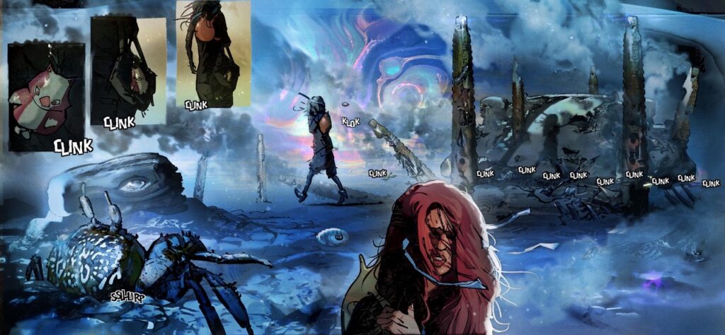
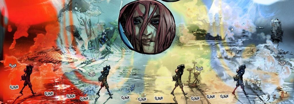
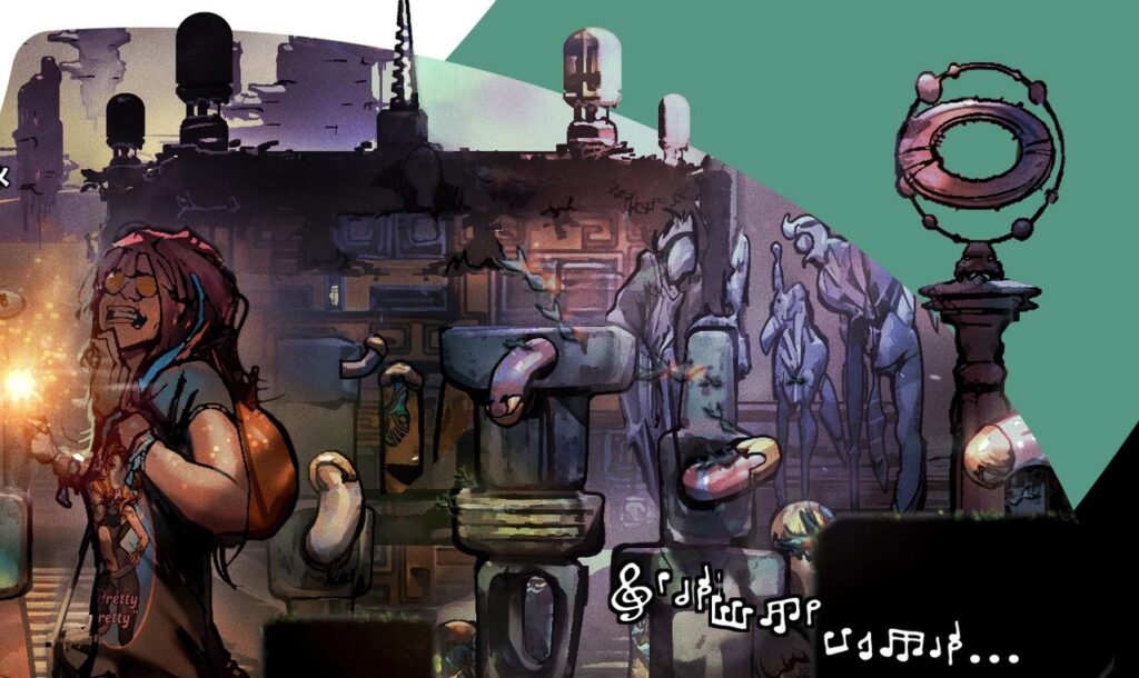
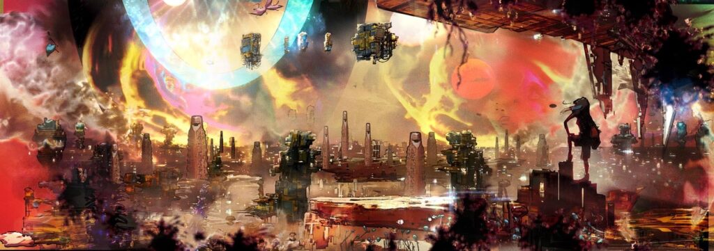
MARK HARRISON: Cyd striding across time would be a variant on what I did in the strip. I considered four versions of Cyd but it became cramped and too obvious.
In the strip, the opening panel and the onomatopoeic sound is a reference to a favourite fantasy comic book artist of mine, the late great Richard Corben. (And here is a chance to push the brilliance of Corben on some unaware reader: DEN- NEVERWHERE. A landmark in fantasy comic book history. Blew my mind when I was a teen. Such an exciting time to be reading comics back in the late 70s and early 80s. You believed anything and everything was possible and allowed. Corben’s storytelling skills really resonated with me. The use of sound effects was ubiquitous to his art.
As a result I do all the sound effects and music lettering myself as part of my comic art. Reading Corben’s strips felt like they created a sense of audio narrative in the mind to accompany the visuals. It can create a rhythm and pacing. I kind of miss that in comics – the wordless panel described in only visuals and sound effects. Dialogue in film and comics can be overused at times (present company excluded of course!) This is a visual medium. Let the film or comic breathe…
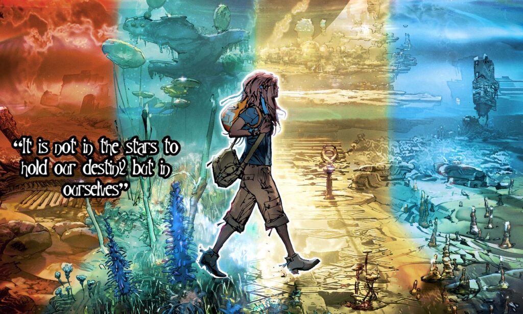
Okay, back to the cover! I decided to have time bleed a little into each zone of colour, such as the grasslands spilling over into other zones. I’m still playing with the colours at this stage and I can see Cyd needs punching out from the background.
I go with a white glow outline. It’s kind of a cheat and lazy, like random edge lighting on posters, but it works – and makes sense with her being “inoculated” from the effects of time as I mentioned earlier. I play with smoke, mist, effects… punch up the contrast and vibrancy… dial it back…
Then I did something weird and added a frame. I don’t think 2000 AD will go with that but I like it. Like it’s one of Cyd’s snapshots of times. And that’s it!
And here’s that final touch – the frame… that, as Mark figured, Tharg, didn’t go for. But that doesn’t detract from a damn fine cover from the Harrison droid…
As always with Mark’s Covers Uncovered, that was some journey! He never lets us down! Thank you so much to him for continuing to send these along and making them never less than fascinating!
So, run – don’t walk – to wherever Thrill Power is sold to pick up 2000 AD Prog 2410, including the 2000 AD webshop. And of course, you’ll be wanting to share the joy – might we suggest that the first collection of The Out, containing Books One and Two of the series, would make a perfect Xmas pressie – get it right here at the 2000 AD web shop.
For more of Mark’s enthralling and deep dives into the process of putting together his covers, make sure you have a look at his previous Covers Uncovered – Prog 2187, Prog 2193, Prog 2251, Prog 2254, Prog 2261, Prog 2314, Prog 2333, and Prog 2401. And be sure to go back and read the interview with Dan Abnett and Mark Harrison all about The OUT right here.
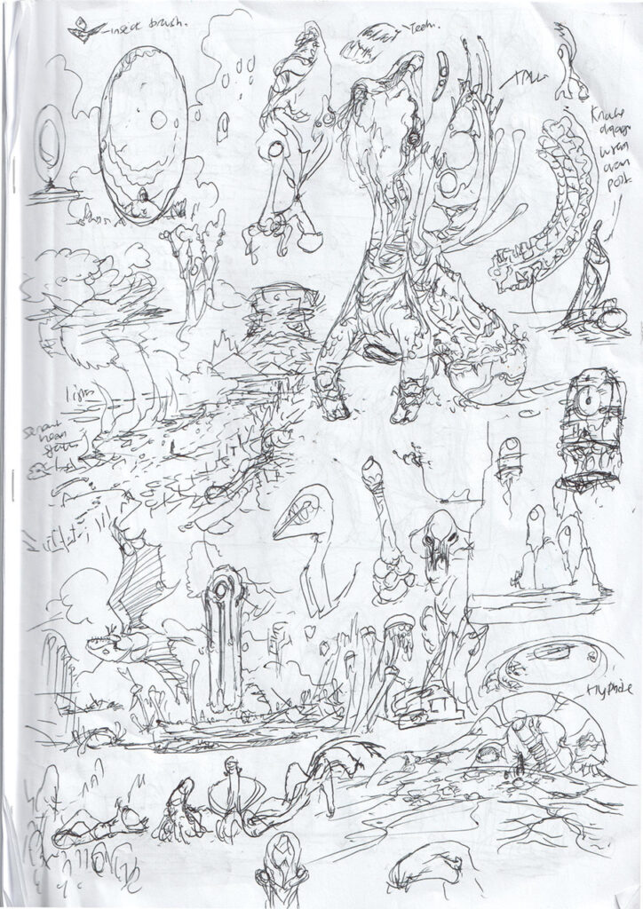
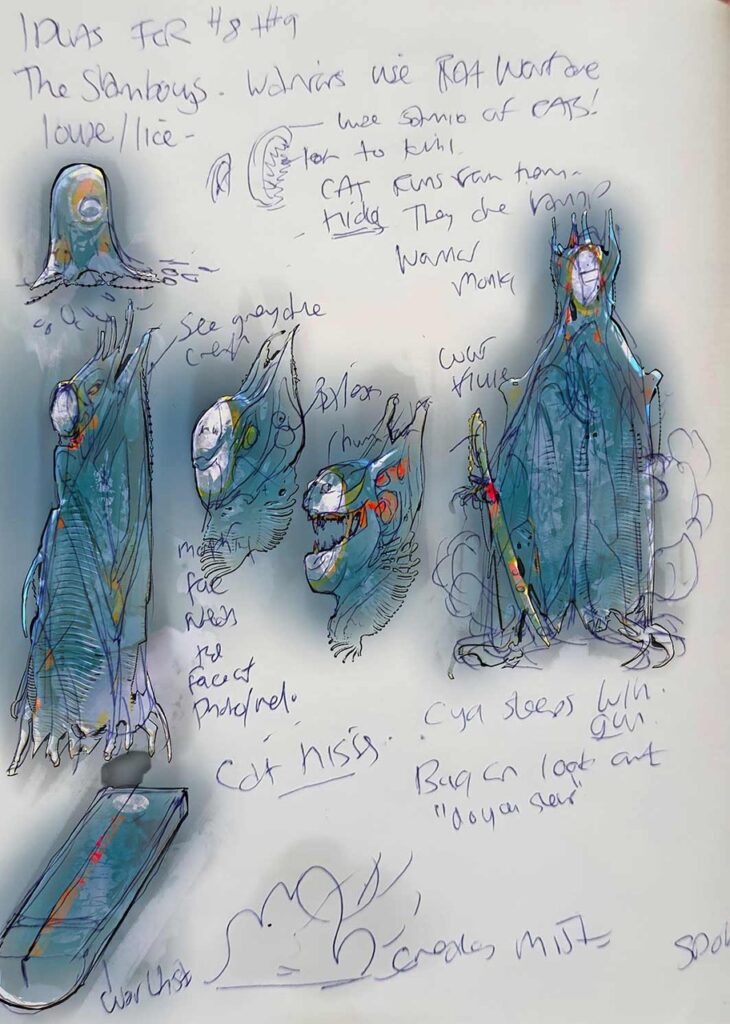
And there’s always something extra to be seen with Marks’ work, and usually something extra he sends along to us that doesn’t quite fit into the flow of his covers piece… this time a sketches and doodles for one prospective cover with early versions of the creatures…
MARK HARRISON: Kind of scribbles and doodles for the script/cover that show an early version of the Knuckledraggers (when they looked a bit more knuckly) and a completely different take on the Slamboys, as more like Flutist Vampires. It was going to be very vampire‑centric, with a Warflute being their main weapon (channelled hypersonics) complete with dry ice filling the ship. (Darn… I kind of like that idea now…)
We eventually went with Space Lions with opposable tails, as it was more macho with their Roarbox codpieces. More predatory; more intimidating? (Vamps tend to be likeable sophisticates and misunderstood whereas Lion: you’re dinner.)
Now, the big versions of Mark’s process in building the cover…
