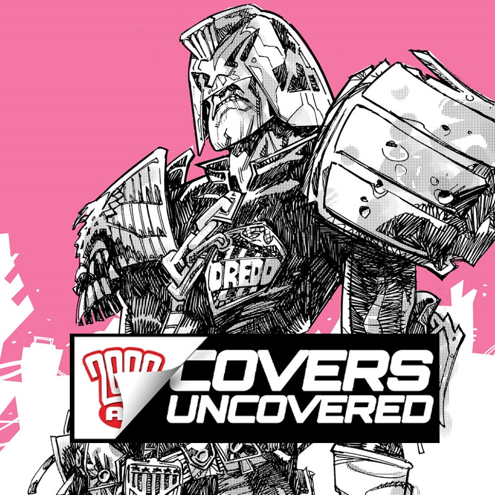
Every week, 2000 AD brings you the galaxy’s greatest artwork and 2000 AD Covers Uncovered takes you behind-the-scenes with the headline artists responsible for our top cover art – join bloggers Richard Bruton and Pete Wells as they uncover the greatest covers from 2000 AD!
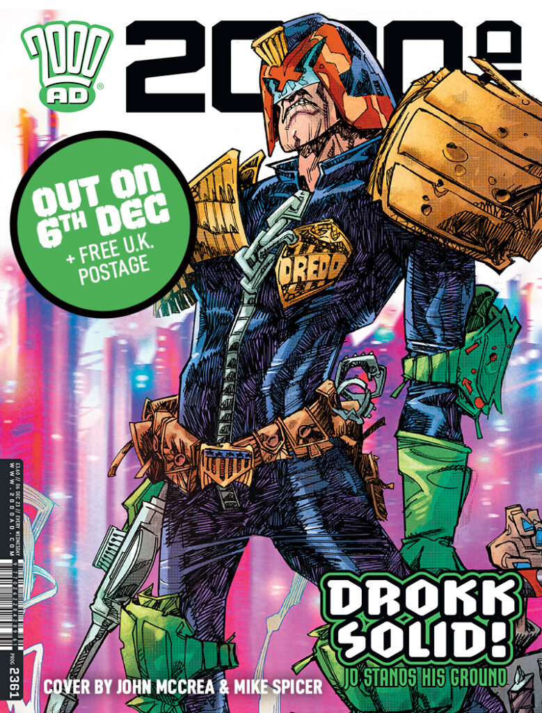
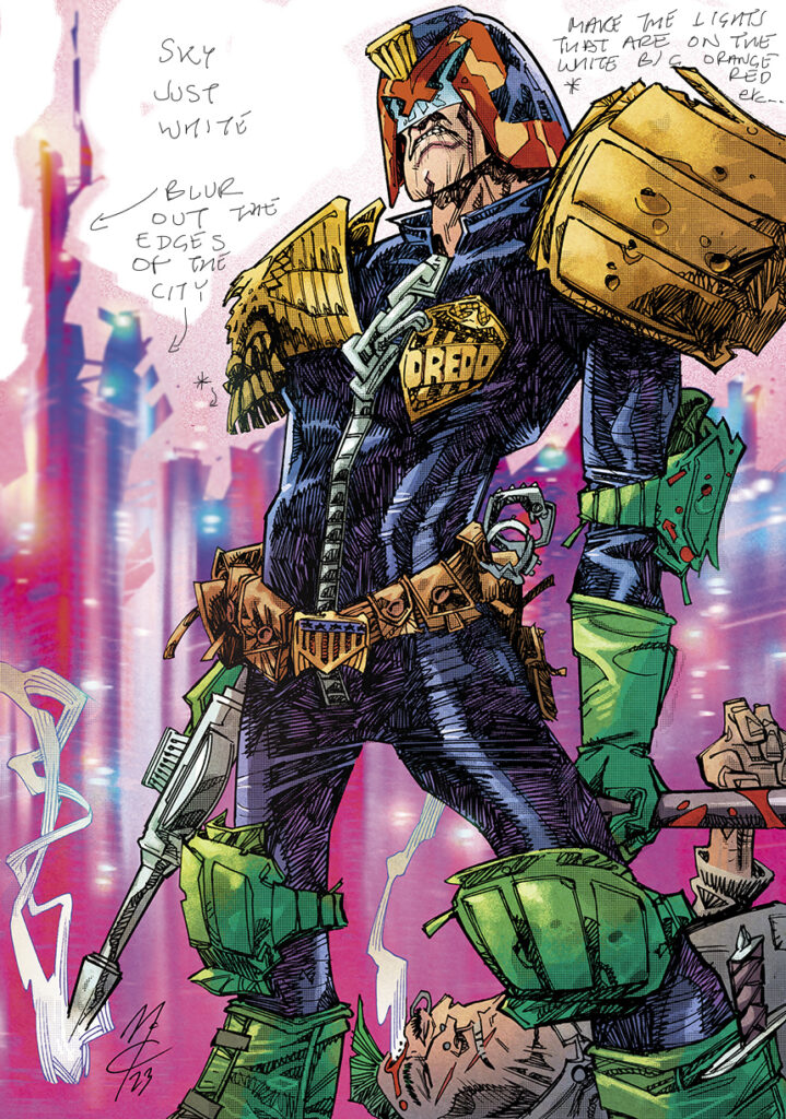
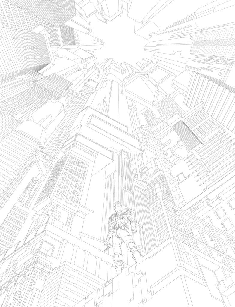
This week, it’s John McCrea back on the cover to the Galaxy’s Greatest, with a super snarling Dredd for 2000 AD Prog 2361.
John’s been a mainstay in comics since his 1989 debut here at 2000 AD with Prog 615’s Fast Forward, soon followed by his and Garth Ennis’ tale, Troubled Souls, their hard-hitting and controversial tale of the Troubles, which heralded the arrival of two brand-new talents on the comic scene.
Since then, we’ve had the pleasure of seeing John’s work pretty regularly in both 2000 AD and the Judge Dredd Megazine, but you’ve had the pleasure of seeing his distinctive artwork at Marvel, DC, Image, Dynamite, and more, including the highly recommended DC Comics Hitman series from 1996-2001 with Garth Ennis. Since then, he’s worked at Marvel, DC, Image, Dynamite, and many more.
Always a pleasure to see John back on the cover of the Prog though, especially with a Dredd that really pops off the cover like this one does! So, without further ado… Mr John McCrea and the making of a great Dredd…
JOHN MCCREA: All I want to do with 2000 AD covers is attempt to draw as iconic an image as my art heroes; Mick McMahon, Kev O’Neil and Carlos Ezquerra. Nobody drew better 2000 AD covers than these guys, imho. Obviously, I have failed to come close to matching them but that’s the goal, that’s what I’m aiming for.
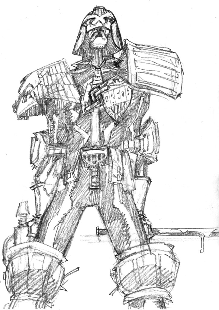
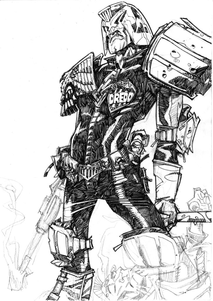
So another Dredd cover. I wanted a cool standing pose that showed Dredd at his most badass. My first drawing was this…
It’s ok, but there’s something missing. Too straight on, not enough tension in the pose. I dunno. (Any actual wonkiness in the drawing would have been sorted out, but technical faults aren’t the problem here).
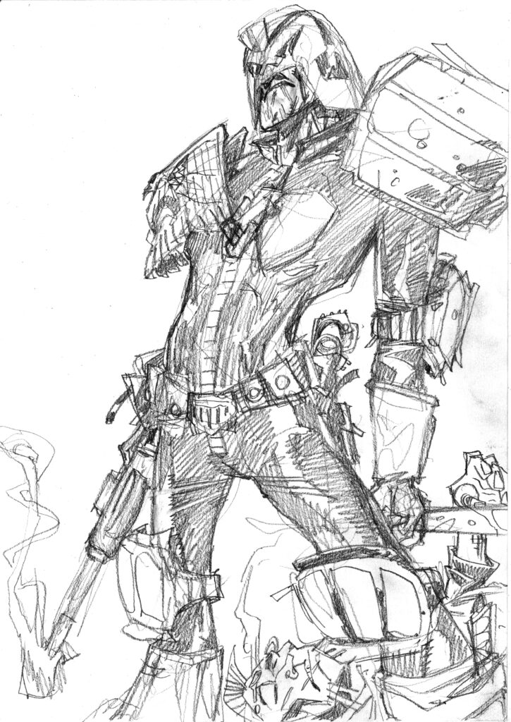
So I did this…
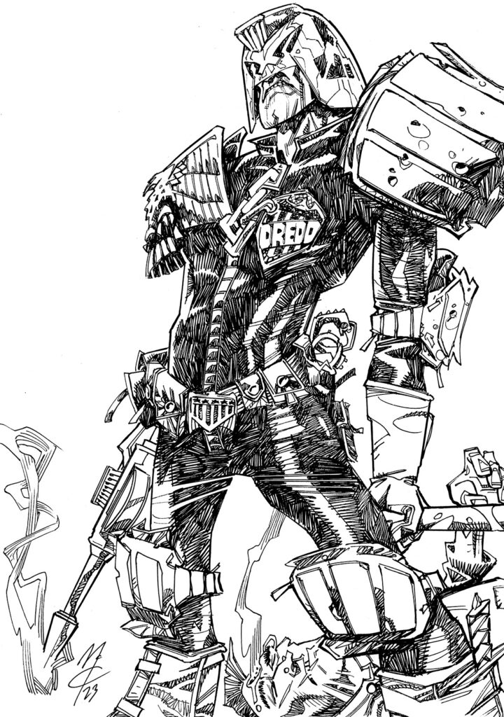
Basically, I rotated the ‘camera’ a bit, but I added more slouch to the pose, more angles to the figure. It seemed to work, so I drew the dead juve in behind him for a bit of visual depth and to give it more story.
Tharg was happy so it’s onto inks…
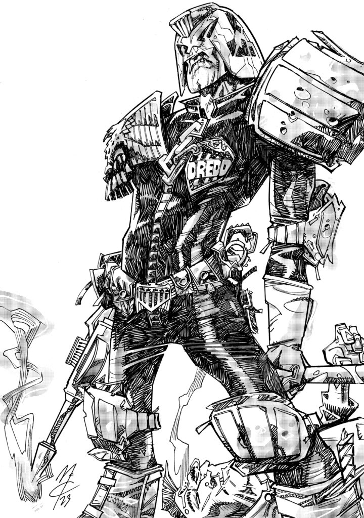
For some reason, I inked this drawing over the pencils, as you can see here. Normally I lightbox the pencils so that I can avoid the horrible erasing process. I can’t remember why this was different.
I love the inking, it’s so therapeutic, correcting any little mistakes in the drawing and just having fun scribbling away. Over the years, my inking has loosened up and relaxed a lot, some of this was due to necessity but mostly it’s due to the influence of my favourite artists, most of whom don’t seem to mind that each line is perfect, just that the whole picture is strong.
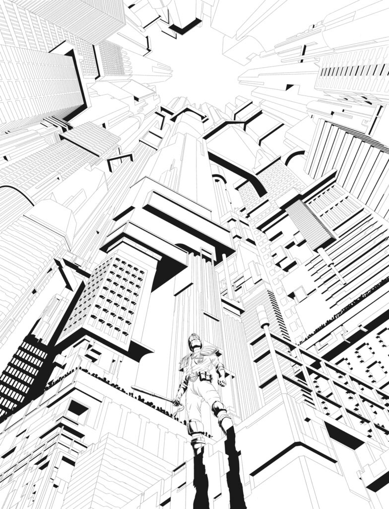
The finished inks, all cleaned up…
I think my favourite bit in this is the smoke wisping off the gun, the way it curls round itself.
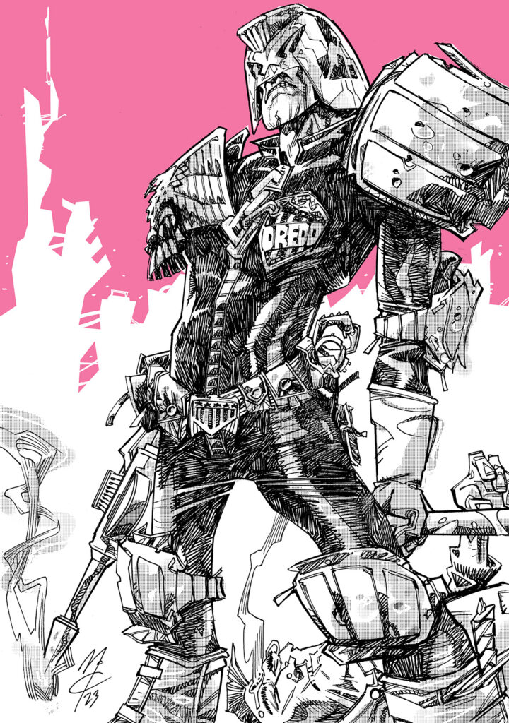
Now I add a bit of digital tone…
Again, I try not to be too exact with this, as a bit of error makes for a more satisfying result. At least, that’s what I feel.
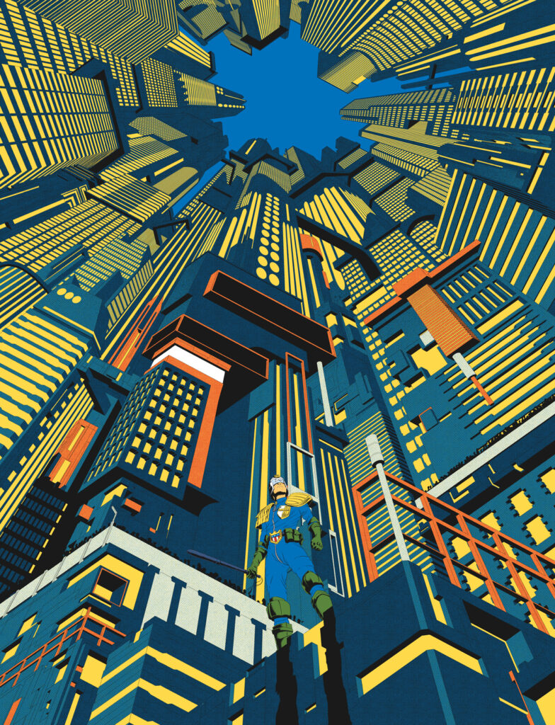
Before I sent this to Mike Spicer, I quickly added this background in Photoshop…
I wanted to give an indication of a Mega City skyline. And I like pink. I sent this to Mike and asked him if he could ignore the pink and just add blurred city lights to the shape, using a stock image found on the Internet as a starting point…
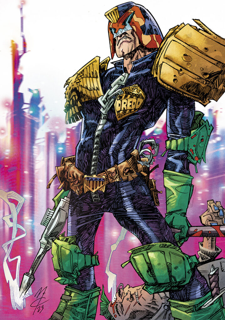
As you can see Mike did an amazing job.
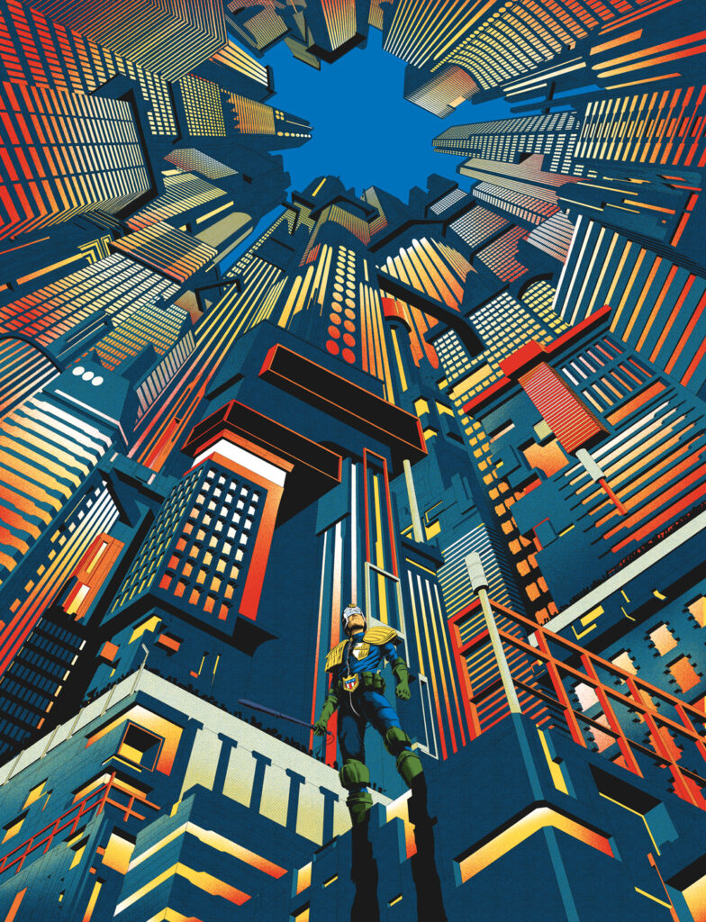
He had made the sky pink but I felt that just distracted from the city below, so I asked for him to remove it.
I hope that the final result really jumps off the newsstand, website or wherever Squaxx dek Thargo find their prog!
That’s the job of a cover artist/colourist, to create an eye catching image that will draw readers to the comic.
Oh yes, that one absolutely launches itself off the shelf or screen John! It’s a great cover, a great Dredd, fabulously loose and full of energy.
Thanks so much to John for sending that one along to us – you can find that Dredd cover on the front of 2000 AD Prog 2361, out everywhere Tharg’s finest is sold from 6 December, including the 2000 AD web shop.
For more from John, be sure to take a look at previous Covers Uncovereds – riding out with Dredd on Prog 2224, ‘everyone’s favourite fascist’ on Prog 2328, and that very special meeting of Sam Slade and Judge Dredd for Prog 2351.
Every week, 2000 AD brings you the galaxy’s greatest artwork and 2000 AD Covers Uncovered takes you behind-the-scenes with the headline artists responsible for our top cover art – join bloggers Richard Bruton and Pete Wells as they uncover the greatest covers from 2000 AD and beyond!
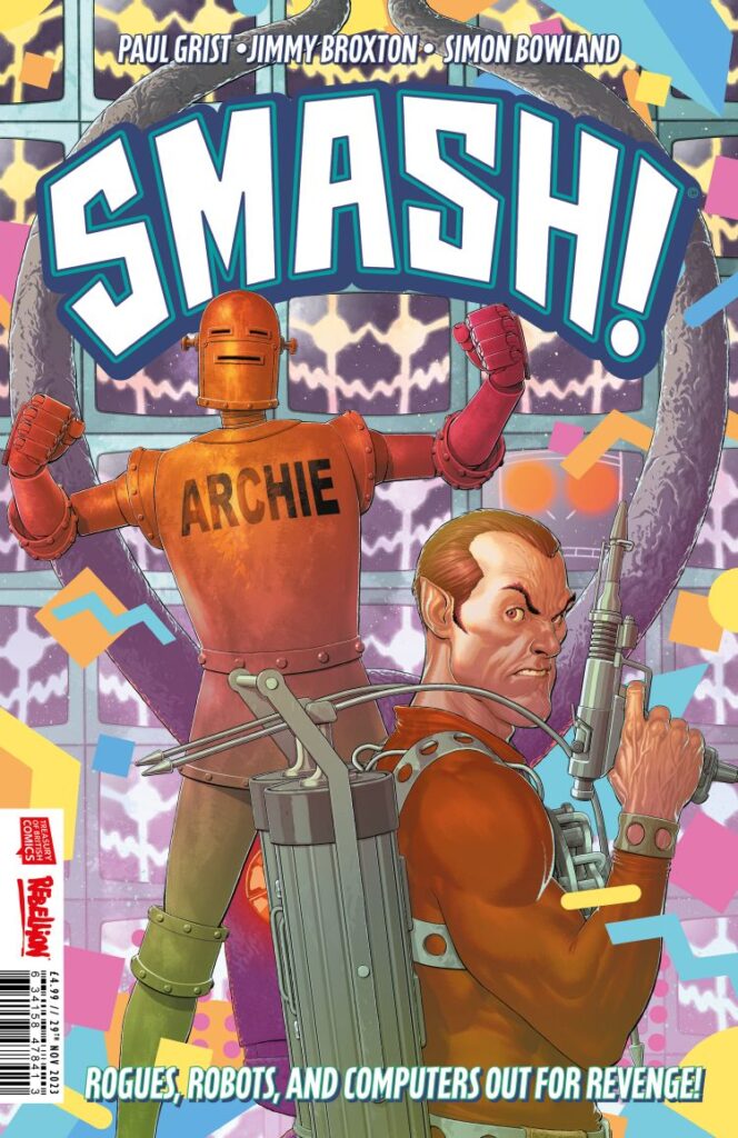
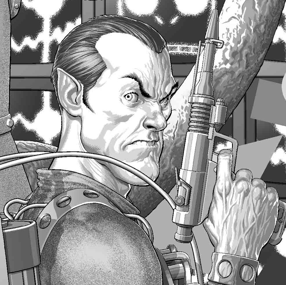
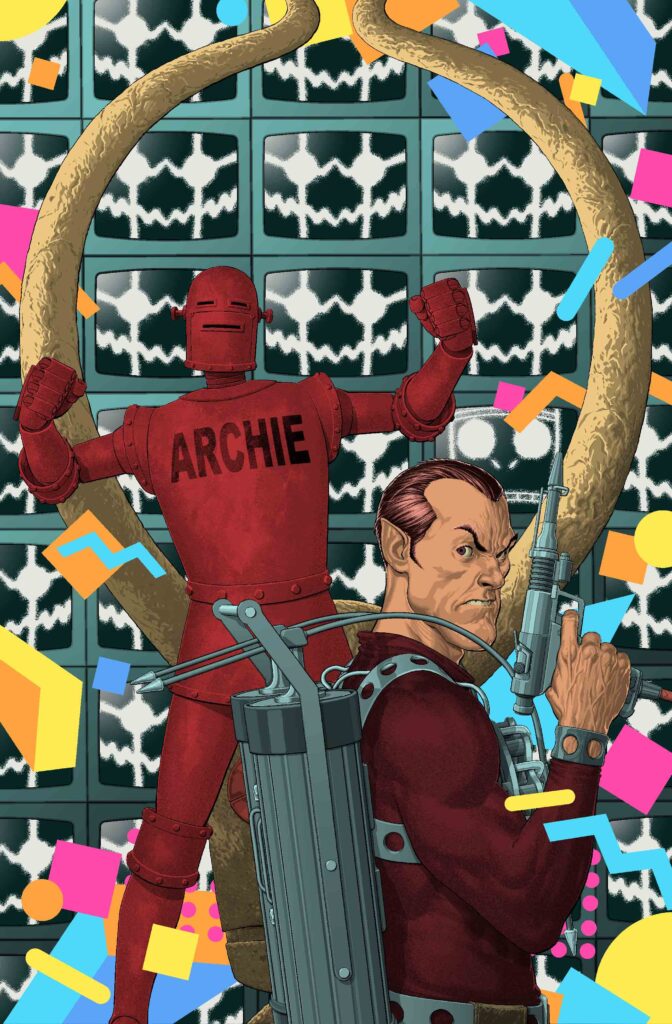
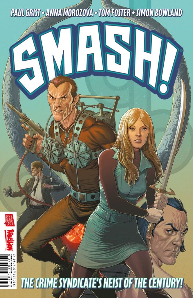
This week, we’ve got another superheroic treat for you with another Smash!-ing Andy Clarke cover to the hit three-issue series that brings together classic Brit super-types from across the ages – SMASH!
Issue 2 of Smash!, by Paul Grist and Jimmy Broxton, is out on 29 November with all-out action and adventuring as we join the thrills in the ‘80s with The Spider finding himself trapped in Maxwell Tower after his heist of the demonic idol created by Janus Stark goes badly wrong.
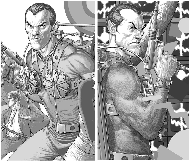
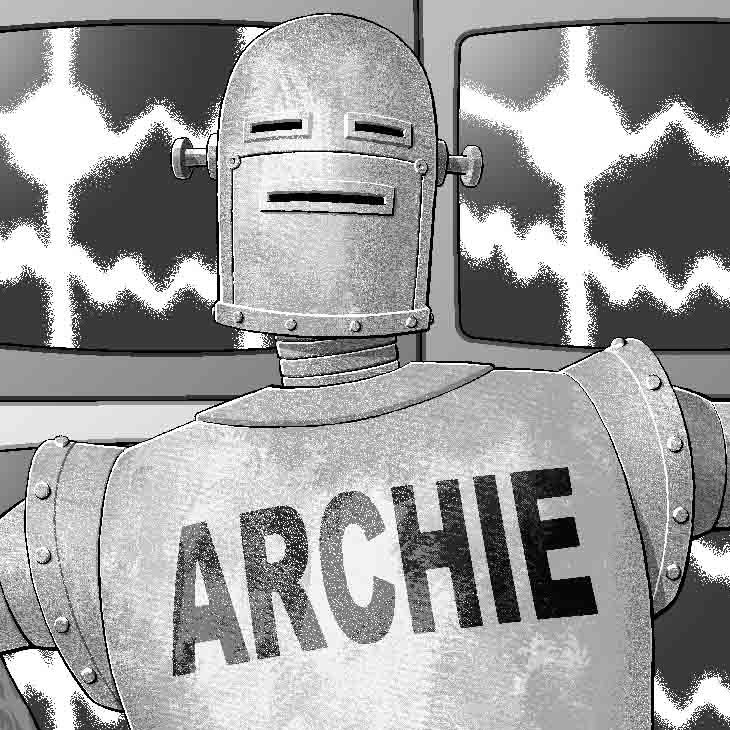
As Robot Archie closes in on capturing the arch-criminal, the King of Crooks is up against malevolent AI Max and the terrors of The Thirteenth Floor in a thrilling second part to this celebration of all the weird and wonderful of Brit comics!
Smash! #2 arrives in comic book stores and on the 2000 AD webshop and app on 29 November and we’ve got cover artist Andy Clarke here to tell you all about putting together the cover for this one…
Of course, alongside this Covers Uncovered for Smash! issue 2, you should head back a month and check out Andy’s art and process for issue 1.
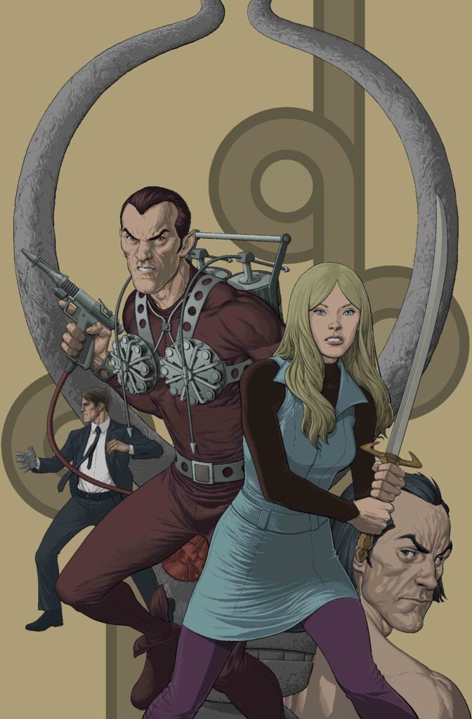
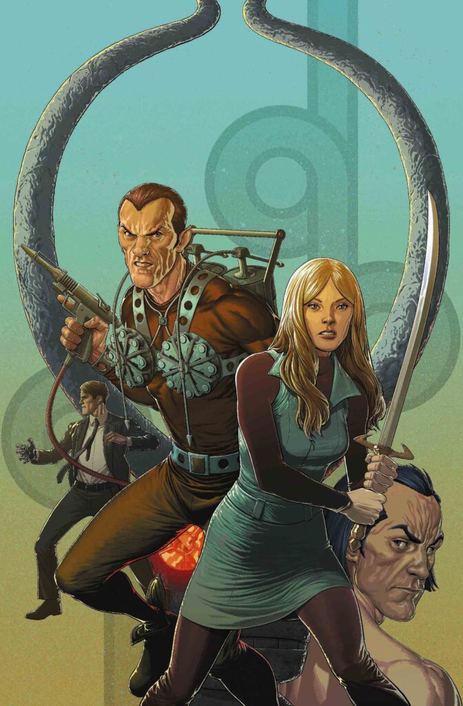
As before, editor Oliver Pickles sent along the reference material for Andy to use – focusing on Max, Maxwell Tower and Robot Archie…
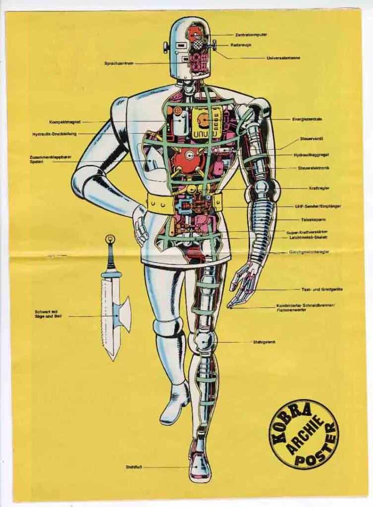
Andy’s reference art for this one – Robot Archie from the six-issue Wildstorm series Albion from 2005/6, written by Alan Moore, Leah Moore, John Reppion, art by Shane Oakley, George Freeman. Cover by Dave Gibbons, interior art by Oakley/Freeman.
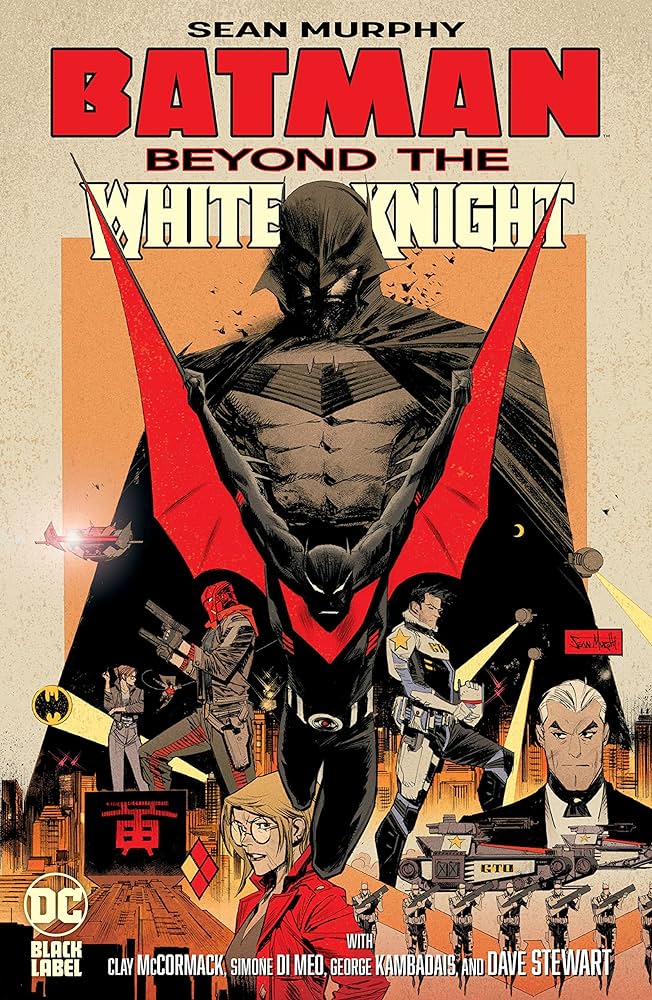
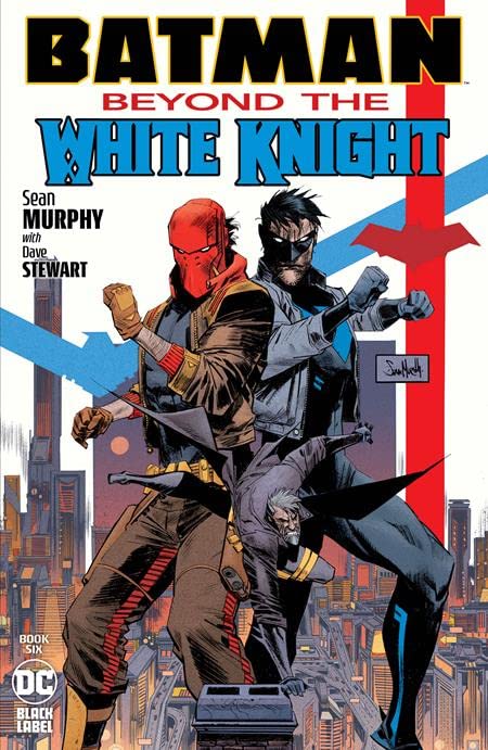
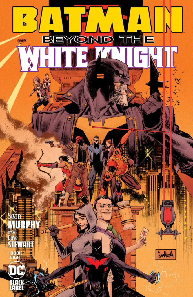
So, as we found out in the process to issue 1’s cover, Oliver also suggested a look at Sean Murphy’s recent Batman covers to give a film poster feel to this trio of covers.
After that, Andy roughed up sketches for all three covers – to keep a ‘look’ going through them all. But also giving each one its period theme, saying this when we talked about issue 1’s cover – ‘As the series is set in different decades, I wanted to add a 1960s (for issue 1) and a 1980s (for issue 2) background pattern or design as a nod to that.’
The idol quickly became the one real linking element for Andy across all three covers… ‘I roughed up some sketches for all three, just really to see if anything popped out that I could carry across them all so they had a connection of some kind. Pretty soon, the Idol looked like it would be the thing that could link the covers together – the Idol also did a lot of the heavy-lifting for each layout/composition in the end, it helped tie everything together.’
In fact, the idol was so integral that Andy used it as, according to him, a bit of a cheat. Here’s what he had to say about that for issue 1 – ‘Once it was agreed the Idol would be the one element repeated on all three covers, I thought that once I’d inked the outline, done all the grey-tone, the flats, the colour and rim-lights on it for issue 1, I could drop it into the other two covers without having to redo it from scratch each time. Then all I had to do was alter the colours and highlights on the Idol for #2 and 3 so it matched the colour-scheme around it. Bit of a cheat really, but it saved some time.
Okay then, now we go to Andy and his thinking about putting together this cover…
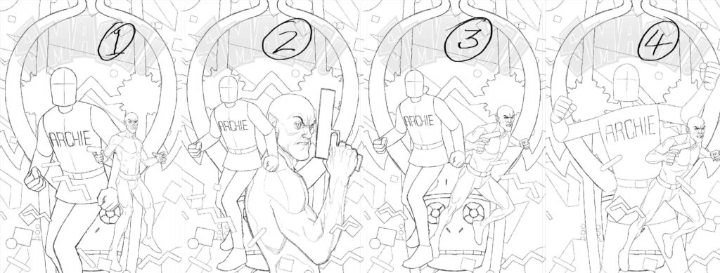
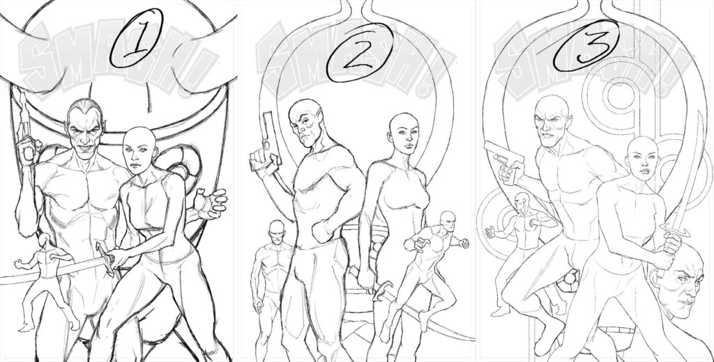
ANDY CLARKE: I did quite a few sketches for the second cover – examples of which are included here – it wasn’t coming together as easily as the first one, so I splurged a bit on different poses and positions for the two characters – changing the size of Robot Archie in relation to The Spider and vice versa.
Cover sketches #1-7 – but something just wasn’t working for Andy
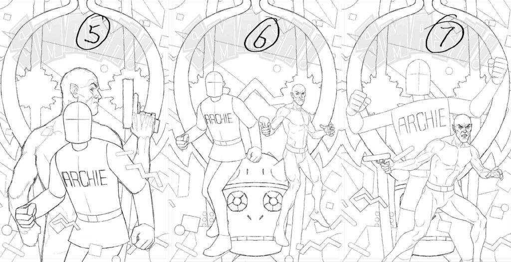
ANDY CLARKE: I was set on using the ’80s pattern I’d found – I broke it up a bit so it looked like it was floating around the characters, but its essentially the same kind of design that was used in the title credits on Saved By The Bell.
He’s right you know… compare and contrast…
Yep, definitely Saved By The Bell vibes! Oh, the strange places these art droids get their inspiration from. And if you want to see the whole title sequence in all its garish ‘80s glory – head here where we got the image from.
Okay, back to Andy…
ANDY CLARKE: The thing that fixed #2 was all down to Oliver. I couldn’t put my finger on why it wasn’t working that well as a composition, I just knew that it wasn’t.
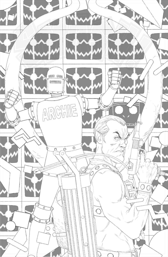
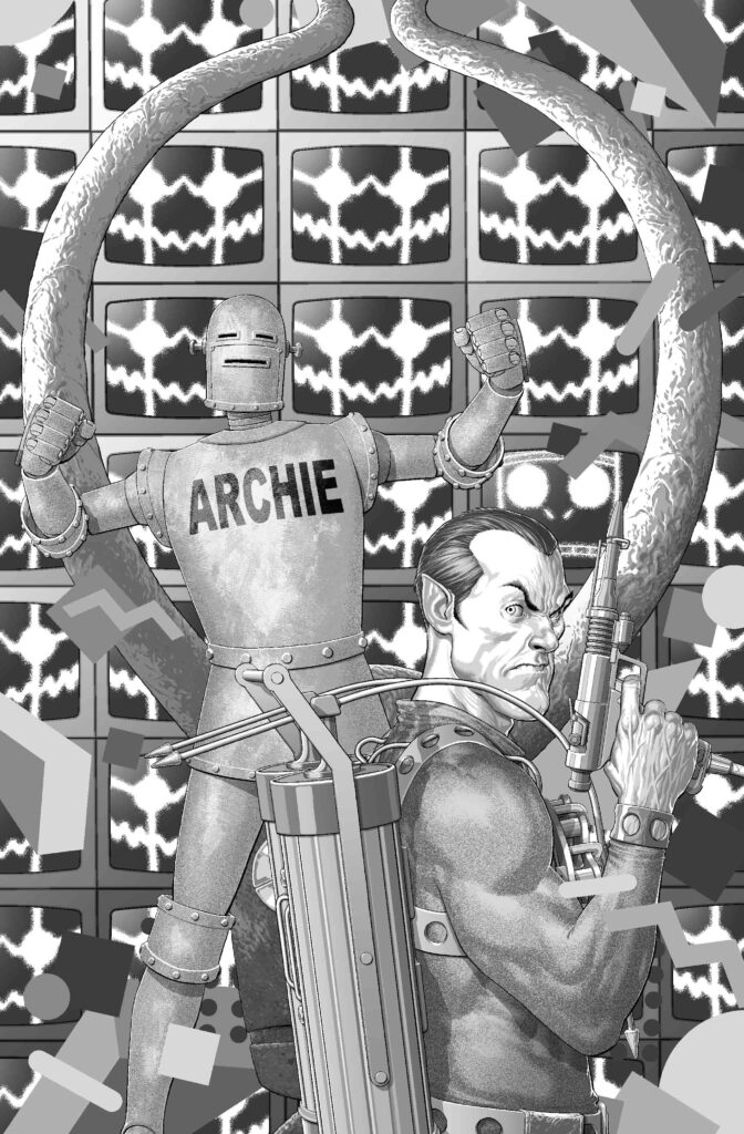
Oliver pointed out that the big, singular version of Max I’d drawn up was occupying the same plane in the picture as the Idol, so he suggested having Max as a wall of TV screens instead that could be pushed back and act as the background. This seemed to fix things for the better immediately – there might even have been an audible click.
And here’s cover sketch #8 – with the Oliver-inspired fix absolutely nailing the design for the cover…
ANDY CLARKE: To fit with the setting for issue 2, I tried to make The Spider more “‘80s” – his shoulders and arms are a bit bigger and more rounded compared with #1.
I was going for a hint of that muscled-up excess a lot of superhero comics had in the late ’80s/early ’90s. I might have been a bit too subtle about it though, looking at it now.
Well, time for another compare and contrast for you! Here’s Andy’s Spider from issue 1 versus issue 2 – subtle but definitely got that ’80s bulk going…
On the left – classic Spider. On the right, ’80s Spider – muscled up for the times. All he needs is pouches everywhere and we’re right back there!
Now, time for the various stages of putting it all together now that Andy’s fixed all the design bits and got something to work off!
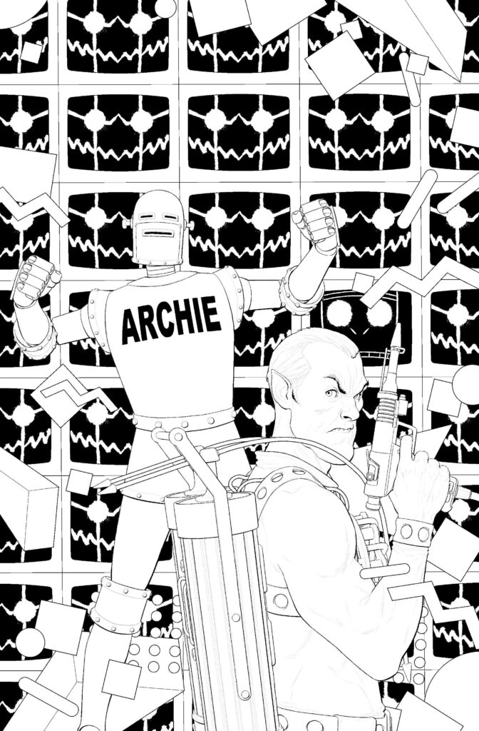
As he’s told us before, he pencils, then inks – but only inks the outlines, putting black only where it wouldn’t be better served with greys (and on this one that means a lot of Max in the background!) After that, the huge amount of detail comes in with the greytones that are added. Finally, with the colouring, it’s flats first and then final colours added to really make it all pop on the shelves.
Everything together at last in the pencils – a muscular Spider, Robot Archie, multiple Maxs, and the idol that started it all off. Oh, and all those Saved By The Bell ’80s visual bits!
Inking stage, where Andy inks just the outlines and anywhere blacks work over greytones – in this case, a heck of a lot of Maxs!
Greytone stage, adding in so much incredible detail.
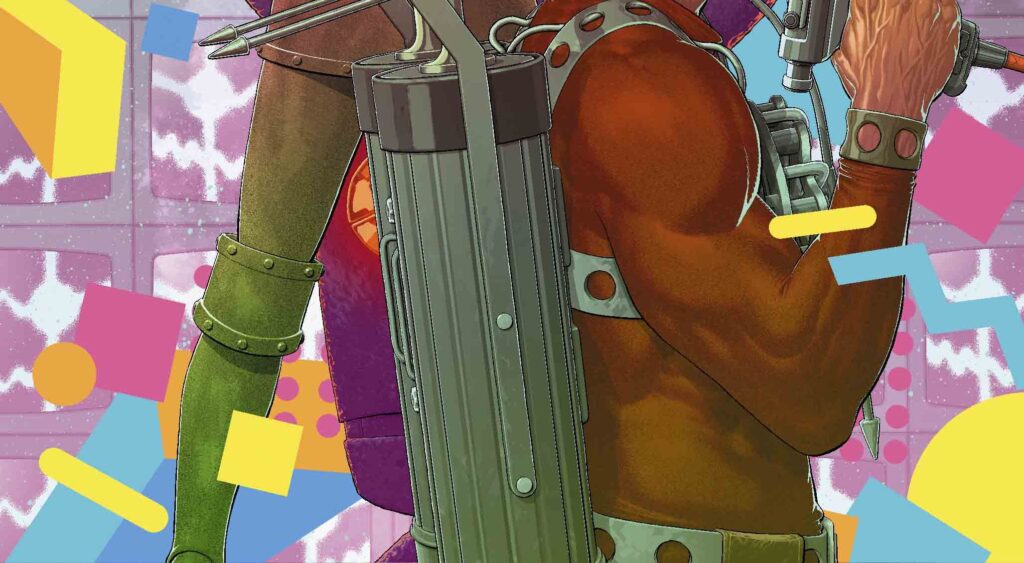
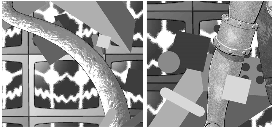
And here’s just a little bit of that detail… it’s so incredibly impressive that we wanted to blow it all up a bit to show you…
Okay, back to the process and the final stages – colours!
Colour stage 1, adding flat colours
Colour stage 2, the final colours that you’ll all be seeing pop off the shelves!
Another SMASH!-ing cover there from Andy (no, we’re not going to stop using Smash!-ing, it’s way too perfect a fit!) Thanks so much to him for sending it along to us.
You can find Smash! issue 2 in comics shops and from the 2000 AD webshop and app on 27 November, and there’s also the chance to pick up all three SMASH! Issues in a bundle from the webshop right here.
Andy’s Covers Uncovered for Smash! Issue 1 is a must of course, but there’s also these to take a little look at – Prog 2287, Prog 2290, Prog 2312, Megazine 444, and not forgetting the Prog 2350 subscriber-exclusive cover!
Every week, 2000 AD brings you the galaxy’s greatest artwork and 2000 AD Covers Uncovered takes you behind-the-scenes with the headline artists responsible for our top cover art – join bloggers Richard Bruton and Pete Wells as they uncover the greatest covers from 2000 AD!
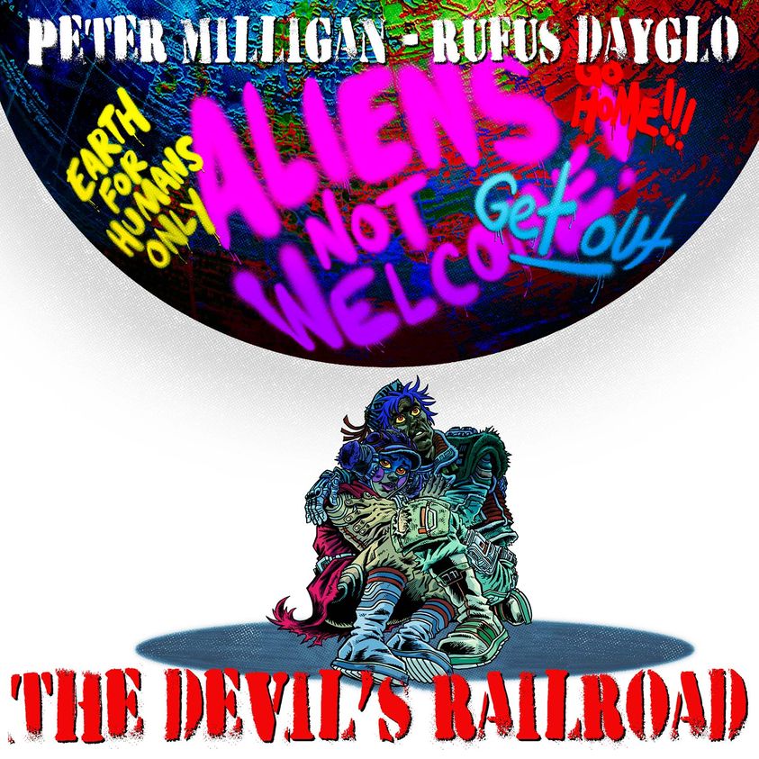
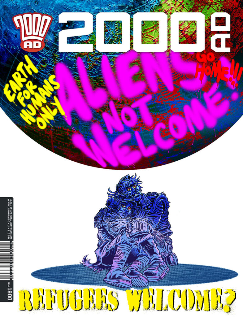
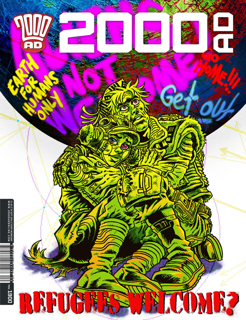
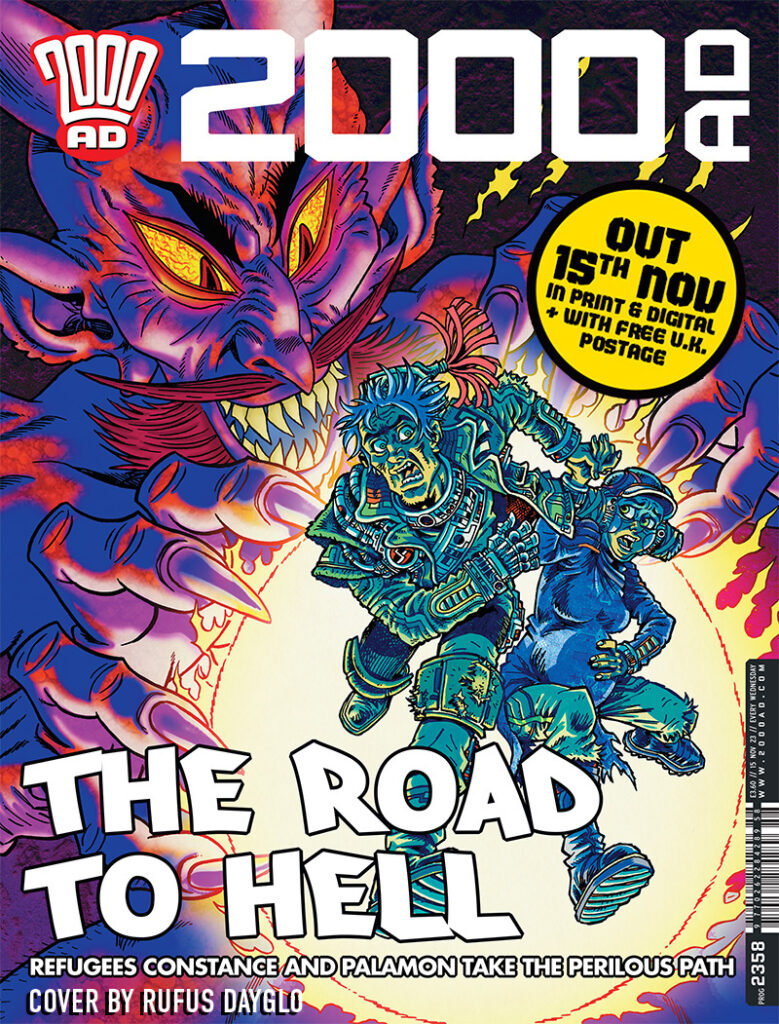
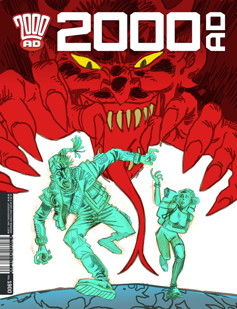
This week we have another fabulous Rufus DaygloDevil’s Railroad cover to delight you on the cover of Prog 2360 – one that you’ve possibly already seen in the promotional images for this great series by Peter Milligan and Rufus Dayglo.
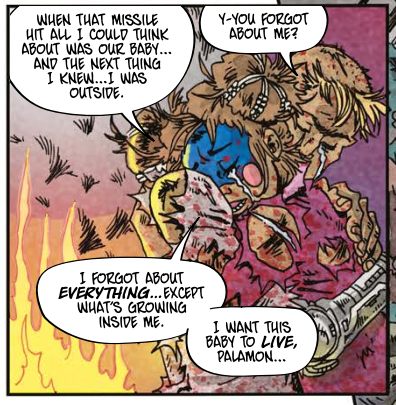
We’re now deep into the incredible sci-fi love story that began in Prog 2352, Milligan and Dayglo thrilling us with a tale of two young lovers living in a war zone who’ve just discovered they’re expecting. Wanting something as simple as a life during wartime and a life not threatened every day for their child, they’ve joined The Devil’s Railroad, the dangerous people smuggling route offering them sanctuary on Earth.
It’s exactly the sort of politically-infused sci-fi that 2000 AD has always been known for, a heady mix of epic love story and social commentary that has already proved a huge hit with fans.
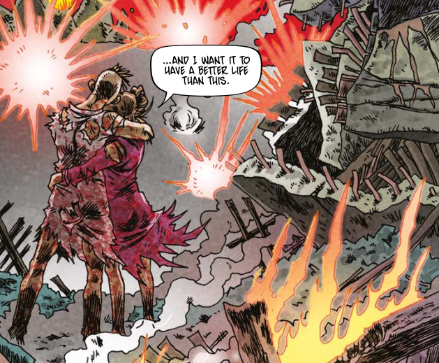
So, time to join the young lovers once more, as Constance and Palamon feel like they’ve got the weight of the world on them in this latest cover by Rufus, such a great cover in fact that Tharg’s already been using it for publicity…
.
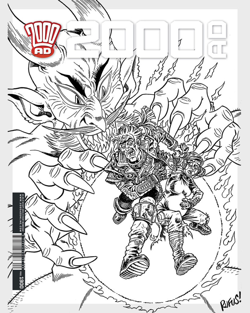
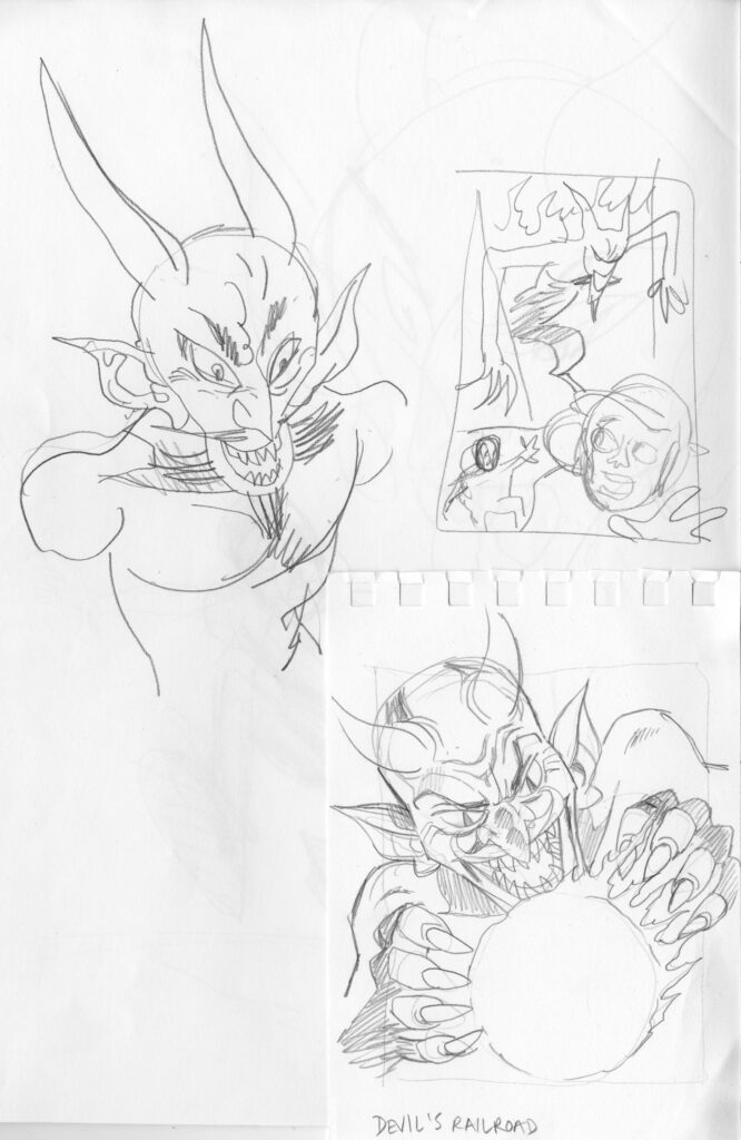
Compared to Rufus’ first cover for The Devil’s Railroad, this one was a lot easier, all starting, as Rufus will tell you, with just the one cover rough… this one in fact…
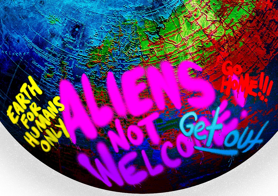
RUFUS DAYGLO: This cover came to me pretty much fully formed as an idea… with the World oppressively failing to welcome our desperate young refugees.
Sometimes it really is that simple!
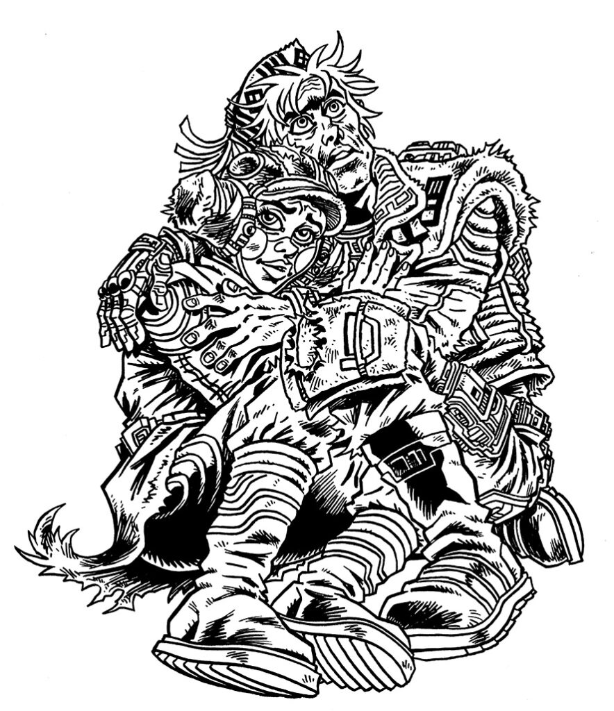
So the two elements of the cover were set and done… first the desperate young lovers…
And then the world above them, full of abuse and hatred…
But even here where the cover came together so easily, there’s still things that cause the art droid problems – back to Rufus again…
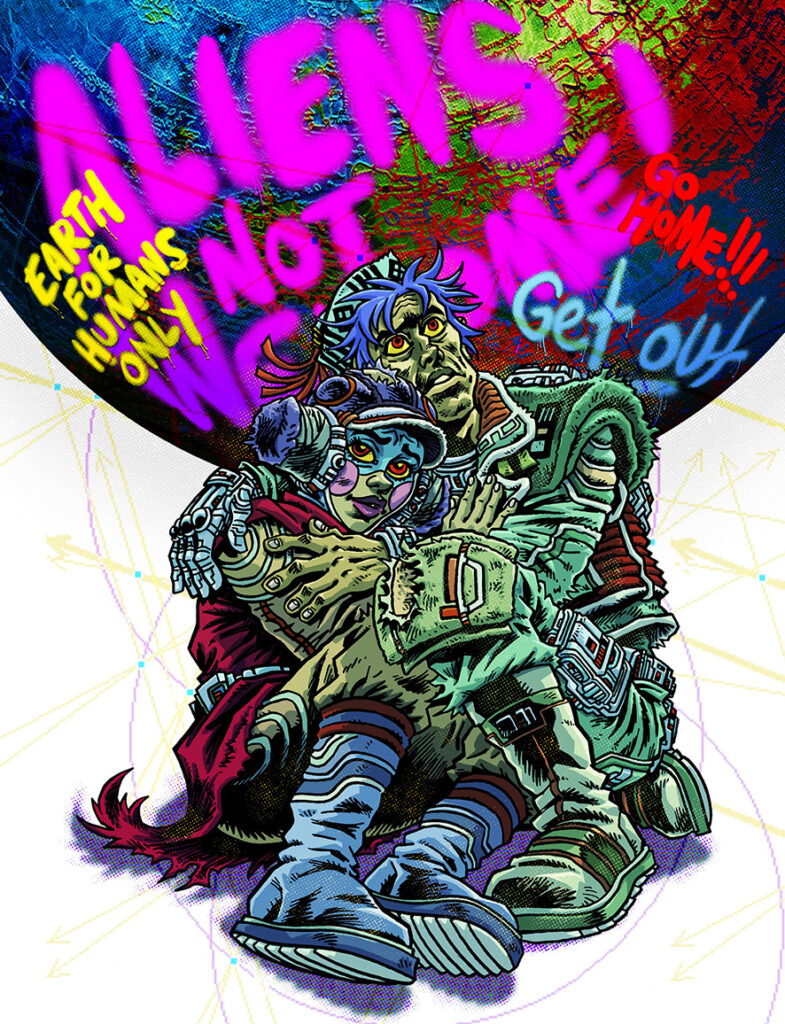
RUFUS DAYGLO: The only thing I tinkered/struggled with was colouring the couple! I tried various simple colour tones before fully colouring them.
The Globe on this cover is actually a Plastic toy Globe I bought at a Berlin flea market from a middle-aged Syrian refugee, who was selling odds and ends to try and make cash. He was an architect from Damascus and we talked in English.
I did two versions of this cover, one with the couple small, almost crushed by the World, and the other with a larger couple, with all the abusive graffiti behind them.
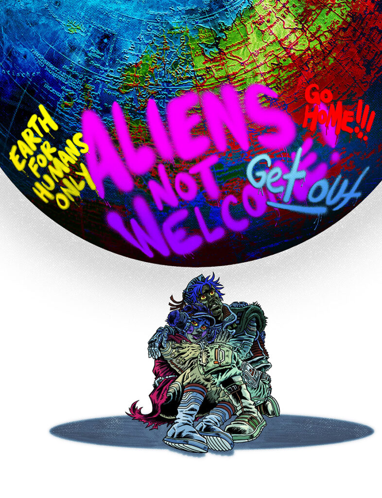
And here are just a few of the various combinations of figures and colours that Rufus tried before settling on the final cover…
All of which led to that iconic final cover – so iconic and representative of The Devil’s Railroad, absolutely stunning…
Thank you again to Rufus for all the details of this second Devil’s Railroad cover – and what a fabulous cover it is! Thanks so much to Rufus for sharing that with us. Find the cover on the Prog wherever thrill power is sold, comic shops, newsagents, and of course the 2000 AD web shop.
For more on The Devil’s Railroad, make sure you read our interview with Milligan and Dayglo, and have a look at Rufus’ first Devil’s Railroad Covers Uncovered as well, you can find that here.
And for more from the Milligan/Dayglo team, there’s an interview on their dystopian cyberpunk thriller Counterfeit Girlhere and we talk Bad Company: Terroristshere.
Every week, 2000 AD brings you the galaxy’s greatest artwork and 2000 AD Covers Uncovered takes you behind-the-scenes with the headline artists responsible for our top cover art – join bloggers Richard Bruton and Pete Wells as they uncover the greatest covers from 2000 AD!
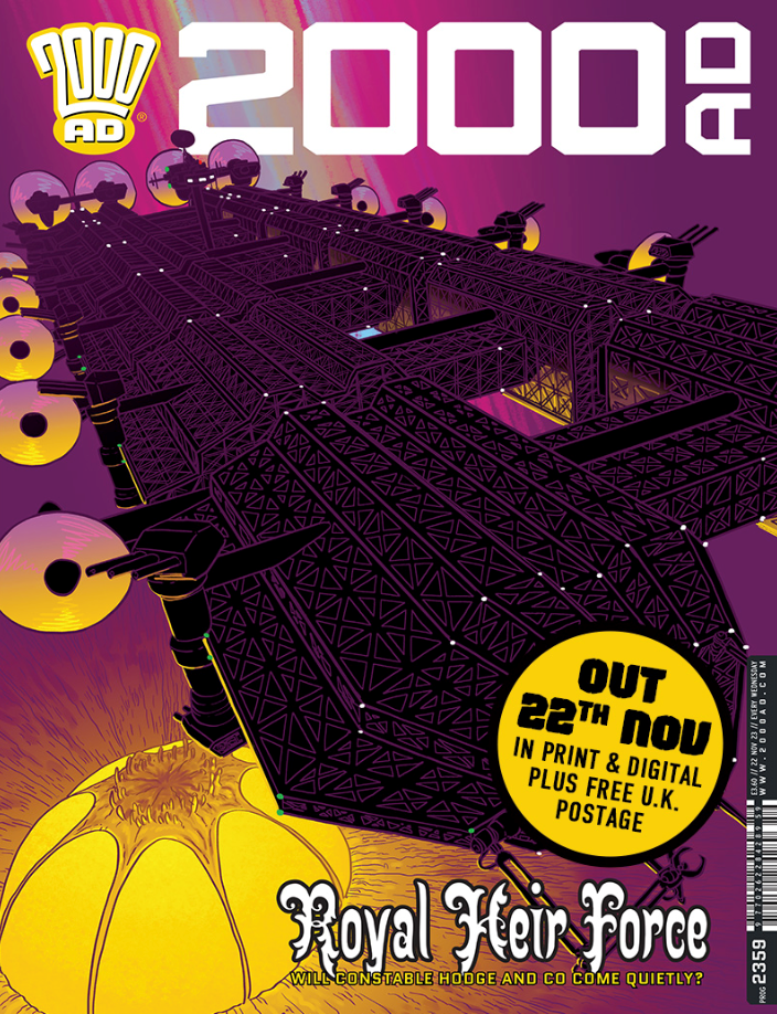
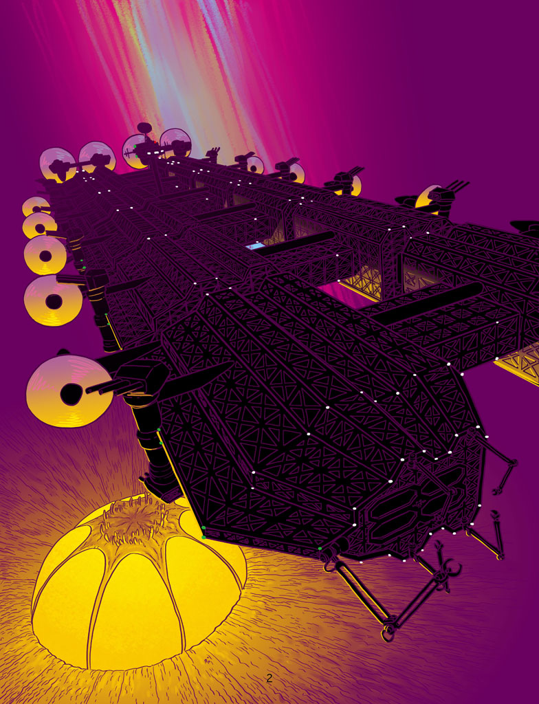
Helium: Scorched Earth by Ian Edginton and D’Israeli is absolutely blasting through the pages of the Prog right now, giving us the thrills of a beautifully strange world. 2000 AD Prog 2359 finds the forces of Ris in the skies above our heroes – as you’ll see from the latest fabulous cover by D’Israeli…
When Helium debuted for a first series in 2015, it told a fabulous tale of adventure in a sumptuously realised world where war has devastated the environment, leading the survivors to seek refuge above the toxic cloud of biological and chemical weapon smog that blankets the world below.
But as we’ve seen in the second series, Scorched Earth, there’s a lot of life both below and in the Fugue Cloud. Our heroes Constable Hodge, her deputy Sol, and the strange Professor Bloom, who claims he can transform the world, are now on the run from the forces of Ris, the city under the Fugue.
All of which has led them to the small township inside the Fugue, a township under a very weird organic shell. But any peace has been shattered as the Ris battle carrier Bellerophon looms overhead. And that’s exactly where we are on this latest cover from D’Israeli.
So, over to D’Israeli to tell you all about it…
MATT BROOKER: This image was produced using a Wacom drawing tablet and Clip Studio Paint software. The same effects can be produced in other graphics programs.
This was an unusual one for a couple of reasons – the first was the choice of cover design itself. For my whole time at 2000AD, Tharg-in-Residence Matt Smith has given me a clear brief for each cover. I’ll usually produce 1-2 interpretations of that brief, plus one complete outlier idea of my own. Matt will usually choose one of the variants on the brief and off we go.
Rough number 1 – The Bellerophon bombardment of the Fugue town
This time, though, Matt’s brief was to show the carrier Bellerophon bombarding the marketplace of the domed town (Rough number 1), and I also produced a variant with the Bellerophon bombarding the dome as seen from the outside (Rough number 2).
We went with the brief of rough number 1, but once I started penciling the image I remembered that the clothing of the inhabitants of the dome was Middle-Eastern in style, and we were showing them being bombarded with artillery. Given current sensitivities over the Israel-Gaza crisis, I thought it best to check back with Matt, and after some thought we went with the second idea, removing the explosions from that version so we just see the huge ship menacing the dome.
Rough number 2 – The Bellerophon cruiser above the Fugue town – the version that eventually became the cover
That actually made the job quite a bit simpler – I’d already used 3D models to get the Bellerophon looking right in the roughs, so most of the job would be inking over the render. This cover was the first one I’ve ever done without needing to do pencils!
Or inks, technically – I was only using coloured outlines for this image, which in the old days would have been classified as “colour holds,” not inks.
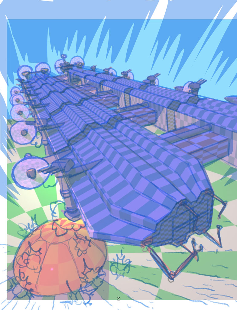
The next step – adding the 3D model of Bellerophon over the roughs
Adding colour holds to it all – inking of a sort!
Having the model to work from saved me a lot of effort in terms of setting up with structure of the drawing, but I still had to add all the gridwork on the outside of the ship.
I’d covered the model in a chequerboard pattern to act as guides for the gridwork, but it’s still a slog drawing it all in. The most difficult bit is working out how to start tailing off the amount of detail into the distance, so the density of the drawing looks consistent. If you try and draw every last girder, the drawing will look like a mess, but tail off too soon and it looks sparse and lazy…
The next step was to add blacks under the girderwork – for printing purposes, black needs to be on its own layer above the colours, so I traced off the shape of the Bellerophon in black on a layer above the linework, then selected the contents of the linework layer (CMD/CTRL + click on the thumbnail for the layer in Clip Studio) and used that to make a Layer Mask that cut out the linework from the black.
Adding the blacks under the girderwork – all on its own layer
Following that, time to add flat colour and a basic grad to make it look as if the dome is glowing, all on layers beneath the black and the linework…
Basic/flat colours and a gradient added to bring things together
Next, I added modelling to the background grad, grads and highlights to the Bellerophon’s propellors (to suggest movement) and also to add yellow highlights to some of the linework on the Bellerophon to help it “pop.”
Modelling, grads and highlights stage – making the linework pop that little more
After that, the final touches – I put in a subtle grad on the blacks so the giant carrier would look as if it were fading into the mist with distance, and I added some detail to the sky – a magenta grad and blue-green streaks which help break up the background a bit. I’m not sure what this effect is meant to represent, but I’ve been putting it in since early in series 1, so there you go.
The final step (not shown) is to export the file to Photoshop, and carefully collapse the layers to give me a CMYK TIFF file suitable for printing.
The final touches to make the finished cover – with a very menacing Bellerophon dominating the skies!
Thank you so much to D’Israeli/Matt for sending that lot across. It’s a really striking bit of cover art that you’ll be seeing on the shelves of your local emporium stocking Tharg’s finest right now. And of course it’s available from the 2000 AD webshop as well.
If you’re after more Helium, we interviewed writer Ian Edginton about Scorched Earth here and we talked of the art of Scorched Earth with D’Israeli here. And as for more from both gents… do be sure to dive into the interview archives… Fiends of the Eastern Front: 1812, interview with Ian and Dave Taylor, Fiends of the Eastern Front: 1963, interview with Ian, Judge Dredd: Babel, interview with Ian and Matt, and Scarlet Traces: Storm Front, interview with Ian and Matt. Plus, don’t miss both Ian and Matt talking on The Lockdown Tapes.
Every week, 2000 AD brings you the galaxy’s greatest artwork and 2000 AD Covers Uncovered takes you behind-the-scenes with the headline artists responsible for our top cover art – join bloggers Richard Bruton and Pete Wells as they uncover the greatest covers from 2000 AD!
This week, it’s the return of Rufus Dayglo to the cover of 2000 AD Prog 2358 with The Devil’s Railroad, the politically charged tale of a love story set against a powerful take on the refugee crisis that’s running in the Prog right now.
Beginning in Prog 2352, The Devil’s Railroad by Peter Milligan and Rufus Dayglo tells a tale of hard-hitting contemporary sci-fi that 2000 AD has always done so well. It’s thrilling and it’s relevant, Romeo & Juliet with a socially conscious backdrop, described by Milligan as ‘an often dark but always human story about that most basic and perhaps ancient of human impulses: the impulse to flee danger and seek out a better life for you and your family. Our heroes take the so-called Devil’s Railroad that they hope will take them to Earth, and a better life. It’s a harrowing journey through an unfriendly and sometimes bizarre universe.’
So, won’t you join our young lovers, Constance and Palamon, who’re just trying to find a new home, a safe place to bring their unborn baby into the world. But to do that, they’ve set out on The Devil’s Railroad…
Now, over to Rufus for the tale of putting the cover together – and, as is common with art droids, there were a few troubles before getting it right…
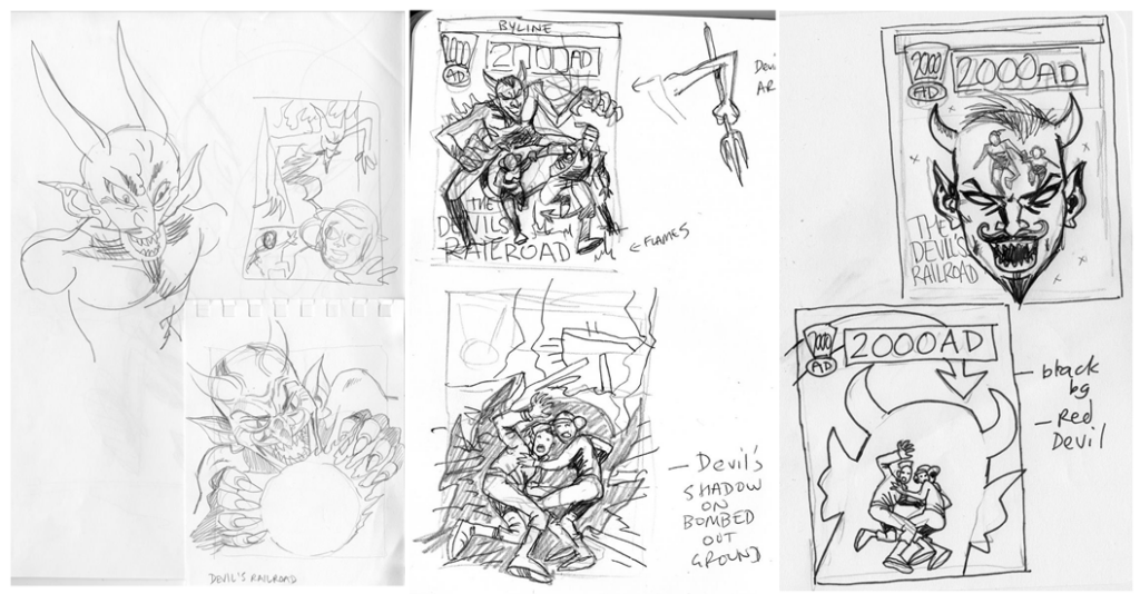
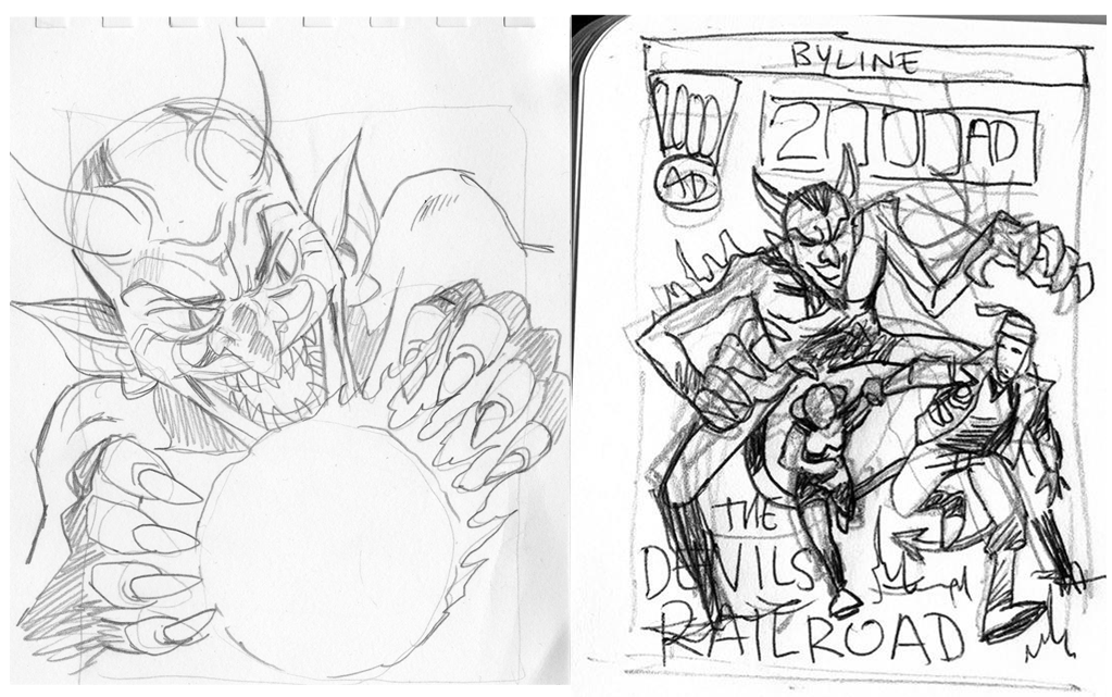
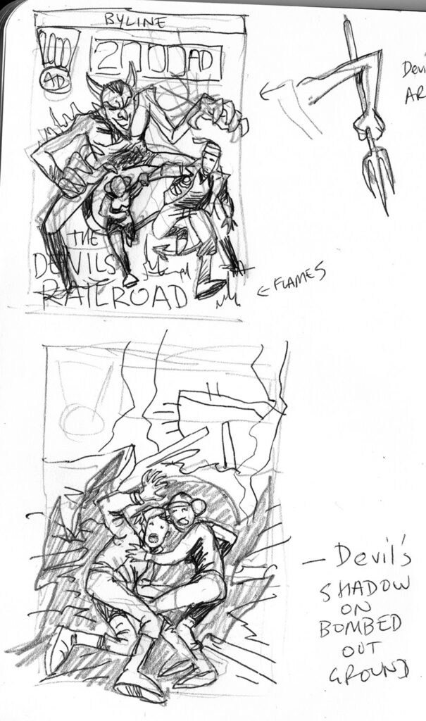
RUFUS DAYGLO: The first cover went through many permutations as I fumbled with the idea.
I wanted the young couple being chased, quite literally, by the Devil. It seemed such an easy idea… and yet I had real trouble landing on a composition I like.
You always have to leave room for titles and other stuff that Tharg’s editorial droids may place (and you don’t know what!) so it can be a bit of a guessing game.
I wanted to convey the urgency and desperation of their voyage, always about to be thwarted by circumstances or villains.
So, with that plan in mind, Rufus set about putting things together, beginning with a few cover roughs…
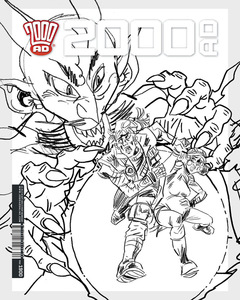
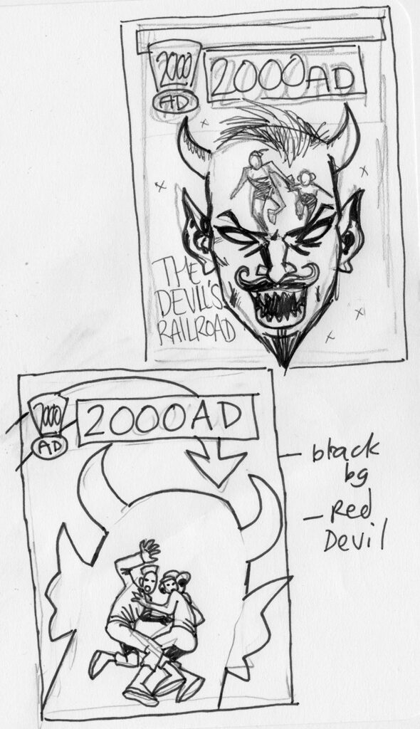
But none of them were ‘it’ so Rufus pulled elements from a couple of the roughs – literally taking the devil from A and the lovers from B…
… and putting them together to make this final cover rough…
Although not before playing around with another idea along the same lines and getting as far as adding a few rough colours…
But no, the decision was made and it’s back to the cover rough, adding pencils and inks…
And then on to colours, where Rufus found inspiration from the much-missed Garry Leach…
RUFUS DAYGLO: The colour scheme was heavily influenced by my friend Garry Leach’s second The VC’s Titan cover.. as the art hangs above my desk. So I did the Devil largely purple in a small tribute to Garry’s cover.
That would be this beautiful Garry Leach cover – The VC’s Volume 2, published by Titan in 1987, complete with bits of Rufus’ studio space!
And with that in mind, Rufus coloured his cover up to give us this stunning thing…
And that’s how another zarjaz Prog cover was made! Thanks to Rufus for sharing that with us. You can find Rufus’ cover on the Prog wherever you pick up your weekly dose of Ghafflebette comics, including the 2000 AD web shop.
For more on The Devil’s Railroad, make sure you read our interview with Milligan and Dayglo right here!
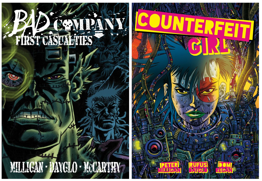
Milligan and Dayglo have a long history of making this sort of brilliant sci-fi, full of action but always questioning and looking deep into society, whether it’s the issues of identity and identity theft in the dystopian cyberpunk of Counterfeit Girl or the brutal take on war and the price those involved pay in their Bad Company tales. Bad Company: First Casualtiescan be found in Progs 1950-1961 and as a digital collection. Bad Company: Terrorists can be found in Progs 2061-2072.
And, whilst you’re looking at the very best future war tales, you should have The Complete Bad Company by Peter Milligan, Brett Ewins, Jim McCarthy, and Steve Dillon in your collections!
Finally, we’ve talked with Peter and Rufus before this about their work together, in 2017 for Bad Company: Terroristshere and for Counterfeit Girl in 2019 here.
And finally, finally, because we didn’t show them to you in their full sizes above, here’s Rufus’ initial roughs in all their glory…
Every week, 2000 AD brings you the galaxy’s greatest artwork and 2000 AD Covers Uncovered takes you behind-the-scenes with the headline artists responsible for our top cover art – join bloggers Richard Bruton and Pete Wells as they uncover the greatest covers from 2000 AD!
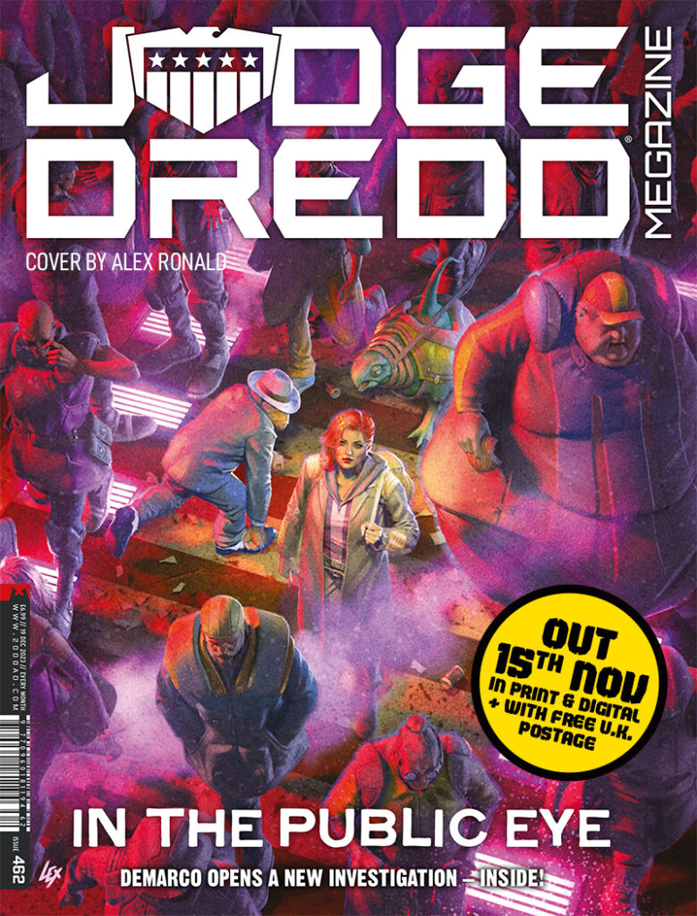
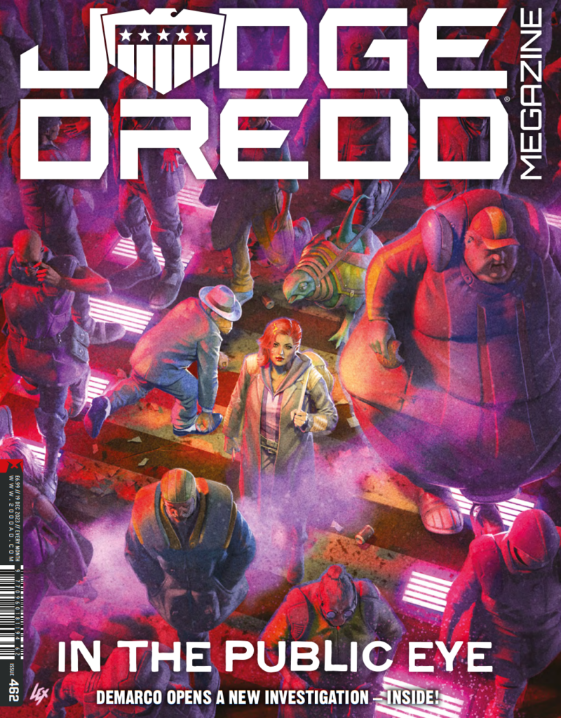
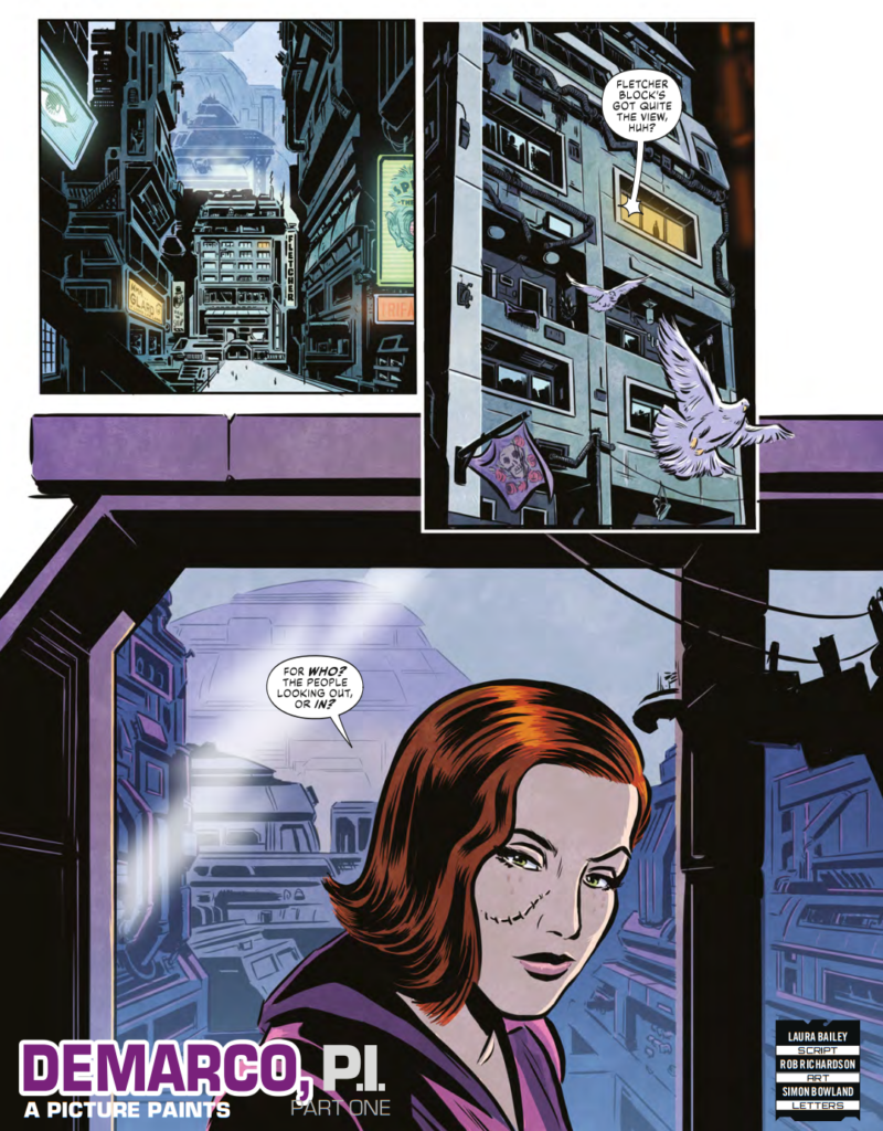
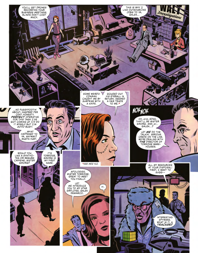
This week cover artist extraordinaire Alex Ronald returns to grace the cover of the latest Judge Dredd Megazine, issue 462, featuring the new DeMarco P.I. series, A Picture Paints.
DeMarco P.I.: A Picture Paints is by Laura Bailey and Rob Richardson and sees with Galen scarred and battered but still out there looking for new clients. She’s joined in the Meg this month by a zarjaz lineup of Judge Dredd, Spector, Lawless, and a new Mega-City 2099 strip taking us right back to the beginnings of it all!
As for Alex, he’s long been a cover specialist for 2000 AD, specialising in digital masterpieces for Tharg since coming back into the fold after a stint in the computer graphics and 3D modelling worlds. And of course, before all that, he got his start from Tharg in 1996 when he jumped on to illustrate Dredd, followed by Vector 13, Rogue Trooper, and Sinister Dexter.
It’s always good to have him back on the cover – and this is a pretty damn fine cover indeed. So, why not let him tell you all about it?
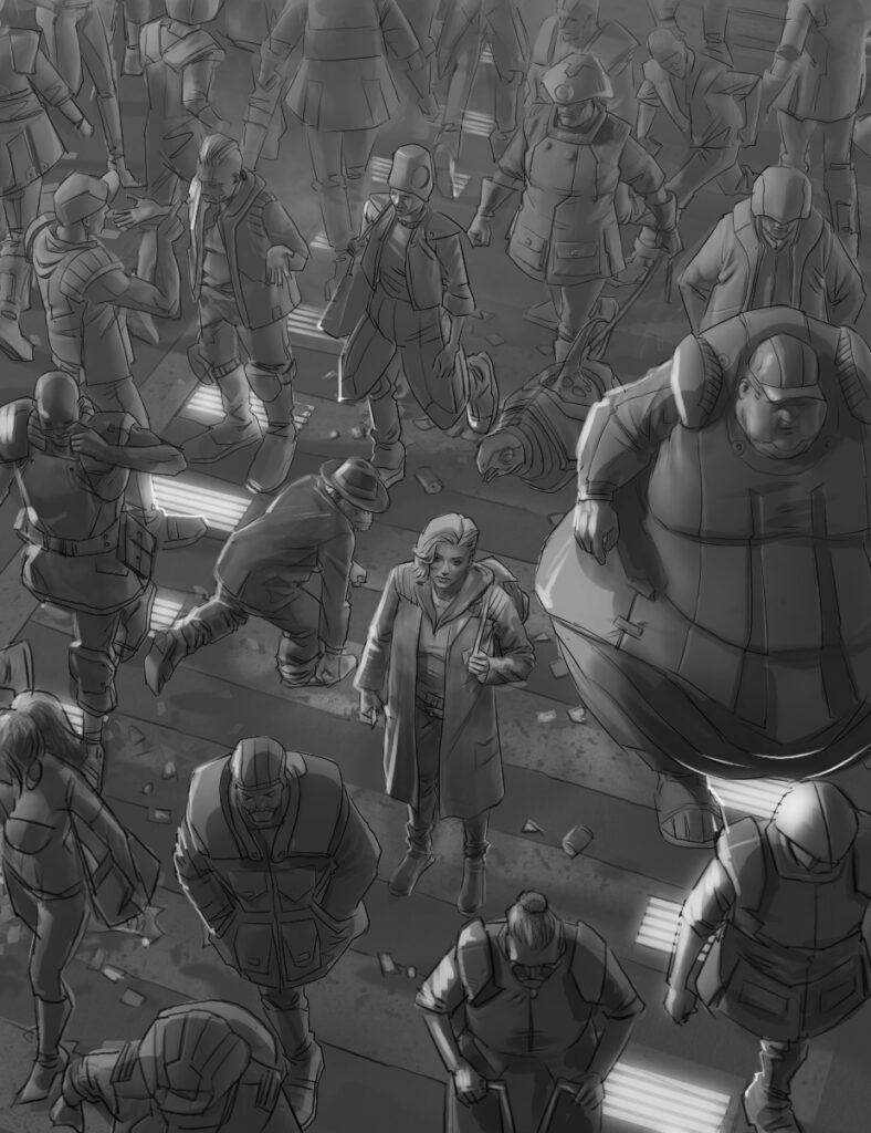
ALEX RONALD: Matt had asked for a new cover for DeMarco and for it to be of a similar angle and composition to the Transmetropolitan cover by Frank Quietly.
That would be this one, a classic from Frank Quitely…
ALEX RONALD: I was supplied some sample pages from the story so I had all the reference images I needed for her outfit and look as well as a few shots of her in the busy streets of Mega‑City One.
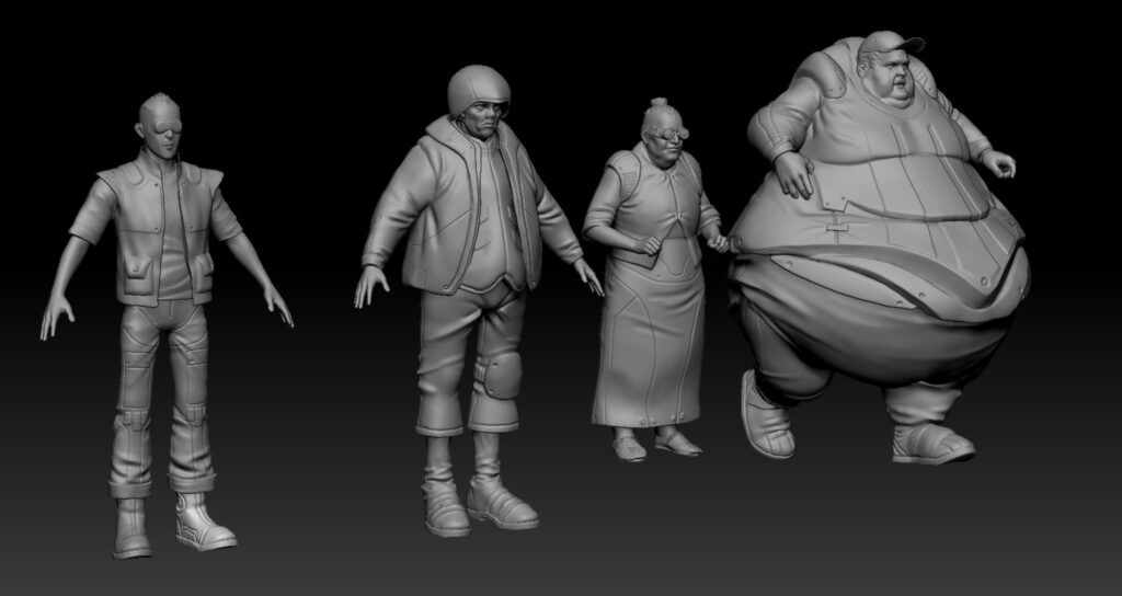
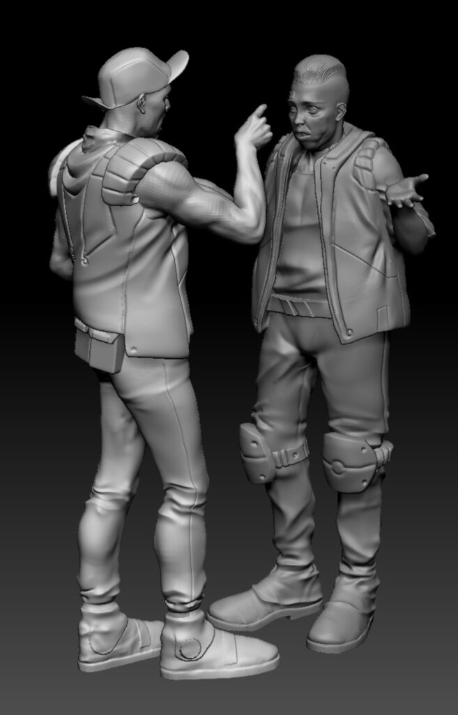
I began by building 3D models of the citizens in Z Brush. I raided the archives of some of my old 80’s 2000 AD and Judge Dredd annuals as I wanted them to depict the clothing styles of the citizens as they were drawn in that period of time, especially by Mike McMahon and those annuals had the most excellent examples.
ALEX RONALD: The character building for so many citizens took a bit of time. I was on my summer holiday at this point and I built and posed one or two characters in the morning of each day. By the end of the week I had the volume of citizens required to give the scene a busy hectic look.
Alex, have to let you know, Tharg’s looking for you wondering about this whole holiday thing – and he’s not too happy, mumbling something about letting you have a morning off about five years ago.
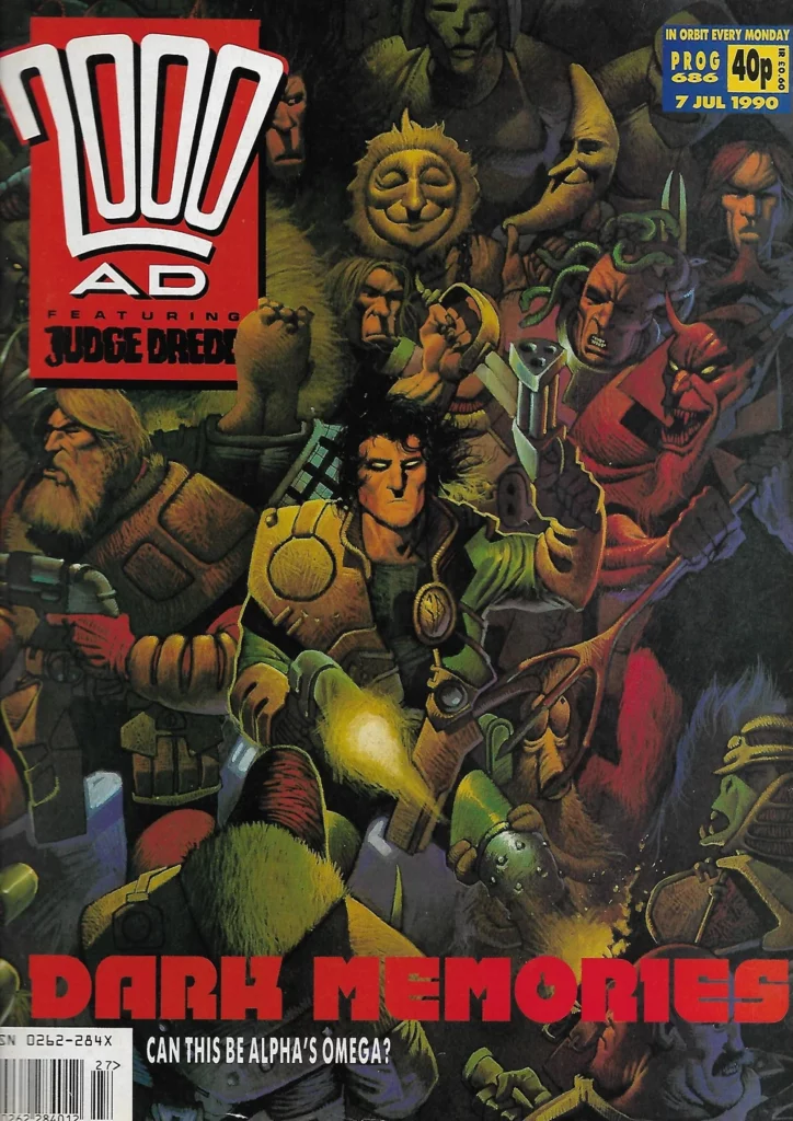
ALEX RONALD: Once the composition was looking good I lit the models in such a way that the main character was highlighted but with the supporting cast were bathed in reds and purples. The inspiration for this came from Colin MacNeil’s Strontium Dog cover from prog 686
Again, that would be this one…
ALEX RONALD: Next phase was a sketch over for approval and then once the nod was given, I painted the image up to final stage for publication. I hope you like it.
Oh, these art droids… when they’re not cowering in terror from Tharg, they’re completely downplaying the incredible skills of what they do! Seriously, from putting together the 3D models to this sketch is incredible enough…and that’s saying nothing of Alex daring to call this a ‘sketch’!
But then to take that sketch and work all that digital magic on it to give us this incredible finished cover… wow…
Thank you so much to Alex for sending that along. Another spectacular looking cover from the Ronald droid complete. You can find that cover on Judge Dredd Megazine 462, out from 15 November wherever you pick up your copies of the Meg and the Galaxy’s Greatest, including the 2000 AD web shop.
And now, as a special treat for you, the first couple of pages from that new DeMarco, P.I. adventure, A Picture Paints, by Laura Bailey and Rob Richardson…
Every week, 2000 AD brings you the galaxy’s greatest artwork and 2000 AD Covers Uncovered takes you behind-the-scenes with the headline artists responsible for our top cover art – join bloggers Richard Bruton and Pete Wells as they uncover the greatest covers from 2000 AD!
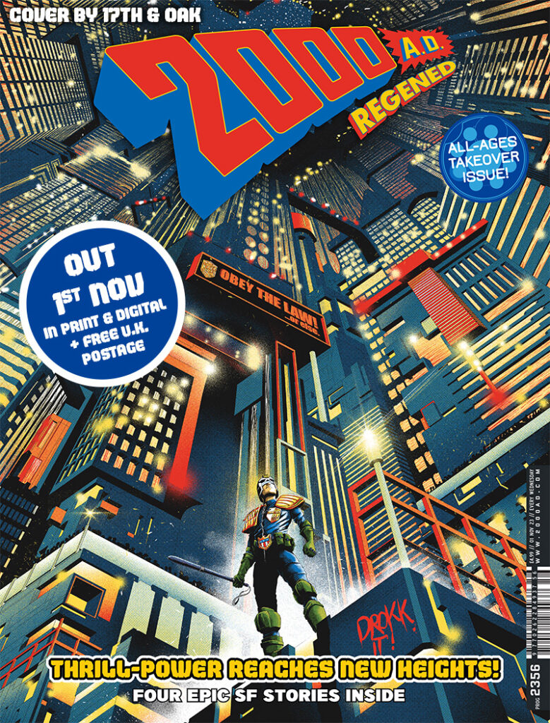
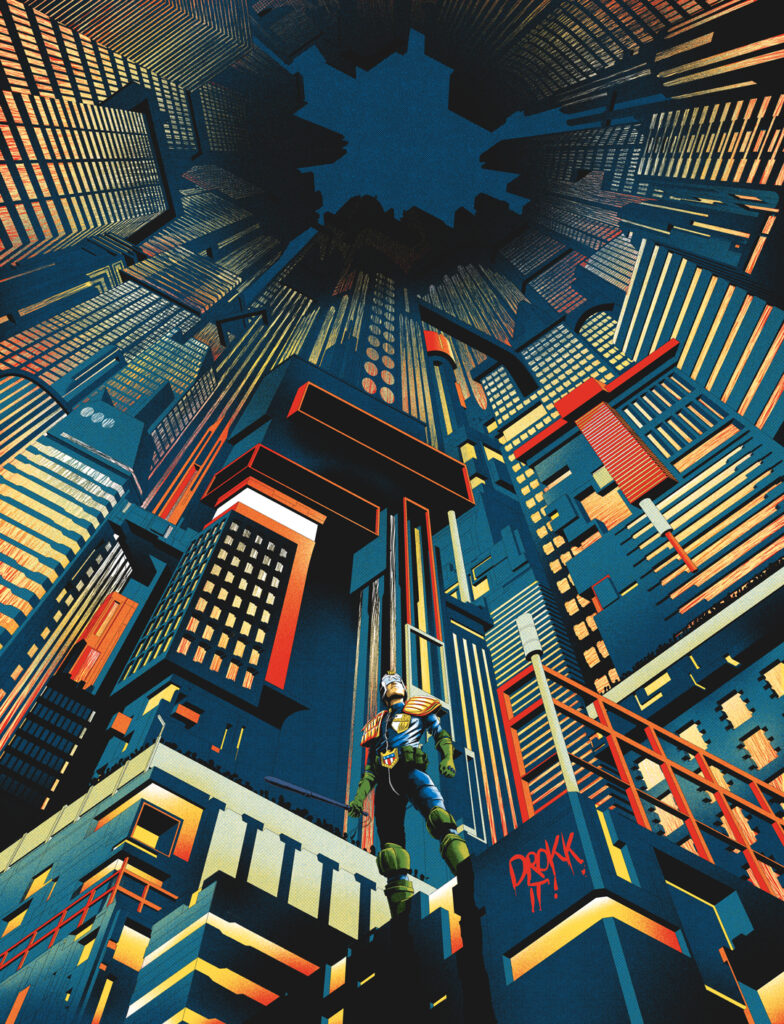
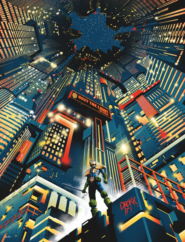
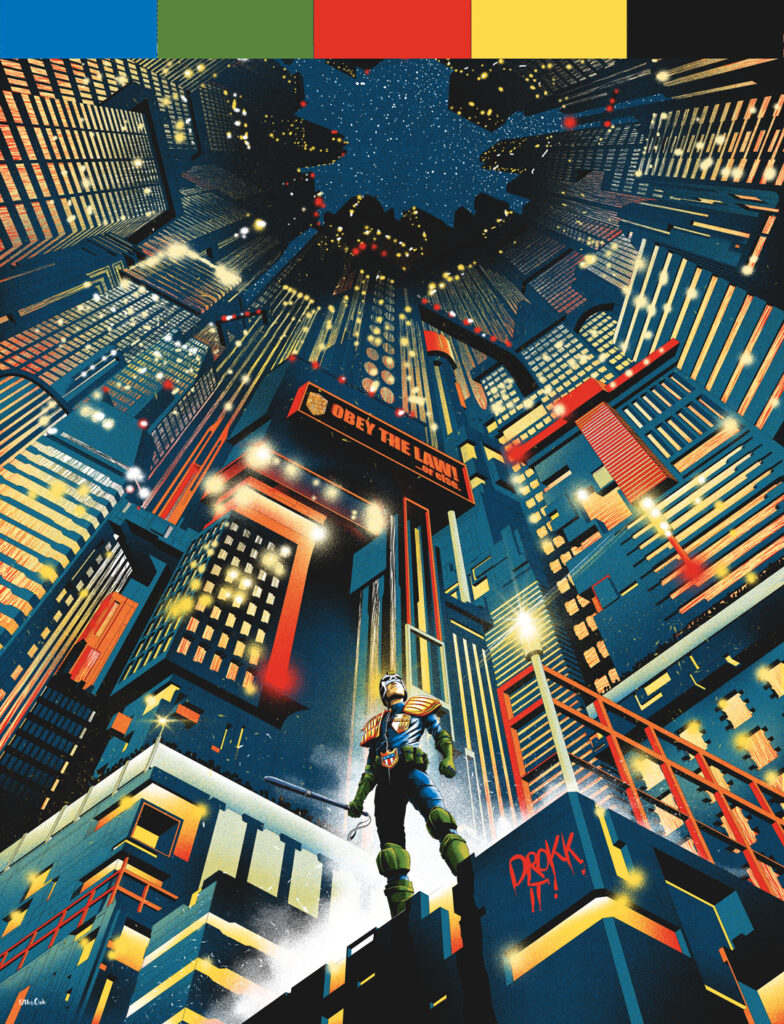
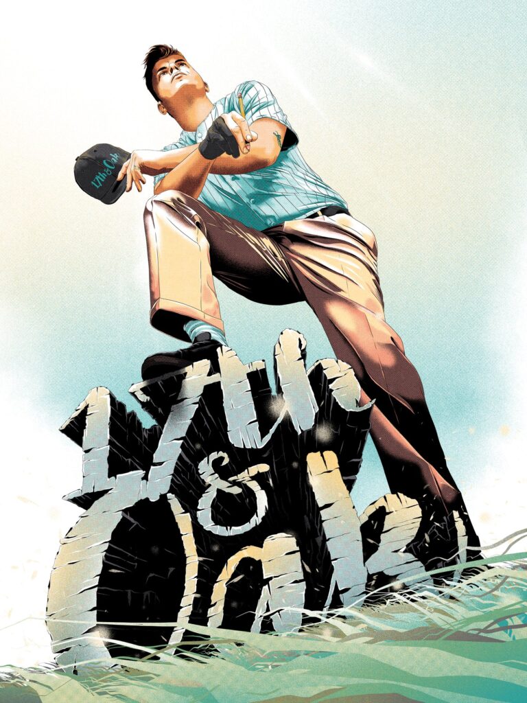
This week, a debutante art droid in 2000 AD Towers – 17th & Oak for the spectacular cover of 2000 AD Regened Prog 2356 – it’s all about Dredd and the Mega-City…
Now that’s a majorly good Dredd & the City cover right there – a zarjaz debut indeed!
So, over to 17th & Oak for the story of who they are and how this great cover came together…
17th & Oak:I’m a Freelance Illustrator based in the south of the UK. My main avenue of work is partnering with movie studios to illustrate alternative versions of film posters used in the marketing campaigns of upcoming releases.
Titles I’ve worked on include Indiana Jones and the Dial of Destiny, Renfield, Bullet Train, and The Mandalorian to name a select few. I’ve alsocreated art for book covers, blu-ray covers, steelbooks, merchandise, editorial, and even trading cards.
But this is my first professional venture into comic covers and wow… what a start, 2000 AD!
2000 AD has been a solid part of my life since my childhood in the late ‘80s/early ‘90s. It was my uncle who got me into comics. He loved the British comic scene and was an avid collector of 2000 AD.
I remember him having boxes full of Progs in the cupboard under the stairs. After telling me one day about 2000 AD he said that I could borrow his collection. As you can imagine my excitement was like a kid in a sweet/toy/comic shop at Christmas with an endless amount of cash! The only thing was that I could only take one box at a time. For the next year or so I was always seen carrying around a big brown box of 2000 AD Progs. It was a funny sight seeing a small kid lugging round a big box of comics like it was my pet. Whenever I was in the car I’d be sat in the passenger seat with my current 2000 AD box in the footwell and my head buried in the comic.
It was the comic equivalent of binge-watching. Once I’d finished an issue, I’d put it to the side and grab the next one of the top and once I’d finished a box it was back to the source for a fresh new pile of escapism.
As you can tell, 2000 AD holds such fond memories for me so getting to work on a cover is a dream come true and an absolute honour.
The piece I’ve created has been received so well and I’ve been made to feel very welcome in the comic world by the fans. So let me talk about it and my process.
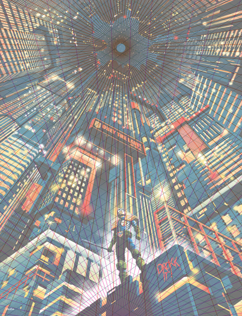
Firstly, there’s two things that most of my art pieces share – perspective and a restricted colour palette. Extreme perspectives are what I’m known for and this piece is no different.
I was asked to draw Cadet Dread standing in front of Mega City One. Simple right?
A main goal of all of my work is to tell a story by capturing a moment in time. With this cover, I wanted to give the sense that Cadet Dredd had just accomplished something, an arrest of a perp for example off camera and he’s standing in a way that is warning everyone else not to mess with him.
To fully communicate this I knew the POV had to be from below which automatically makes Dredd look strong, mean and proud. This would also show the dizzying heights of Mega-City One.
Usually, I tend to have the perspective leading into the corners so the whole piece would have been at an angle but for this one, I decided to keep it straight. Mainly because I liked the idea of the city leading up to the title which would be placed right over the vanishing point creating a dynamic connection between the title and Dredd which your eye naturally follows. Because the brief was simple I wanted to keep the composition and the story simple.
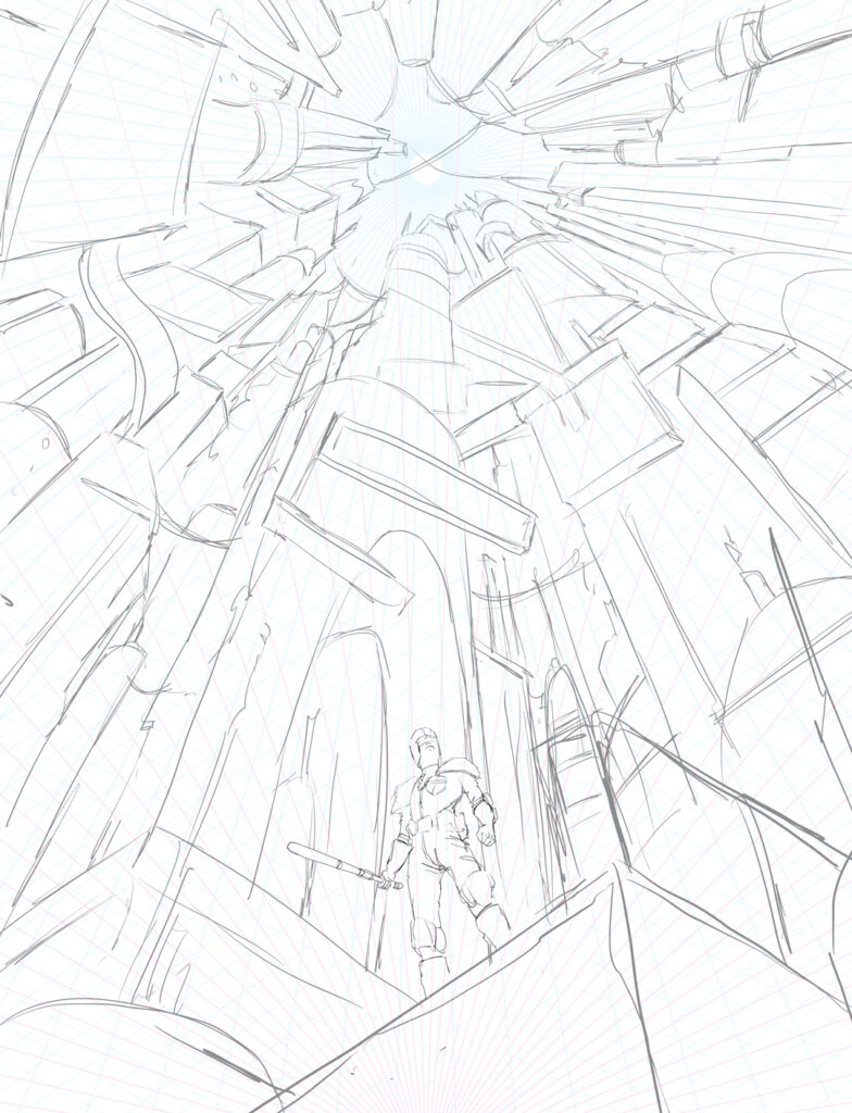
Once the perspective grid has been established, I’m ready to get started. I haven’t drawn Dredd since I was a teenager which was so long ago that I feel like I’ve never drawn him so this was an exciting challenge.
After loads of research to understand how the armour sits on his body, I whipped up a quick sketch. It took a bit of trial and error but I eventually got it to the point that I was happy with his pose and angle…
First up – getting the sketch done, getting that perspective in there
It was then time to move on to the city. Originally I was going to do him holding his gun but decided to have him holding his baton. For some reason, I find the baton way more intimidating than the gun.
Usually for cities, I use reference material but, for this one, I decided not to and drew it straight out of my head making it up as I went along. A strangely therapeutic approach to cities as I can just draw anything that spills out of my head and I’m not bound to a certain look. Having fantasy/sci-fi as subject matter allows me to do this as it doesn’t need to be based on anything in the real world. I find I tend to create unique-lookingcities when I do it this way.
For an idea of what I was going for, I was keeping films like Blade Runner and Akira in my head but I wanted a certain style of brightness to it, a little like Vegas, which gives off the feeling that it’s not a dangerous city at all – but of course, we know different.
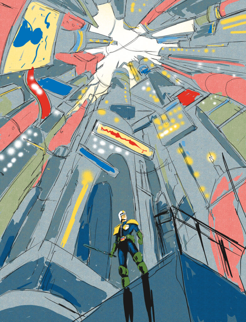
And the final sketch with colours that got the okay from Tharg
I’ve been told that my sketches have a tendency to be a little too advanced (well, for my corner of the Illustration industry, maybe not for comics) but I need to take it to a level that I’m happy with so I believe I’ve communicated exactly what I’m going for. Also, I need to know that what I’ve sketched out can be accomplished.
Using perspective in such an extreme way can be quite tricky. If one vanishing point is wrong it can throw off the whole piece and potentially make the look of the piece completely different so I need to know for certain that that won’t happen.
Colour plays a big part as well in communicating the feel of what I created that’s why I always add basic colour to my sketches from the start.
My sketch got approved instantly! Whoop!
Sometimes I’ll have clients asking to change, add, or remove certain parts but not on this occasion.
Now this is where the hard graft begins. How I create my art has always been very much rooted in comics; pencils, inks, colours. Even though I mainly work digitally, I still take the comic book approach. I’ll take my sketch and draw a tighter more detailed one. Once I’m happy with that I’ll start inking and adding in even more detail. I love giving people lots to look at so I’ll add in as much as humanly possible to each piece I do.
Next – onto the inks, getting the lines down for those perpectives
… and more inks added to the cover, lots of ’em!
As I mentioned before, I use a restricted colour palette. I find that the small amount of colours really brings the piece together and gives it a comforting sense of unity. I know that it looks like I’ve used a whole bunch of colours but I actually only used five.
I take a screen printing approach to colouring using block colours and a clever use of halftone patterns to create highlight, shade, and in some cases completely new colours. Layering certain colours on top of each other with halftones tricks the eye into seeing different colours. I’m a huge fan of traditional printmaking methods so I incorporate this into my work as often as possible. Often I scour the Internet in search of colour palette ideas but what’s great about this piece is that the colour palette was already decided for me because of Dredd’s outfit – Green, Blue, Red, Yellow, and Black for the inks makes my colour palette.
All the colours of Dredd!
Getting the base colours onto the inks
Once the inks are done and the colour palette established it’s a case of seeing which colours work best where and then building it up into the finished piece.
The last thing I do is add a few little details like the glimmering and glare of the lights, steam/smoke, graffiti etc...
Building up the colours…
… and even more building up the colours – plus sneaking in a bit of graffiti right under Dredd’s nose
And there it is – 17th & Oak’s very first 2000 AD cover – boyhood dream achieved!
As you can tell, I’ve developed quite a few rules for myself when it comes to my art. Perspective, colours and even the process (pencils then inks then colours). I believe this is because of my background in Graphic Design which is an artform with boundaries and I’ve taken the same self-restricted approach with my illustration, it just doesn’t look like it.
Working with 2000 AD marks the start of my comic book cover journey so keep an out for the perspective-led, detailed, and colourful artwork of 17th & Oak!
Oh yes – if this is how good his debut cover is, we reckon there’s definitely going to be more Prog covers from 17th & Oak in the future!
Now, a couple of extras from 17th & Oak, just to give us more glimpses behind the magic – the finished cover with the original perspective grid that started it all off and a reminder of just how that simple five-colour palette makes the entire cover work…
And that’s how the cover all came together – a really impressive debut! Thanks to the mysterious new art droid only known as 17th & Oak for sending all the details along. (Well, mysterious until you head to the ‘About Me’ section of his website anyway!)
You can find this latest incredible cover for 2000 AD Regened Prog 2356 wherever you pick up your weekly dose of the Galaxy’s Greatest, including the 2000 AD web shop.
For more from 17th & Oak, head to www.17thandoak.com. And to give you a little idea of his previous work, here’s just a few from his web gallery. He really does like a good bit of perspective!
Every week, 2000 AD brings you the galaxy’s greatest artwork and 2000 AD Covers Uncovered takes you behind-the-scenes with the headline artists responsible for our top cover art – join bloggers Richard Bruton and Pete Wells as they uncover the greatest covers from 2000 AD and beyond!
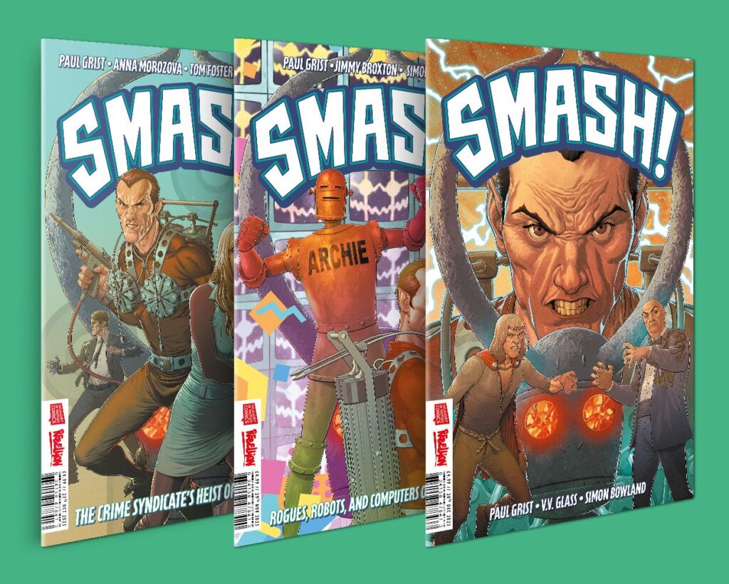
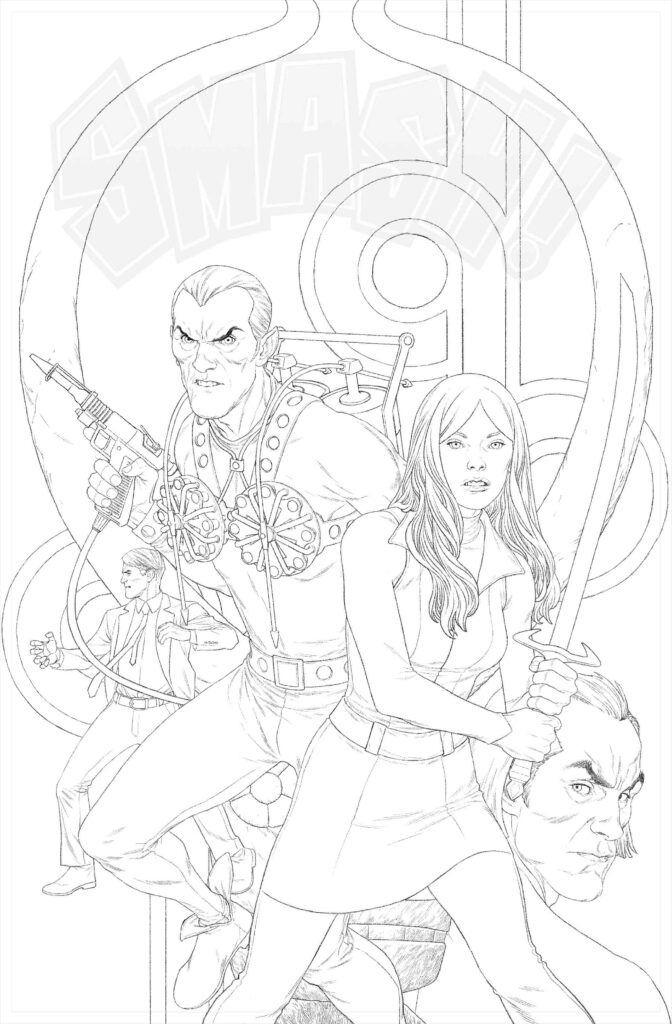
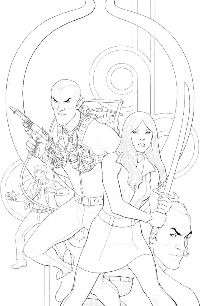
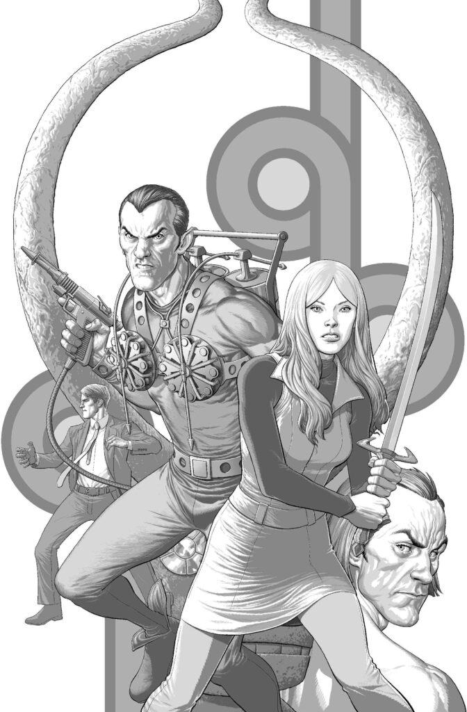
This week, we’re going away from the Prog for a moment to celebrate the coming together of superheroes from across the ages of Brit comics with the release of the first issue of Smash!
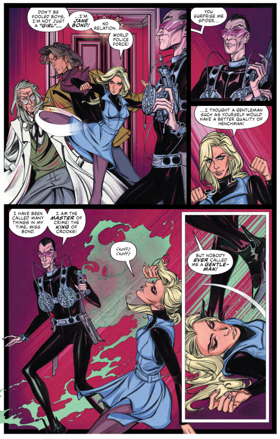
Across three issues writer Paul Grist and artists Tom Foster, Anna Morozova, Jimmy Broxton, and VV Glass are going to unleash the power of Brit comics’ greatest, including Janus Stark, The Spider, Cursitor Doom, Robot Archie, Jane Bond, and The Steel Claw. There’s even a visit to the Thirteenth Floor with the psychotic AI Max!
It’s a no-letting-up, fast-paced, action-adventure mini-series that features the very best and the most outlandish heroes, superheroes, and anti-heroes that comics can offer! It all begins in Victorian London with Janus Stark creating a demonic prize way too tempting, some sixty years later, for The Spider to avoid planning a heist! And that’s just the start of it all, with heroes from across the ages coming together to attempt to thwart the King of Crooks!
Smash! #1 arrives in comic book stores and on the 2000 AD webshop and app on 25 October. Each issue has a stunning cover by Andy Clarke, and he’s here right now to tell you all about putting the cover to SMASH! Issue 1 together…
ANDY CLARKE: I’ll admit, as with the Battle Action cover, I knew the characters in Smash! by name only. I’d seen the odd piece of artwork before – The Spider in particular, but I hadn’t seen any of the comics. Despite my ignorance, I was well up for taking a crack at these covers – it felt like something fresh and new (to me) to have a go at. So when editor Oliver Pickles asked if I’d like to do them, I didn’t have to think about it, it felt exciting to give it a go.
Oliver was able to provide a whole bundle of reference material, past and fairly present, so I could familiarise myself with the characters. There was some great classic-looking artwork in there, a couple of terrific Chris Weston pieces and some superb pages for issue 1. It makes things a lot more enjoyable when you have art from Anna Morozova and Tom Foster to look at and spur you on. Top stuff.
And here’s that reference material that Oliver sent over to Andy…
The Spider by Chris Weston & The Steel Claw by Jesus Blasco
>
Classic Janus Stark by Ian Kennedy and the Smash! issue 1 version by Tom Foster
>
More reference – Anna Morozova’s take on The Spider and Jane Bond (no relation) from Smash! issue 1
ANDY CLARKE: Oliver had the initial idea of looking at Sean Murphy’s Batman covers for composition ideas to start with – it made a lot of sense as the kinda film-poster feel of those covers would suit these multi-character Smash! covers pretty well.
More reference to set the gears inside Andy’s head working – Sean Murphy’s recent Batman covers, all evoking that classic film poster look to things
>
So, with that in mind (but in the back somewhere, so it wasn’t too prevalent), I roughed up some sketches for all three, just really to see if anything popped out that I could carry across them all so they had a connection of some kind.
Pretty soon, the Idol looked like it would be the thing that could link the covers together – the Idol also did a lot of the heavy-lifting for each layout/composition in the end, it helped tie everything together. And, as the series is set in different decades, I wanted to add a 1960s (for issue 1) and a 1980s (for issue 2) background pattern or design as a nod to that.
Once it was agreed the Idol would be the one element repeated on all three covers, I thought that once I’d inked the outline, done all the grey-tone, the flats, the colour and rim-lights on it for issue 1, I could drop it into the other two covers without having to redo it from scratch each time. Then all I had to do was alter the colours and highlights on the Idol for #2 and 3 so it matched the colour-scheme around it. Bit of a cheat really, but it saved some time.
Andy Clarke’s initial sketch roughs for the cover of Smash! issue 1
And here’s Paul Grist’s sketch of the Idol, sent to every artist to maintain the look
The sketch for #1 came together fairly quickly, but 2 and 3 took a little longer to finalise. So, while I thought about those, I got on with working up the cover for issue 1 – I’d come back to 2 and 3 after #1 was done. I was hoping I’d have a better idea how to proceed on the other two once the first one was complete.
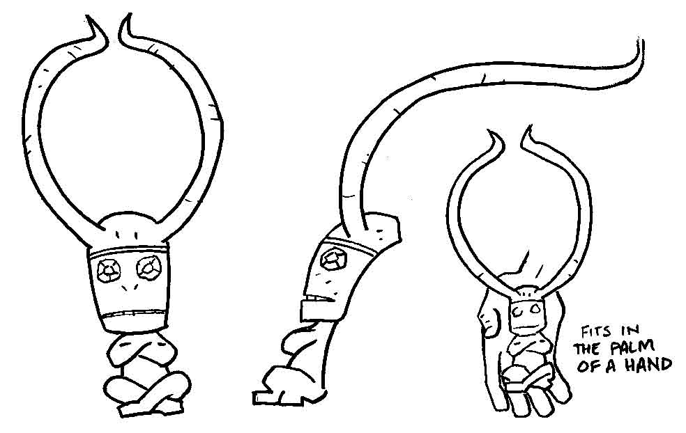
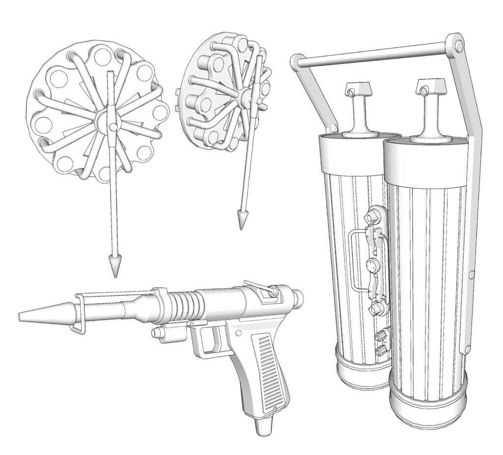
The process with these covers was the same as with my 2000 AD ones. The only extra this time was I thought I’d make things a little easier for myself by looking at Chris Weston’s Spider piece and make some quick models of the equipment (the gun, the back-pack etc.) in SketchUp. As The Spider was central to each of the three covers, I thought it might benefit and I wasn’t all that confident about drawing that stuff from scratch each time and from different angles.
And that’s just what Andy did. So, working through his process pieces that he sent over, first we have those SketchUp models of The Spider’s equipment…
Andy’s model renderings of The Spider’s gun, back-pack and… actually, what they hell are those things?
And after that we have the process of Andy working through the stages – pencils, inks, adding the greys, adding flat colour, and then making it all pop for the final version…
Pencil stage first – and Andy’s pencils really are incredibly detailed and tight
Now to the inks – as usual, Andy inks the outlines and leaves the detailing for the next stage, adding in the greys
Next up, adding in the greys – and Andy’s an artsit who leaves it to this stage to really go to town on the details
Nearly there – adding in the flat colours
And hey presto – with just a touch of a button, it’s all done. Actually no, more like after hours and hours and hours of back-breaking colouring work, it’s all done!
Well, what can we say except SMASHing! stuff from Andy right there! The covers to all three issues look amazing and the insides promise a cross-time caper with all the excitement of the best Brit comics and their unique take on superheroes! This is one series you shouldn’t miss.
You can find SMASH! issue 1 in comics shops and from the 2000 AD webshop and app on 25 October, and there’s also the chance to pick up all three SMASH! Issues in a bundle from the webshop right here.
Every week, 2000 AD brings you the galaxy’s greatest artwork and 2000 AD Covers Uncovered takes you behind-the-scenes with the headline artists responsible for our top cover art – join bloggers Richard Bruton and Pete Wells as they uncover the greatest covers from 2000 AD!
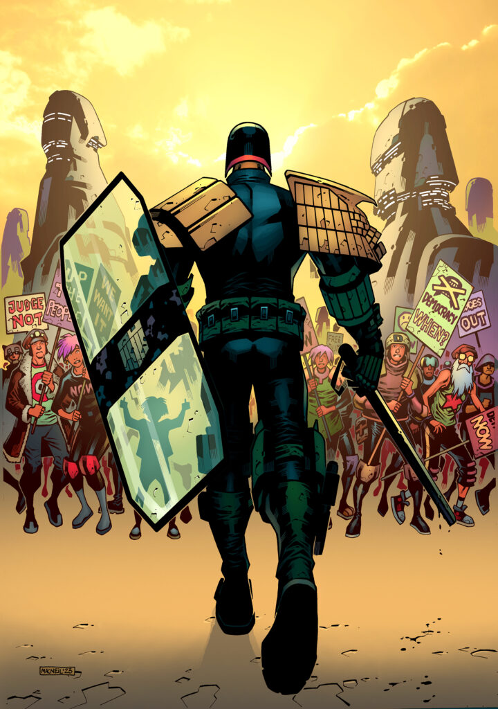
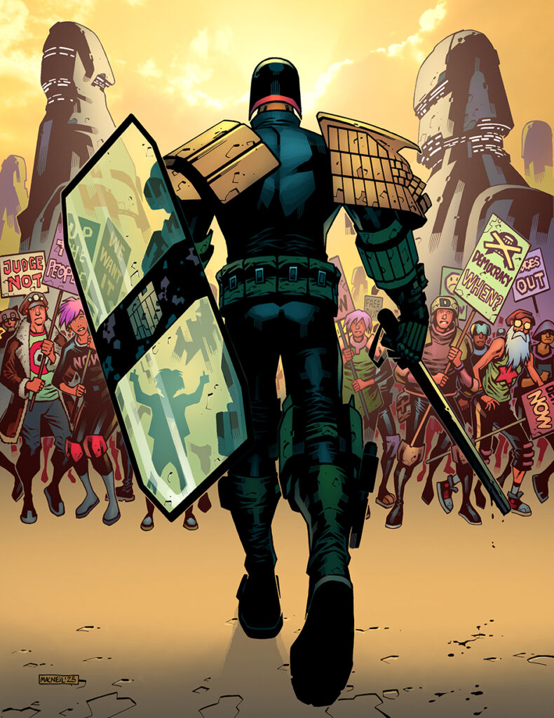
This month’s Judge Dredd Megazine issue 461 sees a brand-new Dredd begin, Risk Assessment by Michael Carroll and Colin MacNeil. And if the prospect of more zarjaz MacNeil droid art inside the Meg isn’t enough, Tharg arranged for us to be doubly treated this month with a new MacNeil Meg cover. It’s like Christmas has come early!
Although, as Colin’s going to tell you, this was originally a pin-up for inside the Meg. One thing you know about Tharg is that he knows a great-looking cover when he sees it – even if it’s not meant to be a cover!
COLIN MACNEIL: I doodled various ideas before settling on this one. Unfortunately, none of those doodles exist anymore, as I tend to use unused sketches to light the fire of an evening. Paper’s paper!
I recall they were the usual sorts of images you’d associate with Dredd. Like Dredd using his nightstickto batter a perp in an alley, or shooting some perp in a dramatic way, or towering heroically over Mega-City One.
Okay, okay, we’re going to be sending Colin a big box of firelighters just so this doesn’t happen again! Just imagine all the art that’s been tossed into that fire over the years!?!
But since fire claimed those sketches, we’ve just got the inked piece and the final pin-up image to show you. BUT, alongside those couple of images, we have Colin giving us the tale of the cover…so let’s hear what he has to say…
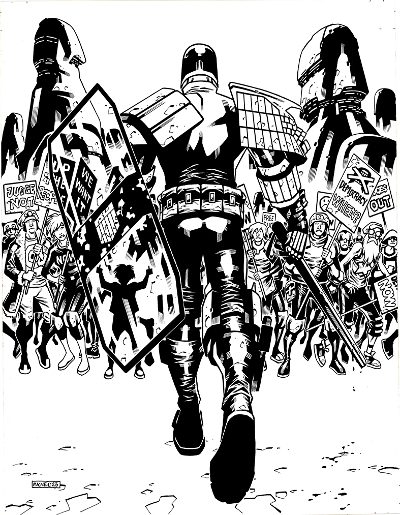
Colin’s final inks for the pin-up
COLIN MACNEIL: Since it was to be a pin up, I wanted the image of Dredd to really dominate the page, so came up with the idea of viewing Dredd from behind, at knee level, as he strides mercilessly towards a group of citizens alarmed by his approach.
Why would he be striding towards them? There was only one good answer to this – the long-running theme of democracy within Dredd’s world. I added a riot shield to Dredd and made the crowd he was approaching citizens protesting for democracy. Marching and protesting for democracy is one thing, but going up against Dredd is a thing the citizens are not willing to do.
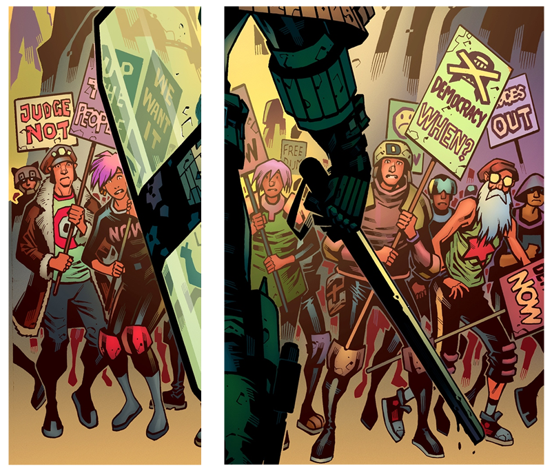
The placards echo those which have been seen in the long struggle for democracy in Mega City One, “DEMOCRACY NOW”, “JUDGES OUT”.
Other placards are more subtle, let us say. “UP THE PEOPLE”, “WE WANT IT”. The Judges have certainly been putting ‘it’ up the people for a long time and since the people have not removed yet the Judges, then they must really ‘want it’.
“DEMOCRACY WHEN?” It’s been such a long struggle, when is it actually going to happen? “FREE DUM”, free dumb. Without a voice, there is no freedom. There is also another way to view “FREE DUM”. You’re dumb if you think they’re ever going to let you be free.
You’d look like that if you had Dredd, nightstick at the ready, marching towards you too
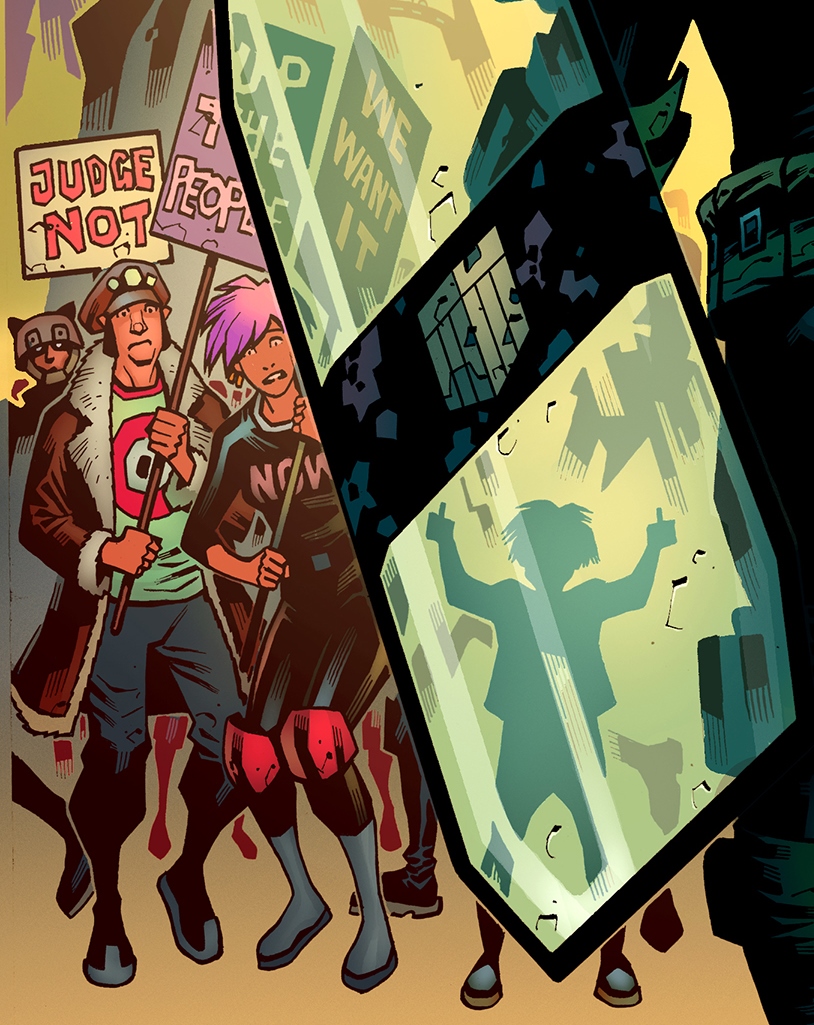
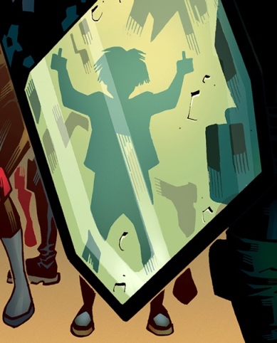
It was a good image, but it still needed something, then it came to me. I added a child to the front of the crowd, silhouetted through Dredd’s riot shield.
Whereas all the adults in the crowd have decided to give in to Dredd and the power of the state he represents, dropping their placards and starting to break and run, the child remains defiant...
Oh Juve, Juve, Juve… the innocence, the defiance
Keeping the image of the child a silhouette was a conscious decision, so you can’t tell their gender or ethnicity. It represents every child. The child is also giving Dredd “the finger”, with both hands.
The child has not yet learned to be afraid like the adults, or to give in like the adults. The innocence of youth, the defiance of youth.
Future iso-cube resident right there
The other thing about keeping the child silhouetted was to hide the figure a little. At first glance it’s just a picture of Dredd striding towards a group of protesters, but once you notice the defiant child, it is all you can see.
The image is no longer about Dredd, it’s about the child. …It’s about the future.
The finished pin-up image. Time to play a little compare and contrast between this and the finished cover!
Originally this image was to be a pin up for the Meg, but as soon as Tharg saw the finished result he wanted to use it for a cover.
Obviously, I hadn’t left room for a logo, since it was to be pin up, so I did an extended version of it to allow space for a logo and that is the one that is used for Meg 461.
And the final, final cover image – extended and ready for the logo
Thanks to Colin for sending us that – it’s a really stunning cover for this month’s Meg (but then again, every MacNeil cover is special, isn’t it?)
You can find the new Megazine issue 461, complete with part 1 of Judge Dredd: Risk Assessment wherever you get your Thrill Power prescription – comic shops, newsagents, and of course the 2000 AD web shop from 18 October.
For more from Colin, head over to the Thrill Cast from 2019 where he talks about Mechanismo and make sure you go and read his last Covers Uncovered for Megazine #437.
Every week, 2000 AD brings you the galaxy’s greatest artwork and 2000 AD Covers Uncovered takes you behind-the-scenes with the headline artists responsible for our top cover art – join bloggers Richard Bruton and Pete Wells as they uncover the greatest covers from 2000 AD!
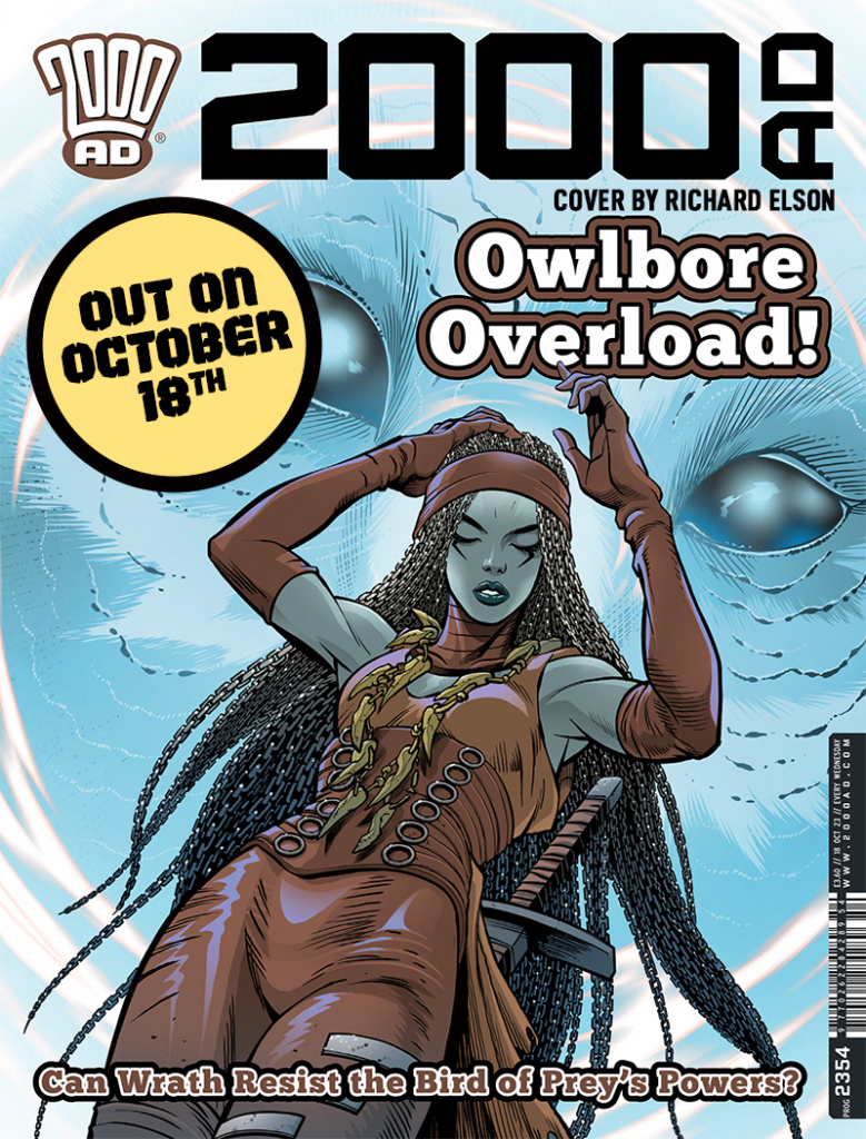
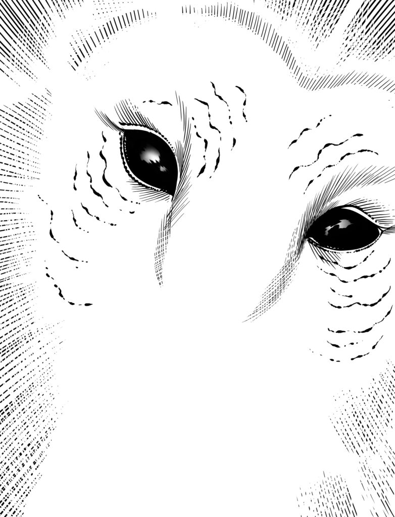
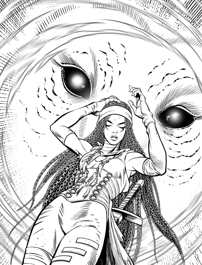
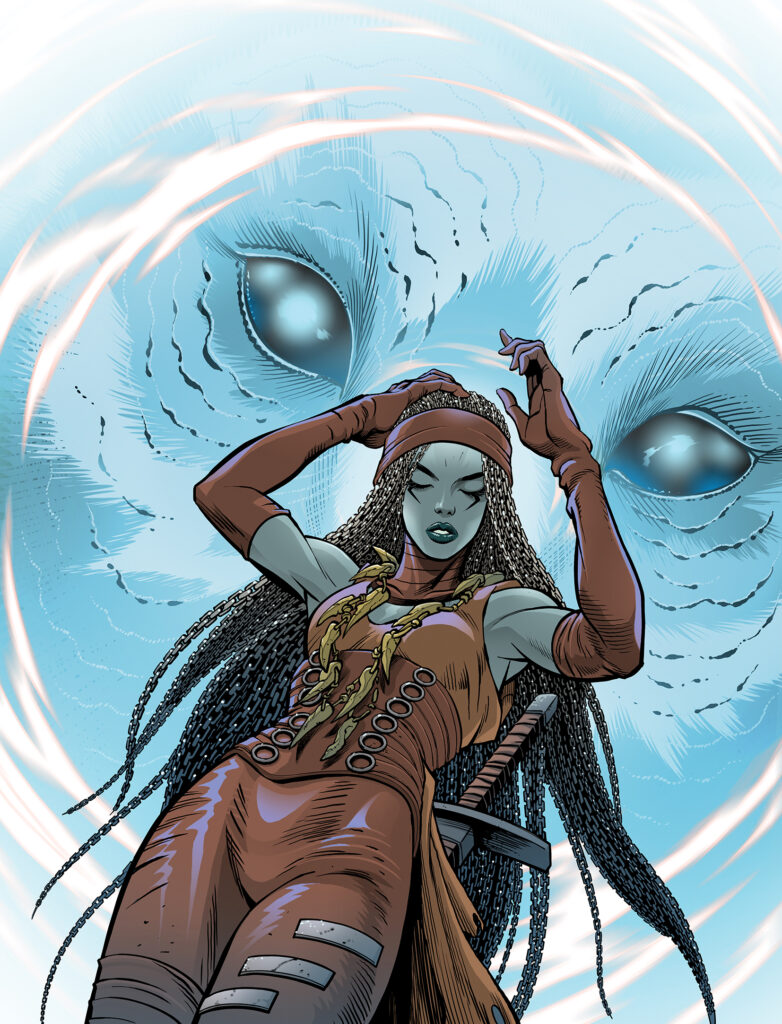
This week, it’s all eyes on Wrath from the fabulous fantasy fable, Feral & Foe. Is Wrath about to get bored to death in the latest adventure, Bad Godesberg? Well, that’s what the Owlbores do… but you’ll have to pick up 2000 AD Prog 2354 to find out!
But if you want to find out just how series artist, Richard Elson put together another great-looking cover, all you have to do is read on…
Elson’s been a mainstay of the comics industry for many years now, whether it’s Sonic the Comic or his 2000 AD work, including Atavar and Kingdom with Dan Abnett, But his work here on Feral & Foe, again with Abnett, really is looking soooo fine!
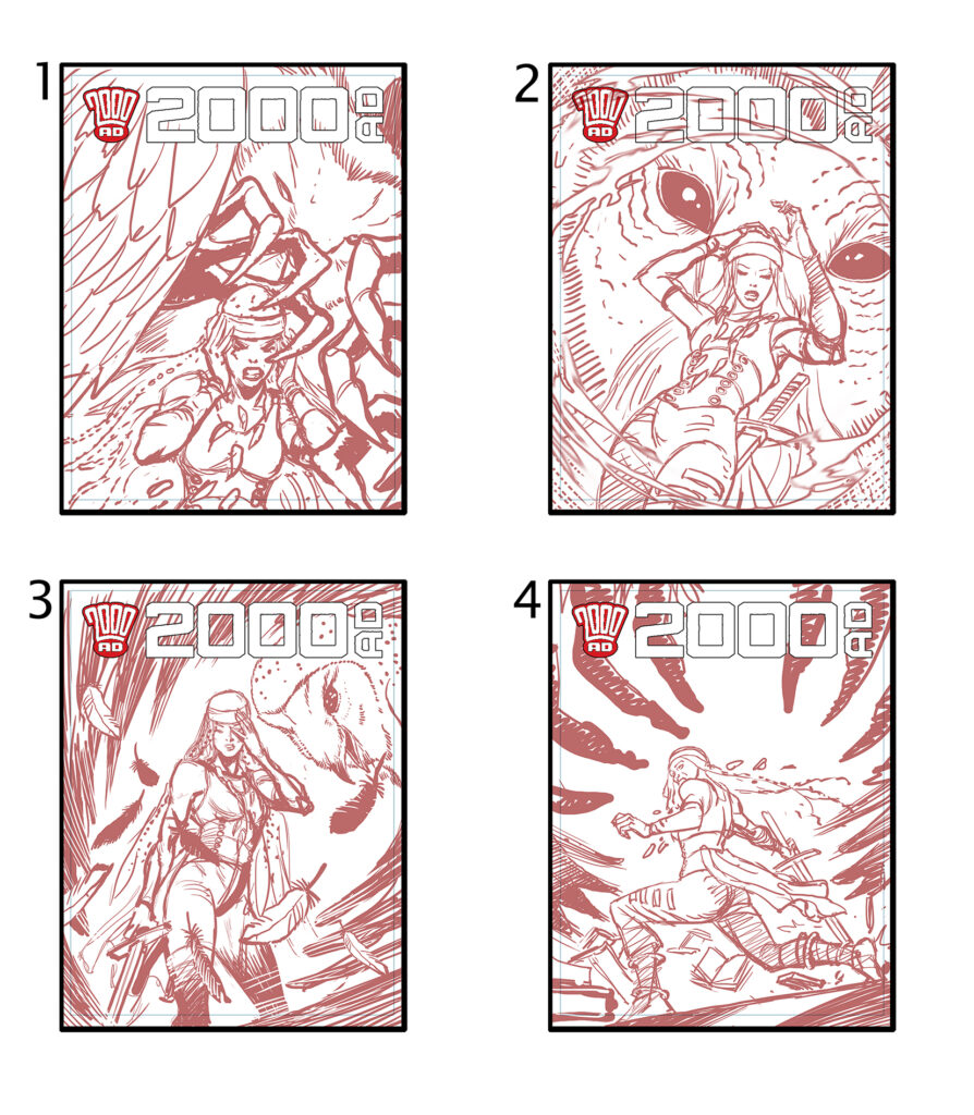
Now, over to Richard to tell us all about this latest 2000 AD cover, all starting with four roughs to send to Tharg for approval…
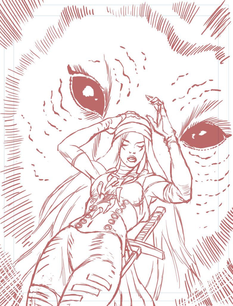
RICHARD ELSON: As usual, I did 4 rough ideas for the cover. The second one was chosen so it was just a matter of scaling that up and tightening the pencils in preparation for the inks.
The chosen layout scaled up and pencilled
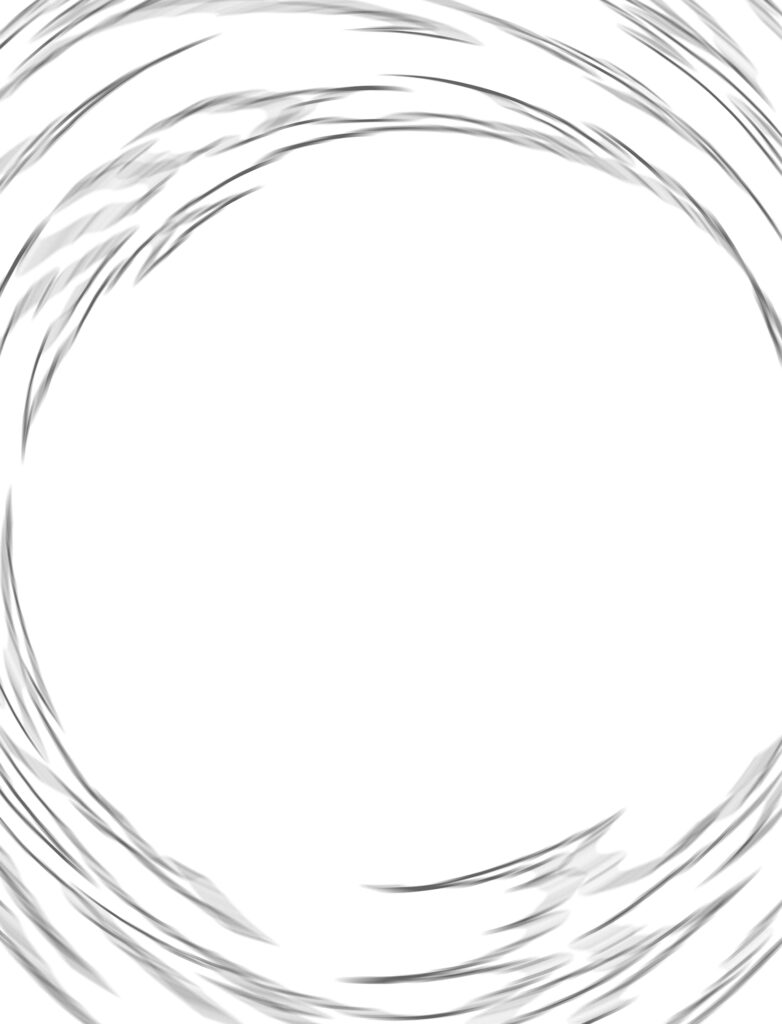
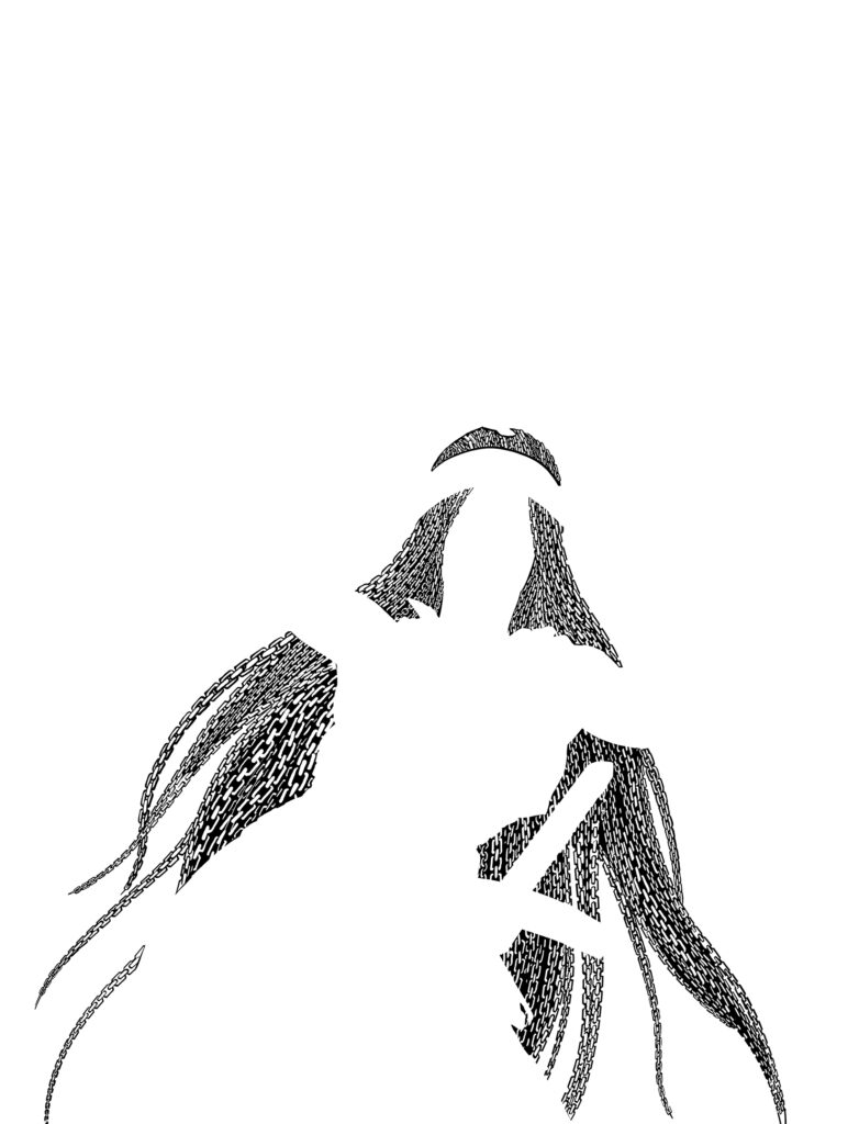
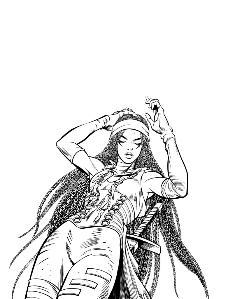
I inked on several layers: one for the owl, one for the swirl, one for Wrath, and one for the hair chains.
As usual, Wrath’s hair probably took as long to ink as the rest of the image combined. I think I might have to introduce her to some chain cutters before we do any more F&F!
The owl and swirl were inked on different layers to make the process of applying colour holds to the linework less tricky.
Inking all the different layers – including those hair chains!
>
Putting it all together and combining the inked layers to give us the final inked cover
It was a relatively straightforward colouring job.There are some pretty busy scenes in this series and not having to choreograph multiple figures for this cover was something of a relief.
As always, it has been great fun working with Dan on these episodes. To date, I think Bad Godesberg might be the most ambitious thing we’ve worked on together; I hope the readers get as much enjoyment out of it as I did.
Yes, Bad Godesberg is another fabulously funny fantasy from Abnett and Elson and that’s just the latest great cover Richard’s given us.
You can find 2000 AD Prog 2354 everywhere that stocks your weekly dose of Ghafflebette comics, including the 2000 AD web shop from 18 October.
To see more of those great Feral & Foe covers and read about how he made them, get clicking on these – Prog 2163, Prog 2192, and Prog 2227, And for even more, we interviewed Richard and Dan about Feral & Foehere and for your listening pleasure, Richard talked to the 2000 AD Thrill Cast in 2019 here.