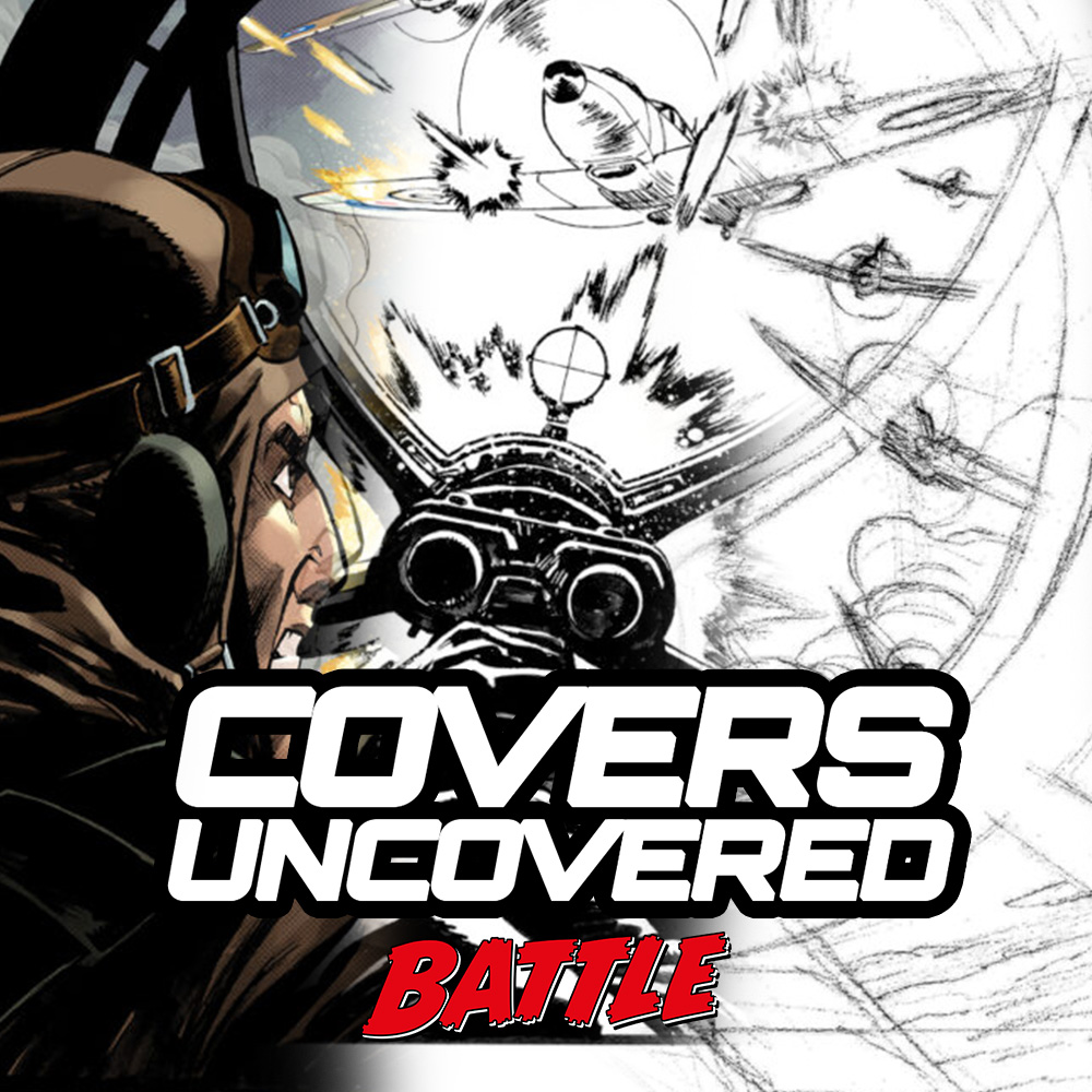
Every week, 2000 AD brings you the galaxy’s greatest artwork and 2000 AD Covers Uncovered takes you behind-the-scenes with the headline artists responsible for our top cover art.
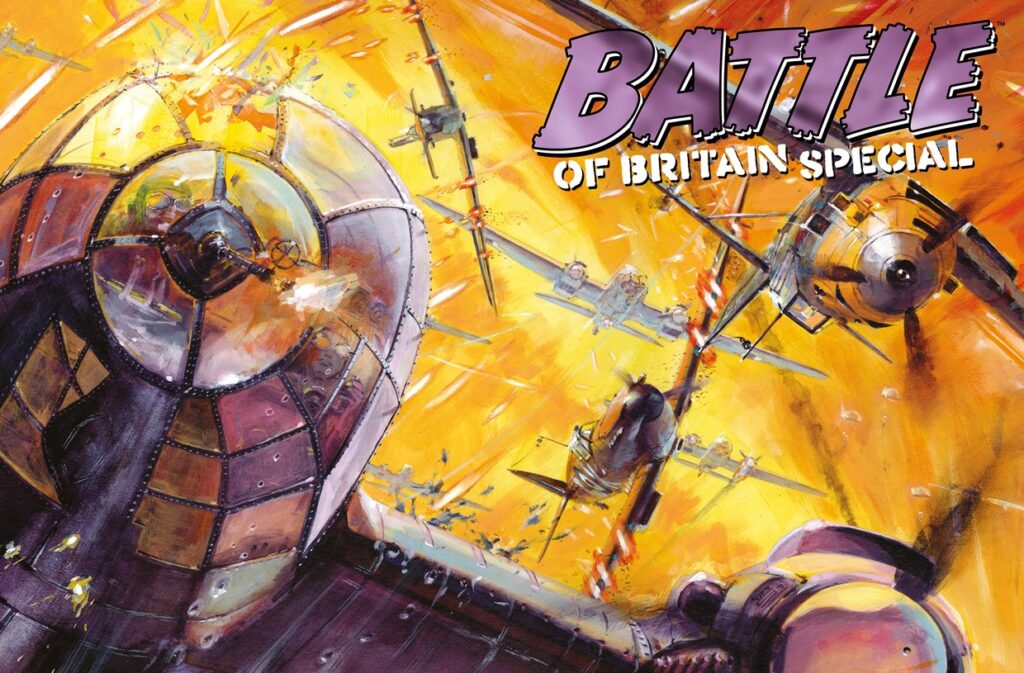
But this week, there’s more than just 2000 AD – this week, we have the publication of the Battle of Britain Special ! We’ve shown you the making of the web-exclusive cover by Keith Burns yesterday, but now it’s the turn of the brilliant artist behind the regular cover that you’ll see on the shelves of your local comic shop and newsagents.
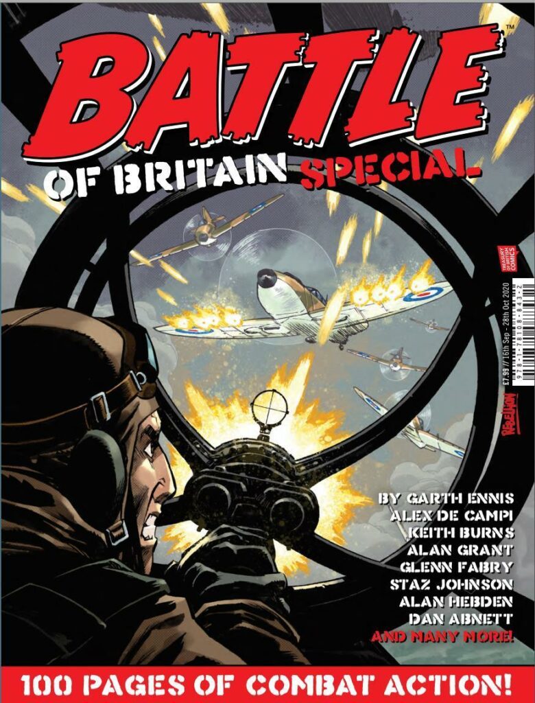
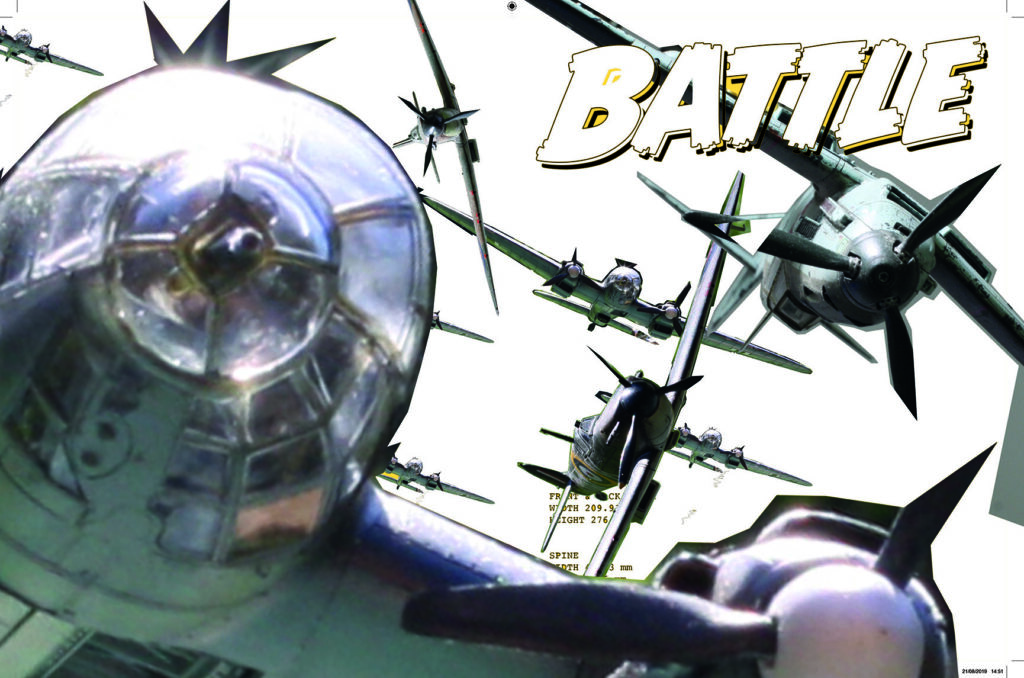
And that action-packed cover comes to you courtesy of Nelson Dániel.
Inside this new Battle of Britain Special you’ll find action and adventure, bravery and heroism, but also strips looking deeper into the tragedy of war and the terrible sacrifices involved. Amongst some incredible new strips from the likes of Alex de Campi, Alan Grant, Rob Williams, Simon Coleby, Glenn Fabry, PJ Holden, and Tom Paterson, there’s also a return to the pages of Battle for two classic strips – Rat Pack, by Garth Ennis and Keith Burns, and El Mestizo by Alan Hebden and Brent McKee.
It’s a must-have collection of the best war strips in decades and it’s out on 16 September from the Treasury of British Comics! If you get your copy from comic shops or newsagents it’s the Nelson Dániel cover you need to be looking for!
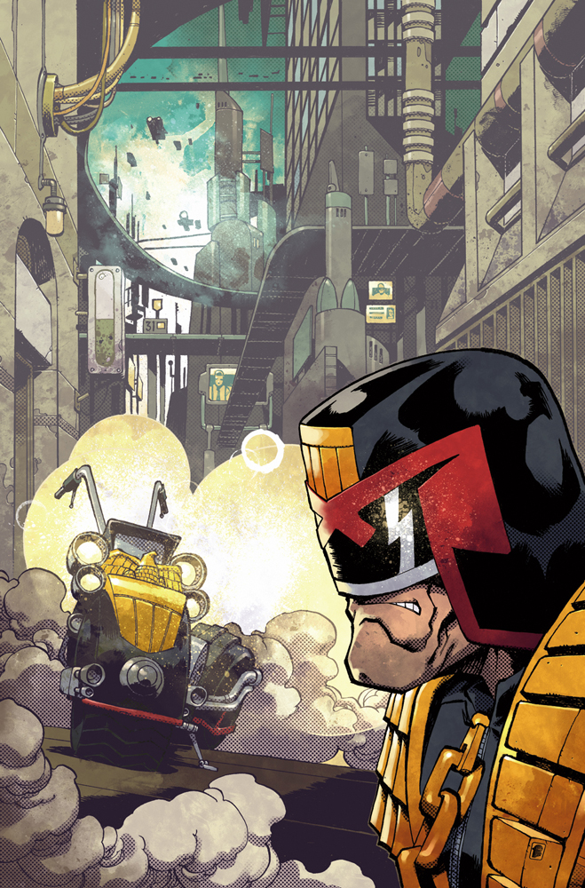
Nelson’s been involved in cinema, illustration, and comics for the last 16+ years. He’s worked as art director, production designer, concept artist and storyboard artists for feature films including Machete, Robotech, Fantastic Four, and The Green Inferno. As far as comics, he’s worked as an artist and colourist for Marvel and IDW, where he’s provided art and covers for the IDW USA Judge Dredd series.
This is his first work for 2000 AD or the Treasury of British Comics and it’s a great cover that jumps off the shelves – great visual imagery, perfect for what’s inside!
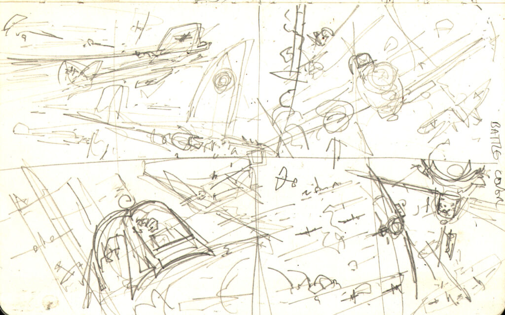
Unfortunately, Nelson was way, way, way behind with deadlines and couldn’t carve out the time to talk to us about his work putting the cover together. But he did send over the important part – the images of his process stages!
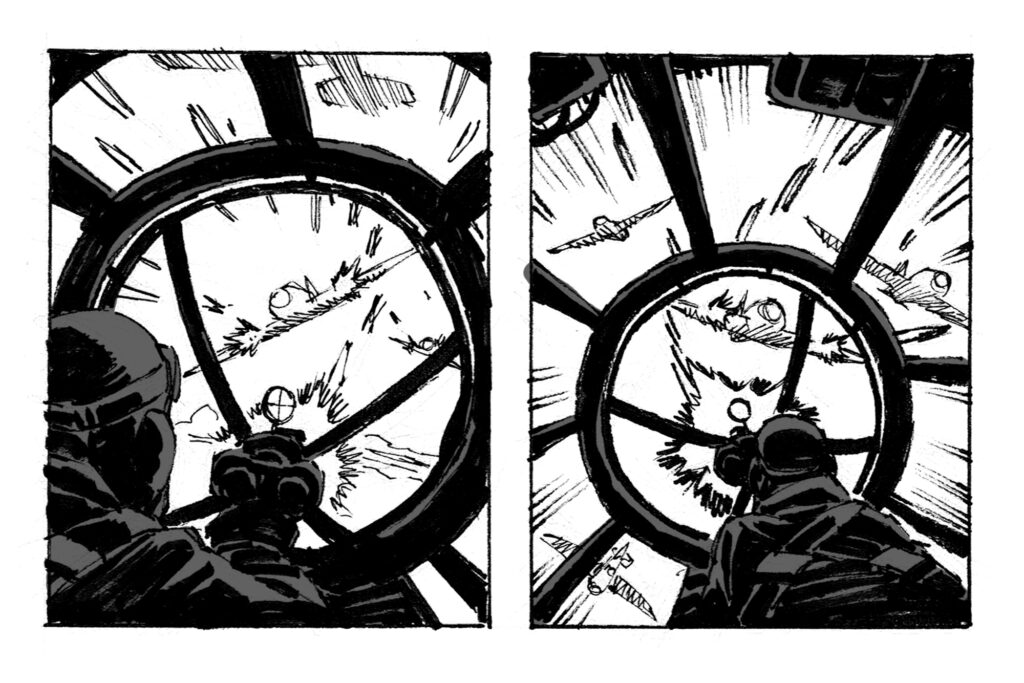
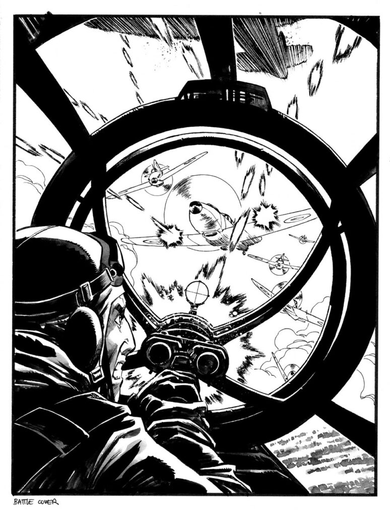
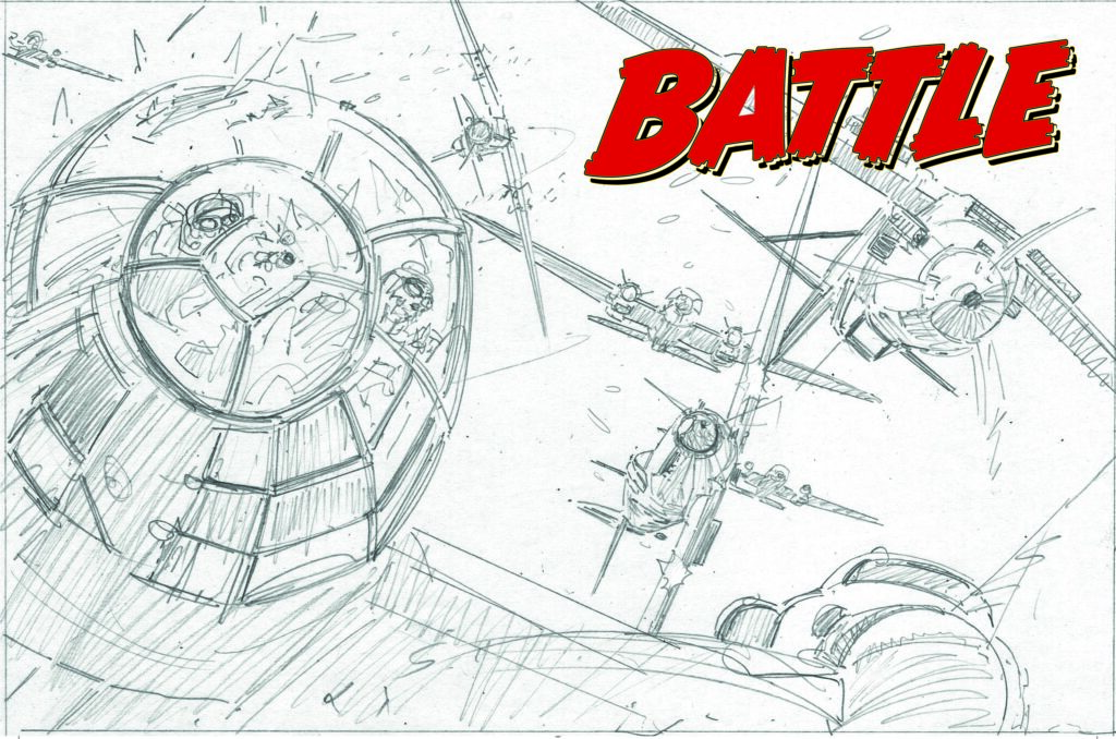
First up, the preliminary thumbnails for editorial to look at. Already fixed on the idea of a poor German gunner looking out at the deathly Spitfires, it was a case of the close-up or longer shot.
Preliminary cover roughs – with editorial saying yes to the one on the right
.
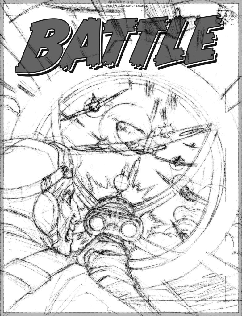
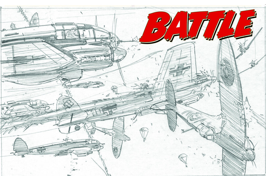
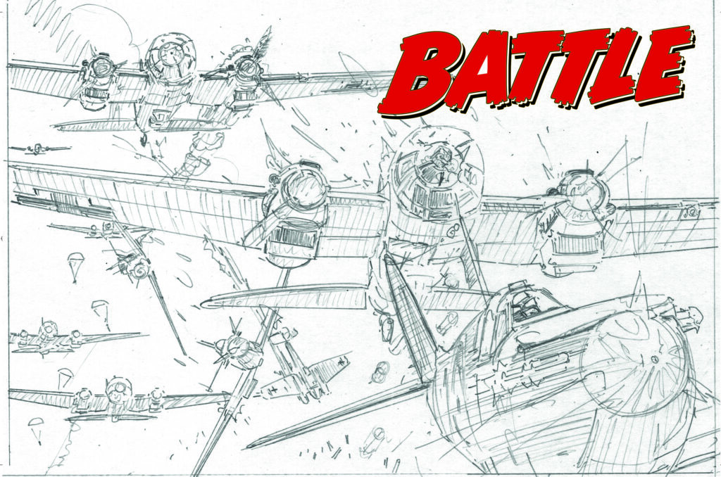
Next stage is pencils, with a shift in position for the gunner and even more Spitfires!
Nelson Dániel – pencils for the cover
.
Next, it’s time for putting down inks…
Nelson’s Battle cover – inked and ready for colour
.
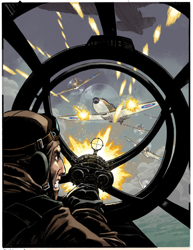
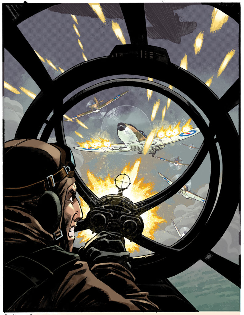
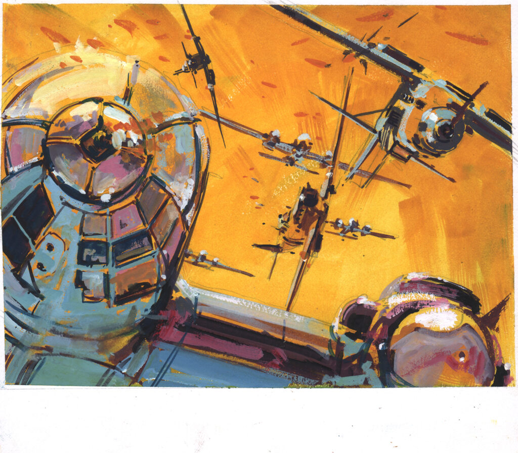
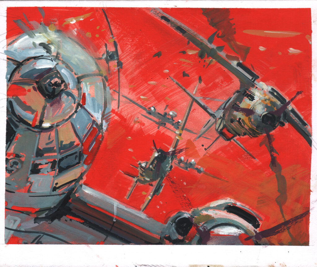
Everything in place and ready for colours now – two colour versions were produced. No doubt editorial saw the first and just decided it was time for more guns, more bullets, more effects, more, more, more!!!
Nelson’s first colour version of his Battle coverNelson’s Battle cover – added effects for a second colour version – more firepower to the Spitfires!
And the end result of that work? Well, it’s the action-packed view through a Luftwaffe gunner’s turret as the Spitfire’s open fire – not a sight you’d like to see from that perspective at all – but a sight that makes a great cover!
Thanks so much to Nelson for chatting to us about this action-packed cover to the Battle of Britain Special. Be sure to follow Nelson on Twitter, Instagram, Tumblr, and ArtistGO site.
And don’t miss out on the greatest Battle action in 30 years when the Battle of Britain Special is released on 16 September!
And finally, just a little extra – a glimpse at Nelson’s Judge Dredd work over at IDW…
Every week, 2000 AD brings you the galaxy’s greatest artwork and 2000 AD Covers Uncovered takes you behind-the-scenes with the headline artists responsible for our top cover art.
But this week, there’s more than just 2000 AD – this week, we have the publication of the Battle of Britain Special with a web exclusive cover by Keith Burns.
The Battle of Britain Special features the return of classic strips, Rat Pack and El Mestizo, alongside all-new strips capturing the spirit of the original Battle. Inside you’ll find work from Alex de Campi, Garth Ennis, Alan Hebden, Rob Williams, Simon Coleby, Glenn Fabry, PJ Holden, Tom Paterson, and many, many more.
It’s a must-have collection of the best war strips in decades and it’s out on 16 September from the Treasury of British Comics!
The cover for the stunning web-exclusive Battle Special is from comics and aviation artist Keith Burns, who also features inside on the Rat Pack strip with Garth Ennis. He first broke into comics in 2007 but he’s also garnered acclaim with his painted aviation art, joining the Guild of Aviation Artists, exhibited at the RAF Club in London, and is currently incredibly busy in that particular field. However, he’s always glad to take time out to return to comics, something he still loves and, as he says, something that’s helped his aviation art to become as good as it is.
Right then, over to Keith Burns for the making of this cover!
I started in comics and that’s where I learnt everything I use in painting. Working in black and white made me concentrate on tone and recession. Working in brush and ink improved my brush work for painting immensely and also makes you describe everything clearly, you can’t really suggest things with inks the way you can with painting which makes it much more difficult.
There’s no better training than comics for figuring out composition, you have to compose thousands of panels and as you go you figure out what makes them look interesting. Completely unique to comics is the fact that you have to lead the readers eye from panel to panel through the page, you don’t have to do this in paintings or single illustrations, yes, you have to lead the eye around the image but not out to the next image or wonder about how it will fit in the whole page full of other images. Then there’s capturing the physical movement and kinetic energy which again I figured out in comics. In comics you have to draw the most amazing made up scenes and make them look convincing.
Aircraft have to look like they’re flying and that takes time to figure out, again I figured this out in comics first by making them look like they weren’t flying. Finally, I always cram some storytelling into my paintings, this is the most important aspect in comics in my opinion and the part I find the most enjoyable. Compared to comics I find painting a doddle and am lucky to be able to still do both. Comics are easily the toughest art job out there.
I was delighted to be asked to produce a cover for the Battle of Britain Special… as a fan of Battle and Rebellion.
I usually start off with a few thumbnails that are gibberish to anyone but me –
Once I have two or three ideas I’ll photograph model kits of the relevant aircraft outside in daylight. Having somehow ended up doing WW2 aviation a lot it makes sense to have a library of models that I can use over and over for reference.
Jobs always come up requiring models I haven’t yet built and so the 3D library is always growing I only have one model of each aircraft so when I need multiply types I have to keep moving them and photographing them within the same scene which is laborious and easy to muck up.
Putting all those photos of model kits together to get to a final image to pencil – just one of many that Burns made for this cover!
Once I’ve photographed the models I’ll put the photo’s together in photoshop. This is also time consuming and sometimes requires re-photographing the models if they don’t sit together correctly, it’s very easy ruin the whole image with one aircraft that looks like it’s not obeying the laws of physics even if it’s tumbling out of the sky.
I’ll then use these images to pencil a rough that is readable to others.
Three different cover roughs from Keith to send to Battle boss, editor Keith Richardson
.
Once Editor Keith has made the choice of which pencil rough is to be used, I set about a couple of small colours studies.
Burns’ colour studies for the cover of the Battle of Britain Special
.
After all that process, the painting is the most enjoyable part and the more you put into the early stages the easier the painting is. I wanted to keep the colours bright and mad like the Air Ace and Battle colours as opposed to realistic. I ended up doing a larger than usual cover size painting for the fun of it.
And that’s it – although, as always, that explanation – ‘the painting is the most enjoyable part’, rather plays down the absolute brilliance of what it is Burns has managed to do. Going from those pencil roughs and colour roughs to the final, published work of art – he makes it all sound so wonderfully simple, yet we know it’s far from it!
Thanks so much to Keith Burns for chatting to us about this stunning web-exclusive cover to the Battle of Britain Special. You can also find his comic work inside on Rat Pack, written by Garth Ennis – it’s a classic tale of the worst of the British Army!
Be sure to follow Keith on Twitter and check out some absolutely superb examples of his aviation art at keithburns.co.uk.
And don’t miss out on the greatest Battle action in 30 years when the Battle of Britain Special is released on 16 September!
Every week, 2000 AD brings you the galaxy’s greatest artwork and 2000 AD Covers Uncovered takes you behind-the-scenes with the headline artists responsible for our top cover art – join bloggers Richard Bruton and Pete Wells as they uncover the greatest covers from 2000 AD!
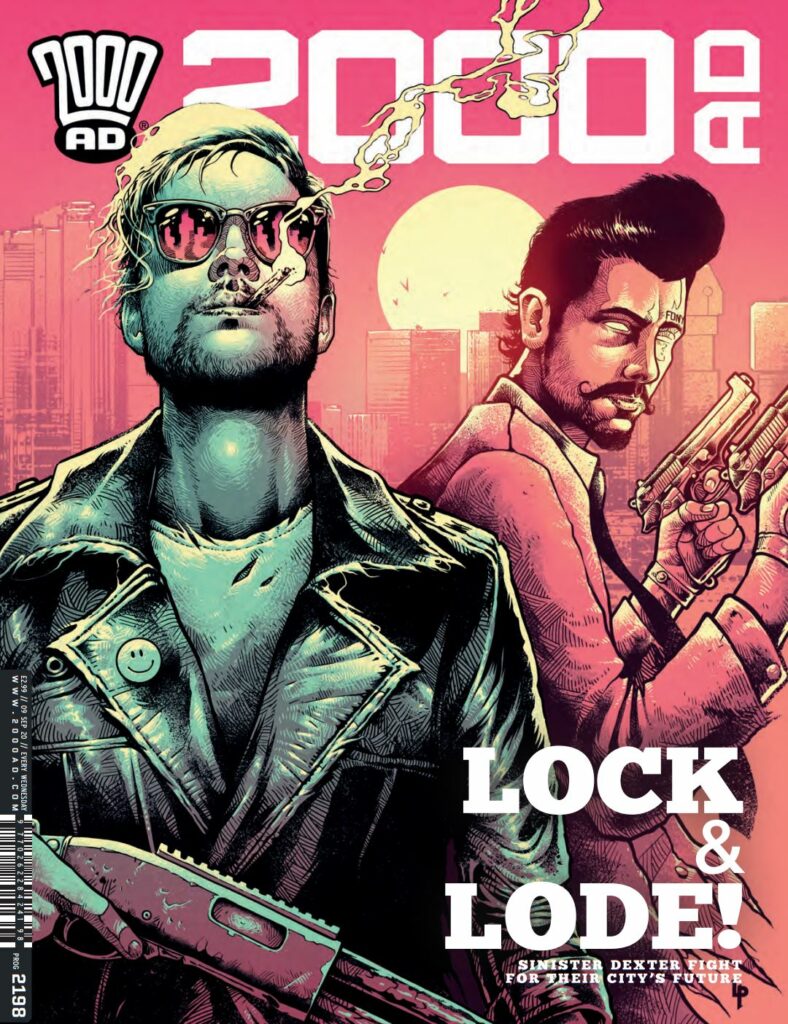
This week, its time to chat (briefly) to the cover artist for 2000 AD Prog 2198, Luke Preece. You can get hold of this stunning Sinister Dexter cover with the boys looking their best bad selves with 2000 AD Prog 2198, out in shops and from the 2000 ADwebshop on 9 September.
Luke Preece is an illustrator based out of the West Midlands in the UK. He describes himself as ‘A child of the 80’s raised on a mixture of Sci-Fi, Fantasy, Comics, Movies and Metal music.’ Over the years, he’s worked with Marvel, Lucasfilm, Metallica, Slipknot, Ozzy, Sony Music, Music For Nations, Santa Cruz Skateboards, Metal Hammer, Xboxand more. But for 2000 AD, he’s was one of Tharg’s design minions between 2004-2011 and has a few gorgeous looking covers under his belt as well as being responsible for the design of the Judge Dredd Case Files.
And he’s a busy, busy, busy man which is why he’s had to send his apologies about this Covers Uncovered seeing as he simply didn’t have time to fill us in on the workings of making his latest 2000 AD cover featuring those bad boys of Downlode, Finnigan Sinister and Raymone Dexter as they look at taking down the A.I. that’s taking over the city in the ongoing Sinister Dexter – Bulletopia storyline.
Here’s what Luke emailed over to us…
“To be honest this cover was pretty straight forward to do. Matt Smith already had the idea of having the characters posing in front of the city skyline. It was up to me to make it a reality…“
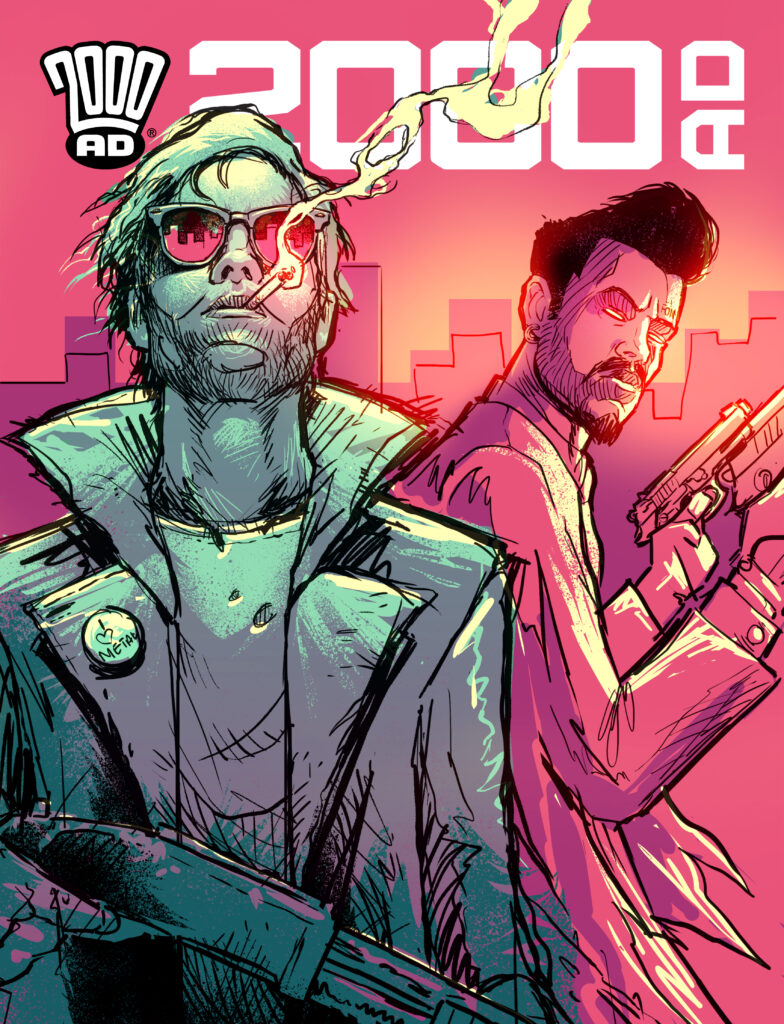
The boys are smokin’ hot! – Luke Preece’s roughs for 2000 AD Prog 2198
See, that is a mean and moody pair of gun sharks right there. The epitome of cool against a Downlode sunset, posing for the artist before heading off to bust a few heads.
Over to Luke once more…
“Luckily, he liked my rough straight away so rendering final art was made easy because of this. It was also super fun as I’d not drawn these characters before.”
Which is why we have just the rough and the final, inked and coloured, cover for this one… but hey, that’s just fine when the end result looks just this good!
All that’s really changed from rough to final is that Finn’s had a bit of a hair tidy up and changed his jacket – obviously a man who likes looking his best for his cover shot. And Ray’s added just that little bit of extra product to the hair to make that quiff even more spectacular!
Thank you to Luke there for taking a break from a veritable mountain of work to send those over to us. It really is a stunning looking cover. Don’t forget to check out more of Luke’s work right here.
Now, as for Luke’s previous work, our esteemed colleague in Covers, the great Pete Wells, has chatted to Luke twice now, for the covers to Prog 2012 here and Prog 2048 here. And here’s just a smaple of Luke’s past 2000 AD cover work…
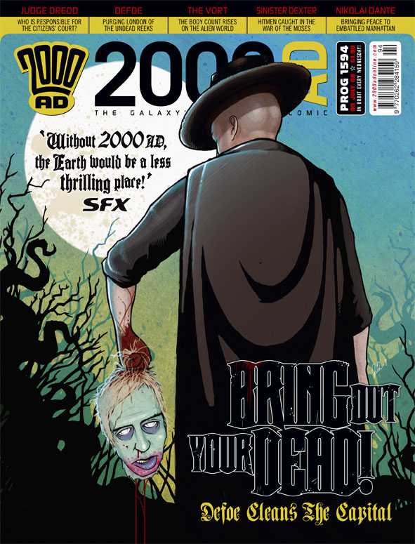
(Luke Preece on 2000 AD Prog 2119)(Luke Preece on 2000 AD Prog 2012)(Luke Preece on 2000 AD Prog 2048)(Prog 1594 – Preece does Defoe)
And of course, we couldn’t leave you without paying tribute to the incredible design work that Luke did for the Judge Dredd Case Files…
Every week, 2000 AD brings you the galaxy’s greatest artwork and 2000 AD Covers Uncovered takes you behind-the-scenes with the headline artists responsible for our top cover art – join bloggers Richard Bruton and Pete Wells as they uncover the greatest covers from 2000 AD!
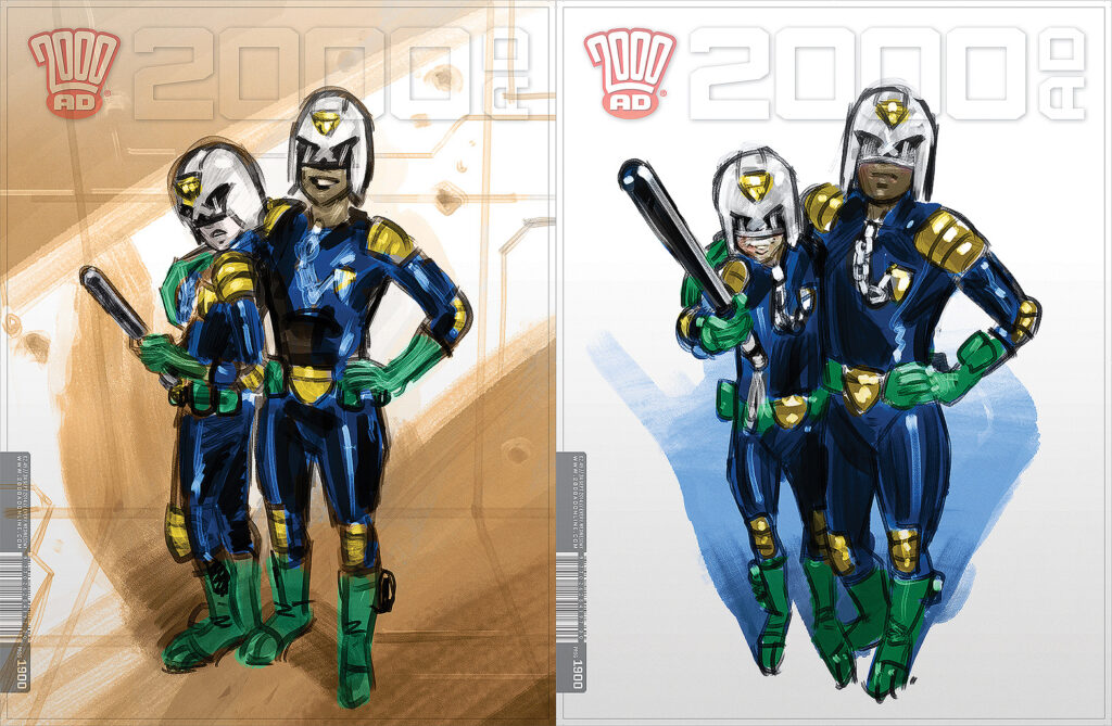
This week, it’s the third Regened Prog of the year, with 2000 AD Prog 2196 – out 26 August!
Tharg’s nephew Joko-Jargo takes over once more to deliver all-ages Thrills including Cadet Dredd, Pandora Perfect, Finder & Keeper, An all-ages Future Shock, and Department K! But first, that brilliant cover from the fantastic Neil Roberts.
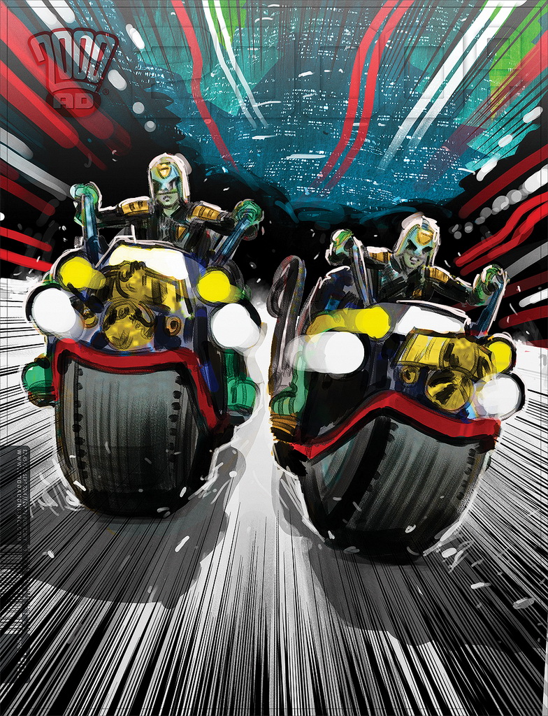
We last saw Neil on the cover of the Prog 2189, with a particularly toothy looking Dredd for End of Days. This time though, it’s time for a new Regened cover… part family portrait, part homage to Katsuhiro Otomo. So, without further ado – over to Neil for the commentary…
The brief for this particular piece was very open – a child-friendly Dredd image. Easy, right?
Initially, I opted for a bright, catalogue-style image, two cadets (one Dredd) smiling but holding daysticks. A classic bit of juxtaposition there.
Tharg didn’t go for this and wanted something more dynamic, cadets on bikes.
So that’s where we went!
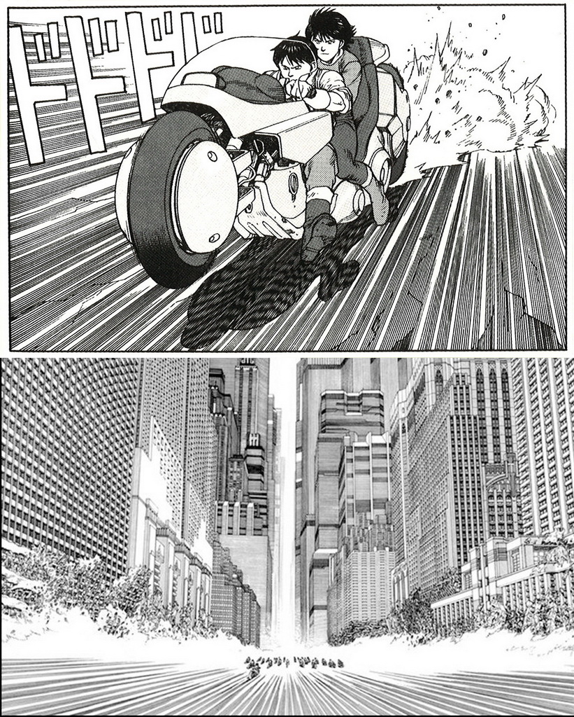
One of the coolest depictions of motorcycles and speed in comics has to be found in Katsuhiro Otomo’s “Akira”. Those neon light-streaks always look soooo cool.
Katsuhiro Otomo’s Akira – an absolute classic of Manga
So I used that as my main point of inspiration.
In this image, I also wanted to play up the contrast between linear and painted art, but that’s just something I’ve wanted to try out for a while.
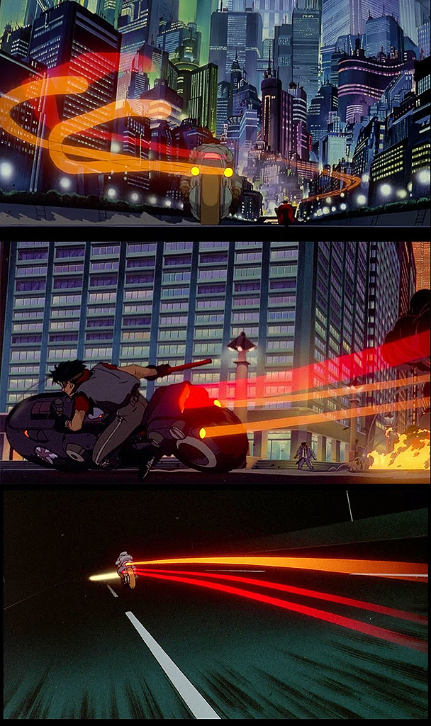
More Katsuhiro Otomo Akira – and the source of Neil Robert’s light streaks
The composition was intended to show Dredd and Rico out on their Lawmasters, patrolling the streets of Mega-City One – with Rico subtly sneering and veering off course, whilst Dredd sternly continues on.
The next major issue for me was how to draw Dredd and Rico as children.
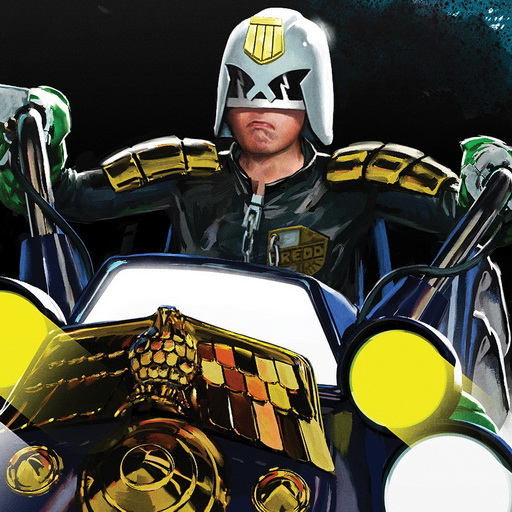
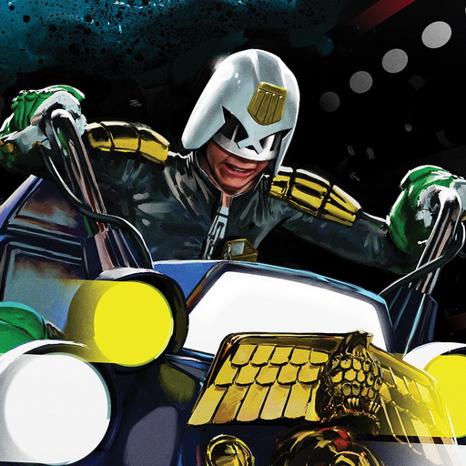
I often use reference for my work and the best and most appropriate reference I had to hand was my son, as he does a mean chin… and I couldn’t pass up the chance to immortalise him as a comic icon.Just like this…
Neil Roberts’ young lad gets immortalised as both Dredd & Rico – how cool is that?
After that, it was the usual case of sitting down, putting on the headphones and painting. A lot of painting.
And When all that was done, we had ourselves a cover.
And that cover looks just like this… a great looking Regened cover featuring Cadets Dredd and Rico…
Thank you so much to Neil (and his boy!) for letting us inside the making of this latest Regened cover. Now, just a couple of extra images he sent along – blow-ups of the various parts of the cover for us to look at, where the Akira homage is so strong!
Every week, 2000 AD brings you the galaxy’s greatest artwork and 2000 AD Covers Uncovered takes you behind-the-scenes with the headline artists responsible for our top cover art – join bloggers Richard Bruton and Pete Wells as they uncover the greatest covers from 2000 AD!
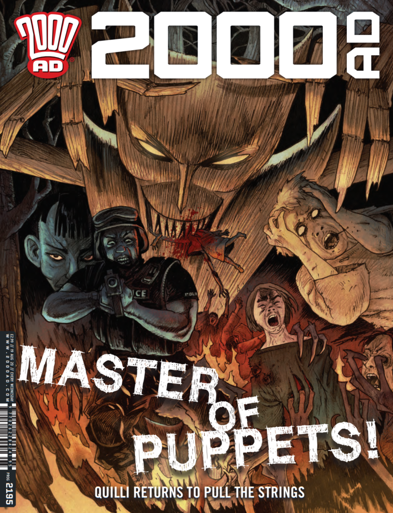
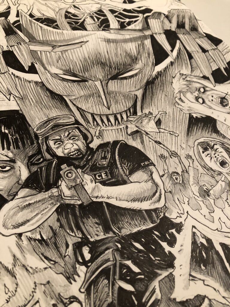
This week it’s the turn of David Hitchcock to grace the cover of the Galaxy’s Greatest – with the terrifying return of Quilli for the cover of Prog 2195, which is out now!
Quilli, created by Hitchcock and writer Laura Bailey, first appeared in 2000 ADProg 2091 (July 2018), before appearing again in The Quilli Committee in Prog 2134 (June 2019).
It all began as a tale of ventriloquism gone wrong, with Jerry Reginaldo claiming to be channelling an ancient God called Quilli through his puppet. Following his ‘tragic accident’ on stage, Quilli gained something of a cult following, leading to a journalist going undercover to get to the truth… and that didn’t end well either!
So, what terrors will this third Quilli tale bring forth? Only one way to find out – pick up 2000 AD Prog 2195 – available from newsagents, comic shops, and the 2000 AD web shop from 19 August.
So, over to David to take us through putting together the cover…
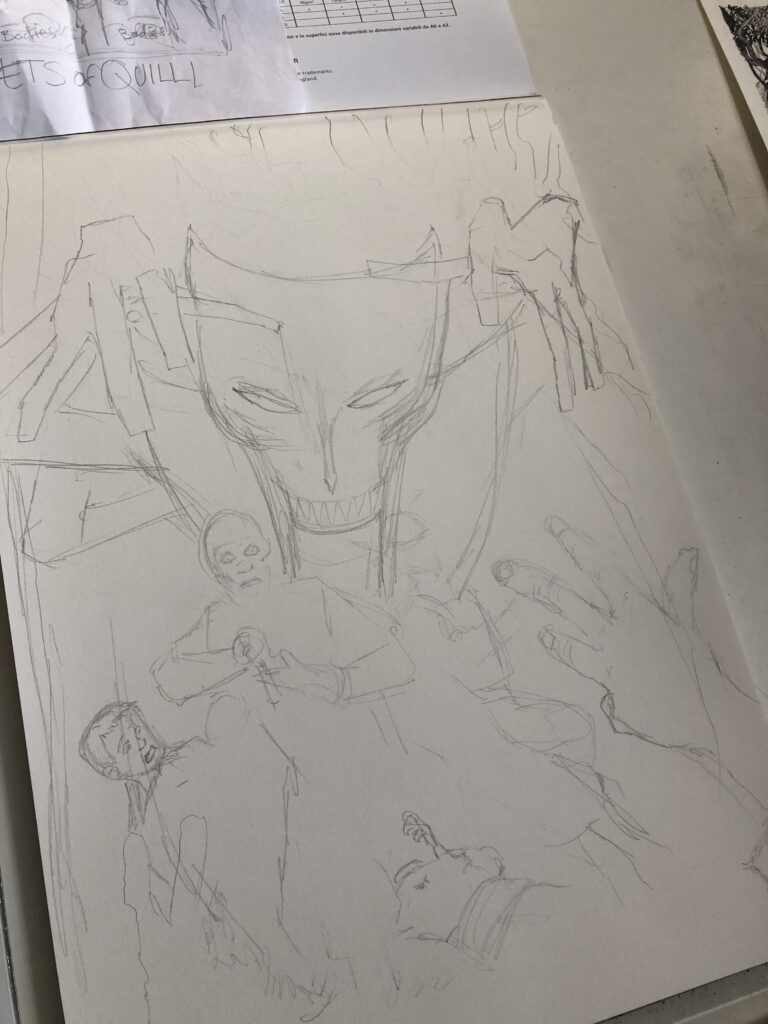
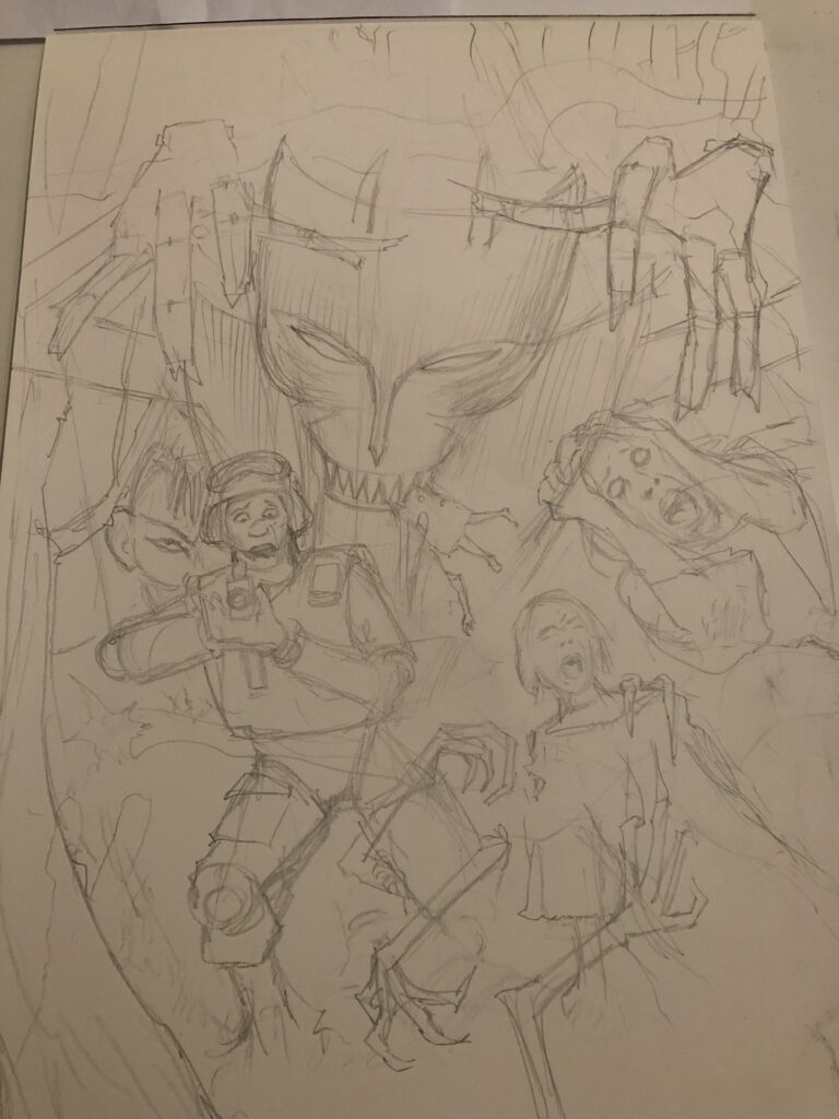
I initially spoke to Laura about an idea I had for a possible cover image. There was a scene that cried out for a cover slot, I sketched the idea out and thankfully the great green one requested to see it as finished art.
This particular instalment has a ‘Wicker Man’ feel to it, where the children are harvesting a plant which is later revealed to be used as a hallucinogenic.
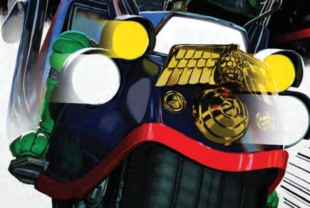
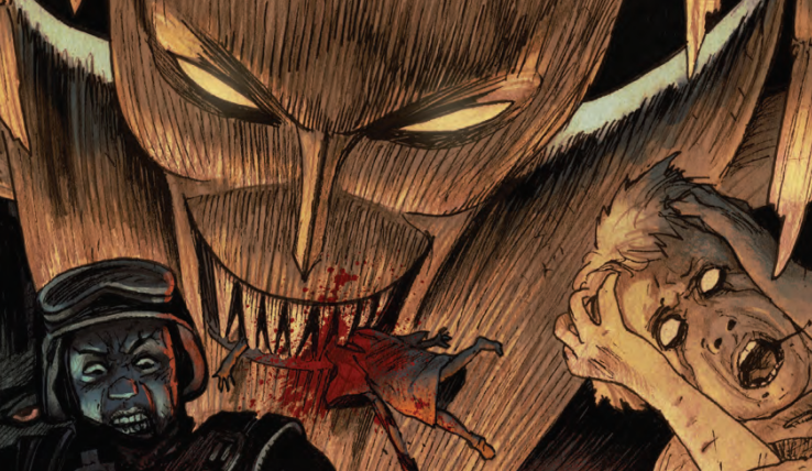
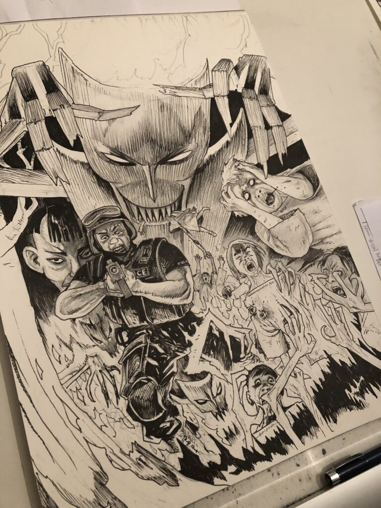
I love drawing spooky woods and gnarly trees and I thought Quilli needed to be looming ominously in the background whilst in the foreground chaos ensued, as the police officer has a bad case of Quilli Vision.
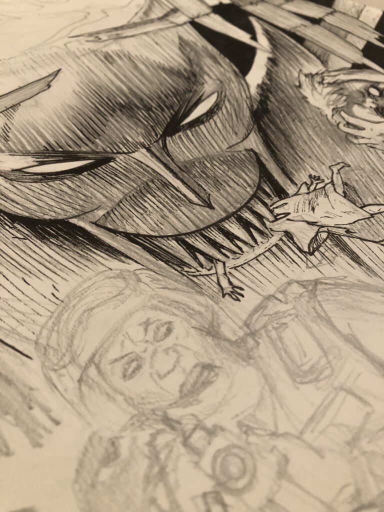
This time I didn’t feel I could colour it traditionally as I did the previous cover. I asked Tharg if he could get it digitally coloured as it needed to have a ‘trippy’ look, maybe a strobe effect here and there and certainly a glowing effect on Quilli’s eyes.
All in all it needed to show the reader that the nightmare scene was actually the officer’s hallucination.
The final cover – colours by Matt Soffe
Thanks to David Hitchcock for filling us in on the latest appearance of Quilli – be careful with those ventriloquist dummies kids, you never know quite where it will end up!
You can follow David on Twitter – @dhitchcie, where you’ll be able to see more of his beautifully rendered artwork for the likes of Frankenstein Texas, Gothic, The Signalman, Springheeled Jack, and more.
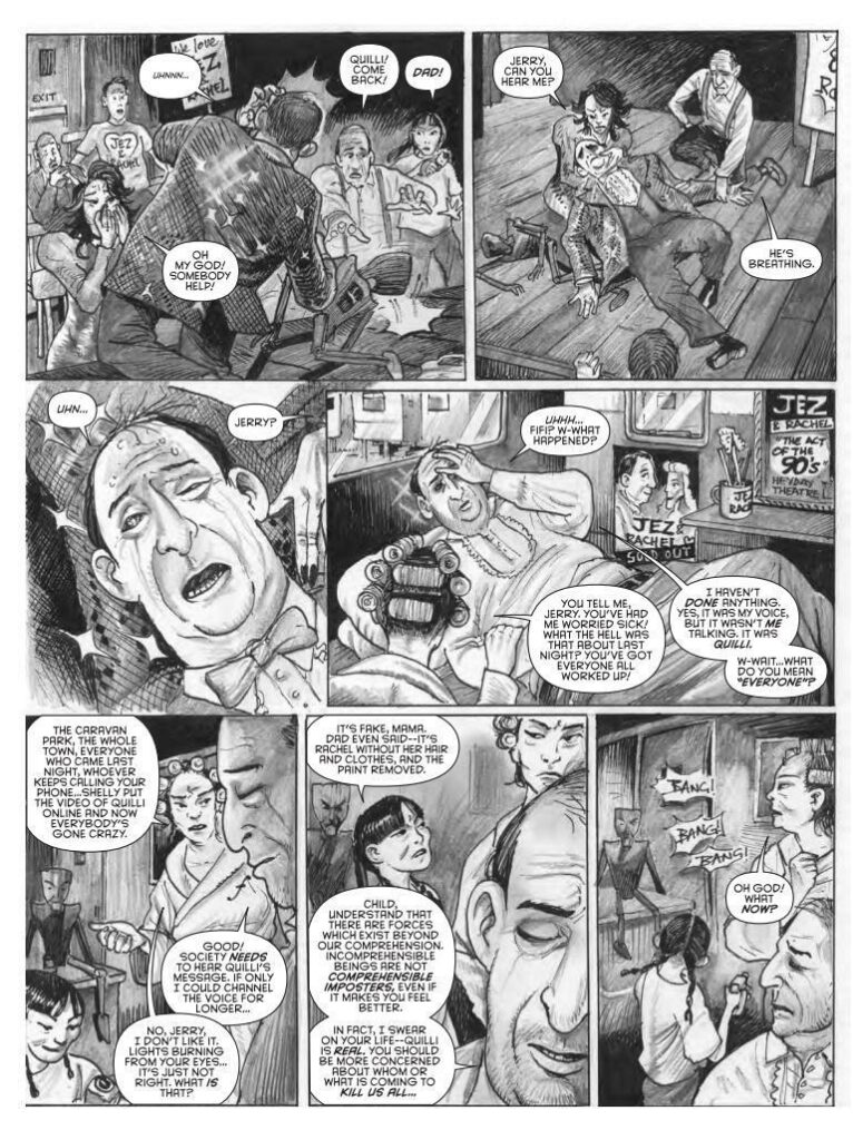
To end, here’s a little recap of the previous appearances of Quilli, beginning with two pages from the five-page Terror Tale in Prog 2091…
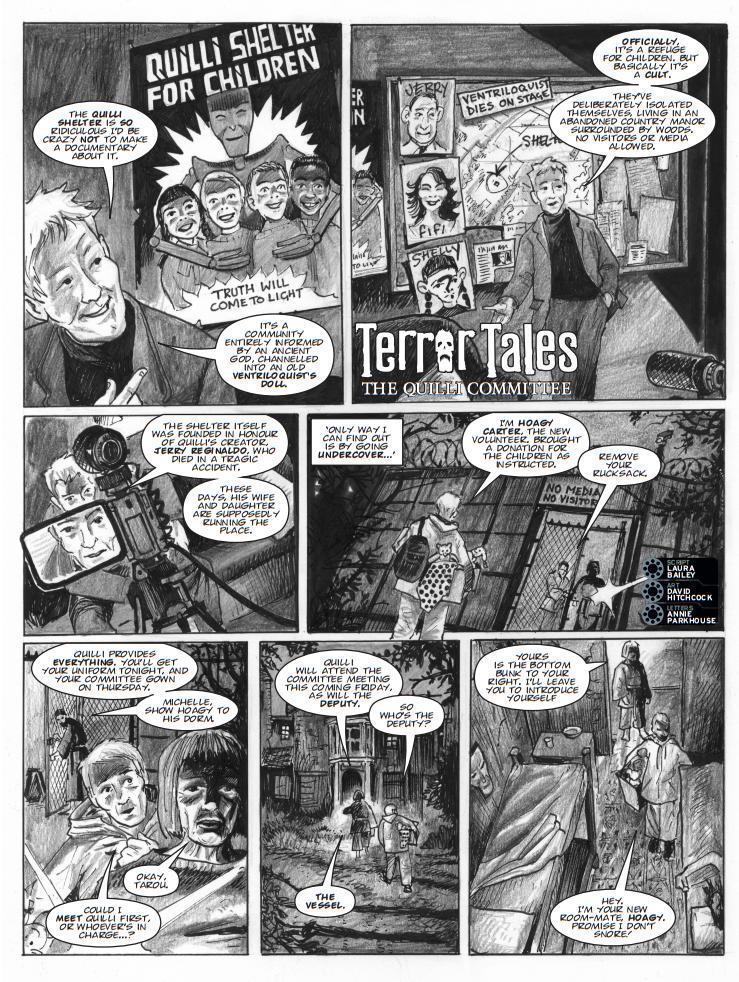
And now, from Quilli‘s second appearance in Prog 2134 – the cover by David Hitchcock and the first two pages of The Quilli Committee…
Every week, 2000 AD brings you the galaxy’s greatest artwork and 2000 AD Covers Uncovered takes you behind-the-scenes with the headline artists responsible for our top cover art – join bloggers Richard Bruton and Pete Wells as they uncover the greatest covers from 2000 AD!
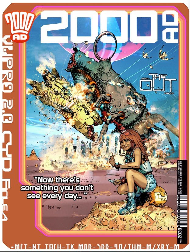
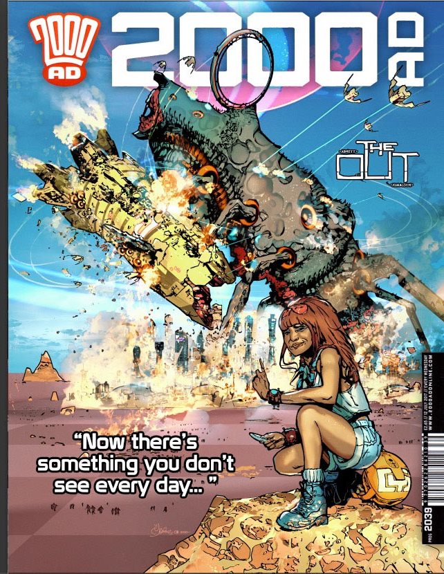
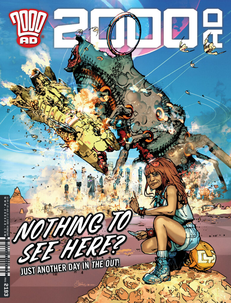
This week, it’s the return of Mark Harrison with his next cover for The Out, his strip with Dan Abnett. It’s 2000 AD Prog 2193 and it’s pretty darn wonderful.
In The Out, Abnett and Harrison bring us the tale of Cyd Finlea, photo-journalist for the Global Neographic organisation in the furthest edge of the universe, far into the future. She travels, she photographs things, she sends them in, she gets paid, she moves on and repeats it all over again. And then things start getting really interesting. Over the course of this first series, we’ve seen Abnett and Harrison set up a truly fantastic universe with incredible visuals of absolute alienness and grand scale.
So, we sat Harrison down and got him to share the making of this one with us. The fun starts straight away, as Harrison entitles the thing…
_______
“Now THERE’S Something you don’t see every day…much!”
(or – A Little Love Letter to the classic generationof Science Fiction and Fantasy book cover art)
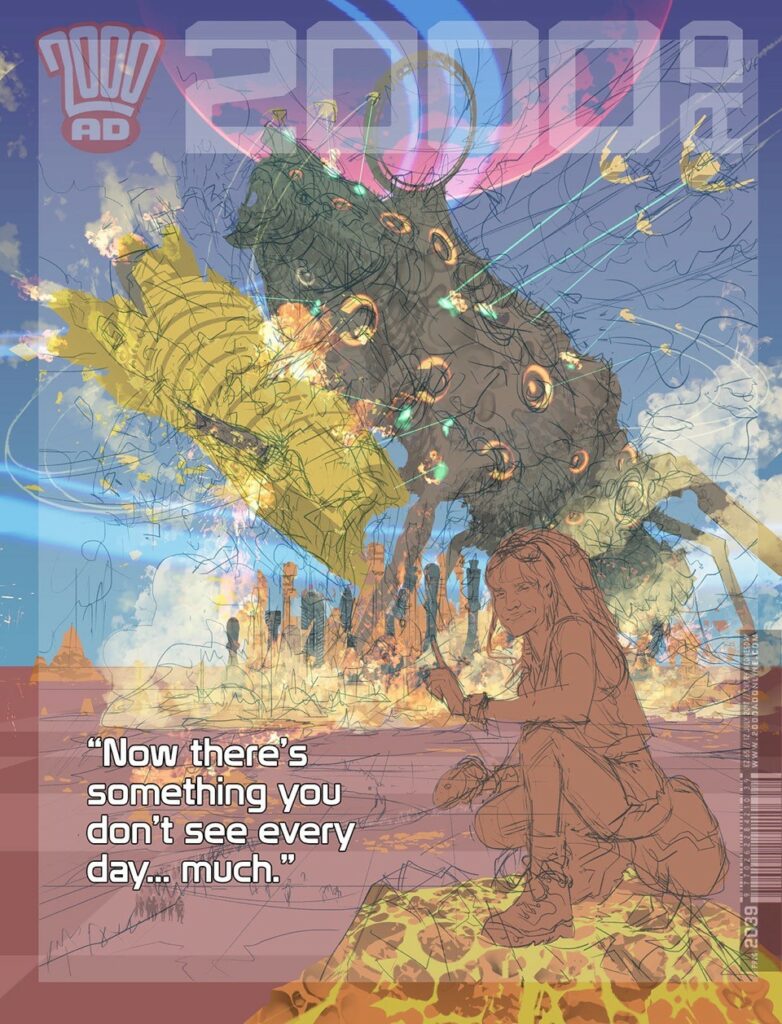
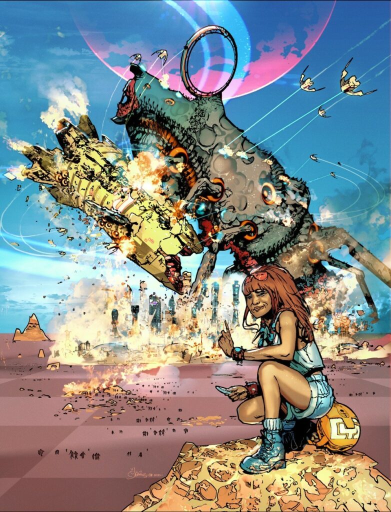
The OUT cover #2 – ‘Giant Star Beast fights Space Cruiser whilst being attacked by fighter squadron over a city on a distant planet’ was one of those covers that just came together very easily.
It was a type of cover that harkened back to the days of nostalgically deceptive comic covers that promised great thrills inside only to leave the young wide-eyed reader gloriously disappointed, in that the cover had NOTHING to do with the strip inside!Or more like a cover from ye olden days of 2000 AD, bright primary colours, hyperbole…Hyper thrills!‘
The idea I’ve had in my head for a while, based on an old cartoon I saw of two men fishing on a lake (loch) and seeing a serpentine monster rise up from the depths (Nessie) to attack a flying saucer that is, in turn, firing on the monster. One of the nonplussed men turns to the other to say: “Well there’s a sight you don’t see very often.”
It was the juxtaposition of the mundane against the amazing (and calamitous) and their understated reaction that made it funny.
It was something I would discover would be hard to replicate on the cover because although Cyd is an average 40 something-year-old 21st Century woman travelling the stars with a line in sardonic understatement herself, pretty much everything she is surrounded by is always amazing, different and otherworldy.So the joke loses a bit of that contrast as there is not enough recognisable “other”.
Still, I proceeded and was so confident in the idea I kinduv went straight to rough digital pencils and colour silhouettes before thinking “Hmmm…. Maybe I should run this past Tharg first”. Fortunately Tharg was okay with it.
In terms of art process, I’ve recently started ‘drawing’ in silhouettes of colour or tone. I say “drawing”. After an initial sketch it’s a case of using the lasso tool in PhotoShop to outline a silhouette and fill with colour (as you see in the submitted rough draft).
This silhouette is built up first in Quick Mask before committing to a layer.
Those initial colours can be reselected and line work added to them with an action or two to give an outline or change the colour, add a texture or more art.
That is repeated for every colour to build up outlines that are then properly drawn into. For most of the time I’m selecting and filling until getting to the details.
It’s something I’ve been refining over the course of the strip and hopefully, it’s going to define how The Out looks in future episodes.
The ship came together nicely, straight out of the Chris Foss shipyards, engines belching out voluminous smoke. A clever scale visual Foss and John Harris used to give their ships mass. We can all equate to smokestacks or cooling towers on the horizon and how massive those are. Real-world reference to sell the scale.
People scattering from the city through the checkerboard fields for an additional scale assist. The ‘Chess Piece’ city sky line was suggested by a friend and that went with the checkerboard crops.
Distant flat almost featureless horizons were a favourite thing amongst sci-fi artists. It provided focus on the foreground but also suggested an uncomfortable vast emptiness beyond the safety of man’s little foothold in space. The unimaginable expanse of the unknown.
Talking of unknowns, the creature was trickier, as sort of squid/insect combination. There’s more and the following gives it away and I hope works subliminally … but the combat is not all it seems...
I designed the ship and creatures ‘maws’ to look deliberately the same as a visual clue to the reader.
You see the creature isn’t attacking the starship.
It’s mating with it. (‘Oh the humanity!’)
I envisioned a case of mistaken identity. Beast on the prowl in mating season ‘sees’ (via electrical signals- it has no eyes as such) a similarly looking ‘mate’ parked above a city – the military space cruiser. And, like a misdirected whale, advances intent on making the earth move for everyone unfortunately involved. Fighters launch from the cruiser to attack ineffectually like annoying gnats. The creatures ovipositor spears the ship, scattering its eggs.
It was why Cyd was wagging her finger in the shot. ‘So much for ‘La petite mort’ was another idea for a cover tag line I had in mind. This cover is going to get printed, right?
(Or if that’s too much information… It’s a giant monster attacking a space ship!)
It’s the sort of visual humour, sci-fi film and TV references, along with modern art that I like to layer throughout the strip, more for my own enjoyment and for those who might get the references. If you think you see something familiar, you’re probably right and that’s great!
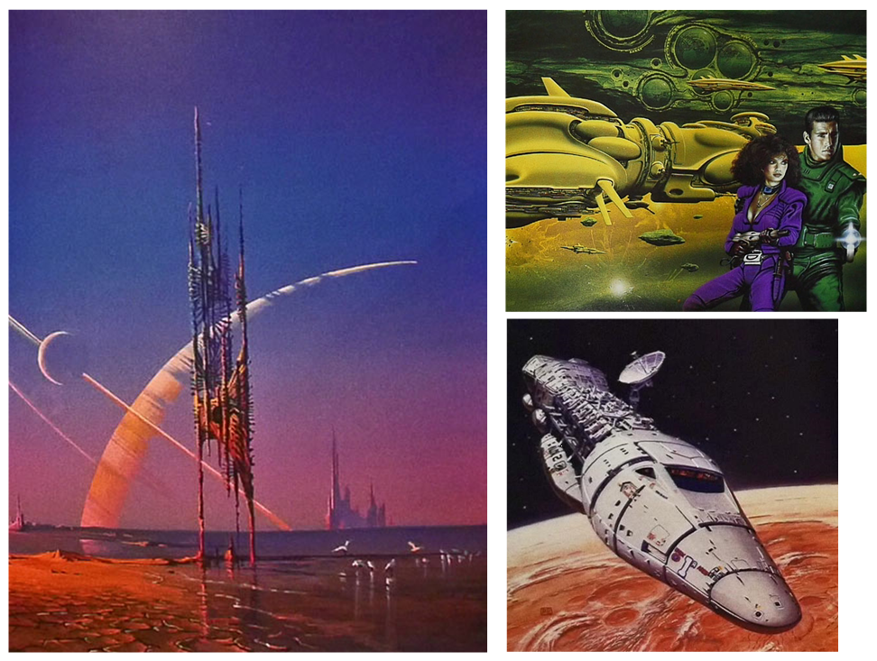
This cover and the story of Cyd’s adventures in The Out are inspired by the sci-fi book cover illustrations of legendary artists Dan and I grew up with in the 1970’s.
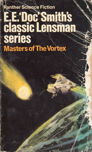
I can recall as a 10-year-old boy a Chris Foss book cover in my uncles bookcase that I would just stare at for ages. It didn’t look painted. I had no knowledge of airbrushes at the time so the art looked almost magically photographic.(The book in question is Masters of the Vortex; part of the E.E. “Doc” Smith’s classic Lensman series… I must read it someday!)
To younger readers seeming unimpressed by this, you have to understand that book covers promised visions of science fiction and fantasy that TV and film at the time could only dream of or copy in a limited way. Shows like Star Trek and the just airing Space:1999 was about as good as it got!
This was like the best CGI and effects ever. In fact, it’s only very recently with the likes of Guardians of the Galaxy have we gone into that colourful space ship universe. (James Gunn presented a ‘Proof of Concept’ for GOTG to Marvel Studios including Chris Foss artwork.)I would dearly love to see a film that had these amazing images in them!
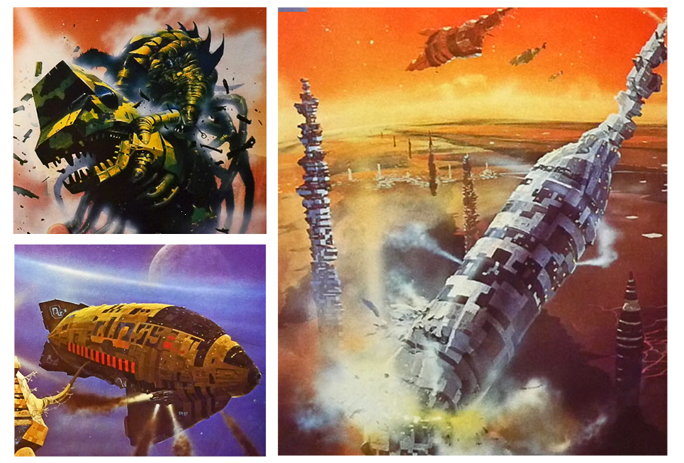
(One of those Chris Foss pieces that inspired James Gunn and GOTG)
From a teenager to present day, I would fill my bookcases with many of the collected covers from artists such as Jim Burns, Peter Elson, Peter Jones, Bruce Pennington, Bob Eggleton, John Harris, John Berkley, Chris Achilleos and Chris Foss. (Achilleos and Foss have also contributed covers to the Galaxy’s Greatest Comic!)
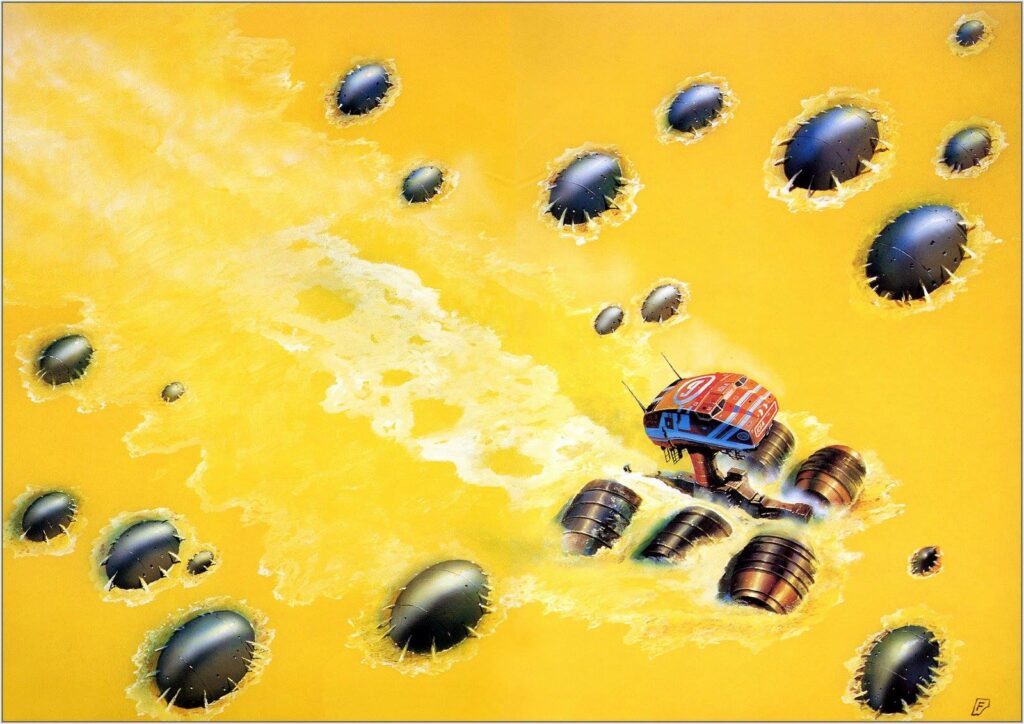
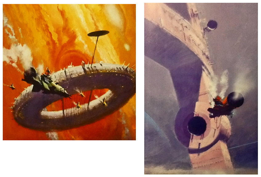
(More of that spectacular Chris Foss artwork)
And whilst I might not have read all the books they illustrated, their covers inspired stories of the imagination, possibly entirely different, and that was the genesis of The Out.
Their work, along with American and European comic artists and their reprints in Heavy Metal Magazine were brainfood to me.
(Art by John Harris)(Art – left – Bruce Pennington, top right – Jim Burns, bottom right – Peter Elson)
All these great visionaries have influenced the look of The Out and the strip is a love letter to their work and the pleasure it gave a growing artist and writer.
In many ways it’s a strip I’ve been waiting to do all my life to do. It’s tapping into a lot of personal history and influences. It’s a journey I’ve been on many times… in my imagination!
And now you can join us as we go further and wilder… Out There!
You definitely need to join Mark ‘Out there’ – The Out is one of those strips that’s got all the makings of instant classic 2000 AD about it. Thank you so much to Mark for giving us another glimpse into what it takes to get a cover to the Galaxy’s Greatest onto the shelves.
The Out began in Prog 2187 and you can find this current Prog 2193 out now from comic shops, newsagents, and the 2000 ADweb shop. It’s a great cover for a truly great strip!
Every week, 2000 AD brings you the galaxy’s greatest artwork and 2000 AD Covers Uncovered takes you behind-the-scenes with the headline artists responsible for our top cover art – join bloggers Richard Bruton and Pete Wells as they uncover the greatest covers from 2000 AD!
This week it’s the return of the brilliant Rich Elson with the latest 2000 AD – Prog 2192 – where Dredd comes up against the great white beast that is Shako – something Elson’s very familiar with after the recent brilliant Kingdom/Shako strip in the 2000 AD Sci-Fi Special this year.
So, over to Rich for just how this particular beauty of a cover was put together…
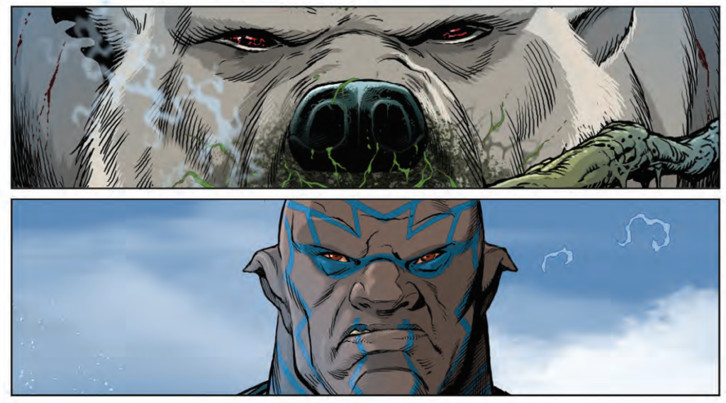
I had just finished up the Kingdom/Shako crossover for the Sci-Fi Special when Tharg asked if I wanted to do the cover for this issue – maybe because I had just spent a few weeks drawing a polar bear!
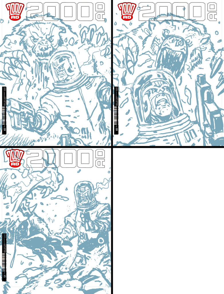
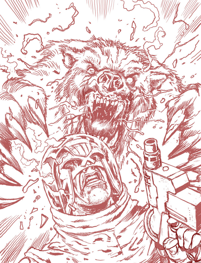
Having finally got around to reading the very enjoyable Judge Dredd Year One a week earlier, I was keen to have another go at the character, so jumped at the chance to draw Dredd when the offer came. Tharg sent over a couple of Henry’s brilliant interior pages to give me an idea of what was required and I drew up three roughs based on the brief.
After the second rough was chosen, I drew up a ‘pencil’ version at full size in Photoshop at 600 dpi.
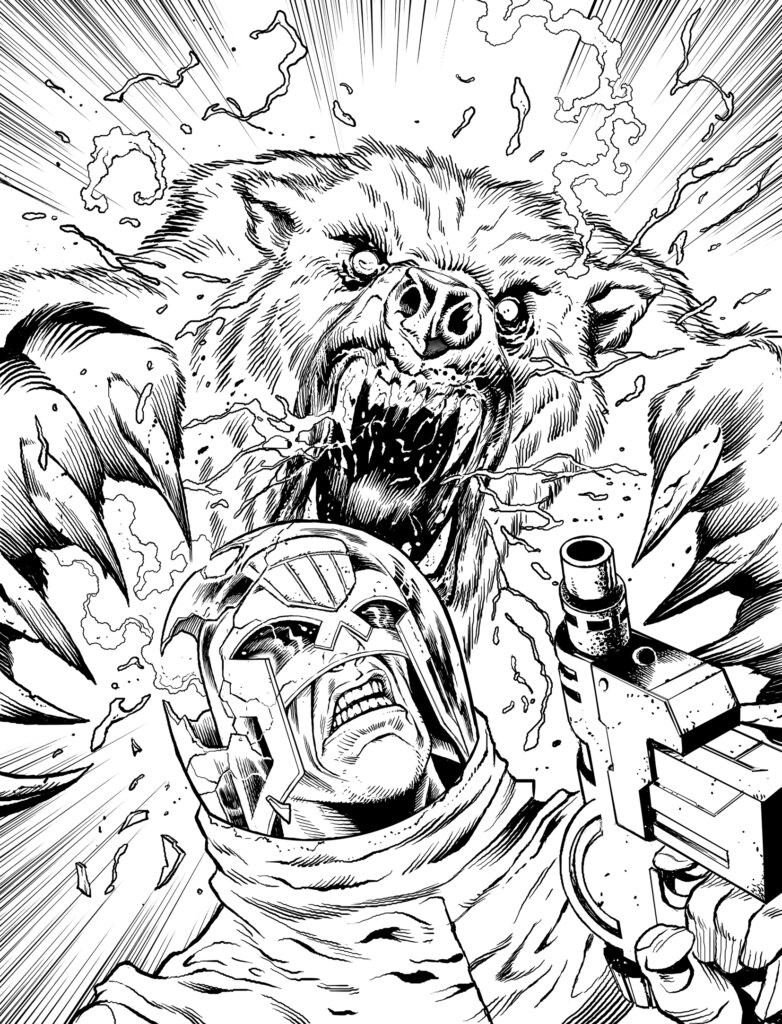
At the inking stage I did Dredd, the bear’s head and paws, the blood and breath and the speedlines all on separate layers: that makes it easier to adjust things, if I need to, before I add colour.
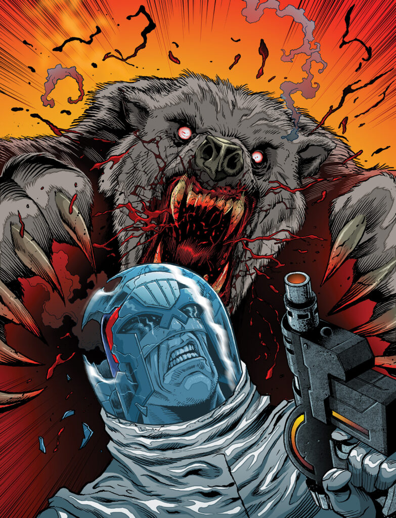
Finally, the colour stage: I wanted a strong colour contrast between the two figures. To bring it all together I spotted a few of the reds, yellows and oranges from the bear and background onto Dredd’s gun and helmet.
This was a really fun job. Who wouldn’t enjoy drawing an enraged, zombified polar bear? Thanks Tharg.
Thanks to Rich for giving us a look at his latest Prog cover – you can see it in the wild from 29 July in print and digital – get it from the 2000 AD shop.
You can hear Rich speak to Molch-R on the 2000 AD Thrill-Cast from last year here. And as for the brilliant Kingdom & Shako crossover from the 2000 AD Sci-Fi Special – you can read more of Rich Elson’s adventures in drawing big, angry polar bears here.
And you can find more from Rich Elson talking about his amazing covers with the Covers Uncovered feature – most recently with Prog 2163 from January 2020…
And here for Prog 2034 – June 2017 – a vision of the Traitor General…
Now, more of Elson’s fantastic cover work over the years…
Every week, 2000 AD brings you the galaxy’s greatest artwork and 2000 AD Covers Uncovered takes you behind-the-scenes with the headline artists responsible for our top cover art – join bloggers Richard Bruton and Pete Wells as they uncover the greatest covers from 2000 AD!
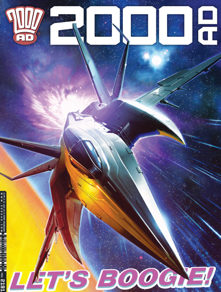
This week we welcome back Alex Ronald, having a good old boogie on the cover of 2000 AD Prog 2191 with the good ship Full Tilt Boogie blasting off…
Alex has been making the covers of the Galaxy’s Greatest Comic for 20+ years now and his digital creations always blast the covers off the shelves… but possibly never more so than this one, with the good ship Full Tilt Boogie exploding off that classic cover.
Alex sent along his art for the issue but also his apologies for not being able to send along commentary at this time. We say it’s no problem at all, as the visuals tell the story all on their own!
First off, the rough – although in this case, rough doesn’t really do the artwork justice…
After that rough is approved by the Mighty Tharg – presumably with the words… ‘YES, Ronald Droid – that’s just perfect as always – now get on with it and stop bothering Mighty Tharg’, it’s time for Alex to get on with putting the final cover into place.
Part of Ronald’s usual process in making his covers involves mocking up a little 3D to help with composition, which is just what he did this time, sending this along for reference to Full Tillt Boogie series artist, Eduardo Ocana‘s version of the good ship Boogie…
Modelling all done, it’s back to the cover, transforming the most un-rough of roughs through the magic of Ronald’s process to something spectacularly worthy of a 2000 AD cover…
Wow, you can feel the power of Full Tilt Boogie as it blasts past you there. Thanks to Alex for sharing those with us, especially in these difficult times. The man is a star.
2000 AD Prog 2191 is available from comic shops, newsagents, and the 2000 ADweb shop.
Now, a little bit extra from both the Ronald Droid and Full Tilt Boogie? Oh yes, I think we can supply that. We have an interview with the creators of Full Tilt Boogie, Alex de Campi and Eduardo Ocana.
And of course, a little more Covers Uncovered from Alex Ronald, another chance to see a master at work in making the magic happen again and again on the cover of the Galaxy’s Greatest. Starting off with the 2019 Christmas Prog 2162…
Prog 2049 – September 2017 – saying farewell to Greysuit…
Prog 2047 – September 2017 – another classic Greysuit cover here…
Something a little different now. In the 2000 AD Sci-Fi Special this year, Tharg commissioned SK Moore (Defoe) to deliver a double-page spread celebrating all that is best in the 20 years of the Rebellion that took hold at 2000 AD in 2000 AD.
Sci-Fi Special cover by Jock
And having seen it in the pages of the Sci-Fi Special, I was absolutely blown away by it. It’s EXACTLY the sort of thing that teen me would have plastered up on his walls.
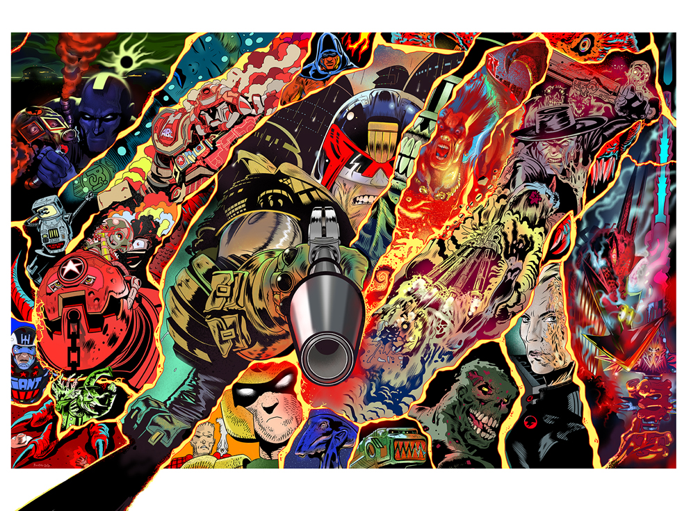
If you haven’t picked up your copy of the Sci-Fi Special (and why the hell not? – Get it from the 2000 AD shop NOW!), then this is what I’m talking about… this glorious double-page spread by SK Moore…
So, having seen it, I thought it would be great if Stewart could share with us the process of putting together the double-page spread pretty much in the same way we do the regular Covers Uncovered feature here.
So… ‘Hey Stewart’, says I, ‘love the pin-up double pager in the Sci-Fi Special. Do you fancy doing a little behind the scenes into how you put it together? Nothing too time-consuming, but would be great to see how something that good came together.’
‘Sure thing’, says Stewart. And then goes off and writes a bleeding essay about the making of the pin-up that covers the very spirit of creation itself and goes deep, deep into so many things. Bless him, it’s fabulous reading.
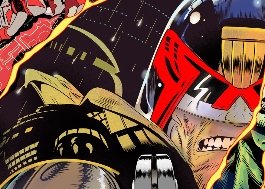
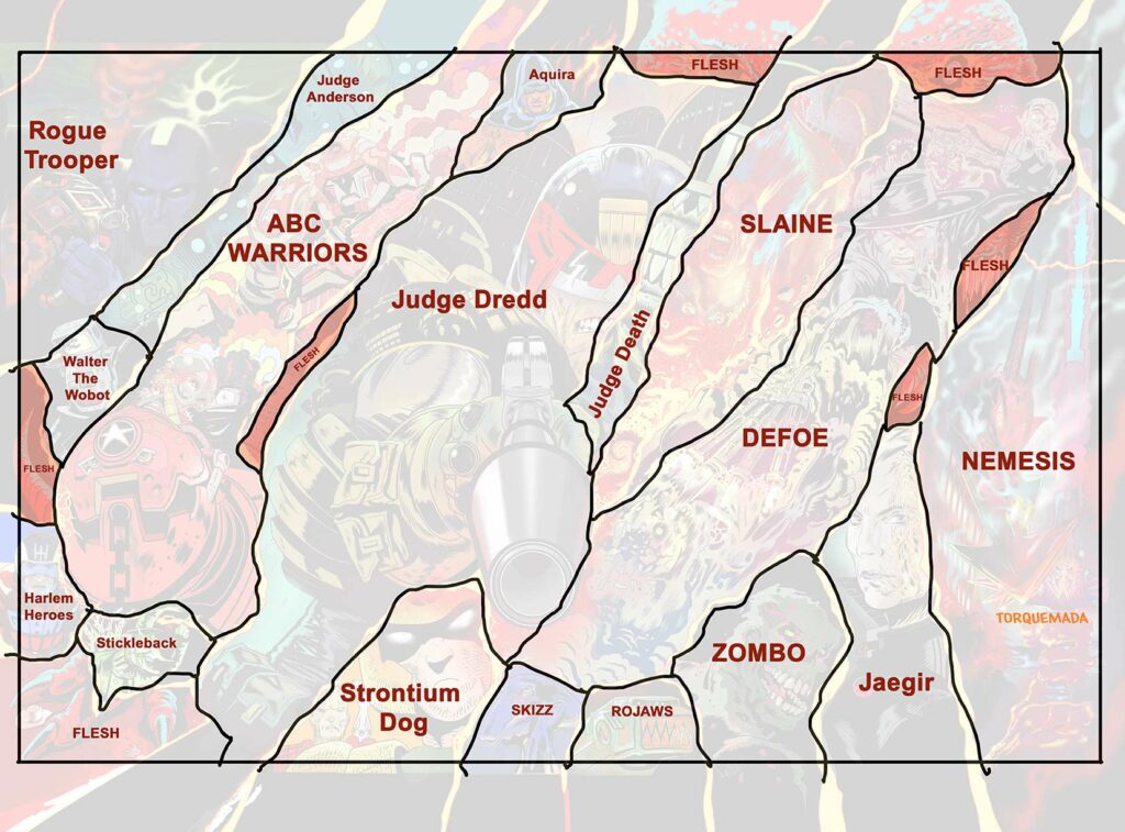
Matt Smith asked me to create a poster pin-up that celebrated a mix of 2000 AD characters for the 2020 Sci-Fi Special. Examples included Dredd, Rogue, Strontium Dog, Slaine, ABC Warriors, Nemesis, Old One Eye – but in addition some of the more recent characters like Defoe, Stickleback, Aquila, Zombo, etc.
It was quite a short deadline for me, I work weekdays on my graphic novel (Project MKUltra: Sex, Drugs & the CIA) and taking on a pin-up would be difficult since I can only work weekends on other projects and the deadline only allowed 2 weekends, it was tight!
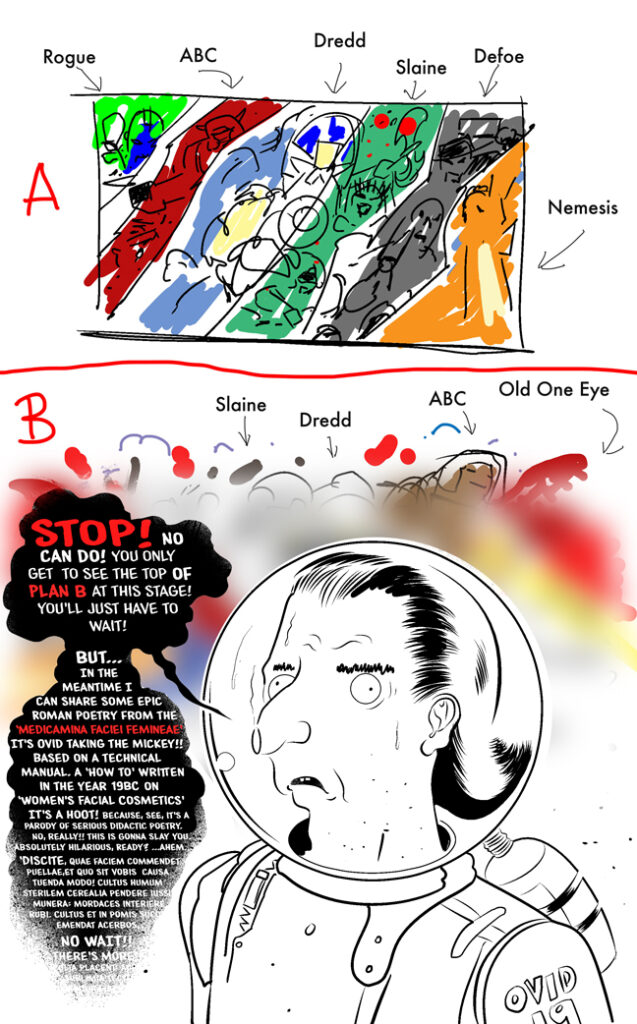
I produced two roughs. The first was a grouping of the characters fighting back-to-back against various enemies, the second a series of vignettes separated by some kind of energy, I’d firm up what that energy was later, but at the time I thought ‘laser fire’. Matt asked me to focus on the vignettes idea now and work up the second composition at a later date.
(So BREAKING NEWS… I’ll be creating a 2nd painting based on the other sketch once I finish my book!)
One of the two roughs Stewart submitted – the other we’ll see soon!
I was a bit relieved, to be honest, by Matt’s choice because the vignettes design would be quicker for me to complete than a full-on perspective-heavy, character-filled, battle scene.
The following description goes into my thought process and doesn’t deal too much with how it was drawn. There are simply hundreds of tutorials on comic art, figure drawing, perspective, oil painting and digital methods, any kind of painting, you name it, it’s all on Youtube. That’s all a matter of practice and learning ‘how to draw’ and paint. What follows here is a little bit about the thought that went into this image.
First I blew up the sketch to fit across two pages. I decided Dredd had to be completed first since he was the focal point. If he shaped up right then everything else should fall into place around him.
Each of the vignettes is a glimpse into each character’s world. If I ran out of time I could widen the dimensions of the vignettes if necessary, in Dredd’s case that would mean more city blocks behind him. But, to my surprise, I made good time with the drawing.
It’s easy at this stage to redraw a bigger version of the sketch and lose all its dynamism, don’t ask me why, it just happens. So I was VERY careful to copy the proportions precisely but much larger and in more detail.
I’ve always been intrigued by optical illusions and use them in my work sometimes. For example, if you hold Prog 2151 (my wraparound Defoe cover) at an oblique angle the condensation trails of the spacecraft compress into skulls.
(Okay… we’ll wait for you to go and try that – I know I did. Cool, huh?)
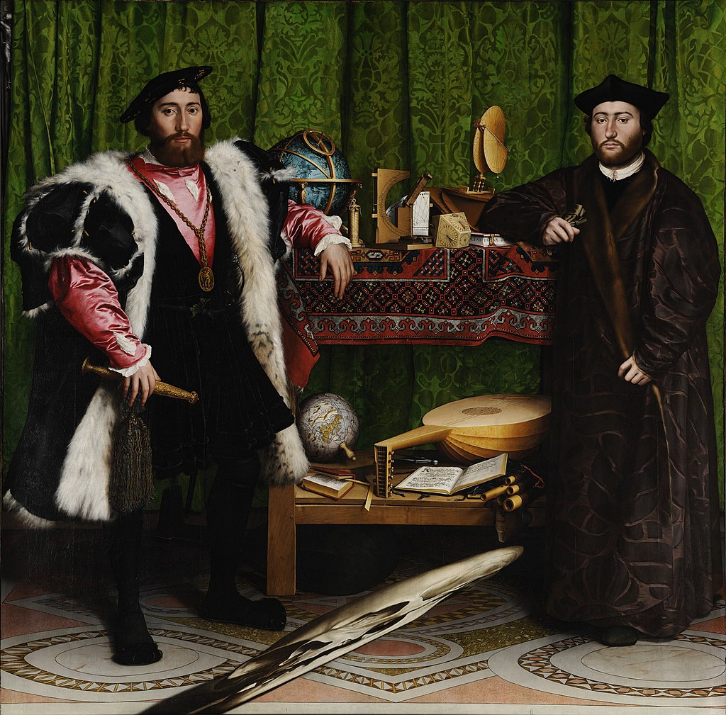
Those skulls are based on one of the most famous illusions in the history of painting. A picture painted by Hans Holbien the Younger known as The Ambassadors. If you are in London it’s well worth a visit to see this astonishing masterpiece at The National Gallery.
Hans Holbien the Younger – The Ambassadors
Al Jaffee’s illusions in Mad Magazine were always a treat and I initially came up with something along similar lines to his work, but it was way beyond the brief, so that idea (which I can’t share right now) has been shelved for the time being. Incidentally, Jaffee is 99 years old and retired from comics last week! (June 2020, as I am writing this.)
One of those Al Jaffee illusions – could this be the thing we’re going to see next in the Prog?
I started thinking about something that I feel I’ve noticed when drawing my own comics. Although letterers put bubbles on the art, the human mind seems to account for that and ‘see’ the obscured areas.
Somehow, even though the bubbles are dropped over the art, I feel I don’t notice the missing areas, somehow my mind still seems to see and understand the composition even though areas are missing. Do you know what I mean?
Artists generally leave space for bubbles but bubbles will very often still land on elements of the artwork, in my case because I’ve not given the letterer enough room. Yet most of the time bubbles don’t actually disrupt the image at all, the mind’s eye sees what’s under the bubble, somehow, anyway. Somehow your mind completes the broken picture line. This is just one of the odd things I feel I’ve noticed while drawing comics and as an artist I’ve wondered about it many times.
So I looked into it and was delighted to find it is a known phenomenon called ‘reification’ and it emerged from studies into what is called ‘Gestalt Psychology’ in the 19th century.
‘Reification is the constructive or generative aspect of perception, by which the experienced percept contains more explicit spatial information than the sensory stimulus on which it is based.’ – Wikipedia.
In other words you see things in the picture that are not there because the mind completes the broken picture based on what is there!
I started drawing just a sliver of Judge Death, and a few others, to slip between the main characters, so he might not be obvious and hopefully a treat to discover in the cracks.
The most challenging attempt at reification was Old One Eye. Her foot is evident at bottom left, the cowboy hat is a clue. Only Flesh has cowboys and dinosaurs! But if you look across the picture there are scales coming through here and there, one empty eye-socket, some teeth and claws.
Character designs should always be recognisable in silhouette. 2000 AD characters are immediately recognizable in this way. But Death is so well designed I think you could put him through a shredder, pick any strand from the waste-paper basket, and still recognise him from just that sliver.
I can only draw Dredd and Defoe off the top of my head. For all the others in the pin-up, I had to study the characters and in the case of Strontium Dog, I even abandoned any attempt to draw him my way. I kind of aped the way that Carlos Ezquerra drew him, is there any other way?
Similarly, I know there are new ABC Warrior stylings, but I am not familiar with them. Instead, I looked at some classic ABC’s by Mike McMahon. I remember, for a while as a young reader, feeling the McMahon run on the ABC’s was the finest thing in the Prog for me, so I looked there for starting points.
I lost a lot of time just looking for material and periods on which to base my drawings.
Once the pencils were near done, I did a second refining layer, then I inked Dredd and then inked Nemesis.
Normally I would only colour after all the inking is done but panic began to set in as I watched the clock hands spin faster and faster. I realised none of this might work – I needed to know it was working.
So I began to complete each vignette, in full, as I moved across the picture. This was advantageous, it spurred me and I was thrilled by the idea that I had no idea how colourful it would end up being.
I could imagine the composition, and each section’s colours, but the overall effect was going to be a surprise even to me.
I worked on the characters that excited me at that moment, and seized them. If you struggle with motivation this is a great creative method to follow. Pick the panel (or areas) that trigger your excitement, you’ll feel it as you look over the pencils, one panel will strike you as exciting, and if you do it well the positivity seems to pass to the next bit of heavy-lifting and before you know it – it’s all done!
This can help you down the creative road faster than plodding through panels you don’t want to draw in numerical order. There’s usually a subconscious reason why I don’t want to draw certain things and that’s usually because something bores me about them. Get stuck into the exciting stuff and it builds your excitement and gives you time to think about how to make those bothersome panels better. This method is also good because when you start you are maybe not firing on all cylinders and by jumping around you warm up in a way that isn’t too obvious to the reader’s eye.
I realised the vignettes could be more like tectonic plates and that ‘energy’ I mentioned earlier could be like lava, between them. So, not thinking too hard about the energy at the beginning helped after all, it gave me time to find the right methodology. Time to think.
Wow. You see what I mean about Stewart throwing himself into it and coming out with an essay on creation?
Stewart’s graphic novel ‘Project MKUltra:Sex, Drugs & the CIA‘ will be published by Clover Press, San Diego later this year. To find out more about the man, go here, and for more on Project MKUltra (& to sign up for the Clover Press newsletter – click here. And here’s a stunning looking page from Stewart’s new book…
Project MKUltra:Sex, Drugs & the CIA – SK Moore
Other things SK Moore related – you can read his (extended) thoughts on making a 2000 AD cover in this Covers Uncovered piece about putting together this beauty for Prog 2179…
Every week, 2000 AD brings you the galaxy’s greatest artwork and 2000 AD Covers Uncovered takes you behind-the-scenes with the headline artists responsible for our top cover art – join bloggers Richard Bruton and Pete Wells as they uncover the greatest covers from 2000 AD!
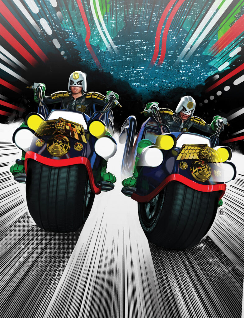
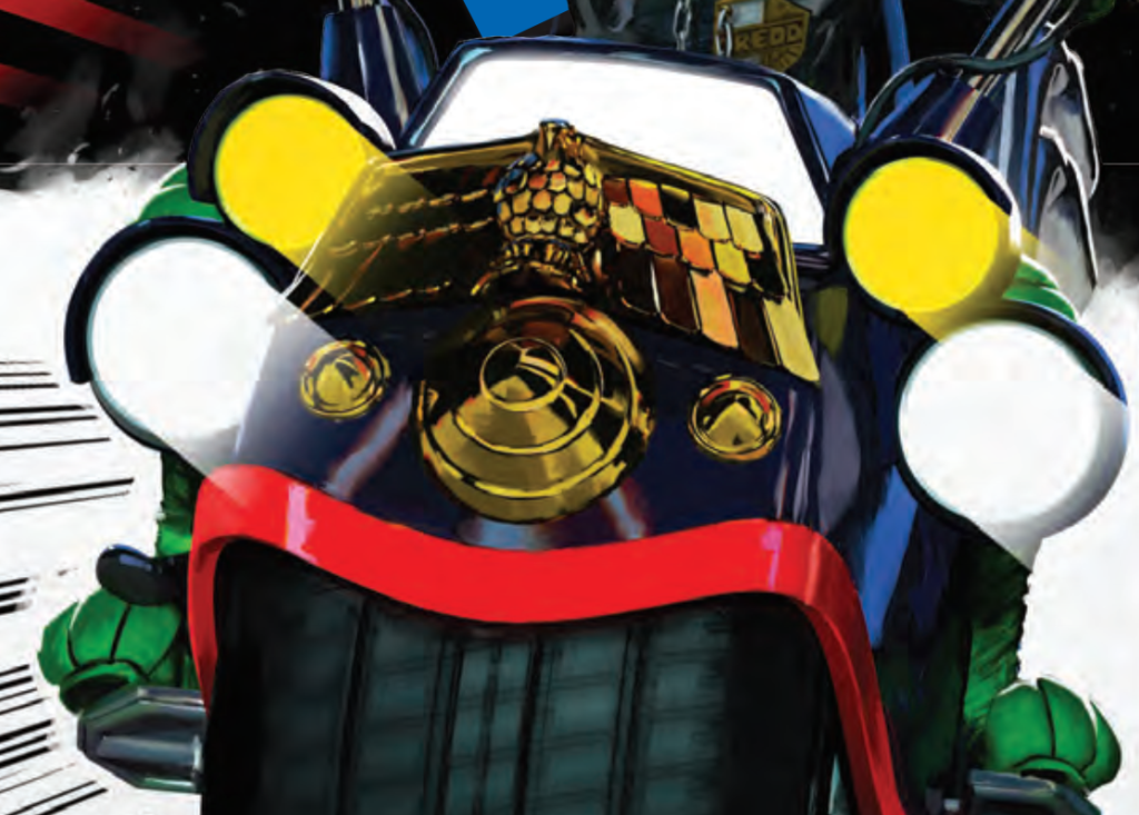
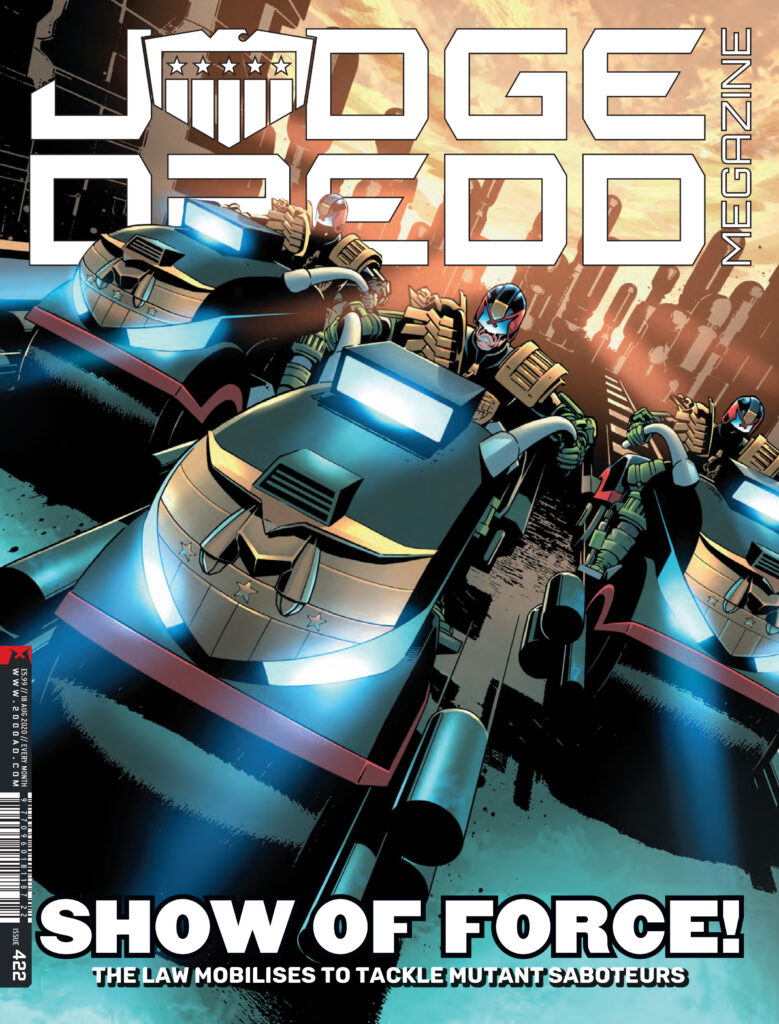
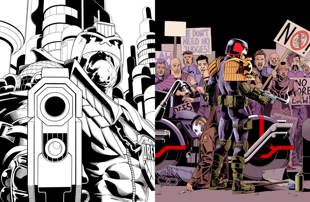
This week, we chat to art droid Paul Williams about his latest cover – Judge Dredd Megazine #422.
Paul was the winner of the 2000 AD art search competition at Thought Bubble 2017 and has since been published in Prog 2072’s Future Shock: Sunday Scientist. and in the DeMarco, P.I. 3-parter An Eye… in Megazine issue 410-413. He had his very first cover just last year, with 2000 AD Prog 2146.
With this latest Megazine cover, he’s created a classic Dredd image that you’ll be able to see for yourselves from the 2000 ADweb shop and comic shops when the Megazine hits the shelves on 15 July.
So, over to the Williams Droid for the skinny…
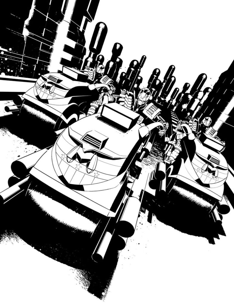
After landing my first cover for the Galaxy’s Greatest Comic last year, I started pitching a few new ideas to Tharg but wasn’t managing to tempt a second commission out of him.
I was having no luck with a couple of pieces that attempted to “showcase” the character of Dredd (below) so I decided to take a different approach.
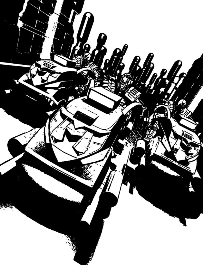
Clearly I had to up my game! Simply posing Dredd wasn’t getting me anywhere so I wanted to try something that was a bit more “graphic” (in terms of design) and less just depicting a moment frozen in time.
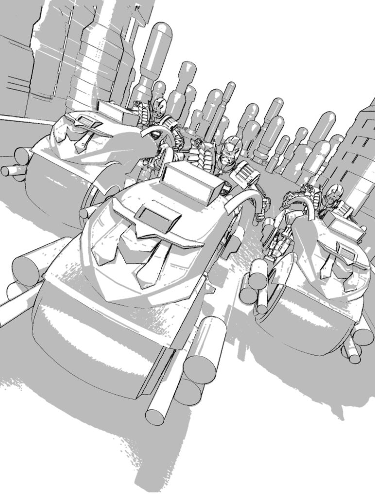
This resulted in a concept that I think is quite different to my usual style, or at least in terms of drawing from some of the influences that don’t show up so much in my comic work. Below is the rough I sent off.
After getting approval from Tharg’s delegate on Earth, Matt Smith, I began to work in some more detail to give it movement.
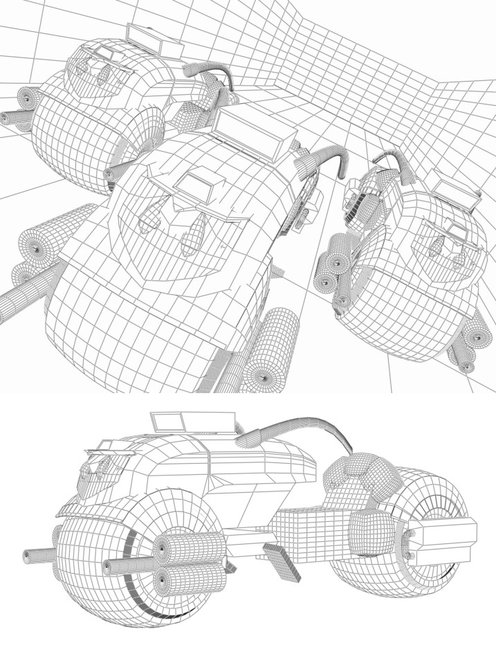
Usually, most illustrations begin with a sketch but in this case all I had on paper was literally a bunch of lines of action spreading out from the top right corner with a vague idea that I wanted the Lawmasters to follow them. I then took that concept into 3D modelling software and mostly figured out the composition by moving my bike models around in a perspective grid.
Incidentally, I usually favour the more ‘classic’ Lawmaster in my Dredd art but wanted less complicated shapes for the foreground of the image so I nicked the design Jake Lynch has perfected for a one-off, as it’s quite streamlined.
Because I work digitally my art doesn’t always separate into “pencils and inks”. Sometimes, like here, it will involve something a bit more like “sculpting” where I’m moving things I’ve drawn around and resizing to find the right compositions, then taking bits out and re-drawing them to add a bit more fidelity.
What will usually happen is I’ll do that until I have something that could pass for inks, then I’ll do “final” inks which are tighter and have a clearer line.
I remember wanting it to almost feel like a “splat” of ink on the page that had organised itself into a more complex illustration, with high contrast between the solid blacks and the empty spaces.
That required me to leave out a bit more detail than I’m usually comfortable with but – for something so out of my usual comfort zone – I was satisfied that it looked more or less exactly like what was in my mind!
Thanks to Paul for letting us inside the making of his latest Megazine cover – out from Wednesday 15 July in print and digital!
You can read an interview with Paul and his co-winner, script-droid Laura Bailey here and both Paul and Laura talk about their DeMarco strip on the Thrill-Cast here. And you can find Paul on Twitter and Behance.
And finally… a look back at Paul’s very first 2000 AD cover – Prog 2146.