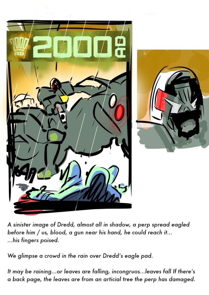
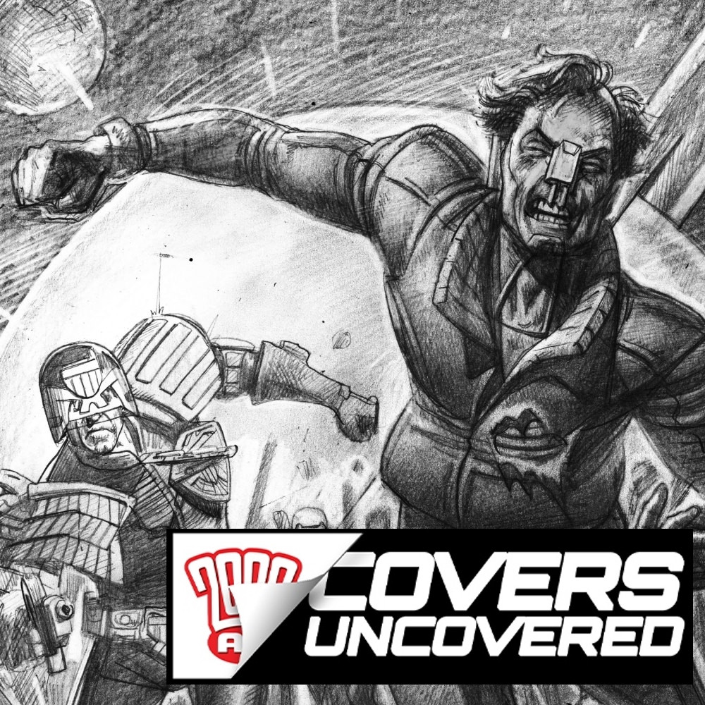
Every week, 2000 AD brings you the galaxy’s greatest artwork and 2000 AD Covers Uncovered takes you behind-the-scenes with the headline artists responsible for our top cover art – join bloggers Richard Bruton and Pete Wells as they uncover the greatest covers from 2000 AD!
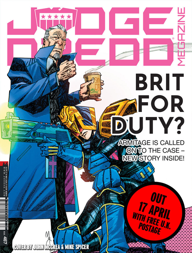
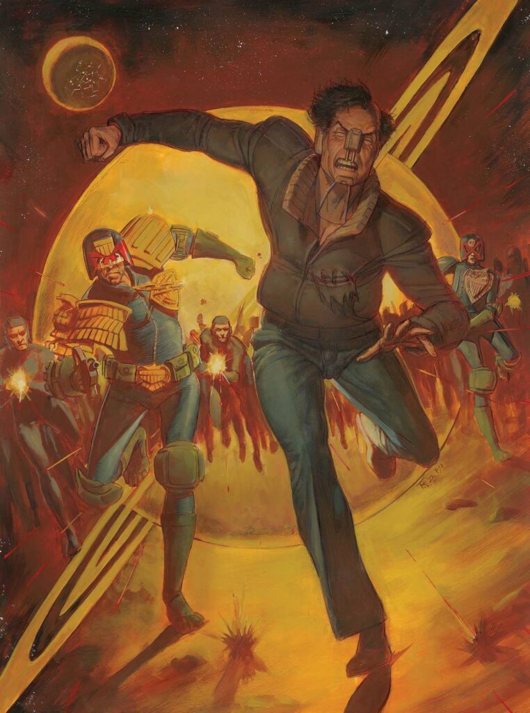
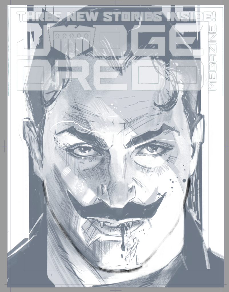
Another month, another zarjaz Judge Dredd Megazine cover to show you – this month it’s the return of Brit-Cit’s finest Detective Judge, Armitage, courtesy of John McCrea, adorning the front of Megazine 467…
Detective Judge Armitage first appeared back in 1991, the creation of Dave Stone and Sean Phillips. Since then, this grumpy, stubborn, opionated, and arrogant copper who’s always butting heads with his bosses has featured pretty regularly here in the Megazine, always proving he’s the best plainclothes operative in the Brit-Cit Justice Department.
Inside Megazine 467, we have the beginning of a new Armitage tale by Liam Johnson and Warren Pleece, all under this fantastic cover from the McCrea droid. So, taking advantage of one of his breaks – Tharg gives his droids one every month or so just so they can get an oil change and do some promo – here’s John to tell us about his latest cover…
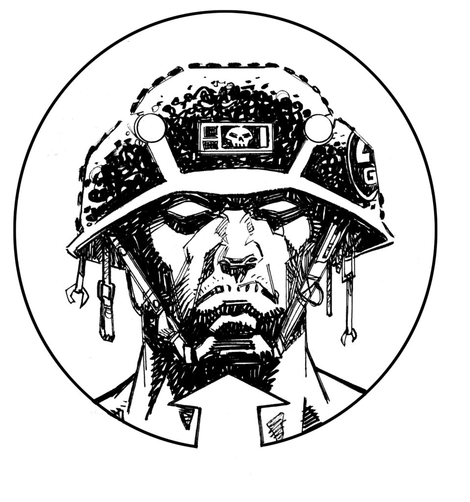
JOHN MCCREA: 2000 AD has been lucky to have two of the best character designers in all of comics – Carlos Ezquerra and Brendan McCarthy. Brendan’s alternative Judge designs are incredible, so when I was asked to do an Armitage cover for the big Meg, I definitely had to get a Brit Cit Judge in there!
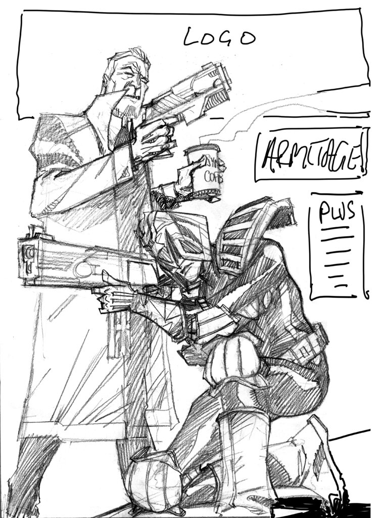
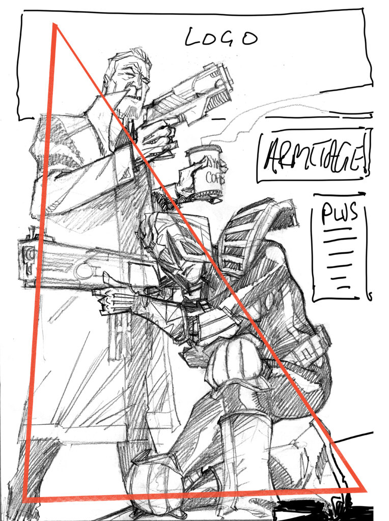
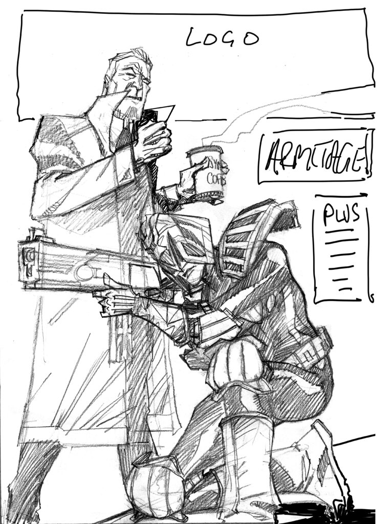
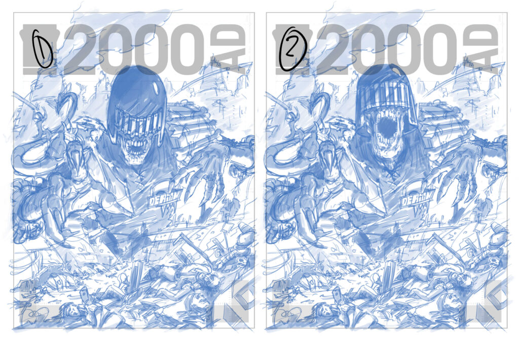
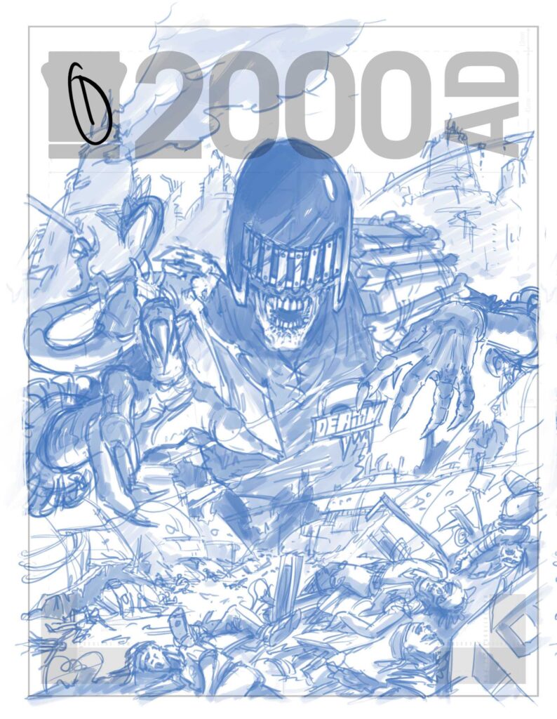
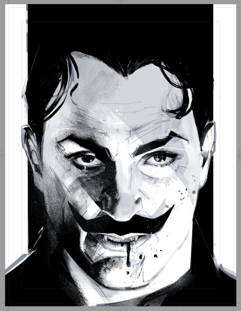
My first pass was this one, using a triangle design to allow for dead space on the upper right for type…
JOHN MCCREA: Tharg sent Mek Quake round to my hab to point out (in no uncertain terms) that Armitage doesn’t use a gun so I had better amend that post haste! I complied.
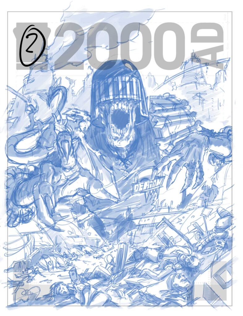
Ooops! One quick removal of gun later and John came up with this one…
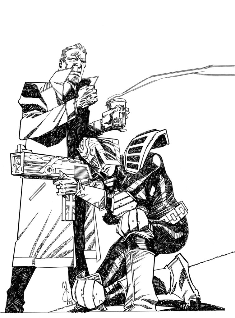
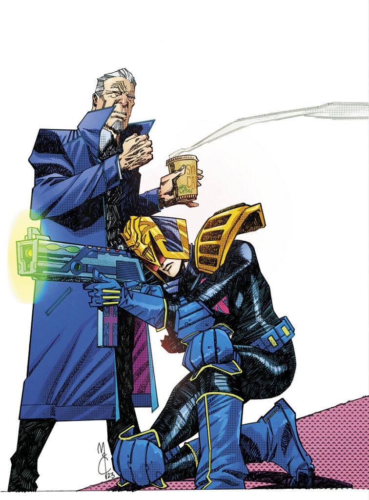
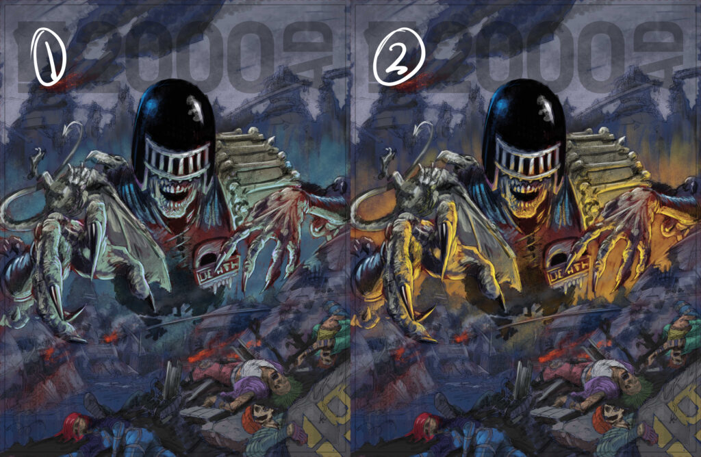
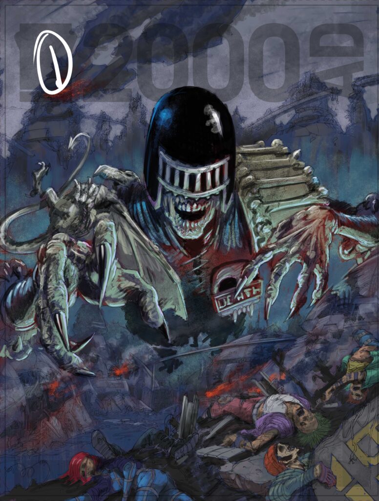
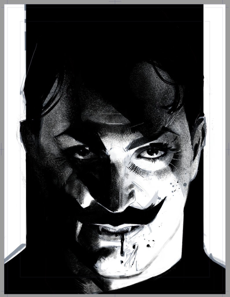
JOHN MCCREA: Tharg forgave my oversight, so it was on to inks. I decided that the reason Armitage was so annoyed on this cover was that the barista (coffee pourer to you and me) had misspelled his name, writing Arse Wedge on his cup o’ Synthi-Joe – which is why he’s commanded the Judge to take out the offending fella.
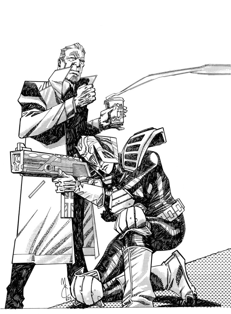
At least that’s the stupid story I made up while inking this. What a job! After the inks, I popped on some digital tones.
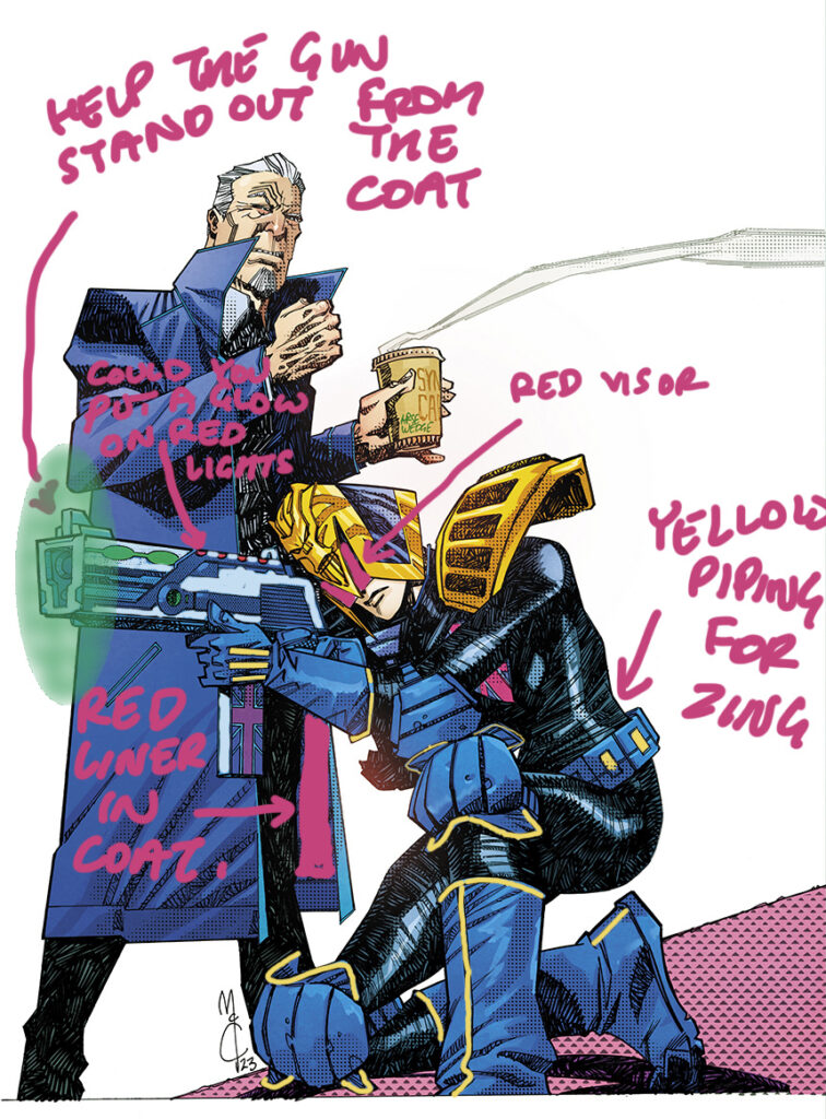
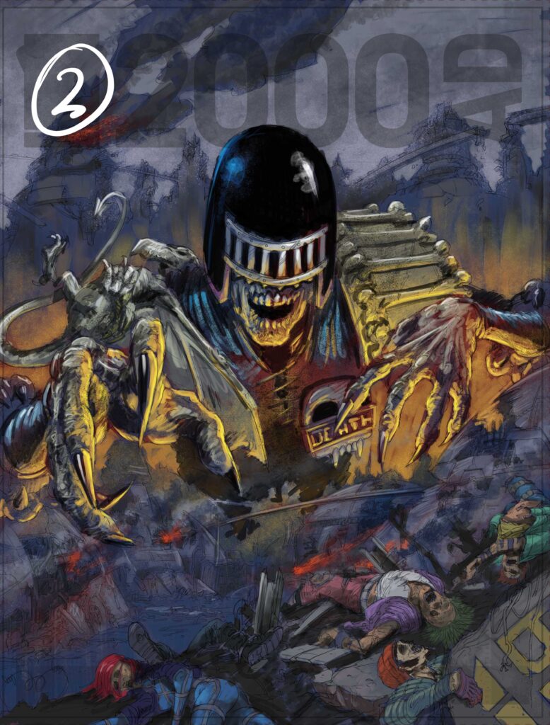
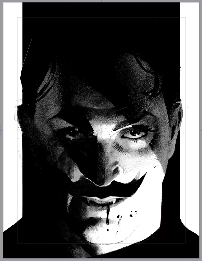
JOHN MCCREA: Off it went to Mike Spicer for colors, and after a few notes we had a Megazine cover all ready to go!
My quest to draw every significant 2000ad character (at least once) continues apace!
Well, you can tick Armitage off that list right now John!
Thanks so much to the McCrea droid for this latest ghafflebette cover – you can see it in all its glory on the front cover of Judge Dredd Megazine 467 wherever the Galaxy’s Greatest is sold – in newsagents, comic shops, and from the 2000 AD web shop.
If you want more Covers Uncovered from John, take a gander at these – with some magnificent Dredds on Prog 2024, Prog 2224, Prog 2328, Prog 2351, and Prog 2361. Now, let’s all ask Tharg to let John do more covers and, even better, return to the inside of the Prog – I think we’d all love that! After all, this is a man on a mission to draw every single major 2000 AD character!
Every week, 2000 AD brings you the galaxy’s greatest artwork and 2000 AD Covers Uncovered takes you behind-the-scenes with the headline artists responsible for our top cover art – join bloggers Richard Bruton and Pete Wells as they uncover the greatest covers from 2000 AD!
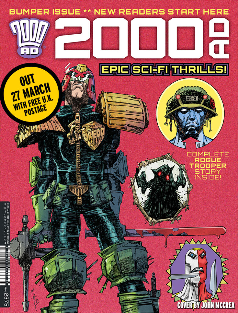
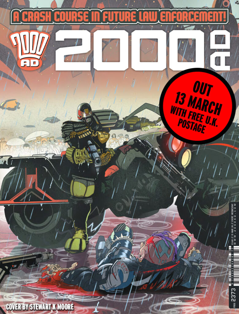
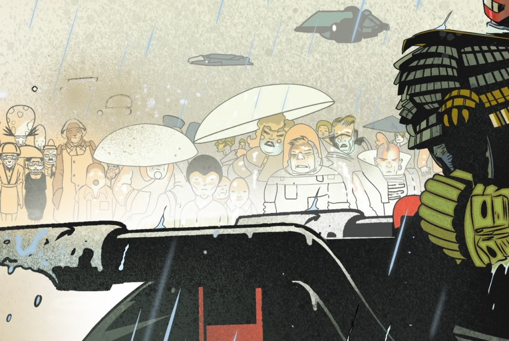
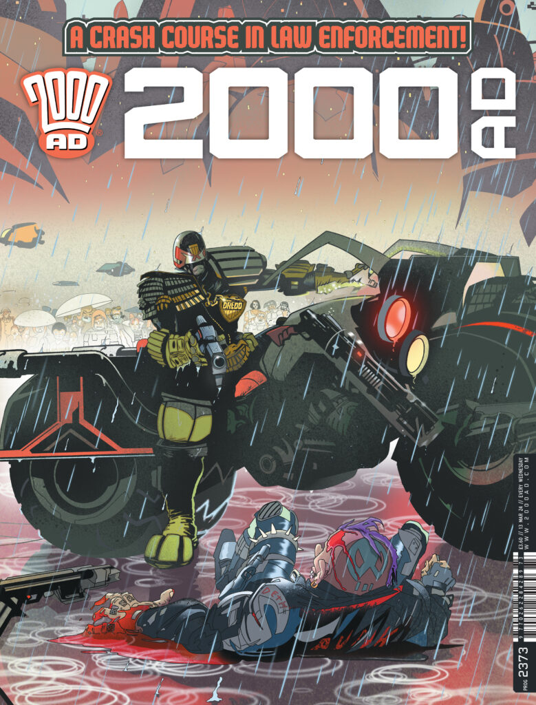
This week it’s time for another treat from our Lord & Master, The Mighty One, as Tharg gives us even more thrill-power in a bumper 52-page Prog 2375 – with Dredd, Rogue, Thistlebone, and Proteus Vex all featuring on the zarjaz front cover by John McCrea…
Inside the Prog we have continuing thrills with the crew of the Full Tilt Boogie and the beautiful madness of Indigo Prime, plus the stunning (and terrifying) finale to folk horror Thistlebone: The Dule Tree. But that’s by no means all – there’s also a one-off Rogue Trooper from David Barnett and Paul Marshall (we think we mentioned there’s a film coming out, yes?); a double-length, 10-page opener, to the latest series of Mike Carroll and Jake Lynch’s magnificent space opera epic Proteus Vex in Devious, and then a new Dredd story by Rob Williams and R.M. Guera that acts as a prologue to the new series beginning next week – Rend & Tear with Tooth & Claw, that’s been trailed as a multi-part survivor horror story that takes Dredd into the snowy wilderness of the territory which once was called Alaska.
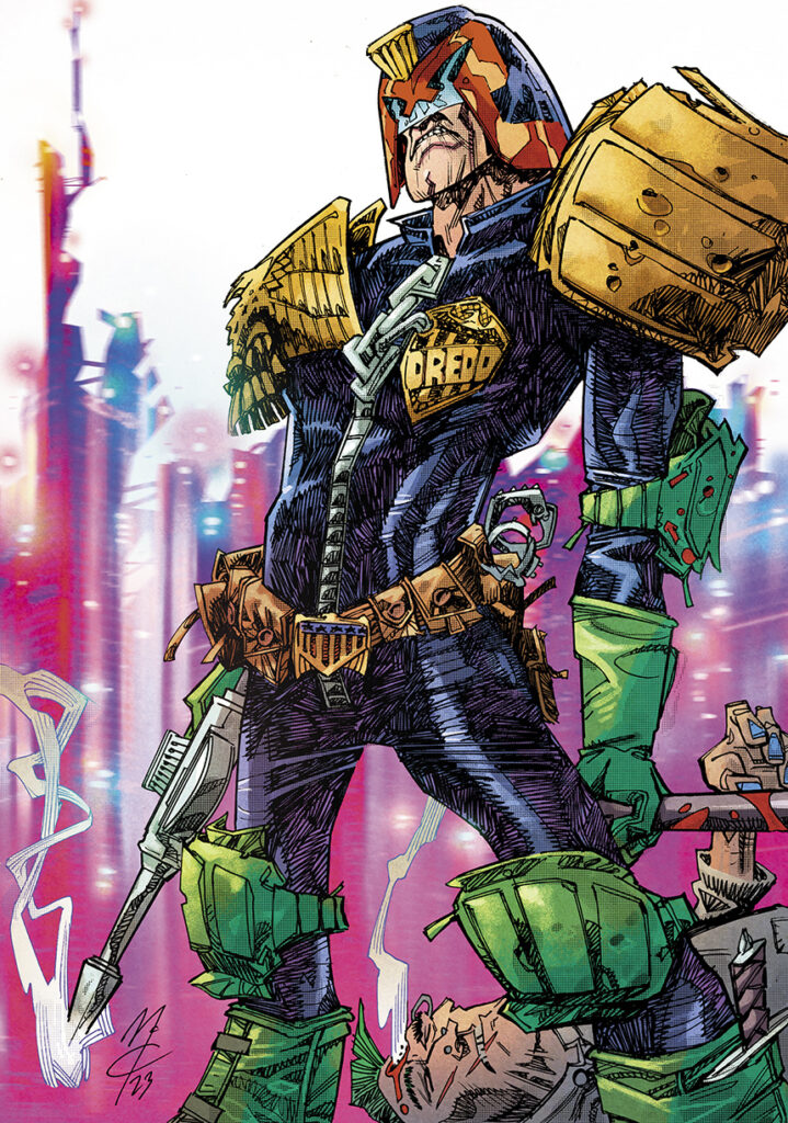
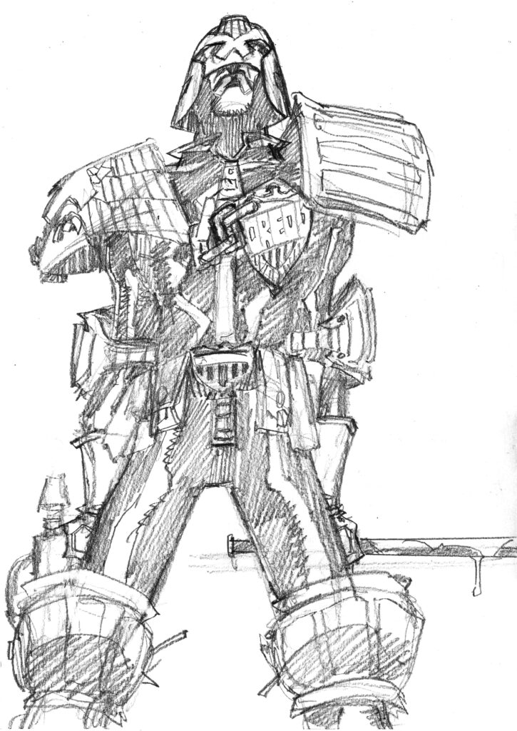
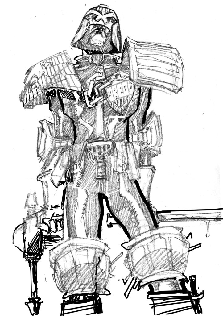
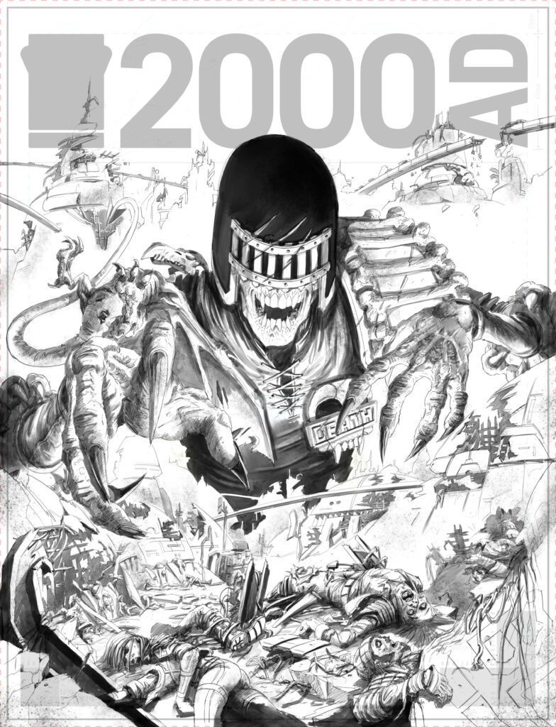
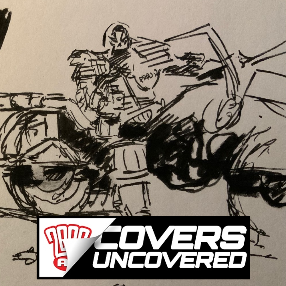
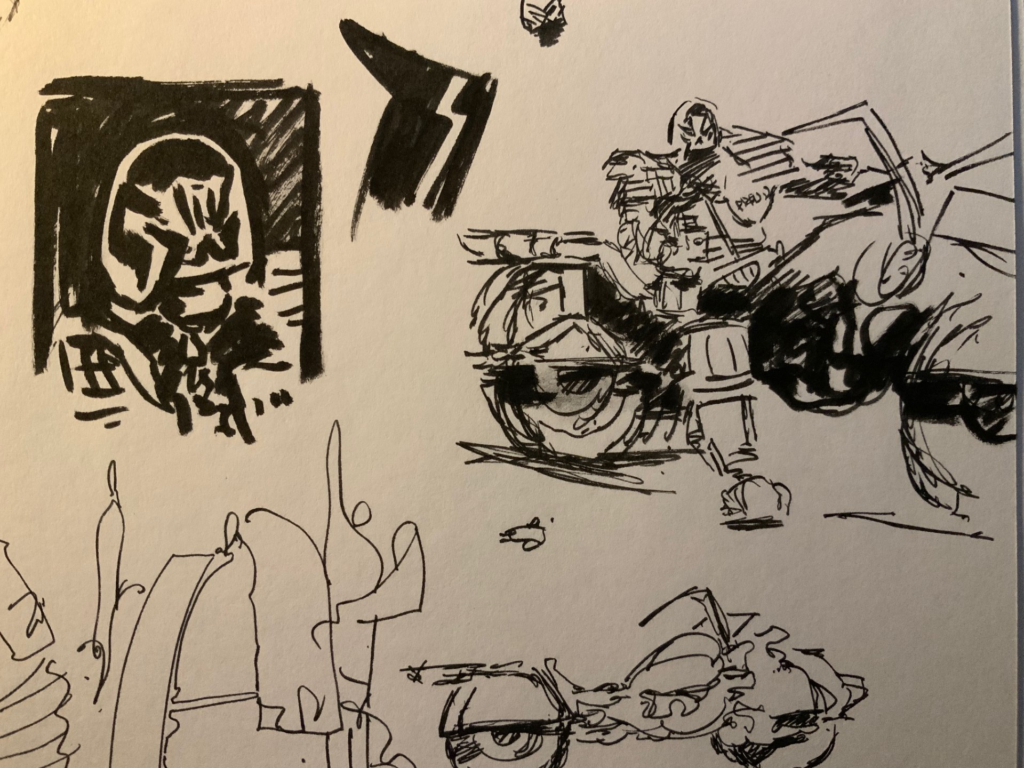
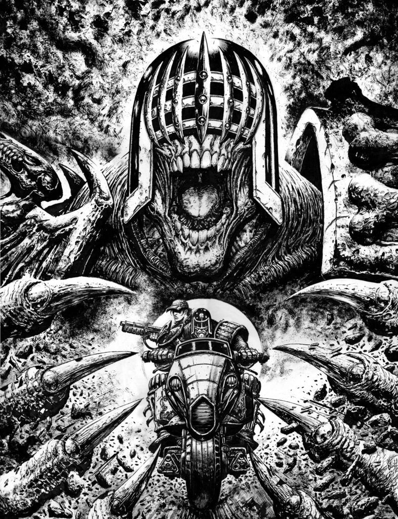
But back to that fantastic McCrea-droid cover, one that’s a lesson in always coming back to your art and giving it a second chance. In fact, this one started with the initial rejected sketch to a previous cover of John’s, Prog 2361, this one in fact…
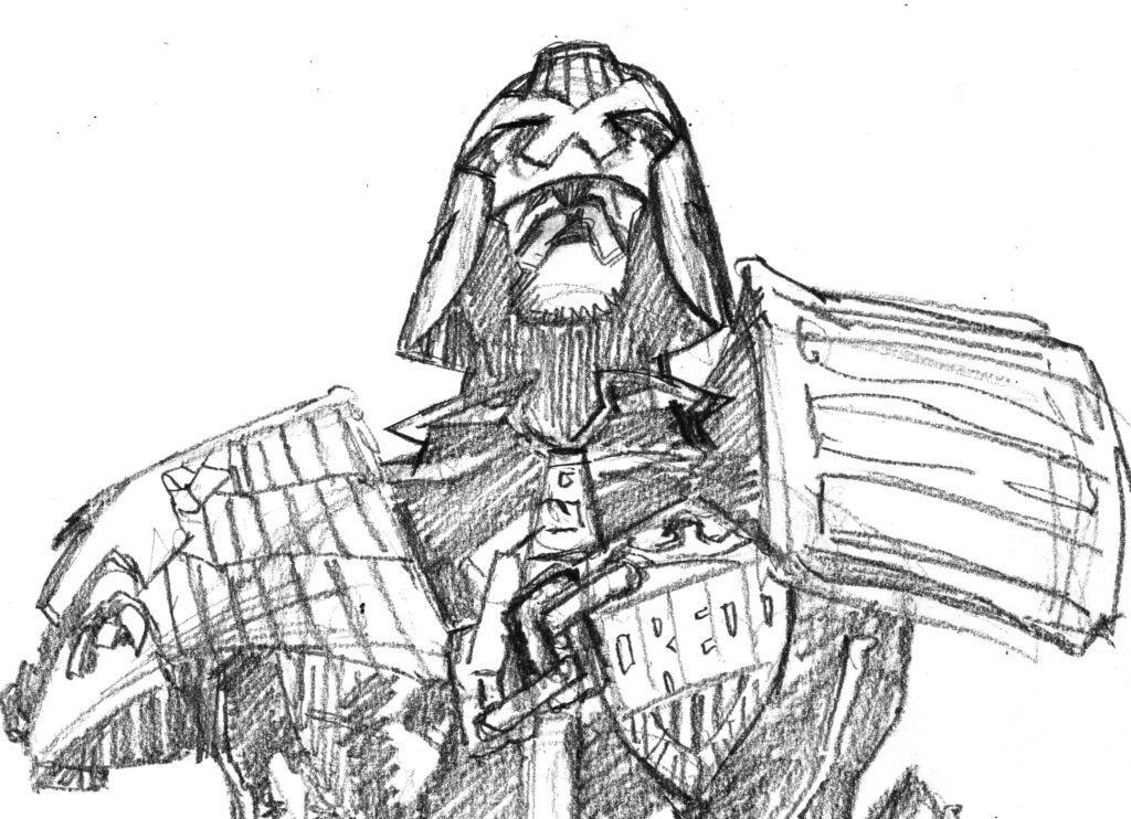
JOHN MCCREA: Ok, this cover started with the previous cover, Prog 2361- Dredd standing over the beaten body of some poor mega city punk.
When I was penciling that one, I thought my initial sketch was lacking in dynamics and the posture wasn’t quite good enough.
Yes, the McCrea unit comes not only pre-programmed with that great fluid line and impressive loose style but, like all of Tharg’s art droids, there’s also a hefty chunk of self-doubt in there to keep him in his place.
This is the initial sketch in question that McCrea did for Prog 2361…
JOHN MCCREA: It’s ok, but there’s something missing. Too straight on, not enough tension in the pose. I dunno. (Any actual wonkiness in the drawing would have been sorted out, but technical faults aren’t the problem here).
Okay then, back to the now and John talking about this current cover…
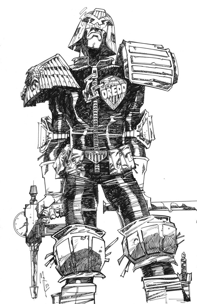
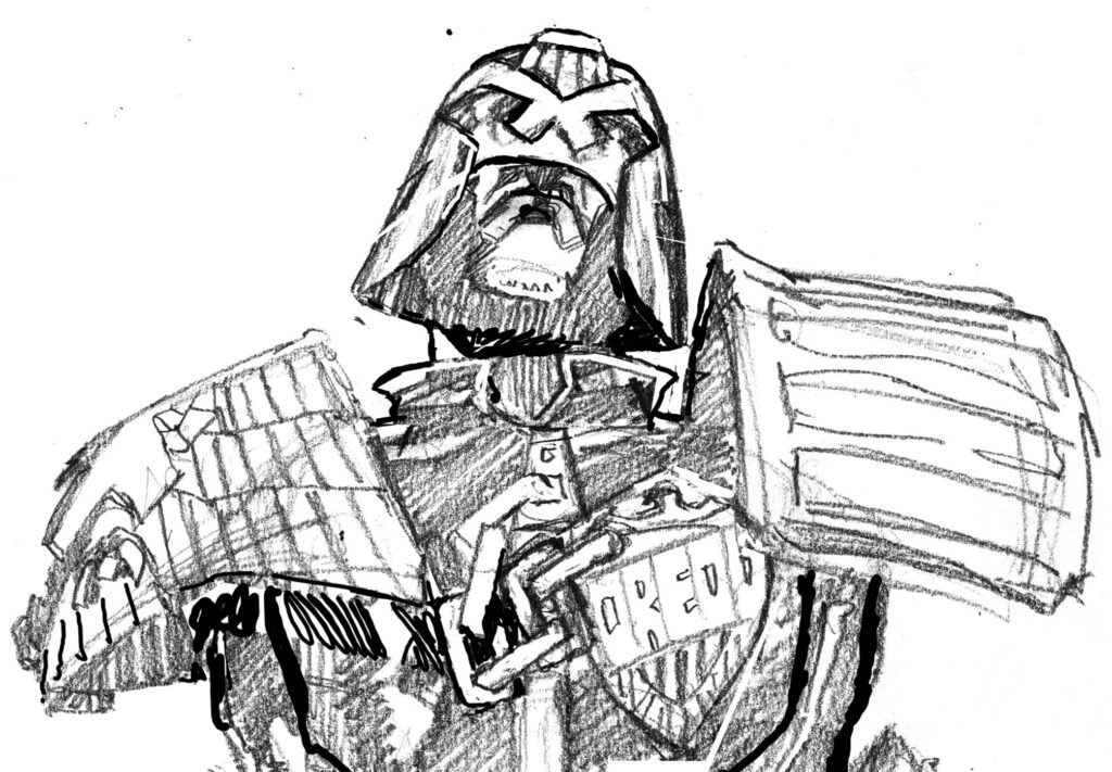
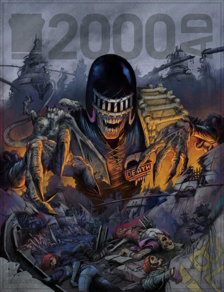
JOHN MCCREA: However after that cover was completed and a few days later, I glanced over the first sketch again and thought I could maybe make something of it. I rarely throw away any art as I hate to waste a drawing – I have realized that time can help you see the faults in a drawing that you didn’t catch before, and maybe figure out ways to improve it.
So I scanned the picture and noodled with it in Photoshop, basically cutting the limbs out and shifting them around like one of those paper dolls. I also altered Dredd’s head, fixing the wonky shape and adding a little more sneer to the face, and ended up with this…
The stance is much more interesting, the whole thing giving off a more ‘don’t f*** with me’ attitude. So I inked it…
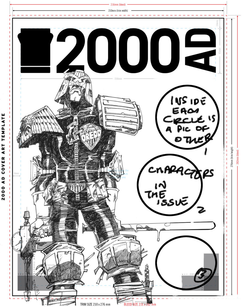
I have always wanted to do a cover with extra characters in circles within the main picture, so quickly mocked this up and sent it to old green bonce.
Tharg loved it and agreed to get back to me when he had decided which issue it was to be fronting.
A month or so later a Regelian Hotshot alerted me to the characters that had been selected, so onwards!
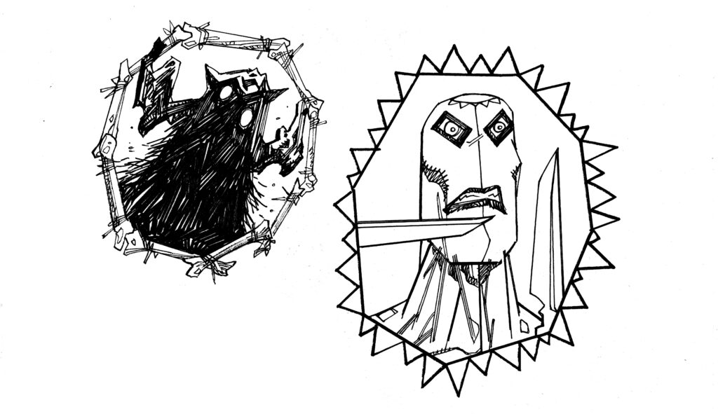
I had to draw the three characters on a separate sheet of paper- I had not left any room on the art as originally I was not thinking of it as being a cover, just a cool pic of Dredd I was drawing.
I decided to make the circles containing the characters representative of the stories and this is how they turned out.
Then I scanned them and popped them onto the art, extended Dredd’s baton to fit the format and my work was done!
(And yes, you can all insert your extending Dredd’s baton gags right here.)
JOHN MCCREA: I sent it off to colourist Jack Davies and, when I got it back, had zero notes! Jack’s magic palette pulled the whole thing together!
I hope all you Earthlets enjoy this issue!
Enjoy the issue John? We think the Earthlets will be loving it – starting with your fantastic cover. You Earthlets can find it on the front of Prog 2375, in newsagents, comic shops, and from the 2000 AD web shop.
Every week, 2000 AD brings you the galaxy’s greatest artwork and 2000 AD Covers Uncovered takes you behind-the-scenes with the headline artists responsible for our top cover art – join bloggers Richard Bruton and Pete Wells as they uncover the greatest covers from 2000 AD!
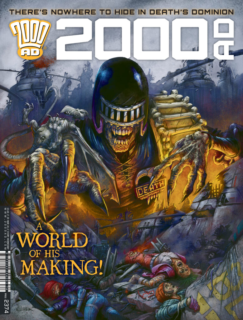
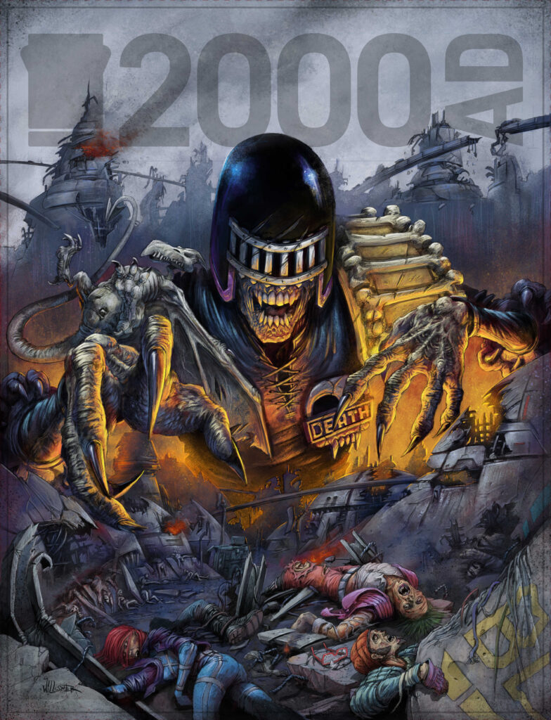
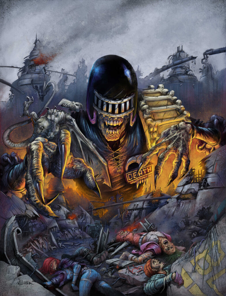
This week we have a pleasing symmetry for you – it was Toby Willsmer that did the ssssstunning cover to Prog 2352 where The Fall Of Deadworld: Retribution began and now it’s another fabuloussss Toby Willsmer cover that marks the finale to this particular visit to the nightmare of Deadworld on Prog 2374…
Yes, Kek-W and Dave Kendall’s The Fall Of Deadworld closes another fear-filled series as we get the 12th and final part of Retribution in this weeks Prog. And those horrorssss to be found in the world of the Dark Judges before it became Deadworld are clear for all to see with a truly terrifying Willsmer droid cover.
Toby’s been in the Prog so often that it’s easy to forget that it was only in 2021 that he won the 2000 AD Art Stars contest. But since then he’s been a regular cover artist; his art’s graced the insides on Robo-Hunter in the zombie takeover tale The Darkest Judge, Cadet Dredd in Prog 2325, and he had a Regened Future Shock in Prog 2346. And we reckon there’s a hell of a lot more to come from this New Zealand-based illustrator and comic artist whose childhood was spent in 70s Britain, meaning that his heart will always come back to 2000 AD!
Now, here’s Toby to tell you all about his latest trip into the realm of nightmaresss with The Fall Of Deadworld, one that’s a pretty damn fine homage to another iconic cover by the late, much-missed, incredibly talented Brett Ewins…
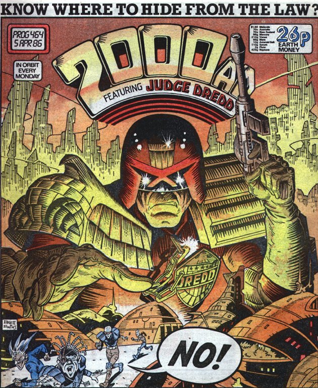
The classic Brett Ewins cover to Prog 464 that Toby’s homaging here
TOBY WILLSMER: Matt asked if I could come up with a Judge Death cover with a similar composition to Brett Ewins Dredd cover from 1986. The difference being the city would be in ruins and have ‘lots of dead people’. Sounds like my cup of tea.
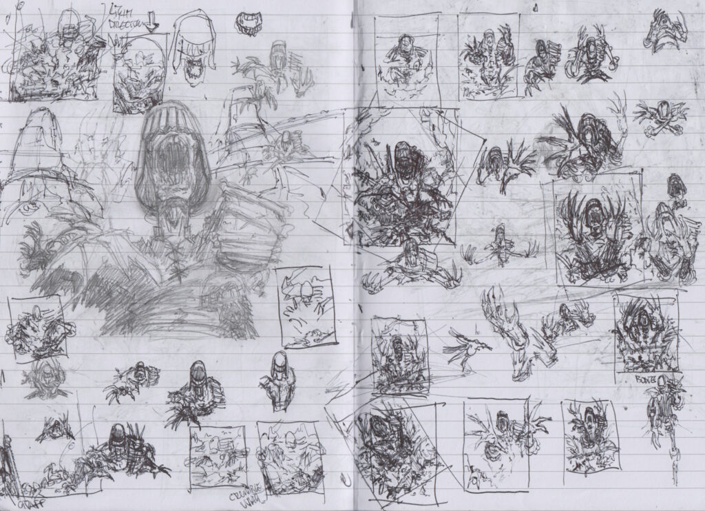
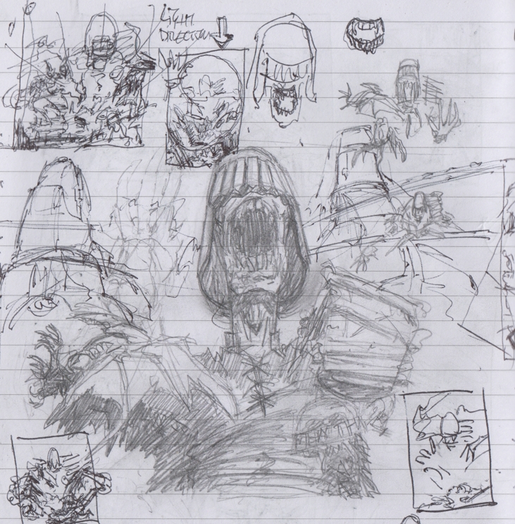
My usual starting point is by dumping all my initial ideas into a sketchbook to see what works best. I like to draw over things a lot at this stage to work out certain parts…
Stage 1 – Initial sketch ideas and a hell of a lot of Judge Deathssss
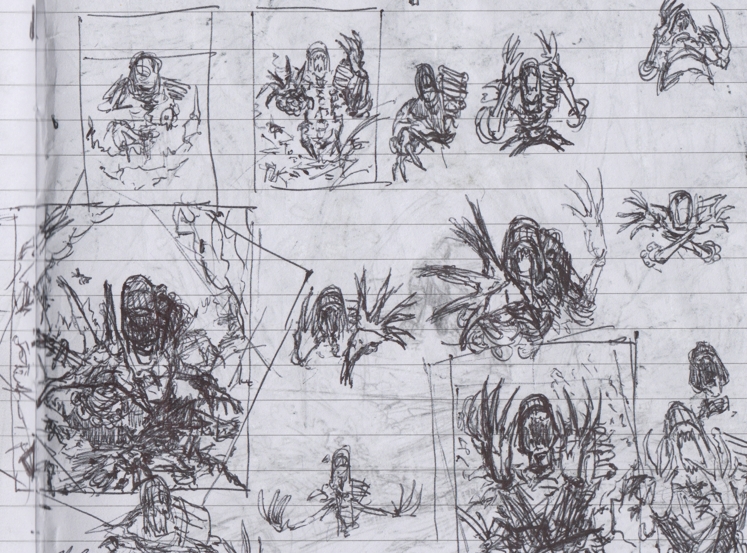
From here, I’ll choose the parts that worked for what I had in mind and draw them up into the roughs…
Stage 2 – Picking a couple to work up into roughs
I came up with Mr Death firssssst (couldn’t help myself) to get the placement right then added the ruined city around him.
I wanted to have a focal point in the foreground as I planned to light and detail this part a little more than the rest of the city. That and it was a great spot for some of those dead people!
Stage 3 – Working the couple of Deaths into colour before presenting them to Tharg to make his choice
I’d planned to use some under lighting on Death and came up with a couple of options for Matt to choose from.
With Matt’s layout and colour scheme selected I’ll go onto the linework. At this point I decided to change the foreground a little to frame the top part of the layout a little better. Matt OK’d the change and I went ahead and drew up the linework and added where I wanted the initial shadows.
From here it’s my usual route of adding all the base colours to get the overall tone right.Then onto the fun stuff adding all the lighting and details until it’s all done.
I’ll never get bored of drawing this guy.
Stage 4 – lines and shades and a change in the foreground
Stage 5 – Adding in the base colours
Stage 6 – The final part – adding all those bells and whistles, the lighting and the details
Oh yes, Toby’s never going to get tired of drawing him and I don’t think we’re going to get tired of seeing his fabulousss (one last time, I promise!) art on and in the Prog! Thanks so much for Toby to sending that absolute beauty of a cover along – you won’t be able to miss it on the shelves wherever you pick up your weekly dose of Thrill Power, including the 2000 AD web shop, from 20 March.
As for more from Toby, his ever-excellent covers have featured quite a bit here – we have Covers Uncovered for Prog 2240, Prog 2262, Prog 2269, Prog 2318, and Prog 2332, not to mention that first Deadworld cover for this latest series on Prog 2352. Plus, you can see his winning Art Stars entry, the thing that started all of this off, here. And for more about Toby himself, just head to his site here or Insta here.
And now, a little Willsmer bonus… first of all a clean, logo-free version of the cover, followed by blow-ups of his incredible sketchbook ideas, his two initial roughs, and then the two colour roughs sent through to Tharg! Enjoy!
Every week, 2000 AD brings you the galaxy’s greatest artwork and 2000 AD Covers Uncovered takes you behind-the-scenes with the headline artists responsible for our top cover art – join bloggers Richard Bruton and Pete Wells as they uncover the greatest covers from 2000 AD!
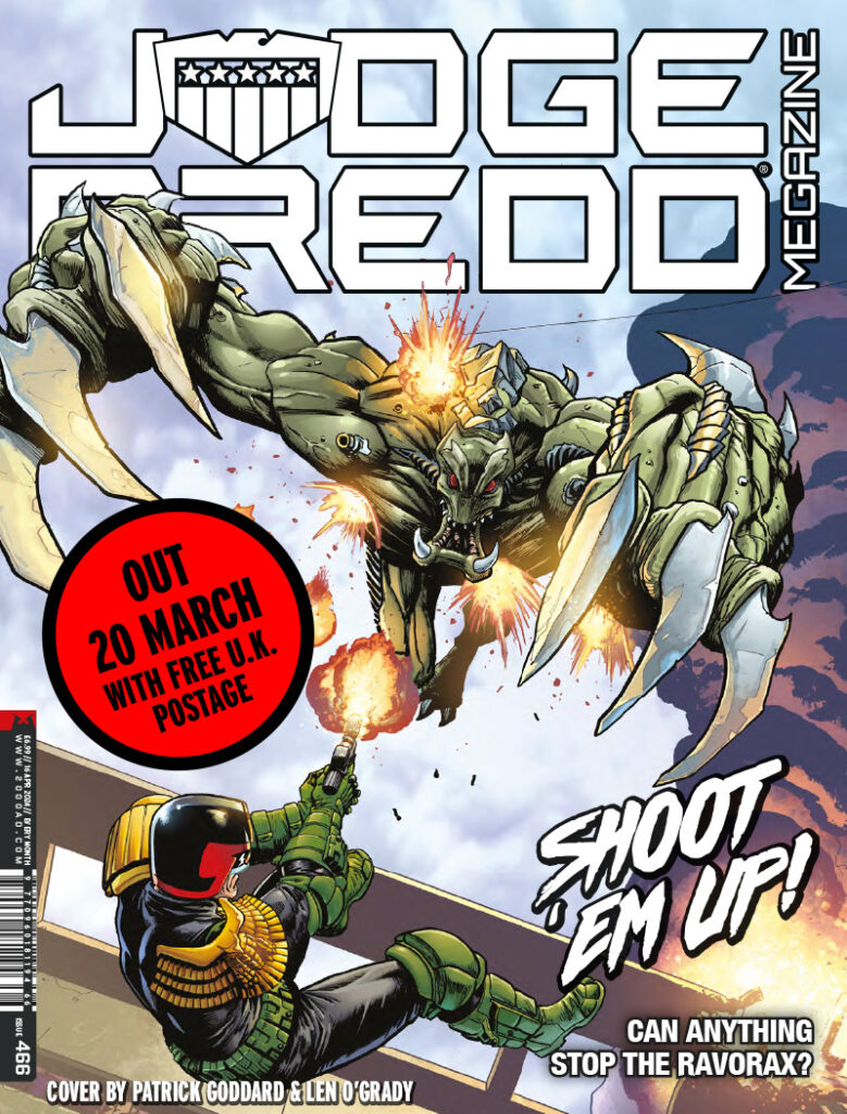
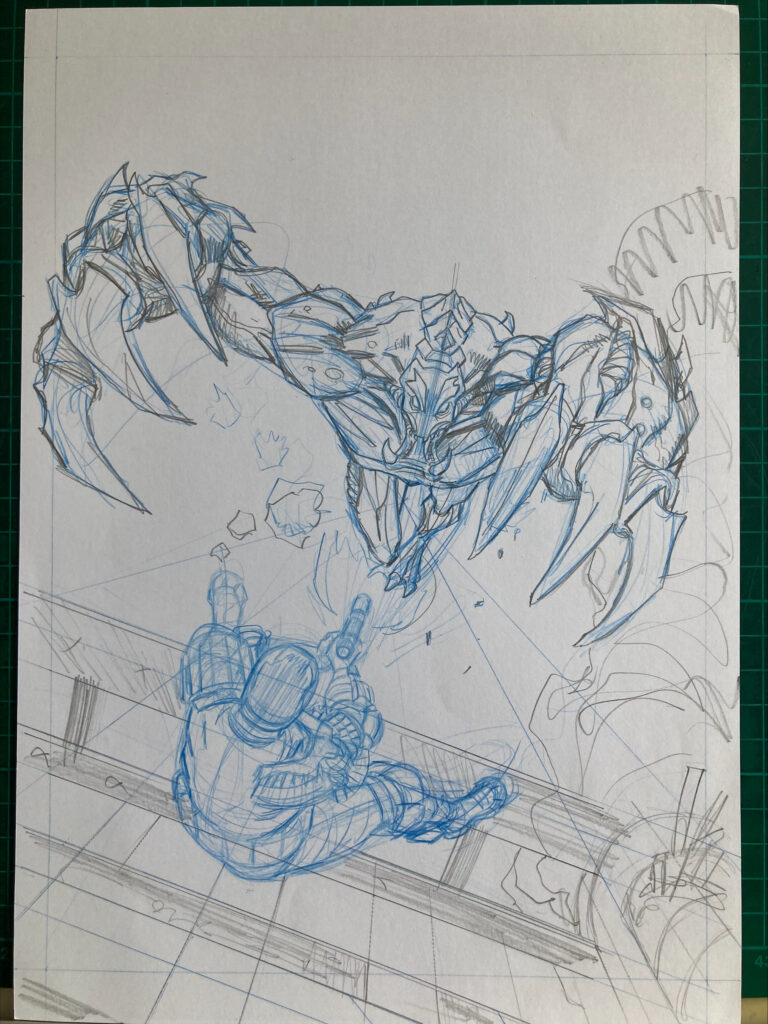
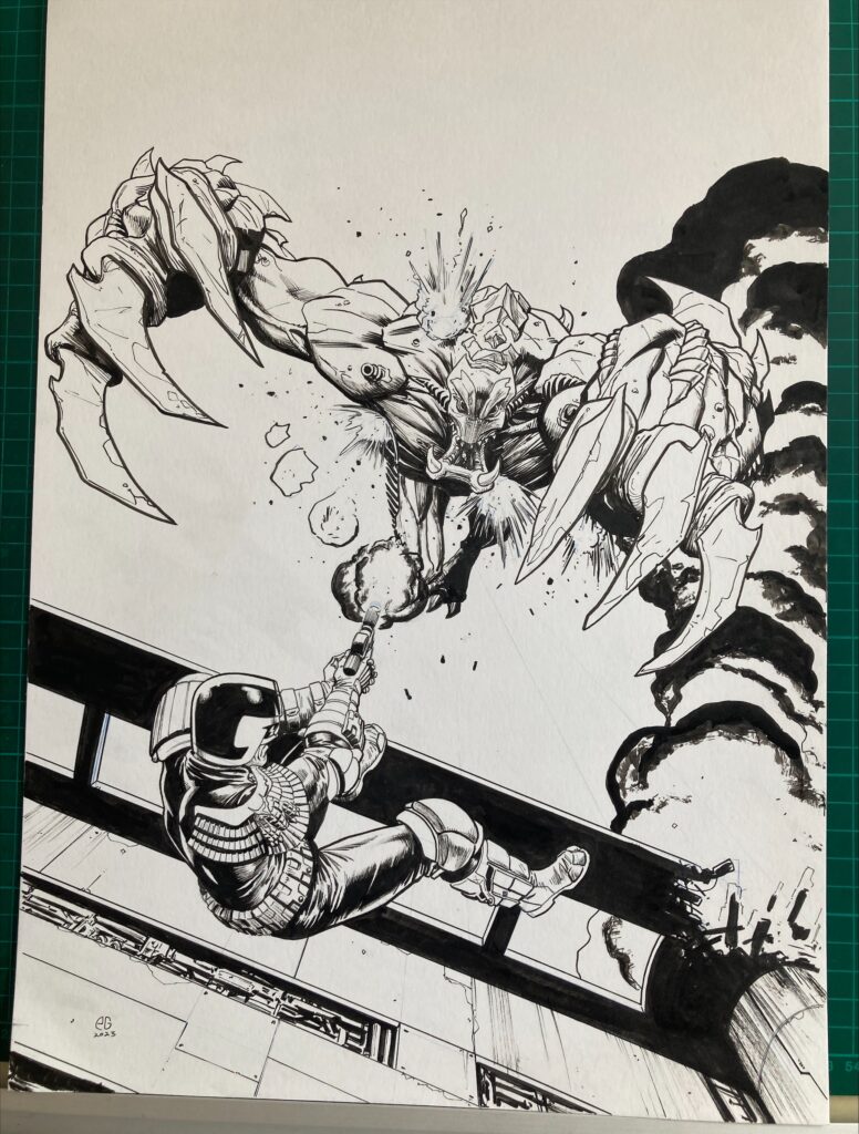
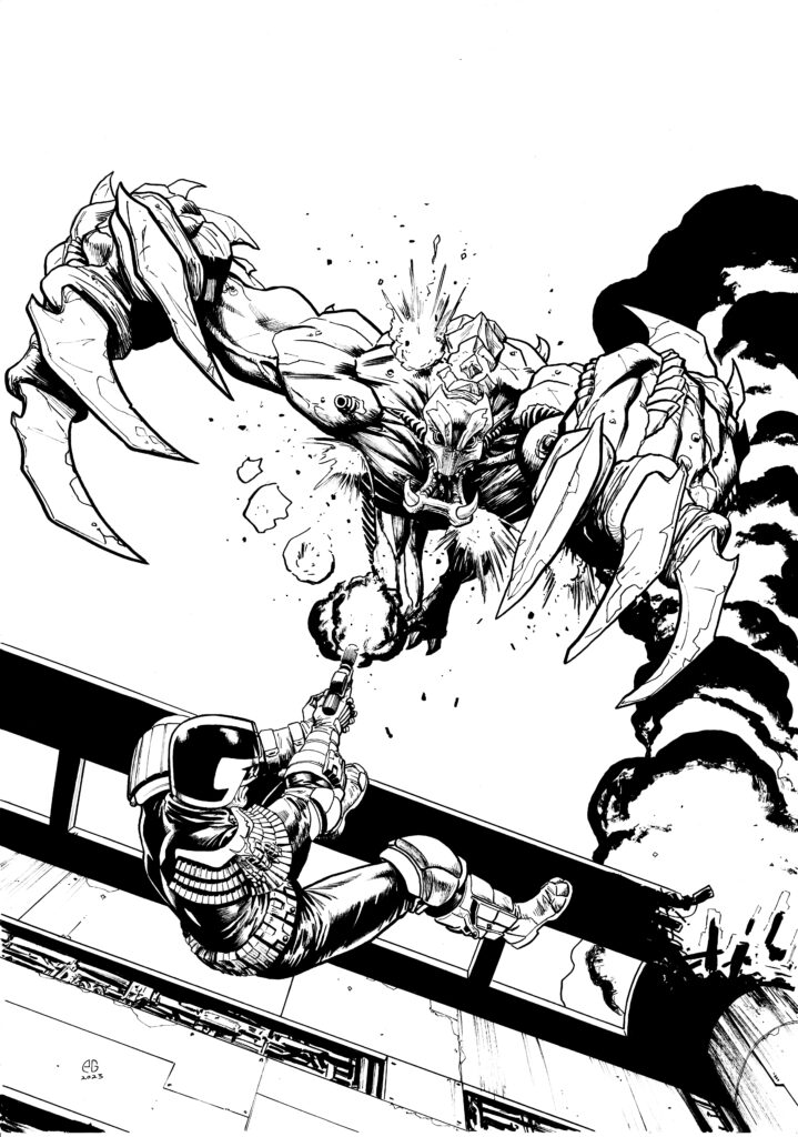
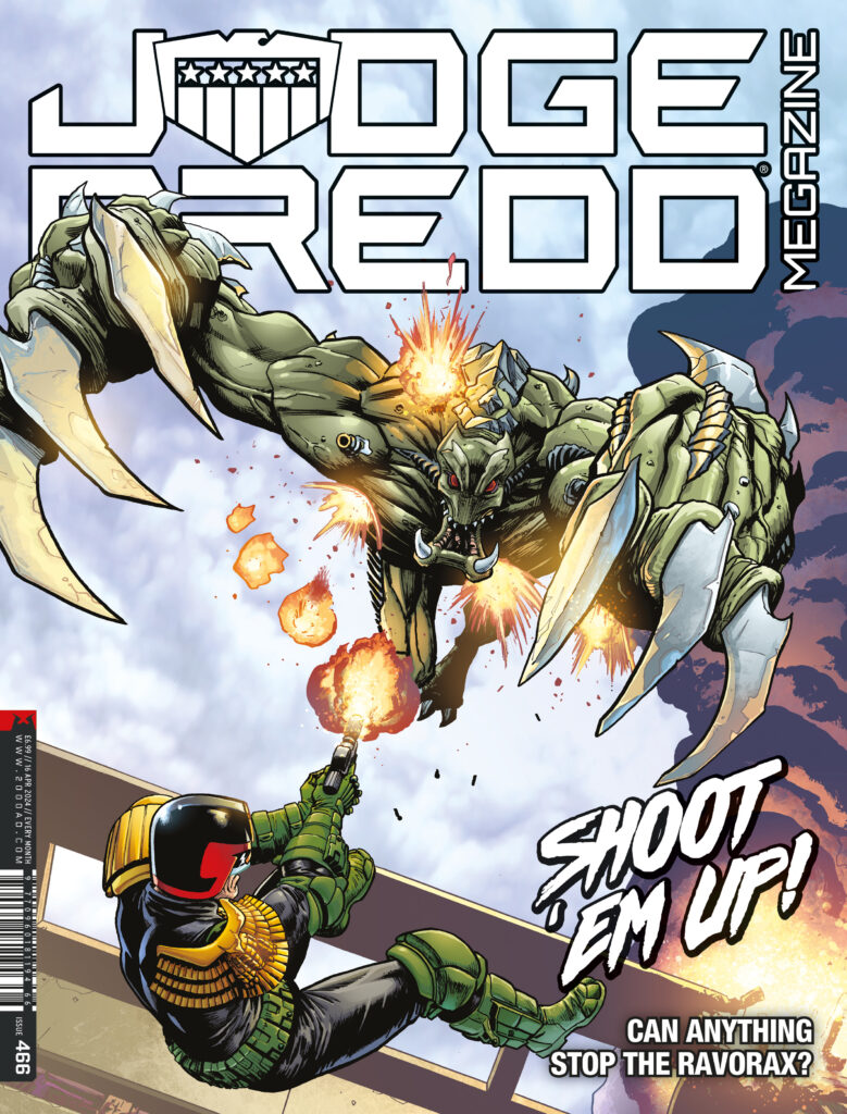
Borag Thungg Earthlets – time to have a good look at the cover of the latest thrill-powered issue of the Judge Dredd Megazine, featuring an amazing Dredd cover by Patrick Goddard…
That cover’s pulling a scene out of the current Judge Dredd: Ravenous, by Michael Carroll and Anthony Williams, which hits its third and final part inside.
Stuck out on a rig close to Texas City with a bio-engineered beastie on the loose that uses another dimension to almost instantly repair itself, things aren’t looking too great for Dredd fight now as he ended the last episode on his way to make a huge splash in the Black Atlantic. Will he survive? How will he survive? And exactly how is he going to find a way to kill the unkillable nasty?
It’s yet another great cover from Patrick Goddard, full of the classic look and the great action we’ve come to expect, the sort of thing we saw in his art last time he was inside the Prog, for the incredible 13-part Rogue Trooper: Blighty Valley with Garth Ennis, getting its well-deserved collection, out on 2 July 2024.
Okay, enough from us, let’s hand it over to Patrick to fill you in on how this latest Meg cover got made…
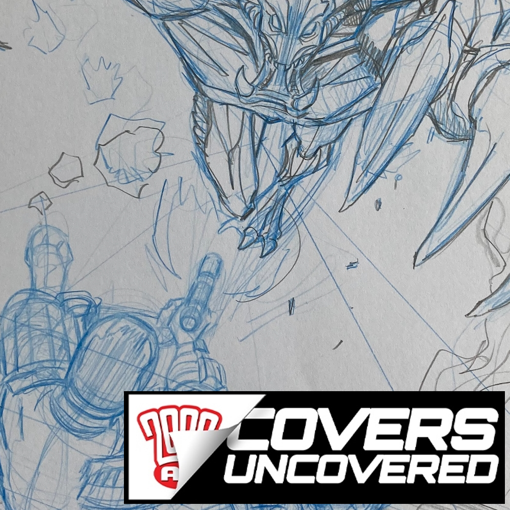
PATRICK GODDARD: Here’s some of the progress pics I found of the Meg Cover – the brief was very straightforward, with Matt wanting Dredd pursued by the creature from the strip falling off the rig John Woo style.I was sent a few pages of Ant Williams’s strip so I could read the scene in full and use his designs etc
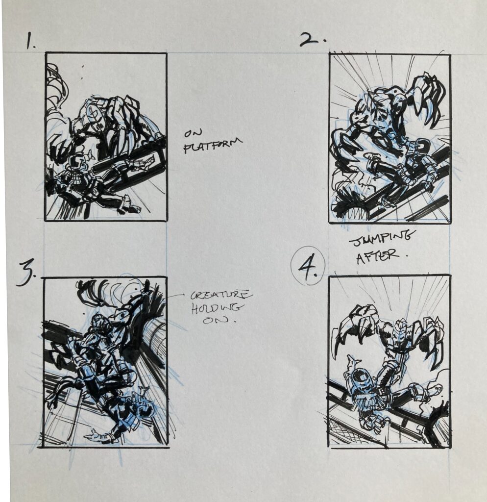
I sent through a couple of rough ideas and number 4 was picked but they wanted Dredd firing back at the creature…
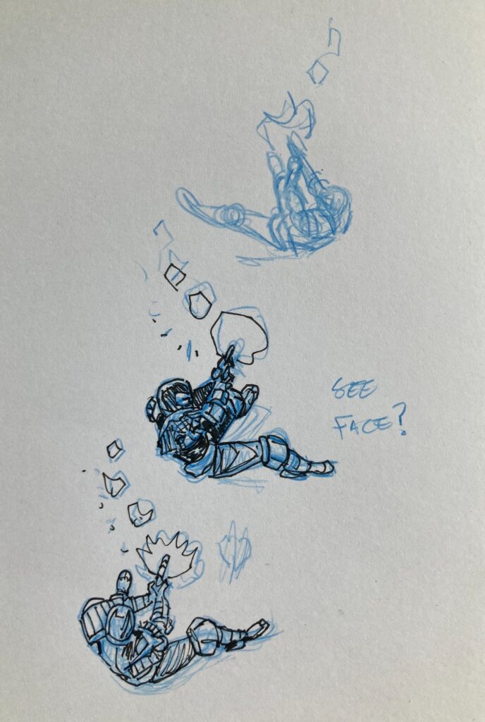
PATRICK GODDARD: My initial sketches had Dredd’s back fully to the reader but it just didn’t feel right to me. I think you need to see a bit more of Dredd on the cover so changed his pose a little to show more of him – although this brings up the issue that he’s a hard man to pose with those big old shoulder pads!
I just about managed to get his arms working and then went to work inking it up.Len O’Grady went on to do the great colouring and it was all finished.
In hindsight, I wish I drew Dredd blasting more heavily, taking big chunks of the creature off but I wasn’t sure if that was how the strip progressed.
Oh, art droids, always something they’re not happy with – almost as though Tharg likes planting the seeds of doubt to keep them in their places! Patrick, Patrick, Patrick, it looks just zarjaz to us!
So, like he said, once that fourth rough was picked as the cover it was all about getting more of Dredd on the cover and having him going down guns blazing. So,lots of versions of Dredd to get it all just right…
After that was fixed, time to pencil it up, getting all that perspective right… although still there with the back of Dredd’s head that needed changing…
Next comes inks, and plenty of them plus the altered version of Dredd, giving a bit more face to you…
Then scanned in and sent across to master colourist Len O’Grady to add all those fabulous colours to really make the whole thing pop! And pop it so does…
Absolutely great cover from Patrick for you there – it’s going to be launching off the shelves from 20 March – find it in comic shops, newsagents, and the 2000 AD web shop.
If you’ve loved all that – and we’re sure you will have done – there’s plenty to be getting on with here at 2000 AD – there’s plenty of Covers Uncovered, with Patrick’s art for the covers of Progs 2185, 2205, 2219, 2244, and 2264, plus his upcoming Rogue Trooper: Blighty Valley cover. We’ve also interviewed him twice, about the Judge Dredd: Special Relationship story (written by Rob Williams) here, and about Judge Dredd: Unearthed (with Williams and Chris Weston) here. There’s also a 2000 AD Thrill-Casthere with Patrick, Garth Ennis, and Keith Burns talking Battle Action, and Patrick talks to Molch-R in the 2000 AD Lockdown Tapeshere. Oh yes, plenty there to be getting along with for you! And hopefully it’s not going to be all that long before we get to see his cracking art both on the cover and inside the Prog and/or the Meg!
And finally, make sure to follow Patrick on Twitter and Instagram.
Every week, 2000 AD brings you the galaxy’s greatest artwork and 2000 AD Covers Uncovered takes you behind-the-scenes with the headline artists responsible for our top cover art – join bloggers Richard Bruton and Pete Wells as they uncover the greatest covers from 2000 AD!
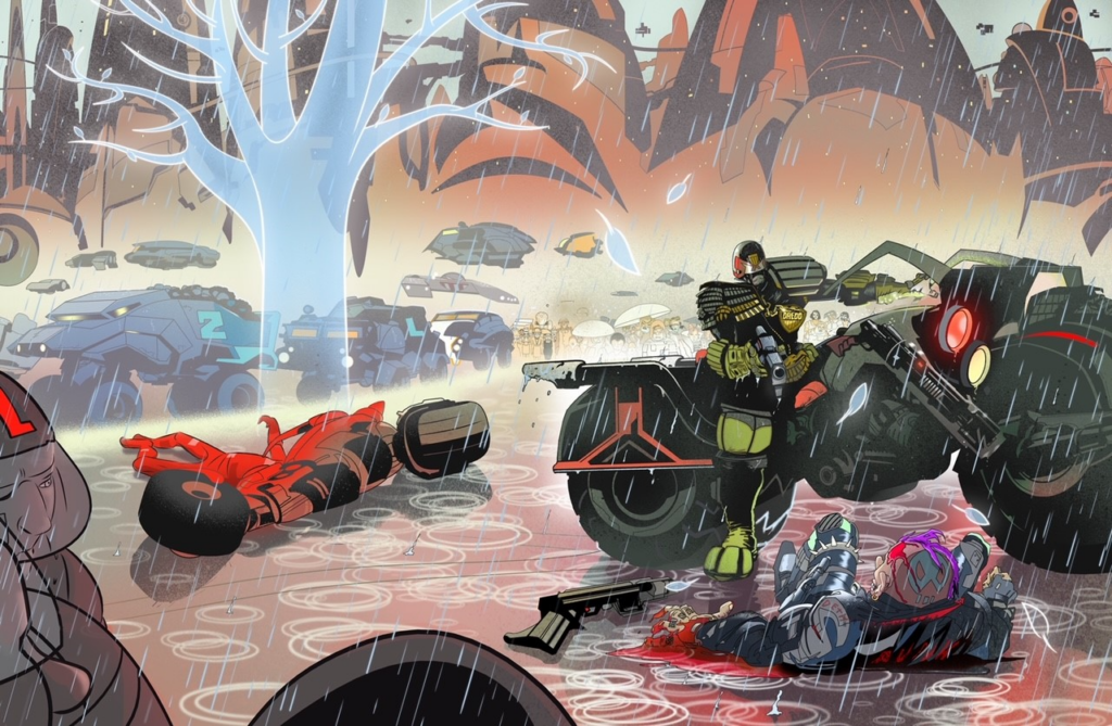
Another stunning Prog cover now from Stewart K Moore, wrapped around Prog 2373 with Dredd astride an absolute beast of a Lawmaster…
>
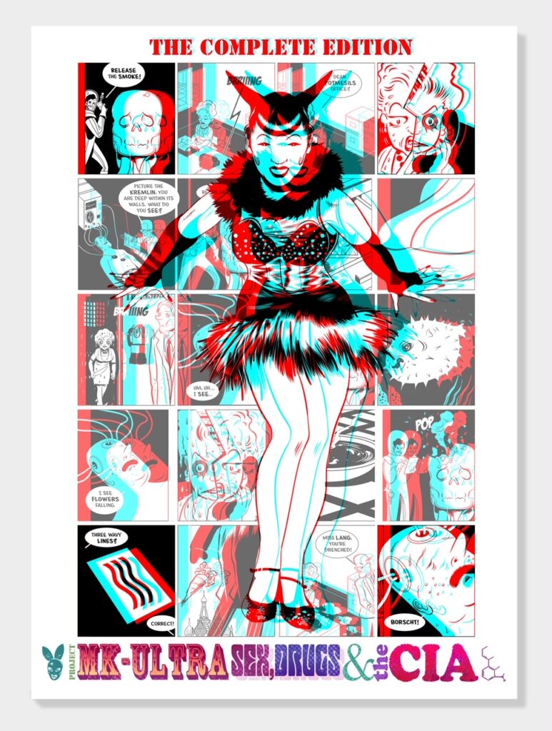
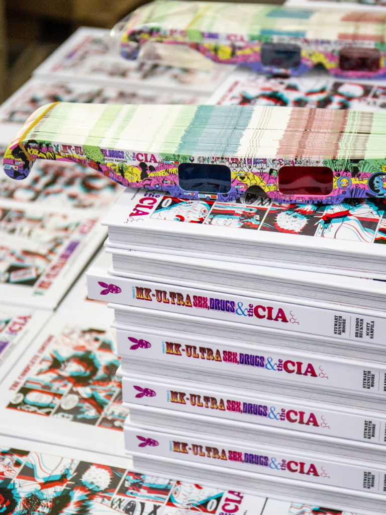
Although he initially dabbled in comics in the 90s, Stewart K. Moore’s career didn’t really being until the 2010s, starting with a project that would take him a decade to complete – Project MKUltra: Sex, Drugs & the CIA. He’s also completed his Tragedie of Macbeth adaptation, initially self-published, but then released in 2023, again from Clover Press. Finally, there’s the two amazing series in David Lloyd‘s digital anthology Aces Weekly – The Boötes Void and Thrawn Janet. And of course, his immediately recognizable art first appeared in the Prog with Pat Mills’Defoe: The Divisorin 2019 (Progs 2150-2161), followed regularly with some great work on Dredd, along with plenty of stunning covers, just like this latest.
So, on we go… Stewart K. Moore with his latest Prog cover, a typically gorgeous wraparound piece that looks an awful lot like this…
>
SK MOORE: In Block Mania written by John Wagner and Alan Grant, Steve Dillon drew a panel that sums up dystopia in the world of Judge Dredd. It begins to rain and Dredd looks up because he now knows where the terrorist is. He knows because rain is not scheduled.
Maybe it’s because I grew up in Scotland, a place where it’s usually scheduled to rain, but I always considered this scene a darkly funny moment. For my purposes on this cover, the rain here is just a dramatic element. It’s an easy way to give a still scene movement. It gives it life. Here it’s a steamy summer or early autumn rain.
Steve Dillon’s classic art from Block Mania – the moment when the rain comes down
I have a hard-bound black A3 sketchbook, it looks like an enormous moleskin, it even has the elastic black band of a moleskin notebook. In it, I do only Mega-City One stuff, where I try and sharpen my act on everything that might be found in the city.
I think, looking back, I may have taken for granted that I knew Dredd’s world well enough to just go ahead and draw it for 2000 AD. Well, I do know it well enough but what I don’t have [when a script hits my desk] is time to hone things, to find the best shorthand for me for say a Mega City truck or ‘Starscraper’, so this notebook is a place to practice those things.
One of Stewart’s MC-1 sketchbook pages – with the first stirrings of the cover
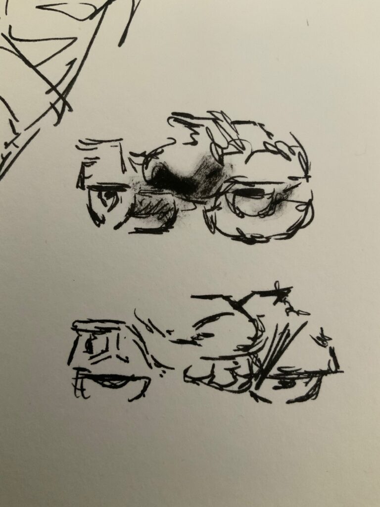
I’ve said it before but reading Dredd inspired me to become an artist – I imagined drawing it decades before I ever did. I’d think a lot about the best way to approach the subject. And one thing I always thought slightly intimidating was the Lawmaster bike.
This bike has to be as imposing as him – its best images seem almost like a steamroller/road roller, but it also has to be fast and capable of dynamic jumps. Initially I tried to draw a fairly traditional Lawmaster, but I’ve noticed art droids putting interesting design spins on it of their own invention. Over the years these moments of artistic freedom have contributed to an evolution of the design that I think keeps the subject evergreen and at its best.
So, to notebook! What can I do with it to make it work for me?
More Lawmasters from Stewart’s MC-1 sketchbook
For me any of my Lawmasters simply can’t deviate too much from the classic – I don’t have permission or the desire to deviate too much – but it does have to do the job in a way that convinces me. After all, if I’m excited by it it’ll show on the page. The inverse is also true, I cannot draw what I’m not interested in and if I feel the drawing looks stupid it’s over, I lose heart and it becomes a struggle [or a greater one, because it’s always a struggle!] It’s a big personal failing, I can only draw what interests me.
So in my notebook, the bike has been changing and growing. I’ve referred to the main sketches a few times in different ways, initially as a prospective cover pitch that I didn’t actually pitch.
The time finally came in late 2023 but I reduced Dredd and the bike to a silhouette and submitted the idea to Tharg…
I moved Dredd’s arms, adjusted the angle of the head and the posture from my original. I draw all these things without models – you can use posable digital models, or apps to generate forms, or you can use photo references, anything goes. But I feel while they can help they can also add awkwardness. I’ve tried them but tend not to and didn’t with this, going the traditional way – from doodles to sketches, to finished art.
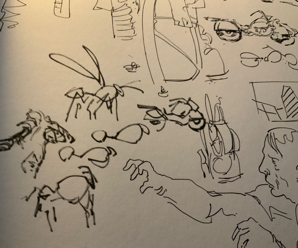
I combined three or four things to punch things up a bit for the bike. First, I like drawing horses and I thought of the Clydesdale workhorse, a massive beastie. And if you look at the arch of my ‘gas tank’ you may see it evokes an arch a bit like the neck and main of a horse. But the handlebars suggest a bull’s horns, so that’s why the engine pulls down, like the deep chest of a bull too.
With these animal similarities, I have a weighty and powerful ride but I still don’t have extreme speed and dexterity. That came when I thought of a wasp.
Don’t tell anyone because I might get into trouble for doing this but I articulated the back wheel. I draw it in a way that allows it to move independently of the main chassis. I’m not a biker, I may not have my terminology ’down’ but you can see that articulation in some of my pages.
Scene from Stewart’s Dredd in the 2022 Sci-Fi Special that shows off that wasp-like Lawmaster articulation perfectly
On the sketchbook page below you can see how I worked all that out on the page.
Only, I didn’t – that’s a big fat lie – I did all the animal stuff in my head and just scribbled this, right now, to satisfy the odd art lecturer that might be reading this.
‘Show your work?’ I did the work in my head.
The wasp & the Lawmaster – just another thought connection in the artist’s head
There’s often a rifle on the side of the bike, a riot gun. Here I thought about the Widowmaker design. I think it was first drawn by Carlos Ezquerra and later, for the Karl Urban film, by Jock (I think). So I drew something in that range for the rifle, I put it in a clear holster because, A) I had a selfish desire to show it all off and, B) because I was too daft to realise it didn’t need one. Next time there won’t be one.
I took chances with the punk, I drew him a bit more graphically than normal, not real. I drew him twice in fact; the first time was bloody awful and I had to put it down, that part of the drawing sucked and I went away a bit depressed. I came back later, deleted that crap and drew this new fella…
I started to feel like the scene was shaping up like an animation cell. I drew the bike on the back a bit like the great design in Akira. To be honest though, this kind of happened by accident, I only painted it red once I saw what I’d done, the design similarity. I love that film, so it’s always in there somewhere I guess. But here I was really preoccupied by all the trees in the holographic orchard.
Yes trees. Yes holographic orchard.
The back cover – holographic tree, trucks, and the classic Akira bike
Not sure if it would work, I drew this thinking about extinction in a world where the trees are holograms with leaves programmed to fall in autumn. I knew I was going off the rails and so I did all the trees on other layers in case it didn’t work – and it really didn’t. Tharg had the option to use or delete.
An important lesson – learn to love throwing it all away; there’s always the next panel and the next and the next. Let the idea find its place down that endless line of pictures. Do that with failures too, keep going, make it better next time. In comics there’s always the next panel.
In the background I drew trucks I was very happy with – pure luck. Sometimes I think drawing comics is best when you feel you are drawing a kind of toy world, toy-like things and toy-like people, animate toys. Some of my favourite artists draw this way. I think.
Stewart’s central casting dept. of freaks – a common sight if you look close enough
I have a central casting or ‘dept. of freaks’ and some of them are in the background here, if you look closely. They’re onlookers, gawkers. The keen-eyed might see their same cousins elsewhere in my work such as on my MK Ultra 3D glasses, I had been working on those around the same time I started this picture and there is a clear family resemblance – a kind of backwoods, ‘I’m My Own Grampa’ kinda resemblance. A way-too close for comfort ‘Deliverence’ kinda family resemblance.
Process wise this project went like this :-
1. Transfer sketch to 2000 AD page template in Manga Studio, grey it out, and draw over it on a new layer.
2. Next I began thinking I needed engine details and Dredd details, so I added more details and it stopped being a strict silhouette – that wasn’t working for some reason.
3. I drew the city as a black mass, faded it out, and added a new layer for details. I drew the skyline first in other words. It’s maybe my best MC-1 so far. Just luck. It worked for a change.
I paint it all in Photoshop, grey out, darken, spatter, delete spatter, spatter again, feel angst and wander off for a coffee and when I come back it somehow looks better. Like machine elves have come in and fixed it or I’ve forgotten the bits I struggled with.
Finally – art tip – With everything I do, I start with the big shapes and slowly work in to the smaller shapes. Painting a city? This! Painting a head of hair? This!
Thank you so much to Stewart for another fascinating look at how it all gets put together – you can find it on the front (and the back) of Prog 2373, in newsagents, comic shops, and from the 2000 AD web shop.
And he’s right – in art, and in life, you’ve got to learn to love throwing it all away, not being so precious, letting the idea find its place, keep going, embrace the failures as well as the successes, and make it better next time.
As for more from Stewart, there’s plenty of his 2000 AD work we’ve covered – Covers Uncovered pieces for The 2000 AD Encyclopaedia, Prog 2179, Prog 2239, Prog 2340, Megazine 440, his 2020 Sci-Fi Special poster, and a fascinating look at the artistic process with his two-part Covers Uncovered for Surferhere and here. We’ve also interviewed him twice now, first about his work on Defoe: The Divisorhere and his Judge Dredd: Ascension Day strip here.
It’s now available in a complete collection of volumes 1 and 2, with orders from Mission Comics San Francisco and Gosh Comics London coming with an extra 3D original sketch to go with Stewart’s new 3D cover for the book – and don’t worry, you also be getting Stewart’s aforementioned dept. of freaks on the 3D glasses that come with the book.
Every week, 2000 AD brings you the galaxy’s greatest artwork and 2000 AD Covers Uncovered takes you behind-the-scenes with the headline artists responsible for our top cover art – join bloggers Richard Bruton and Pete Wells as they uncover the greatest covers from 2000 AD!
Today we have the return of Dredd artist Tom Foster to talk about putting together his web shop exclusive hardback cover to the collection of his and Ken Niemand’s zarjaz Dredd trilogy – A Penitent Man.
We all make mistakes – but when you end up on the wrong side of the Justice Department, is there any way of making things right?
That’s the big problem facing former Judge Kyle Asher on his return to Mega-City One after 20 years on Titan’s penal colony. Under close scrutiny from the Law and with Dredd taking a special interest, will there be a way for a penitent man to get by in the big Meg, or is his fate already sealed?
This is a collection of Niemand and Foster’s trilogy of A Penitent Man, An Honest Man, and A Fallen Man, all of which came out to great acclaim in the Prog. This is one of the best recent Dredd tales, leaning hard into the classic Dredd themes of justice and simply getting by in a system where the rule of Law can be absolutely brutal and unforgiving.
Tom’s come a long, long way since winning the 2013 2000 AD Art Portfolio Competition at Thought Bubble. After his first 2000 AD work, the Tharg’s Terror Tale: Done Deal, written by Alec Worley and published in 2000 AD Prog 1886, his distinctive and classical style, reminiscent of Bolland and Chaykin but developed into a style very much his own, meant further work co-creating and illustrating the first Storm Warning series. But he really came into his own on these three longer Dredd stories, with his art deservedly praised by all who saw and loved it.
So, without further ado, over to Tom to tell you all about putting together this cover for the web shop exclusive hardback of Judge Dredd: A Penitent Man. And, as usual, he’s already putting himself down…
TOM FOSTER:I’ve been accused in the past of denigrating my own work in these Covered: Uncovered features – but then again, I’ve also been accused of producing covers that aren’t very good – so, in the interests of even-handedness, I’m going to waver in my appraisal and try desperately to please everyone.
Things started out positively enough, with word from the editorial team that they were planning on releasing A Penitent Man collection and a request to produce a cover for the webshop exclusive hardback. I was genuinely very flattered to be asked and started sketching a prelim.
This first concept of Asher and Dredd looking at each other over their respective shoulders was rejected. It was felt to be too subdued and not enough of a contrast with the paperback cover. Something with a bit more action was required.
This presented a bit of a problem, as the story contains very few action scenes that contain both Dredd and Asher – and those that do often don’t really reflect the dynamic of the story as a whole. So, I decided to try a montage of action beats from the story, centered around a motif of Asher looking at his blood-stained hands – with Saturn and, more pertinently, Titan as a unifying compositional element for the background vignettes.
Hearteningly, this idea was rejected with less enthusiasm than the first, and there was a sense that we might be getting somewhere. It might, I was told, even be good enough to be approved at the editorial meeting, but, for the sake of certainty, it was advised that I produce something entirely action-oriented, even if it meant straying from the text a little.
So, finally, I produced the sketch that went on to be the basis for the finished article. I didn’t want to just completely invent a scene that doesn’t happen in the book, so settled on something that was quite obviously supposed to be non-literal – something that suggested the themes while clearly being a bit abstracted.
I borrowed the Saturn/Titan element from the previous design and made it a more explicit backdrop, representing Asher’s past exile, with the man himself vainly fleeing it. Dredd is in close pursuit and, amassed behind, a bevy of the book’s other antagonists give chase to them both.
It’s perhaps as well that Asher has no nose to speak of, else it might have been crushed by the weight of my symbolism.
With this idea approved, I went about doing a more detailed pencil drawing. I had already more or less made up my mind to paint the cover, both to differentiate it further from the paperback version and in an impotent attempt to try and give the whole thing a sense of prestige, so this was more of a value study than my usual pencils, which are designed to be inked.
For the painting, I decided to work at a larger scale than usual, in hopes of producing a more finely-detailed piece. I printed out a scaled-up version of my pencil study on two sheets of A3 printer paper and taped them to tracedown paper, which I used to transfer the basic outlines to a large piece of claybord, with a painting area somewhere between A3 and A2.
Then I did an underpainting in burnt sienna acrylic ink, trying as best as possible to match the values of the pencil version.
With that done, I started to add colour with soft-body acrylics. It had been a while since I’d done any painting, and my experience in the medium is limited, so this process took a while.
I couldn’t land on colours or tonal values that I was happy with and, for a day or so, I felt like maybe I had made a bit of a mistake in assuming I could paint well enough ensure any level of professional finish.
After a while of trying different things and remembering lessons I’d learned on previous paintings, things started to look a little better – but, as so often happens, the more detailed and dimensional the rendering got, the more I started to realise the weaknesses in the underlying drawing.
Proportions that had looked okay to me at previous stages now started to look odd and unrealistic and I began to regret not using any photo reference. Even a quick selfie might have helped, but at the outset I had felt that use of reference might only serve to take some of the dynamism out of the pose. Now that I was trying to give it some level of (albeit heightened) realism, the liberties taken with form only served to compromise their sense of weight and depth.
The trial-and-error process required to try and compensate for my inexperience in painting ended up eating pretty heartily into my time, so I couldn’t really afford to start the whole process again.
Plus there were elements that I quite liked. Asher’s face seemed, if not exactly bursting with life-like detail, at least appropriately lit and coloured. In fact, the whole effect of having the front of the foreground figure seemingly in shadow, while in reality being quite deliberately lit for clarity and impact, seemed to have been managed effectively. Also, the planet in the background had the oddly luminous glow I was aiming for, without competing too much with the figures. So, I decided to finish the painting up as much as I could in the time I had left and try to learn from it.
I think, compositionally, it more or less works. The colour palette, while it wouldn’t look out of place on a calendar in a Chinese takeaway, has a certain old-fashioned appeal. The figures have motion in them. Generally, the flaws are not things that leap out at first glance, but which become more obvious the longer you look at it. No one detail is so well-painted that it draws the eye, but no one element is so completely off as to be distracting.
So, there you go, I’ve managed to avoid saying definitively what I think of it. That should keep everybody happy.
Oh Tom, Tom, Tom, always putting yourself and your work down. It’s almost as though Tharg drills it into his art droids that they’re not quite good enough to keep them all in their place! Needless to say, it’s a great, great cover!
You can grab Judge Dredd: A Penitent Man from everywhere ghafflebette graphic novels are sold from 13 March 2024, including the 2000 AD web shop. The softcover is here, with Tom’s artwork on the cover, but even better is the hardback here with the exclusive cover he’s just shown you!
You want more from Tom? Well there’s plenty of Covers Uncovered from him – 2000 AD Progs 1986, 2225, 2281, 2310, 2341, his great Storm Warning cover for Megazineissue 450 and his just as great Surfer cover for Megazine issue 454. We’ve also interviewed him a couple of times – he talks about his 2013 Thought Bubble talent search win here and the Judge Dredd: A Penitent Man strip here. Finally, if you want to see and hear him, there’s his 2000 ADThrill-Cast Lockdown Tapes appearance here and his far too funny From The Drawing Board video can be found here.
Every week, 2000 AD brings you the galaxy’s greatest artwork and 2000 AD Covers Uncovered takes you behind-the-scenes with the headline artists responsible for our top cover art – join bloggers Richard Bruton and Pete Wells as they uncover the greatest covers from 2000 AD!
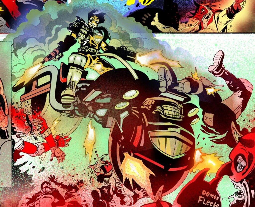
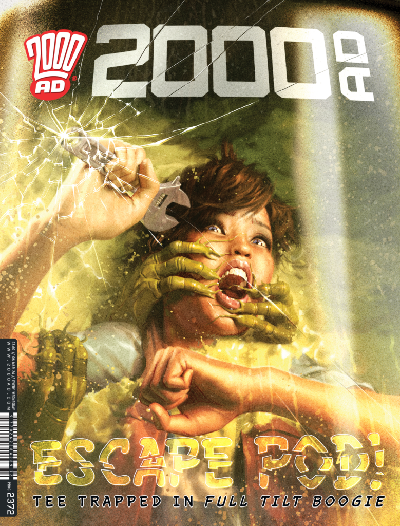
Borag Thungg Earthlets for another Covers Uncovered – this week we have the return one of Tharg’s cover specialist droids for the cover of Prog 2372 – it’s Alex Ronald with a ghafflebette look at the thrills and dangers to be found in Thrill Tilt Boogie…
Now, Alex has been a dedicated cover art droid for Tharg since he returned to 2000 AD Towers after leaving to start a second career in the computer graphics industry. Before that, he’d been drawing interiors at 2000 AD, getting his break on a Judge Dredd back in Prog 984. More work on Dredd followed, along with runs on Dredd, Vector 13, Rogue Trooper, and Sinister Dexter before he headed off into the sunset. But Tharg has his ways of pulling droids back into the Prog and the Ronald droid was no exception, bringing a very different digital style to his covers ever since!
This is another of Ronald’s Full Tilt Boogie covers for the series written by Alex De Campi and drawn by Eduardo Ocana. It’s glorious space opera stuff, epic & expansive, and packed with action and adventure against some really solid worldbuilding and beautiful art from Ocana to make the whole thing fly.
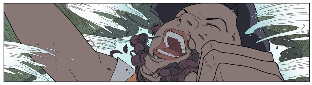
This second book of the adventures of the good ship Full Tilt Boogie finds our heroes grounded, in need of repairs themselves – although that hasn’t stopped Tee managing to get herself into a hell of a lot of trouble, as you can see from Alex’s fabulous cover, all pulled from the incredible visuals of Eduardo, just like this…
(Eduardo Ocana’s stunning artwork for Full Tilt Boogie – one of the reference pieces Alex sent over to show us)
ALEX RONALD: For this cover Matt had asked for a recreation of the scenes with the character trying to break out of the Cryo-chamber. Specifically he wanted it to look like she was breaking out of the Prog cover.
And Alex sent over all the references he was working off, showing just how much trouble Tee had found herself in… this couple below as well as the stunner above!
(More of the references Alex sent over – Eduardo Ocana’s fantastic interior art for Full Tilt Boogie)
ALEX RONALD: Although I knew I would have to work close in on this one, working in 3D I built a portion of the tree trunk with the glass canopy as you can see from the reference comic pages.
(Alex’s usual 3D render for the cover – Tee’s tree troubles continue!)
ALEX RONALD: In the end very little if any of the tree was visible in the final art but It helps me to have all elements there. The 3D figure was posed into position and I partially filled the chamber with a 3D fluid plane.
Once everything was in place I lit it for best effect then spat out the rough render to sketch over.
(Alex’s rough of the cover, that incredible way the 3D render gives way to glorious artwork)
ALEX RONALD: Once Matt had approved the rough it was onto painting – my favourite part! In the end, I tried to put more fear into the characters face than was in the rough.
Using the 2000 AD logo, I curved it very slightly to follow the contour of the glass and then broke it along the lines of the cracks to try and reinforce the character ‘breaking out’ from the Prog.
I hope you like it.
Oh, we think the readers aren’t going to like it Alex, they’re going to love it!
And hands up how many of us noticed the slight curve of the logo this week? And hands up how many of us are even more impressed with Alex’s cover now we’ve seen it and loved it?
Thanks to Alex for sending all of that over to us – it’s out right now on the shelves of all ghafflebette newsagents and comic shops, as well as the 2000 AD web shop.
And finally, just a bit of a blow-up to go close to Alex’s art to really show you the amazing details he gets into the covers, from 3D render to rough through to the finished, on the shelf cover…
Every week, 2000 AD brings you the galaxy’s greatest artwork and 2000 AD Covers Uncovered takes you behind-the-scenes with the headline artists responsible for our top cover art – join bloggers Richard Bruton and Pete Wells as they uncover the greatest covers from 2000 AD!
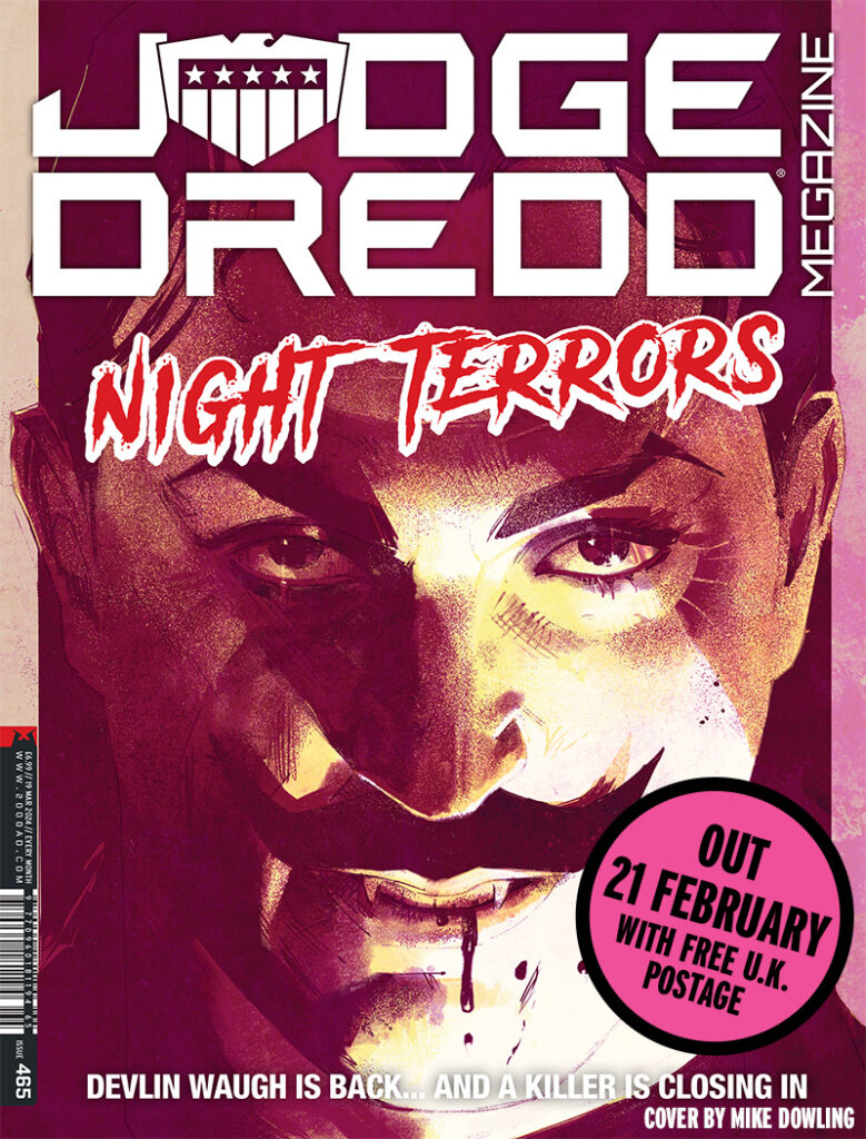
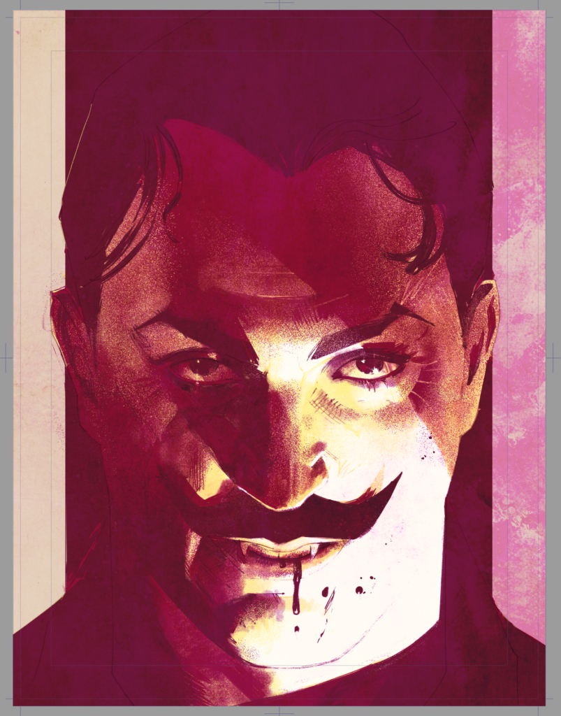
We’re looking at the new Judge Dredd Megazine for this latest Covers Uncovered – with Megazine 465 featuring the return of the deliciously dandyish, voluptuously vampish (not to mention vampiric) Mr Devlin Waugh, as brought to life by Mike Dowling for the cover…
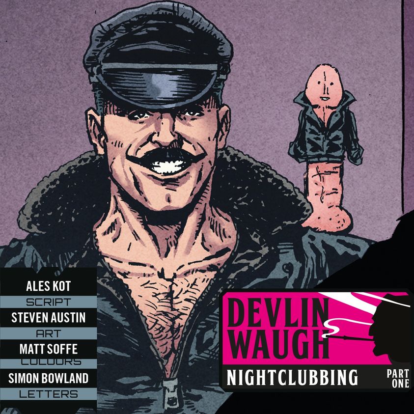
Inside Megazine 465, we have the return of everyone’s favourite Brit Cit bon viveur, Devlin Waugh, with Aleš Kot returning to write Nightclubbing alongside new series artist Steven Austin, where we’re checking in with Devlin and his plastic pal Titivillus. The trouble is, Devlin’s struggling a little to get his shit together right now after his most recent troubles in dealing with a curse on his bloodline.
Here’s just a little of what to expect inside, with art by Steven Austin…
But before you get the delights of peeking inside at Devlin’s latest exploits, time to chat to Mike Dowling about putting this great new Megazine cover together, complete with a sneak peek at a Devlin cover in Mike’s rough ideas that we might well be seeing later in the year. As is often the case, it was another example of the art droids throwing themselves on the mercy of The Mighty One for work. Or, in this case, Tharg’s Earthly representative…
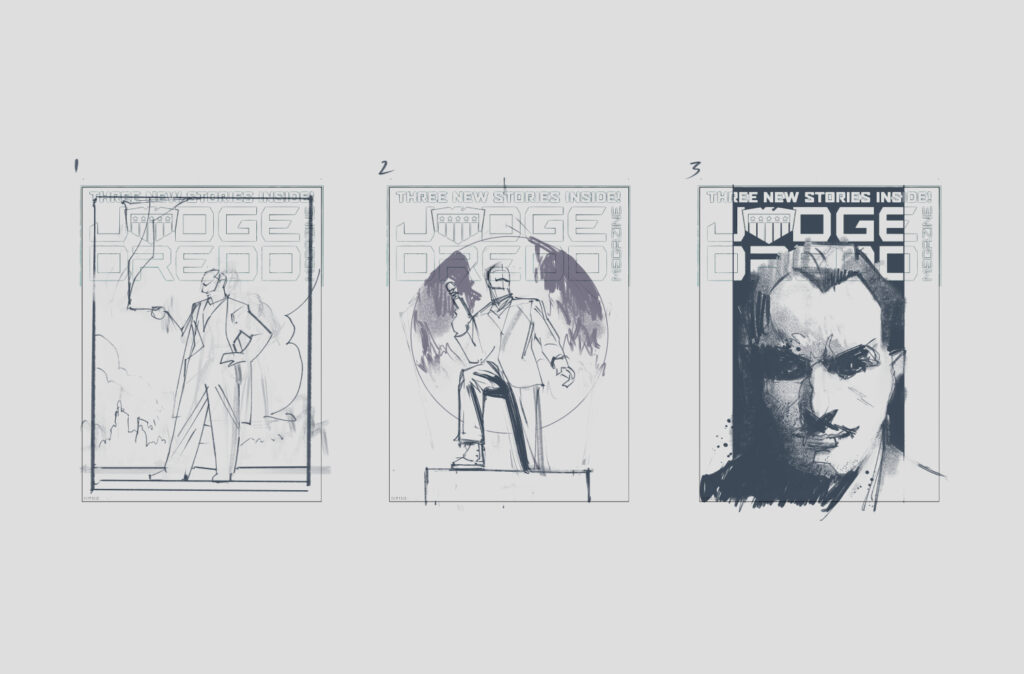
MIKE DOWLING: I’d got in touch with Matt Smith to see if he needed anything and he suggested A Devlin Waugh cover. I sent over 3 rough ideas and handily for me, Matt went for 2 of them.
I started with the big portrait of Devlin. I’d tried to do something like this before and it hadn’t worked out. I was keen to have another go at it and at least get it mostly right this time!
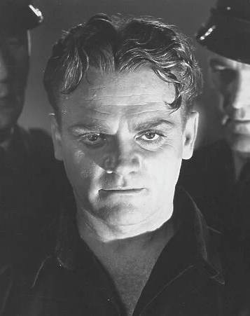
Looking at the original sketch I decided it just wasn’t dramatic enough. I originally thought the scale of the head would be striking enough but I quickly decided I needed something more – something in the lighting to give it some drama. I remembered a picture of James Cagney from Angels with Dirty Faces – he has such presence in the photo – I thought I could lift the lighting from that publicity still wholesale. I wanted some menace in the picture, which Cagney has in spades but I also needed something a bit carnal – It’s Devlin after all!
After that decision it was all pretty straightforward – I put together the pencil drawing, adding another shadow to better frame Devlin’s left eye and made sure it would all fit with the logo.
I’ve moved from the dark tones to the light, trying to find the right balance.
With all the tones in place, I spent a while trying to sneak up on the right colours for the piece. Normally I would have a colour idea in place when I got started, but as this was not part of a scene or larger story I had to deal with the worrying possibility of the colour being ‘anything I wanted it to be’.
Existential crisis aside I added some paper texture, Made sure it still sat happily with the logo and considered it finished.
>
And that’s it – it always sounds nice and simple when droids like Mike lay it all out that way, missing out the hours and hours of blood, seat, and tears that go into putting something worthy of a cover together!
Our thanks to Mike Dowling there for sharing the art there to this latest gorgeous Devlin cover. You can find it on the front of Megazine 465, in newsagents, comic shops, and from the 2000 AD web shop right now.
Every week, 2000 AD brings you the galaxy’s greatest artwork and 2000 AD Covers Uncovered takes you behind-the-scenes with the headline artists responsible for our top cover art – join bloggers Richard Bruton and Pete Wells as they uncover the greatest covers from 2000 AD!
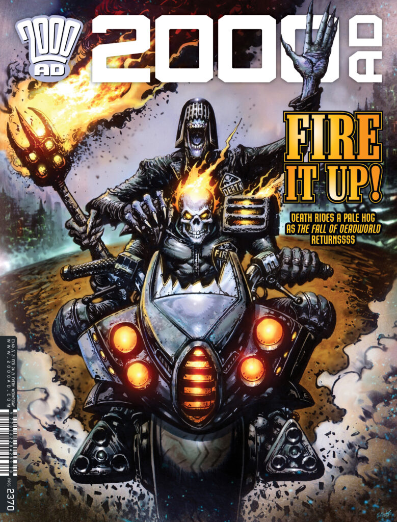
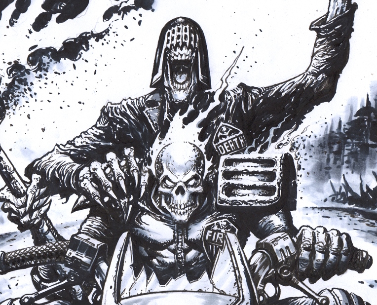
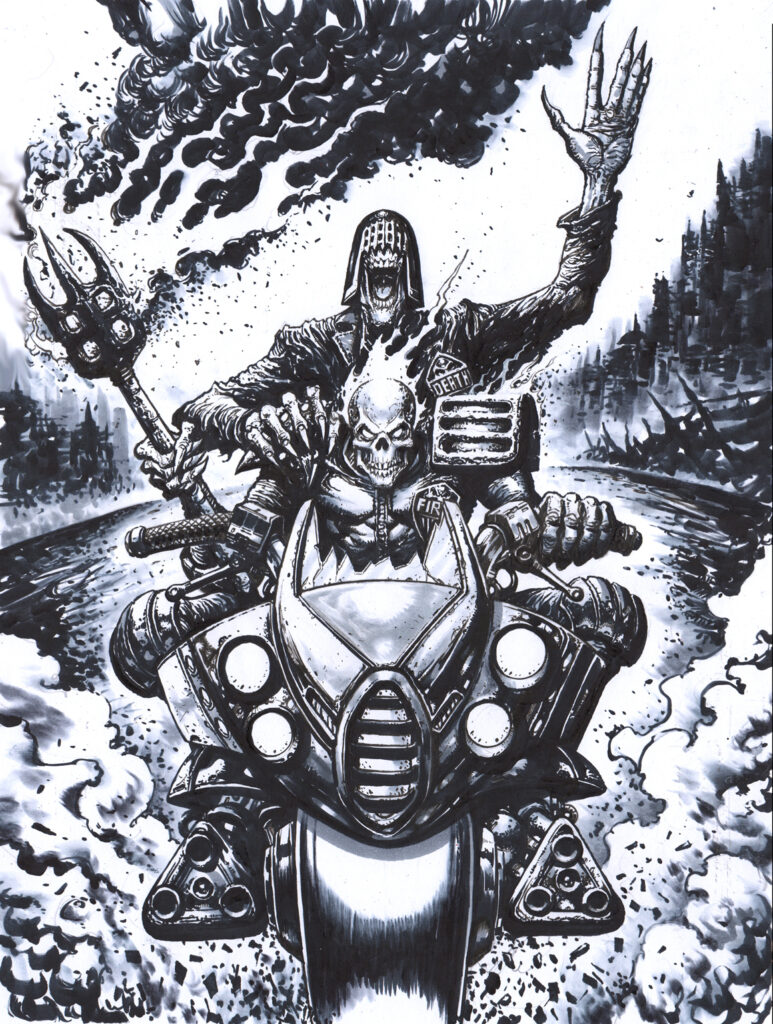
You’ve seen it on the shelves or popping through your letterbox already, but we’re going back to last weeks’ spectacular Clint Langley cover to 2000 AD Prog 2370 now – it’s Judges Death and Fire comin’ at ya’ on a bike from hell…
It’s Clint’s latest foray of fear and horror in Deadworld and the Dark Judges, showing us the delights of Kek-W and Dave Kendall’s ongoing The Fall of Deadworld series, which roared back into Prog 2370 with the continuation of the Retribution storyline.
Clint’s got biking form with the Dark Judges as well, with this cover acting as a homage of sorts to his own cover of Prog 2025 where it was Judge Fairfax and Jess Childs roaring out of the cover at you. So, hang onto those helmets one and all, let’s get into the putting together of this latest Langley bit of brilliance!
There’s not too much art to show you with this one, as Clint works pretty much direct with inks and brushes – like he told us when sending the art across, ‘I tend to go straight into the art!’
He did have this to say though – ‘I really enjoyed working on the Deadworld covers. Love the Deadworld strip in the Prog. Getting to draw such classic 2000AD characters is always a pleasure.’ And a pleasure it is to see you on the cover Clint!
As with all of Clint’s covers, he’s old school, hand-drawing the covers with ink and brush, A2 sized (which must just look stunning to behold in all their fearful majesty!) After that, it’s scanned off to the computer and then digitally coloured with Photoshop. So here’s that fully inked cover to feast your eyes on…
Thank you so much to Clint for sending all of that along – Quaequam Blag, just absolutely stunning as always, the sort of thing that leaps out at you, grabs you by the throat and doesn’t let go – it’s the thrill-powered way!
You can find Clint’s cover on the front of Prog 2370, in newsagents, comic shops, and from the 2000 AD web shop – available right now! For more of Clint’s incredible work, check out the great Art of Clint Langley Facebook page.
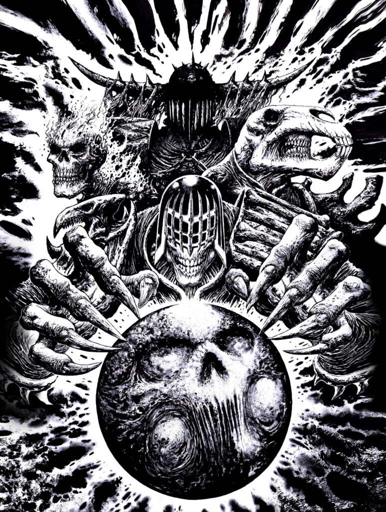
Now, as an added extra, Clint was good enough to send over some of his finished inks for his previous Fall of Deadworld covers – all done in the same style and the same fashion, huge direct inked pieces that just boggle the mind…
We start with Clint’s first Deadworld, giving us all the grotesque delights and absolute horrors that you’ll find in the strip – the cover to Prog 1980
Next came Prog 2025 with the cover that Clint’s homaging in his way with this latest – showing Judge Fairfax and Jess Childs doing their damnedest to escape the clutches of Judge Death and his grotesque group, an escape that we all know just isn’t going to happen – it’s called the FALL of Deadworld after all!
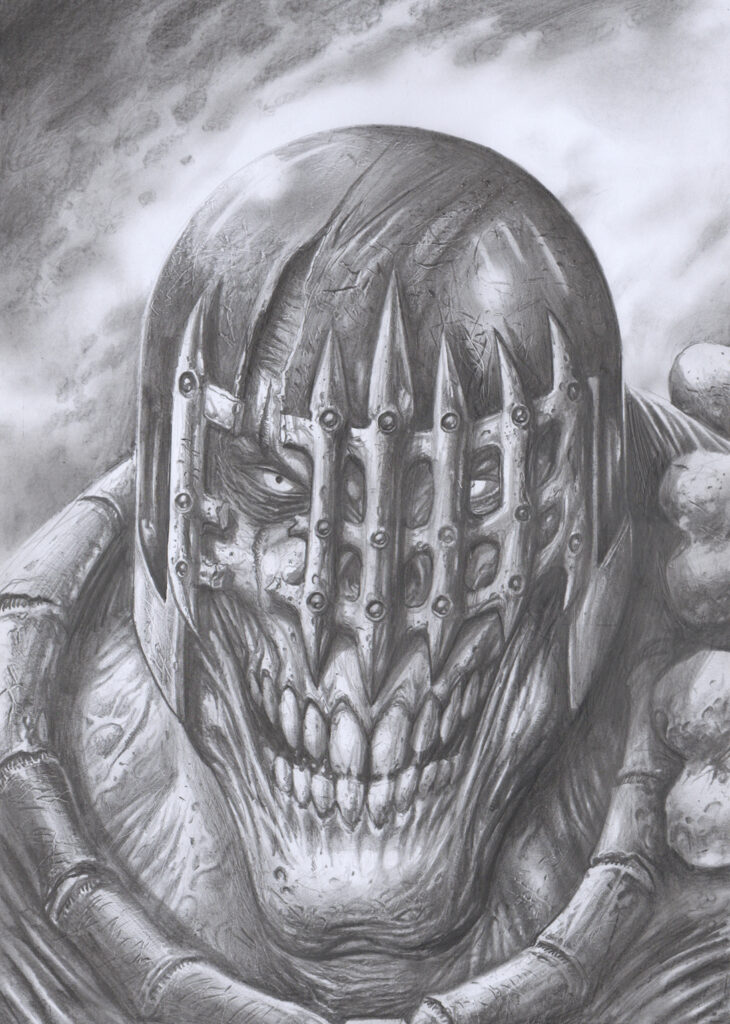
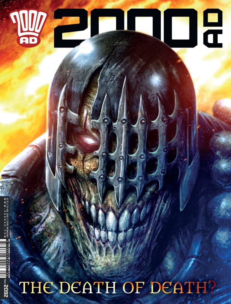
And finally, we have Prog 2092, with a quite wonderfully wicked and unbelievably unholy look at the main man himself – Judge Death!
Every week, 2000 AD brings you the galaxy’s greatest artwork and 2000 AD Covers Uncovered takes you behind-the-scenes with the headline artists responsible for our top cover art – join bloggers Richard Bruton and Pete Wells as they uncover the greatest covers from 2000 AD!
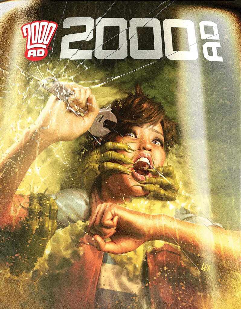
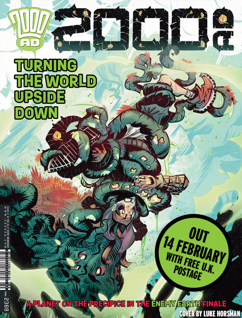
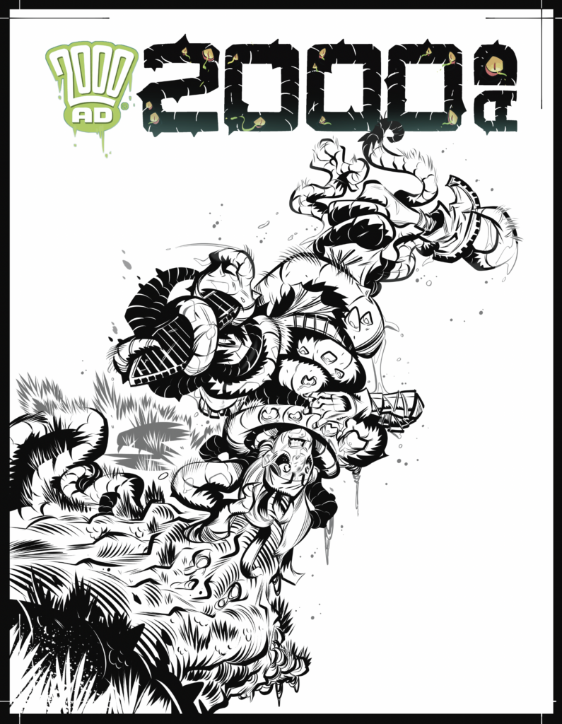
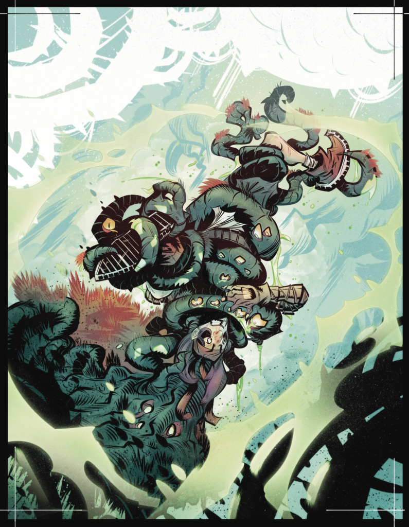
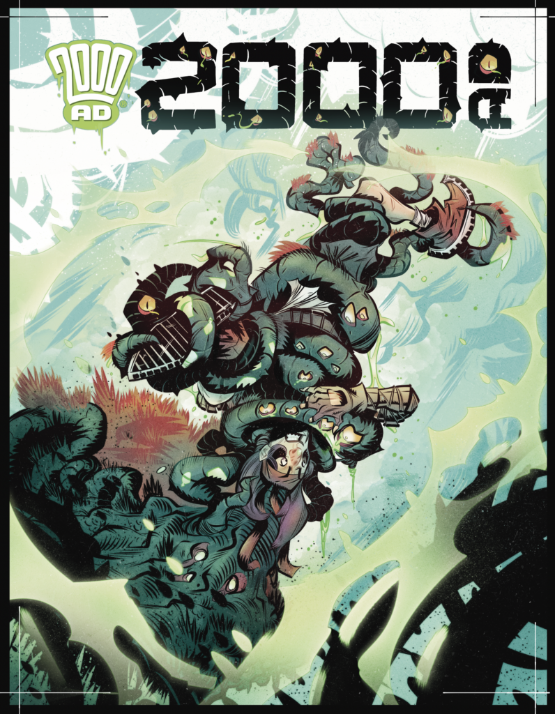
This week it’s 2000 AD Prog 2369, featuring the finale to Book Three of Cavan Scott and Luke Horsman’s Enemy Earth – which is also the finale to the entire Enemy Earth saga. Fittingly, series artist Horsman gets the cover…
There’s always something very special about the covers that do something different with the 2000 AD logo – don’t you think?
Anyway, across three series of Enemy Earth, we’ve had a world gone mad, fauna and flora mutated and out to kill any human that’s left alive, and we’ve seen a very unusual found family come together to triumph over all the problems that this world can throw at them (and that’s a hell of a lot!)
So, one last time for Enemy Earth, here’s Luke Horsman talking about an Enemy Earth cover… and as usual it all starts with Tharg beaming his magnificence into the presence of an unworthy art droid and telling them just what he’s after for this latest cover…
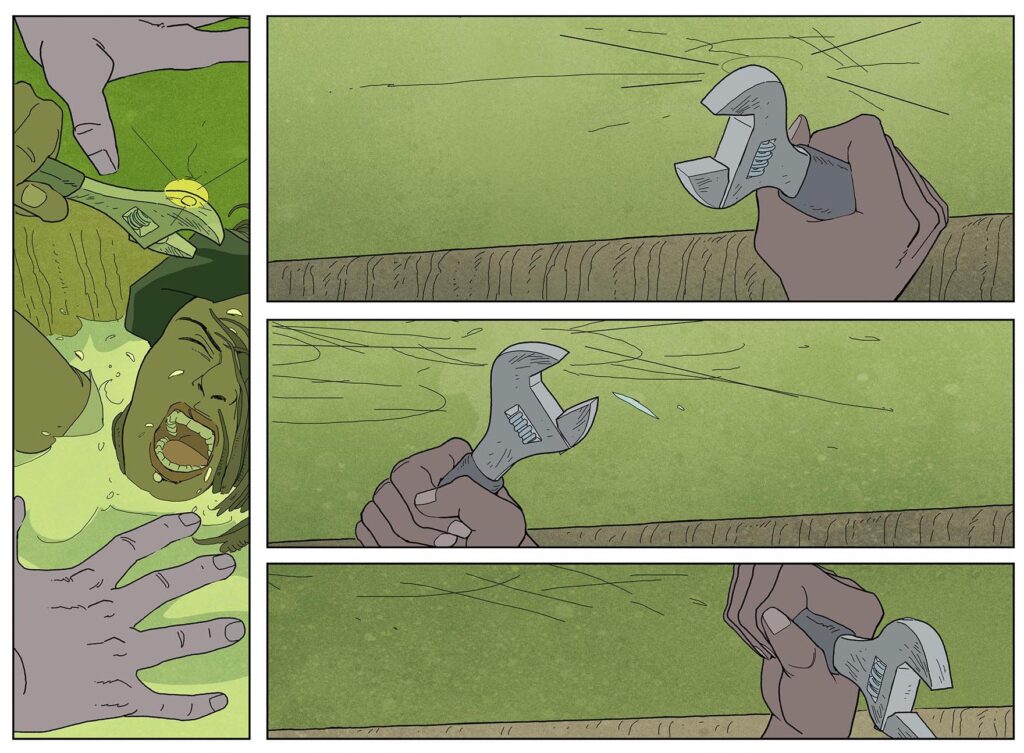
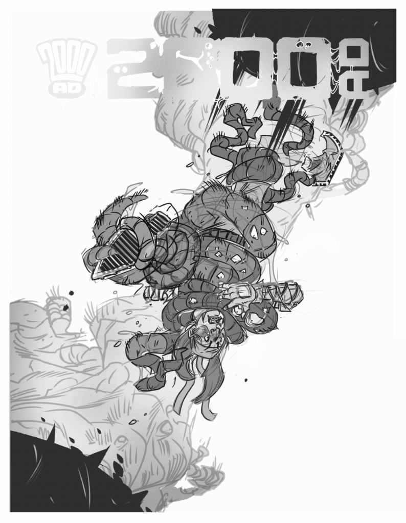
LUKE HORSMAN: Starting with the rough – I was asked to produce a cover image inspired from a scene in the previous episode of Enemy Earth, with Zoe hanging upside down by Jules’ mutated tentacles.
That would be this scene…
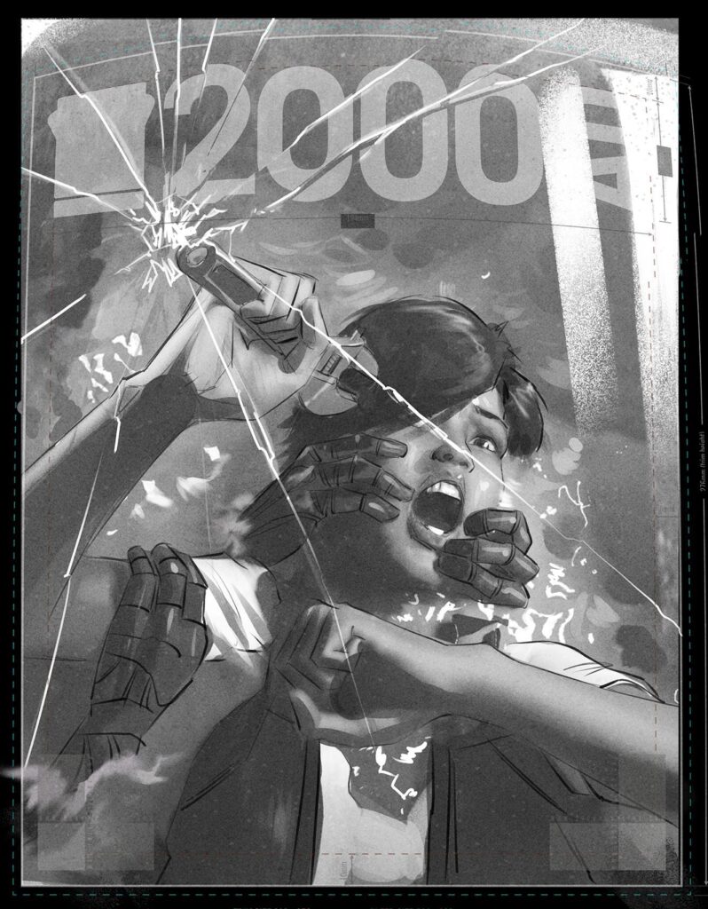
And this is the sketch that Luke worked up for the cover…
Okay then, with the sketch all sorted and approved and art droid Horsman still shaking from being in the presence of The Mighty One, it’s time to get back to work, with Luke bringing us a great cover, complete with that customized logo…
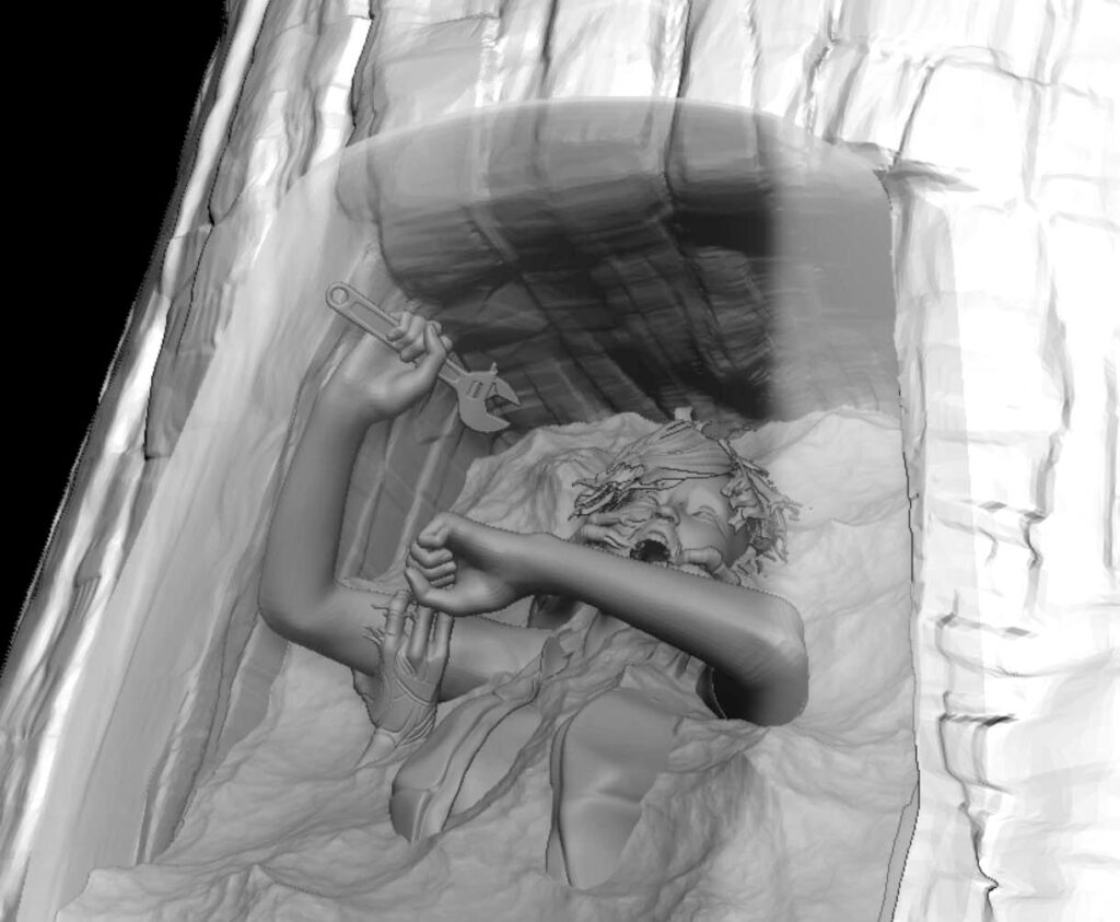
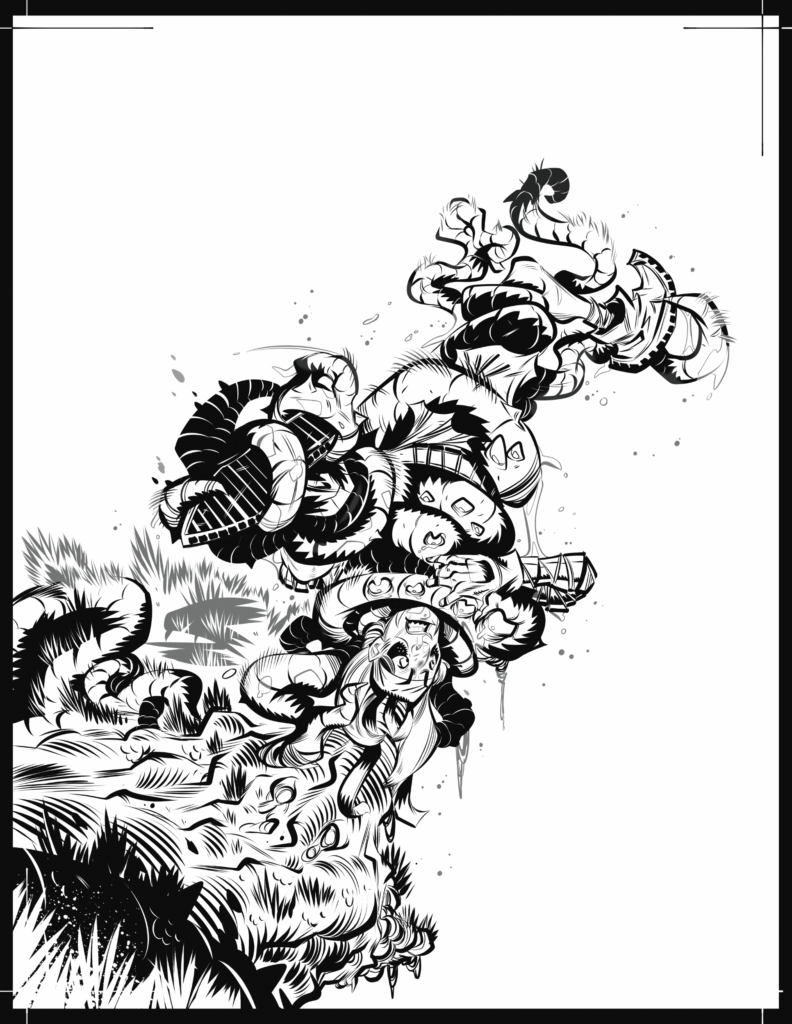
LUKE HORSMAN: Once all was approved, I laid down the line work as usual.
LUKE HORSMAN: Next, working up the title treatment I had in mind to work into the image...
LUKE HORSMAN: Now on to layers of colour work. I wanted to frame the main aspect with some basic silhouette designs so everything popped in the right way…
LUKE HORSMAN: And finally drop the title back in…
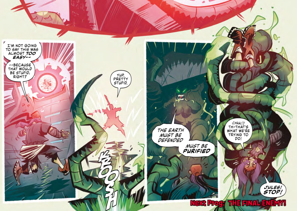
And there you have it – a final fabulous Luke Horsman cover for Enemy Earth. You can find it on on the front of Prog 2369, in newsagents, comic shops, and from the 2000 AD web shop.
As for previous Covers Uncovered from Luke, he talks Enemy Earth covers for Prog 2303, Prog 2307, and Prog 2329. We’ve also interviewed Luke three times – here along with Cavan Scott about the very first Enemy Earth in 2000 AD Regened Prog 2256 and here for a chat with them both for the first series of Enemy Earth that began in Prog 2301. And finally, there’s an interview here with Luke and writer Mike Carroll about another Regened strip, Action Pact, from Prog 2220.